3D Model World Globe PowerPoint Charts Template for Presentation


Type: PowerPoint Charts template
Category: 3D
Sources Available: .pptx
Product ID: PC00791
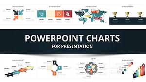
Template incl.: 20 editable slides
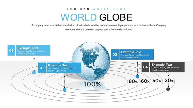
In an interconnected world where global trends shape everything from trade policies to climate strategies, visualizing data on a planetary scale is essential. Our 3D Model World Globe PowerPoint Charts Template empowers users to do just that, with 20 editable slides that turn abstract statistics into tangible, rotating globes. Picture mapping international supply chains for a logistics firm, or highlighting biodiversity hotspots for an environmental NGO - these charts make complex information accessible and memorable. Designed for business leaders, educators, and keynote speakers, this template incorporates geospatial best practices, similar to those used in GIS software like ArcGIS, to ensure accuracy and impact. With seamless integration into PowerPoint, you can customize continents, add data overlays like GDP growth rates, and animate rotations to simulate real-time global shifts. This isn't just a template; it's a tool to foster understanding in boardrooms, classrooms, or conferences, helping you navigate the challenges of a globalized economy with confidence and creativity.
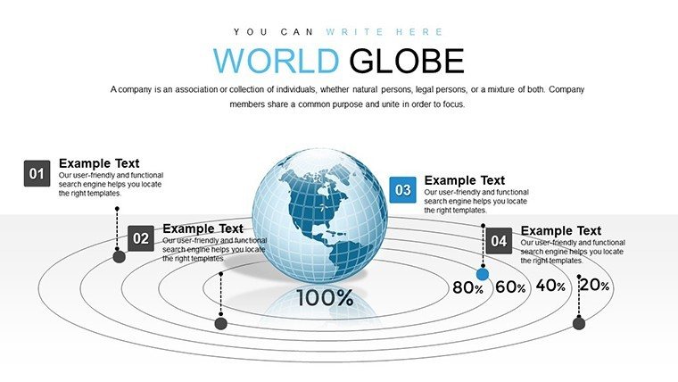
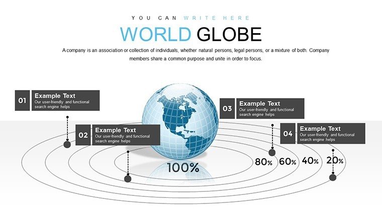
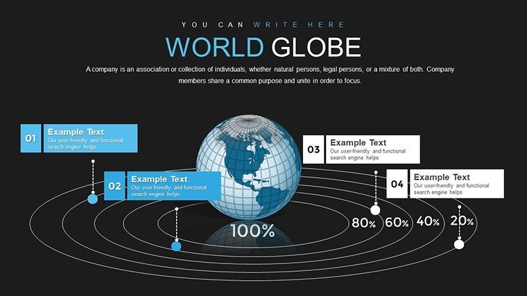
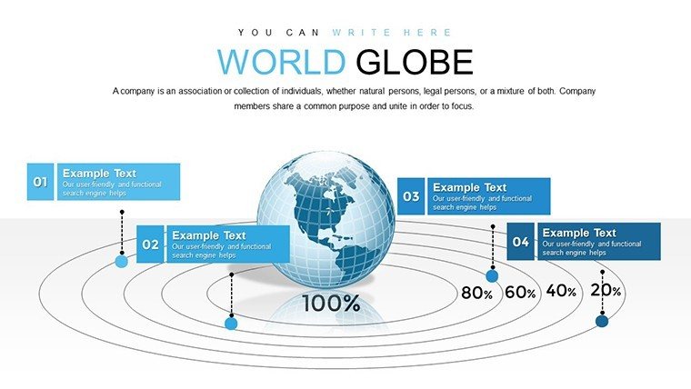
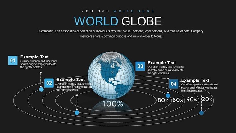
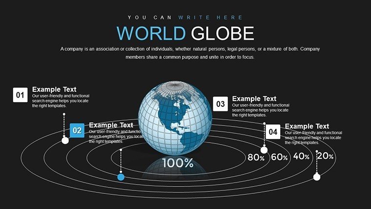
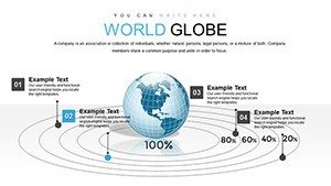
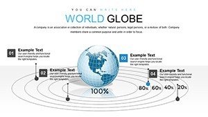
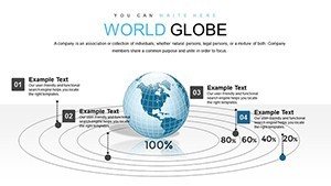
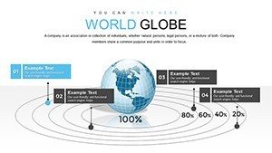
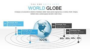
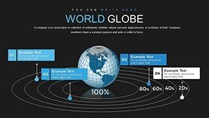
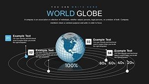
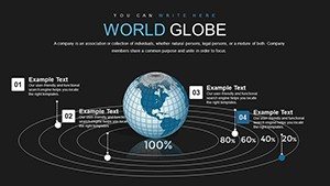
Essential Features for Global Storytelling
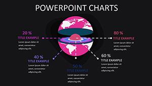
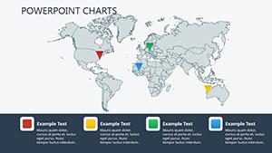
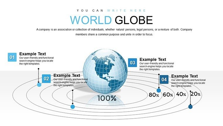
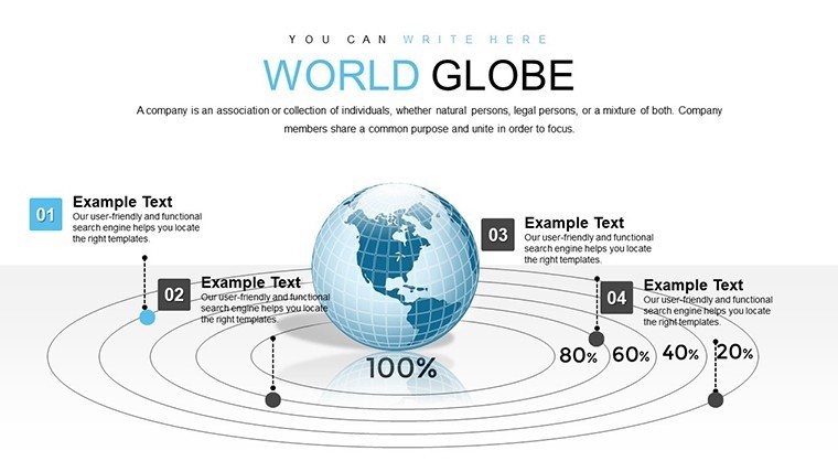
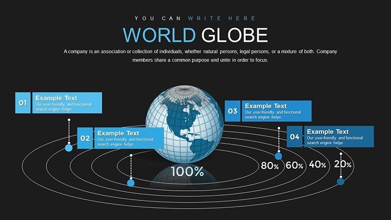
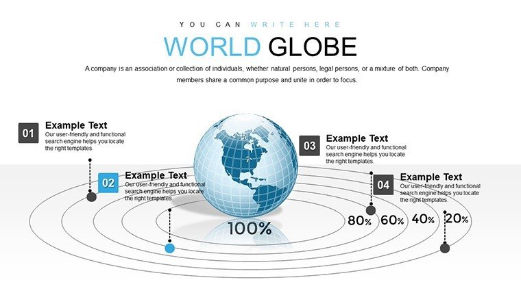
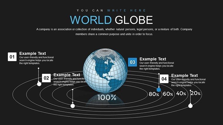
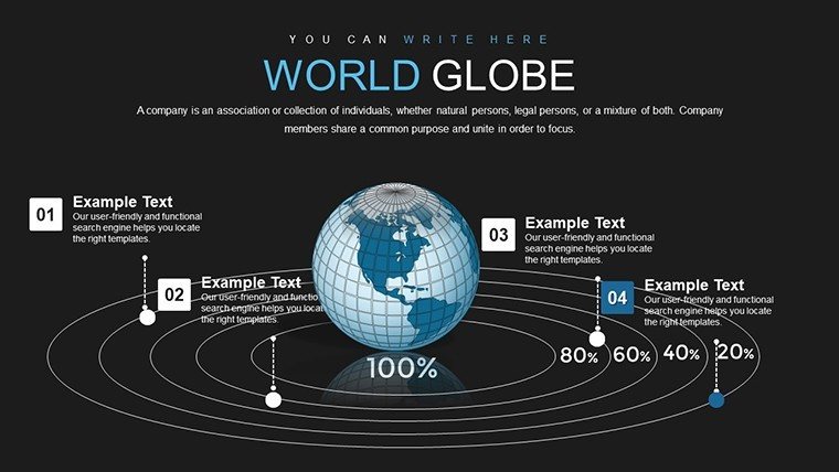
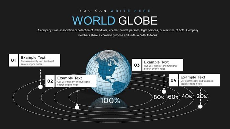
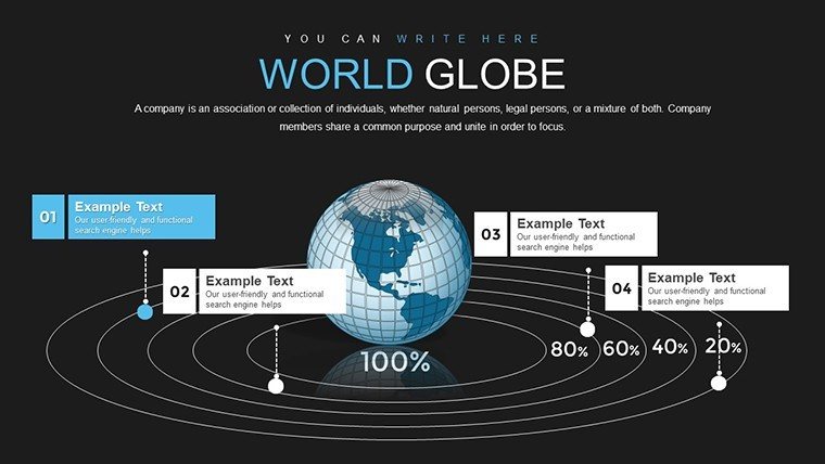
This template's core strength is its interactive 3D globe, which serves as the centerpiece for all slides, allowing users to pinpoint locations with precision markers for data points like export volumes or population densities. Among the 20 slides, you'll find customizable infographics: pie charts overlaid on regions to show market shares, or heat maps illustrating climate change effects. Colors and fonts are fully adjustable, enabling alignment with themes such as sustainable development goals (SDGs) from the United Nations. Animations bring dynamism - rotate the globe to reveal hidden layers, much like exploring satellite imagery. Compatibility extends to Google Slides, with no loss in fidelity for cloud-based collaborations. Rooted in authoritative design principles from cartography experts, the template avoids distortions common in flat maps, promoting trustworthy representations that enhance credibility in presentations.
In-Depth Look at the Slides
Breaking it down, Slide 1 introduces the globe with a welcome overlay, ideal for setting the stage in international business reviews. Slides 2-6 focus on economic indicators: use 3D bar charts to compare GDP across continents, drawing from World Bank data to visualize post-pandemic recoveries. For example, highlight Asia's manufacturing dominance versus Europe's service sector strengths. Slides 7-11 shift to environmental data, with line graphs tracing carbon emissions trajectories, animated to show projections up to 2050. Educators can adapt these for lessons on plate tectonics or migration patterns. Midway, slides 12-15 incorporate social metrics, like literacy rates via color-coded regions, supporting case studies from organizations like UNESCO. The final slides, 16-20, offer composite views - dashboards combining multiple datasets, such as trade flows with political risk indices from sources like the Economist Intelligence Unit. Each slide includes editable legends and tooltips, facilitating quick adaptations for diverse audiences.
Proven Applications in Diverse Fields
Real-world success stories abound with this template. A multinational corporation used it to present supply chain vulnerabilities during a shareholder meeting, mapping disruptions from the Suez Canal blockage and securing approval for diversification strategies. In education, a university professor illustrated historical trade routes in a history course, increasing student engagement by 25% through interactive elements. Keynote speakers at events like TEDx have leveraged the globe for talks on global inequality, overlaying data from Oxfam reports to drive home points visually. For thought leaders in sustainability, integrate findings from IPCC reports to depict climate migration scenarios. This template excels in virtual settings, where hyperlinks to live data sources add interactivity, building trust and encouraging deeper discussions.
Expert Tips for Effective Customization
- Begin with data import: Link to Google Earth datasets for accurate geographic overlays, ensuring your globe reflects current borders and features.
- Utilize animations wisely: Sequence reveals to build suspense, like unveiling trade deficits region by region.
- Add thematic elements: Incorporate icons for industries - airplanes for aviation hubs or wind turbines for renewable energy zones.
- Ensure inclusivity: Use high-contrast modes for color-blind accessibility, adhering to global standards.
- Combine with analytics: Export from tools like Power BI for enhanced data depth, then refine in PowerPoint.
These strategies, informed by geospatial professionals, maximize the template's potential for impactful global narratives.
Advantages Compared to Basic Tools
Standard PowerPoint maps are static and limited; our 3D model offers rotational views that provide context, like understanding time zones in international operations. This depth aligns with by drawing on expert cartographic methods, reducing misinterpretations in critical presentations. Users appreciate the time savings - pre-built elements cut design time in half - while the professional polish elevates perceived authority. In fields like international relations, where accuracy matters, this template supports evidence-based storytelling, far surpassing generic options.
Frequently Asked Questions
What makes the 3D globe interactive?
The globe supports rotations and zooms via PowerPoint animations, allowing users to explore data layers dynamically.
Can I add my own maps or data?
Yes, easily import custom datasets or images to overlay on the globe for personalized insights.
Is it suitable for educational use?
Absolutely, with features tailored for interactive lessons on geography, history, or economics.
What formats are supported?
Provided in .pptx, compatible with PowerPoint and Google Slides.
How do animations enhance presentations?
They simulate real-world movements, making abstract global trends more relatable and engaging.
Can I use it for business analytics?
Yes, it's ideal for visualizing market expansions or risk assessments with data-driven globes.