Fully Editable Performance Trend Analysis Chart PowerPoint Template - Instant Download


Type: PowerPoint Charts template
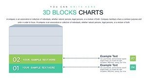
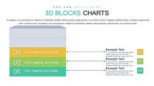
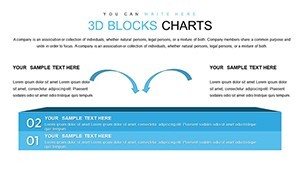
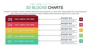
Category: 3D
Sources Available: .pptx
Product ID: PC00782
Template incl.: 33 editable slides
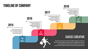
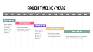
Tracking performance over time requires visuals that reveal momentum shifts, seasonal patterns, and critical inflection points without ambiguity. This performance trend analysis chart PowerPoint template provides clean line graphs, stacked bars, and combination layouts that make data stories immediately understandable. Built for leaders who need to anchor discussions in evidence, it supports dual-axis comparisons and clear annotations for professional impact.
Key Features
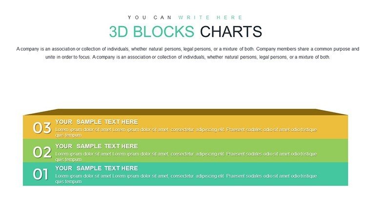
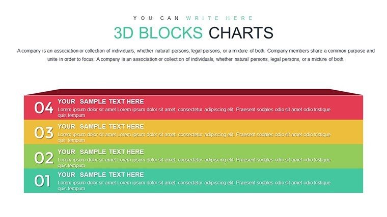
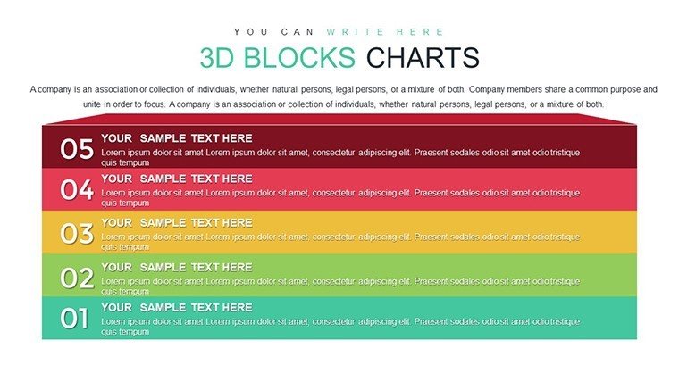
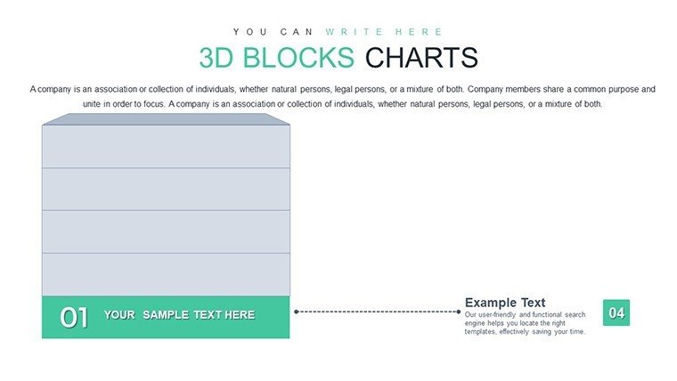
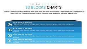
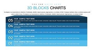
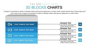
- Multiple chart types: line, bar, and combination layouts
- Dual Y-axis support for comparing different scales
- Annotation callouts for highlighting key events
- Fully editable elements with professional color schemes
- Optimized for clarity in presentations and reports
How to Customize This Template
After downloading, open the PPTX file in PowerPoint and input your time-series data into the placeholders. Switch between chart types, adjust axes, and add annotations for product launches or market changes. Customize colors and styles to match your branding - all changes are simple and require no design expertise.
The template works seamlessly on PowerPoint 2010 and newer, including Microsoft 365 for Windows and Mac.
Professional Use Cases
Finance leaders present earnings trajectories and margin trends during board meetings.
Product managers track user growth and engagement metrics over multiple quarters.
Operations teams monitor efficiency gains and cost reductions across time periods.
Consultants illustrate client performance improvements in strategy reviews.
Download now to make your trend analysis more compelling and evidence-based.
Frequently Asked Questions
Does this template support dual-axis charts?
Yes, it includes pre-built dual Y-axis configurations for comparing metrics with different scales, such as units sold versus revenue.
Can I add annotations to highlight events?
Absolutely. The template includes easy-to-use callouts for marking product launches, market shifts, or other significant events.
What PowerPoint versions are compatible?
The template works with Microsoft PowerPoint 2010 and later, including Microsoft 365, on Windows and Mac.
Is the download instant after purchase?
Yes, you receive an immediate download link to the PPTX file upon completion of payment.
Can I use this for commercial presentations?
Yes, full commercial use is permitted, including client work and internal business reporting.