Accumulation Infographic PowerPoint Charts Template


Type: PowerPoint Charts template
Category: Puzzles
Sources Available: .pptx
Product ID: PC00721
Template incl.: 24 editable slides
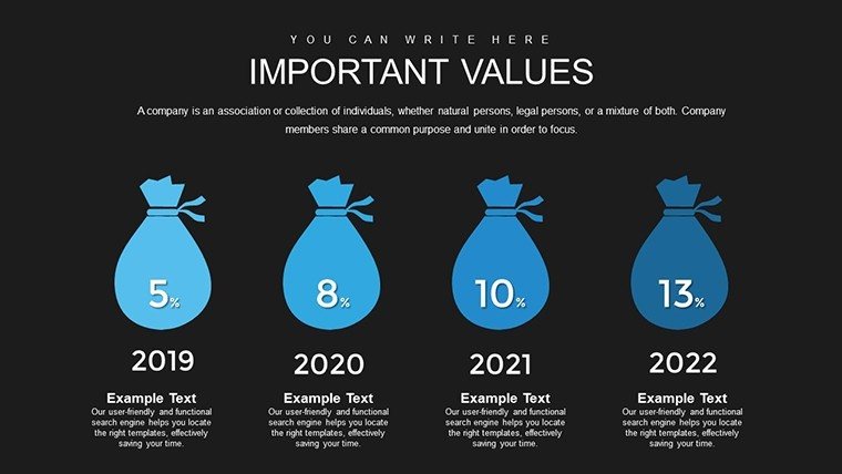
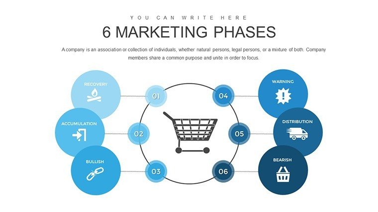
When data accumulates - be it sales growth, project progress, or market shares - presenting it effectively can make or break your message. Our Accumulation Infographic PowerPoint Charts Template, with 24 editable slides, is engineered to visualize these build-ups in ways that captivate and clarify. Designed for data-driven professionals like marketers tracking campaign accruals or project managers monitoring milestone aggregations, it turns incremental data into progressive stories. Envision stacking bars that grow dynamically to show revenue accumulation over quarters, inspired by financial reporting standards from bodies like FASB, ensuring your visuals are not only eye-catching but also credible. This template alleviates the tedium of manual charting by offering pre-configured infographics that adapt to your inputs, fostering efficiency and allowing you to spotlight trends that drive decisions. Compatible with both PowerPoint and Google Slides, it's a versatile asset for hybrid teams, blending infographic artistry with analytical precision to elevate your presentations from informative to influential.
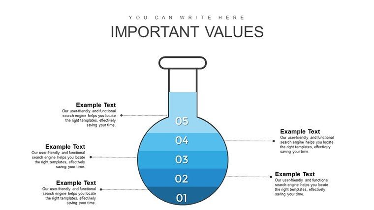
Building Insights Layer by Layer
At its core, this template excels in depicting accumulation through layered visuals, where elements stack or flow to represent cumulative effects. For analysts, this means illustrating budget accruals with waterfall charts that cascade expenses against incomes, providing a clear audit trail.
Core Advantages for Data Storytellers
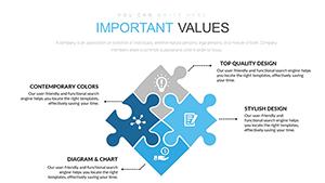
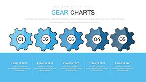
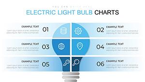
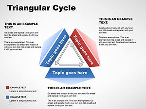
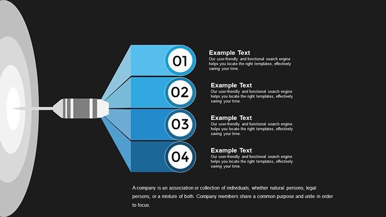
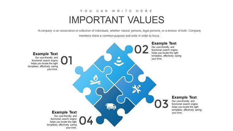
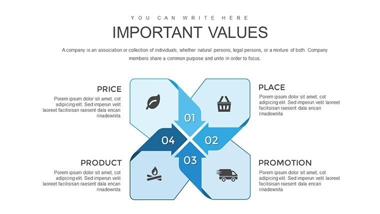
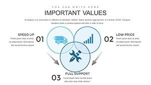
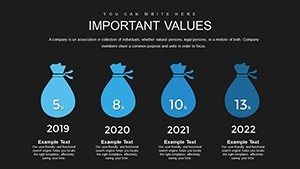
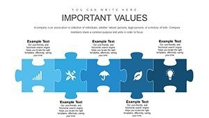
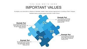
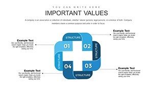
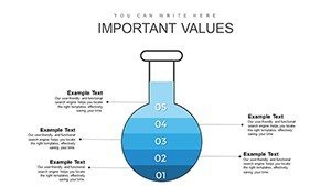
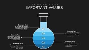
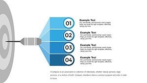
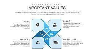
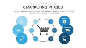
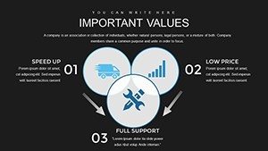
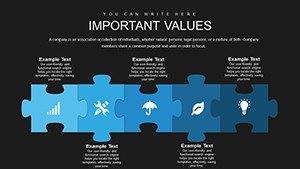
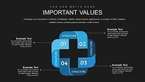
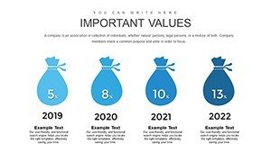
- Layered Infographics: Stackable elements that visually accumulate data, ideal for showing progressions.
- Full Customization: Modify shapes, scales, and palettes to align with your dataset and brand.
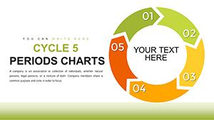
- Diverse Styles: From funnel charts for sales pipelines to area graphs for trend build-ups.
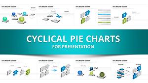
- Cross-Platform Compatibility: Seamless use in PPTX or Google Slides, with no loss in quality.
- Professional Polish: High-res vectors for crisp prints and digital displays.
Backed by insights from data viz experts like Stephen Few, who emphasize perceptual accuracy, this template enhances trustworthiness by avoiding misleading distortions in accumulative representations.
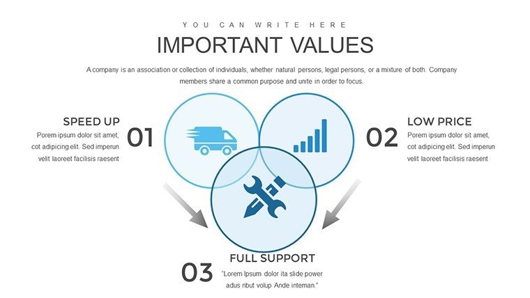
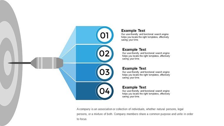
Applications That Accumulate Success
In marketing, use accumulation charts to demonstrate lead generation over campaigns, with pyramids building to total conversions. Research teams can map citation growth in studies, while trainers accumulate knowledge modules in e-learning decks. Each use case leverages the template's strength in progressive revelation.
Hands-On Customization Workflow
- Choose Your Chart: Select from 24 variants based on your accumulation type.
- Enter Data Points: Use smart placeholders for quick population from sources like CSV.
- Style to Suit: Apply gradients or icons to emphasize build-up phases.
- Animate Accumulations: Set builds to reveal layers, heightening drama.
- Share and Iterate: Collaborate online, refining based on feedback.
This process, echoing lean analytics practices, ensures your infographics evolve with your data, building a foundation of expert reliability.
Outperforming Generic Accumulation Methods
Unlike PowerPoint's default stacked charts, which can clutter with complexity, our template incorporates smart scaling and labeling for readability at scale. With 24 specialized slides, it covers niche scenarios like cumulative frequency distributions, surpassing basics in depth and through refined, authoritative designs.
Pro Strategies for Accumulation Mastery
Employ color progressions from cool to warm to denote increasing values, per perceptual psychology. Integrate tooltips for detailed breakdowns on hover. For leaders, pair with KPIs; for educators, use in flipped classrooms. These tactics, derived from analytics conferences, maximize the template's potential for memorable impacts.
To sum it up, the Accumulation Infographic PowerPoint Charts Template is your scaffold for data that grows. It doesn't just chart - it constructs narratives that accumulate audience acclaim. Stack up your success - download and start building now.
Frequently Asked Questions
- How do accumulation charts handle large data sets?
- They scale layers efficiently, with options to group or filter for clarity.
- Is Google Slides support full-featured?
- Yes, all edits and animations transfer seamlessly between platforms.
- What makes these infographics unique?
- Their focus on progressive build-ups with customizable stacks sets them apart.
- Can I link to live data?
- Yes, embed Excel links for dynamic updates in accumulations.
- How to avoid visual clutter?
- Use the template's smart labeling and spacing tools for clean designs.
- Are there examples for beginners?
- Included starter slides with sample data guide new users.