Sliced Pie PowerPoint Charts - Instant Download | ImagineLayout


Type: PowerPoint Charts template
Category: Pie
Sources Available: .pptx
Product ID: PC00677
Template incl.: 28 editable slides
28 Slides and Sliced Layouts: Package Contents
28 editable slides arrive in one PPTX file.
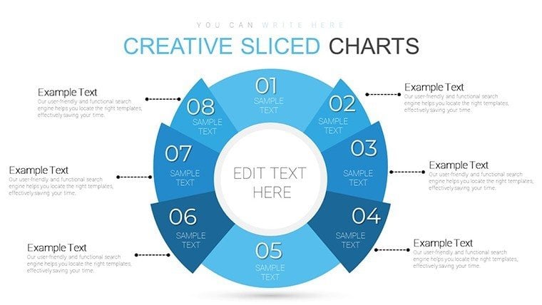
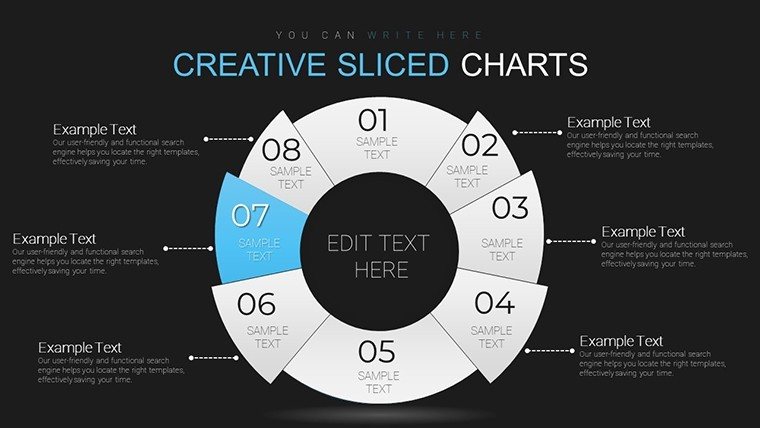
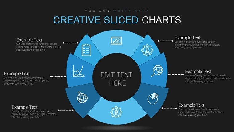
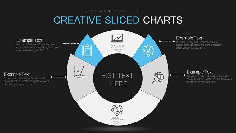
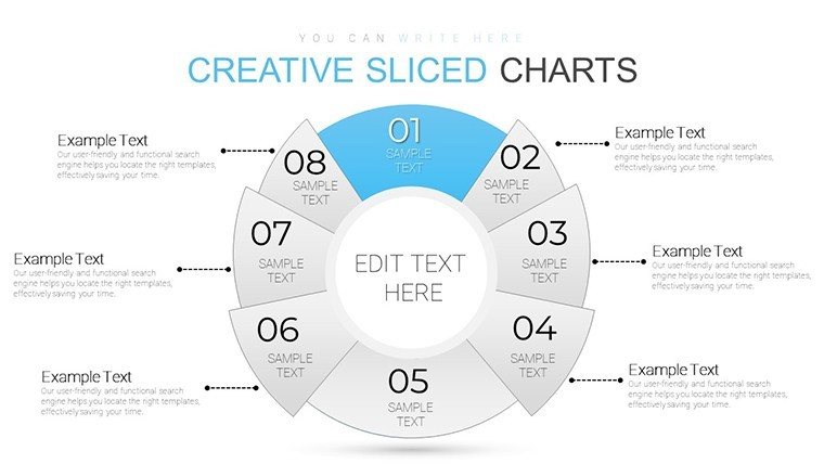
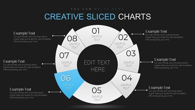
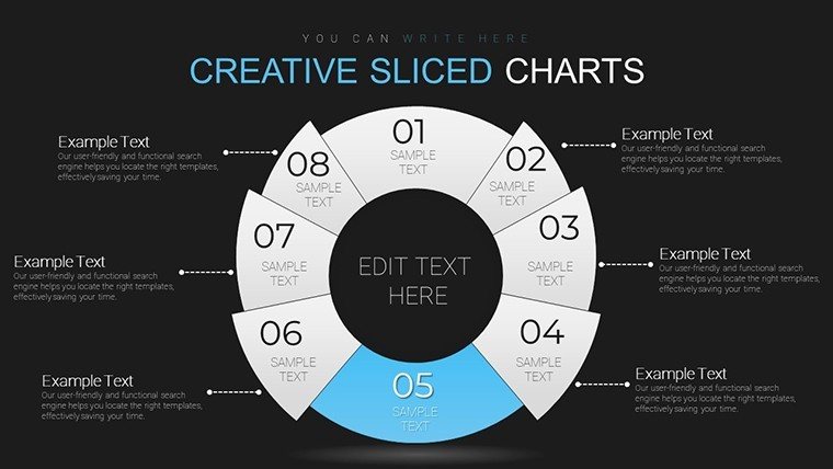
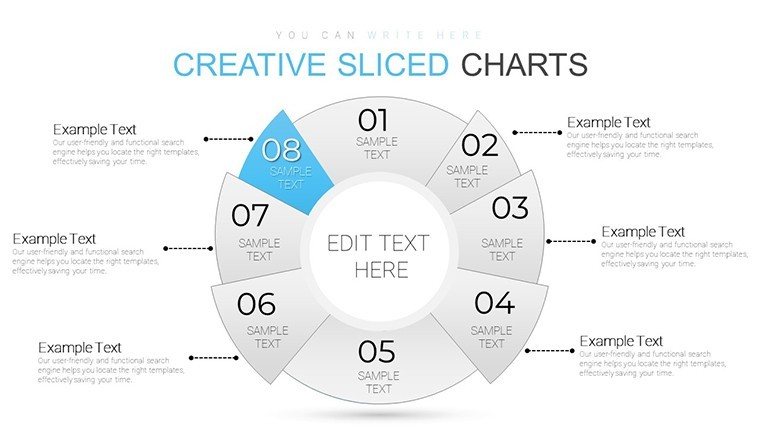
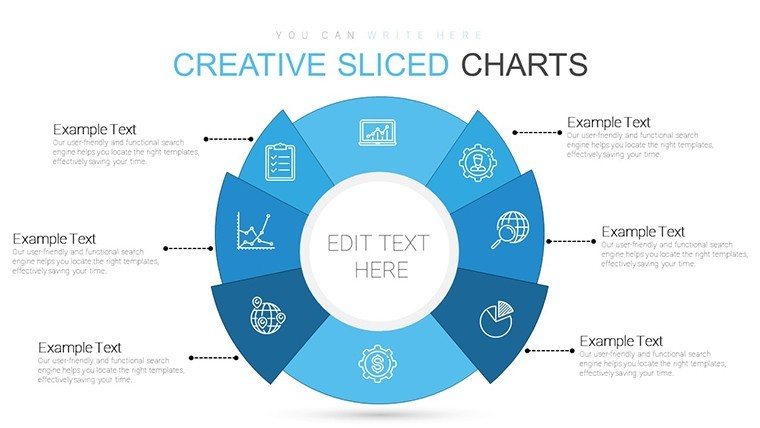
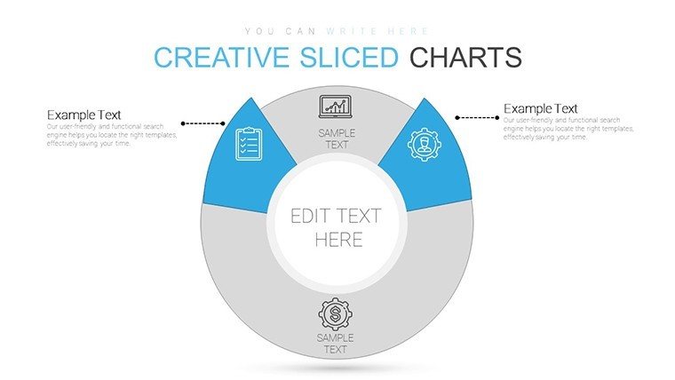
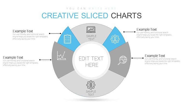
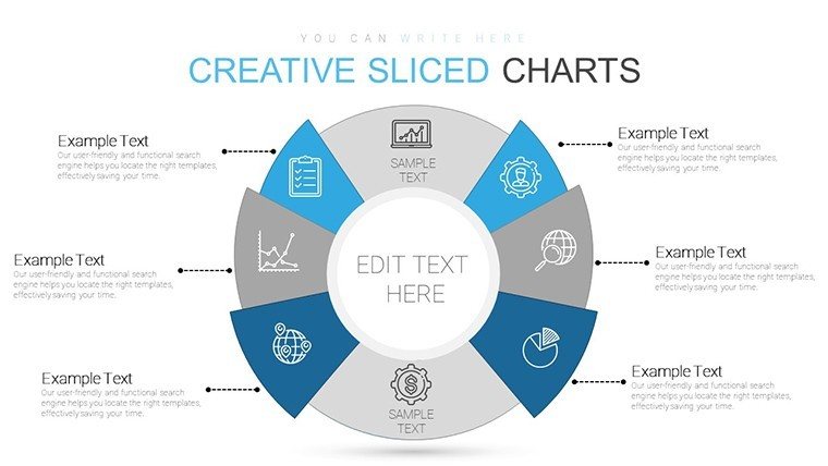
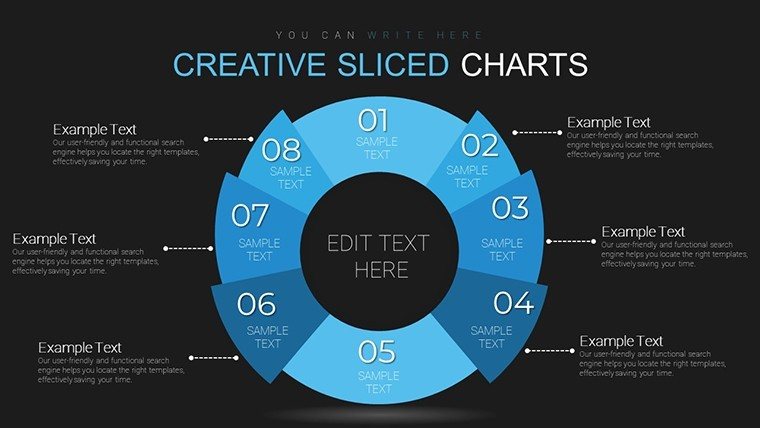
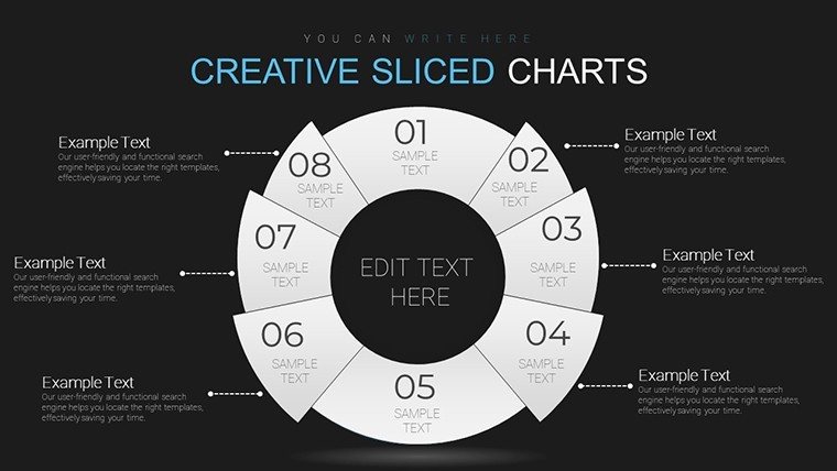
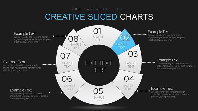
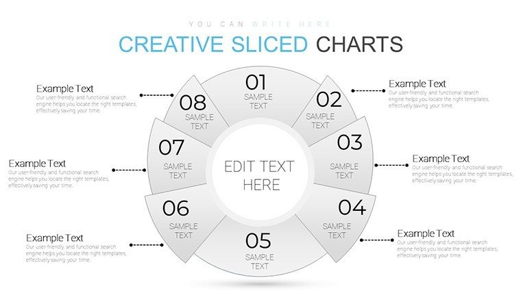
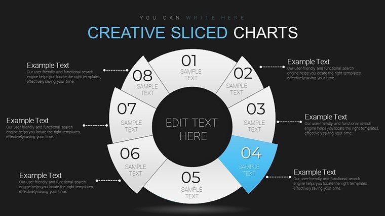
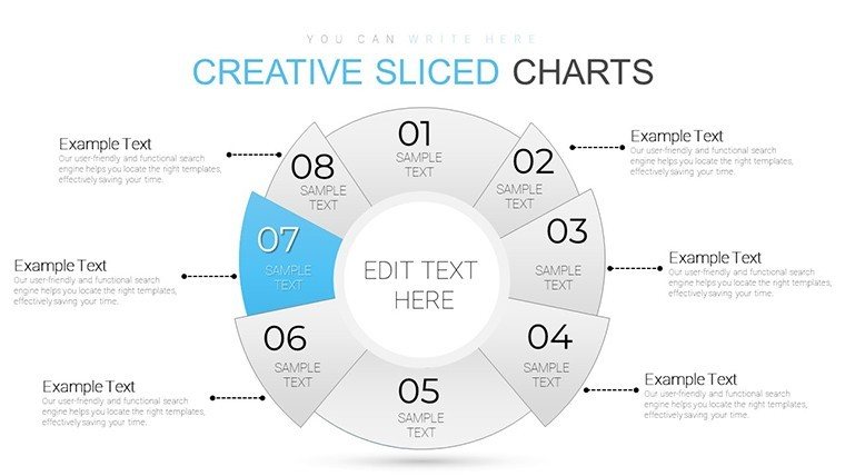
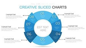
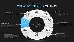
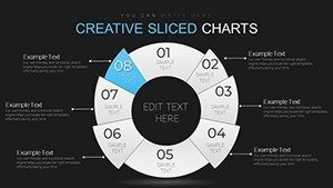
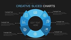
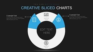
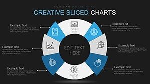
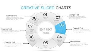
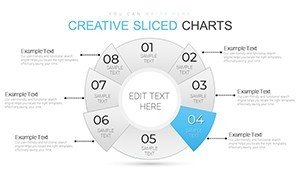
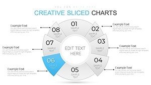
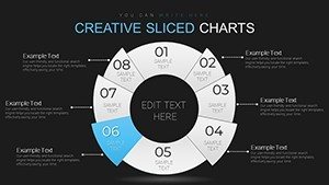
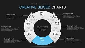
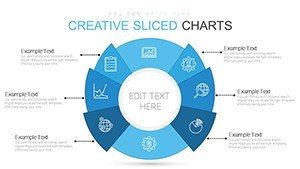
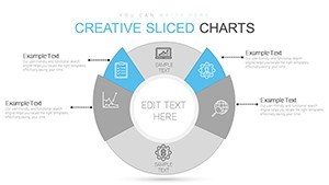
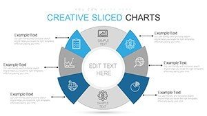
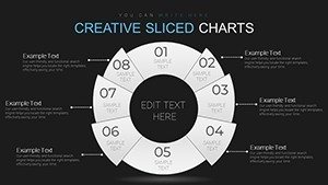
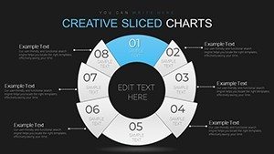
Sliced pie and donut layouts combine proportional segments with outer labels to cover part-to-whole breakdowns from market data to performance metrics.
These layouts integrate for allocation tasks by letting color contrast define segments while information spacing prevents overlap during client proposals.
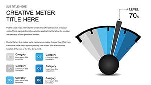
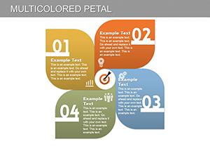
The creative sliced design with light and dark themes sets it apart from gauge-style speedometers or petal flower variants because it prioritizes proportional clarity over radial gauges.
This template works best for market share breakdowns in sales presentations since the segment slicing reads faster than neighbors centered on dashboard gauges or teaching matrices.
The paid version covers all 28 slides with light and dark themes included.
Editing Capabilities at a Glance
| Feature | Details |
|---|---|
| Slides included | 28 pie and donut layouts |
| Editable shapes | slice segments resize and recolor independently |
| Text placeholders | labels update without unlocking grouped elements |
| Color theme adjustments | compatible with PowerPoint slide master palette |
| Diagram connectors | lines adjust in direction and weight |
| File formats | PPTX for editing and PDF export |
From Strategy Decks to Boardroom Pitches
Marketing teams in retail present customer segmentation and cut deck preparation from three hours to 45 minutes.
Consultants in finance adapt the same file for budget allocation reports across three client proposals by swapping color schemes.
Download the sliced charts now
Customization in 5 Steps
- Open the .pptx file in PowerPoint 2016 or later (1 minute)
- Replace placeholder text with your content (3 minutes)
- Adjust brand colors via the slide master (2 minutes)
- Edit slice labels and segments (4 minutes)
- Export as PPTX or PDF (1 minute)
Editing difficulty: Moderate.
Building From Scratch vs. Starting Here
Creating sliced proportions from scratch requires two hours and intermediate design skill for equal spacing.
Diagram connectors link outer labels because inside placement reduces readability on projection screens.
This layout keeps labels outside the slices and avoids the overlap issues that commonly appear in manual builds.
Get the sliced pie template
Which PowerPoint versions does the file support?
The template opens in PowerPoint 2016, 2019 and Microsoft 365 on Windows and Mac. Compatibility extends to older versions with limited support for donut effects. Users report smooth performance in version 2019 without plugins. Test the slide master for any custom fonts if your installation differs.
How do I change the color scheme?
Open the slide master view in PowerPoint. Select the slice elements and update colors through the theme palette. Apply changes to all slides at once via the master. Save the file and the new scheme propagates across every layout.
What license applies to client work?
The paid download permits use in internal presentations and paid client deliverables. You may not resell the file or sublicense it to third parties. Internal company training sessions fall under allowed use. Always keep the original attribution if required by the download terms.
What file formats open the template?
The PPTX format opens in PowerPoint on Windows or Mac. Export options include PDF for distribution or image formats for sharing. Keynote users convert via import tools with minor layout checks. The single file contains everything needed for editing.
Is animation support included?
Basic entrance animations appear on slices. Remove or add them through the animation pane in PowerPoint. The layouts remain fully editable after any animation changes. No advanced motion paths ship with the file.