Time Circles PowerPoint Charts: Visualize Trends Now


Time waits for no one, especially in presentations where every second counts to convey evolution and progress. Enter our Time Circles PowerPoint Charts Template - a game-changer for illustrating temporal data with elegance. Boasting 28 editable slides, this cycle and pie-inspired tool is tailored for data enthusiasts, educators, and marketing pros who transform timelines into captivating visuals. Whether tracking project milestones or historical trends, these circular charts offer a fresh perspective, blending pie segments with chronological flow. Compatible with PowerPoint, it's your shortcut to professional graphics that highlight growth trajectories without the hassle. Imagine dazzling stakeholders with seamless designs that adapt to your narrative, boosting retention and impact. This isn't just a template; it's a visual storyteller that aligns with modern design trends, helping you communicate complex patterns simply and inspiringly - because understanding time's arc can propel your ideas forward.
Core Features That Circle Success
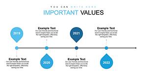
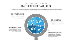
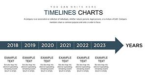
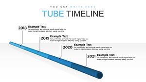
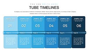
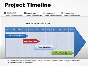
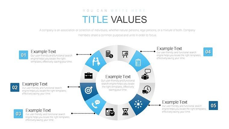
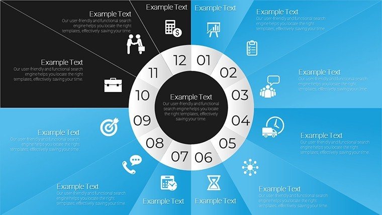
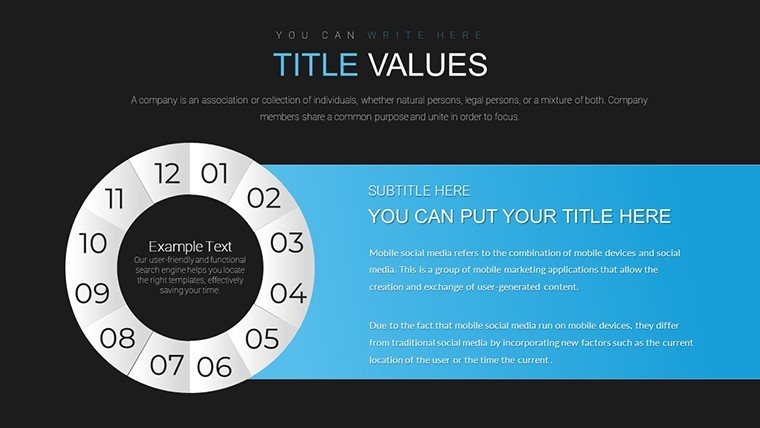
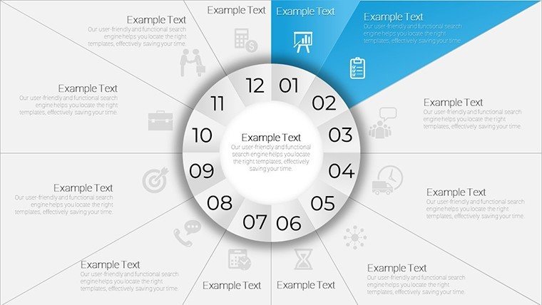
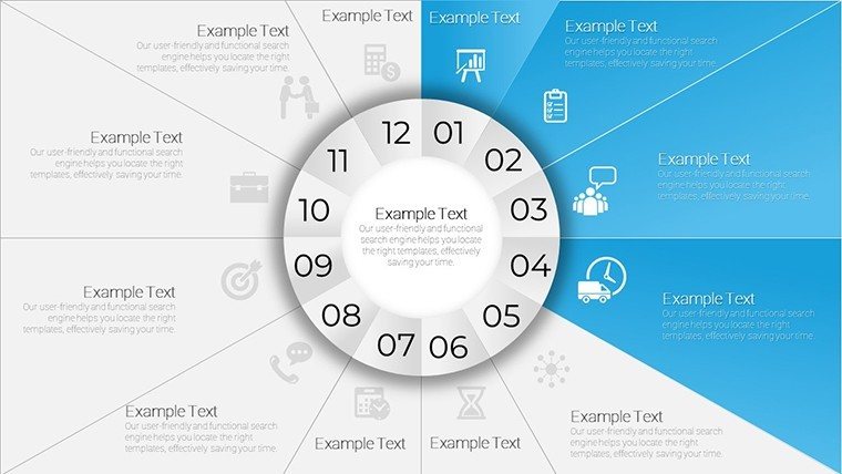
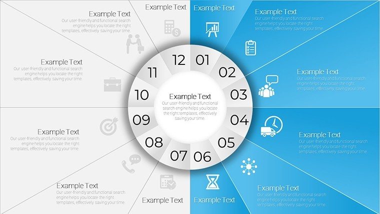
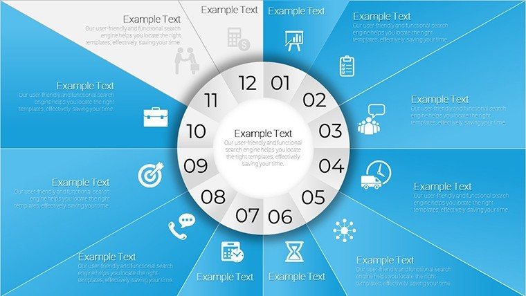
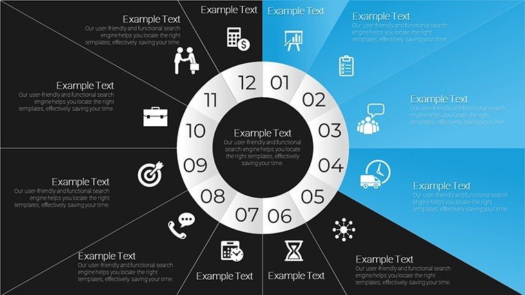
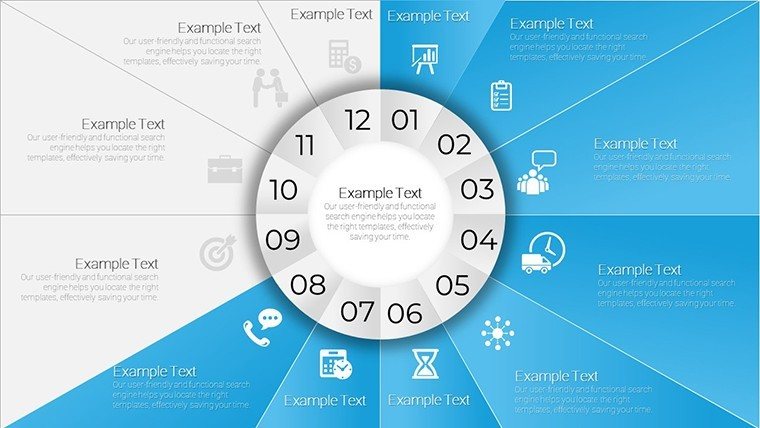
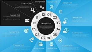
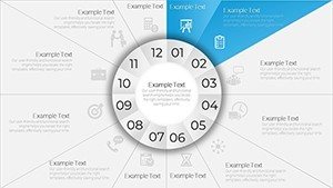
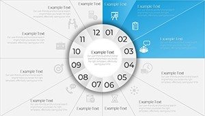
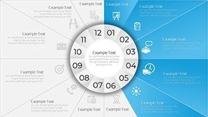
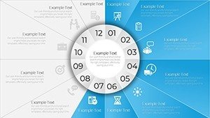
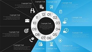
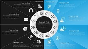
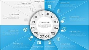
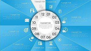
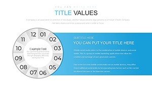
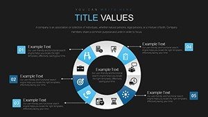
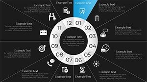
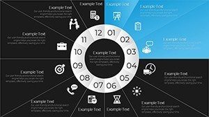
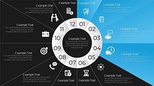
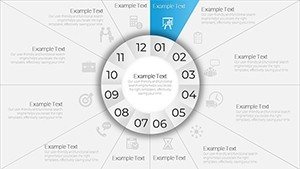
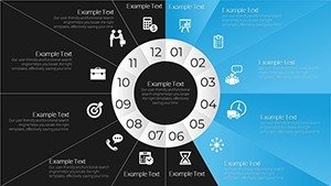
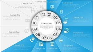
This template shines with its array of customizable circular charts, each optimized for clarity. Adjust layouts to fit your data, from quarterly reviews to decade-spanning analyses. The 28 slides provide ample variety, including layered circles for multi-phase projects and segmented pies for proportional time allocations.
- Dynamic Circular Designs: Represent time-based data like cycles or evolutions with intuitive rotations.
- Full Customization Suite: Tweak colors, fonts, and scales to embody your brand's essence.
- Audience-Focused Layouts: Built-in guides ensure logical flow, enhancing viewer navigation.
- Instant Integration: Download and embed into existing decks without compatibility issues.
Inspired by visualization pioneers like Florence Nightingale's rose diagrams, these circles prioritize insightful representation, turning data into digestible insights.
Applications and Value in Action
For marketing mavericks, use time circles to depict campaign lifecycles, as seen in successful strategies from brands like Coca-Cola, per AdAge reports. Educators can visualize historical events, aligning with curriculum standards for interactive learning. The value? Enhanced engagement - studies show circular visuals improve recall by 20% over linear ones.
In architecture, apply to project timelines, showing phases from design to build per AIA protocols, fostering client trust. Benefits include time savings and elevated professionalism, outpacing basic tools with pre-polished aesthetics.
- Trend Analysis: Chart market shifts or growth patterns for reports.
- Educational Tools: Break down concepts like life cycles in biology classes.
- Stakeholder Updates: Illustrate progress in business reviews.
Versus generic charts, this template's thematic coherence prevents visual discord, ensuring a unified presentation.
Customization Workflow and Pro Tips
Start by downloading the .pptx, then populate data via easy editors. Layer elements for depth, and animate for timed reveals. Tip: Use gradient fills to denote progression, mirroring natural time flows. For urban development pitches, customize to map regulatory timelines, incorporating sustainable design tips from USGBC.
Further enhance with balanced compositions - avoid over-segmentation - and test for mobile viewing. This mirrors expert workflows, yielding presentations that inform and inspire.
Revolutionize Your Time Narratives
Data pros and teachers, arm yourself with visuals that command attention and convey authority. This template's depth ensures repeated value, adapting to evolving needs. Seize the moment - download and redefine how you present time today.
Frequently Asked Questions
- How many customization options are there?
- Extensive - edit every aspect from colors to segments for personalized timelines.
- Compatible with Mac PowerPoint?
- Yes, works flawlessly on both Windows and Mac versions.
- Can I add animations?
- Built-in support for custom animations to enhance time-based storytelling.
- Suitable for non-profits?
- Ideal, with no usage fees for any organizational presentations.
- How to export for sharing?
- Easily save as PDF or video for broad distribution.