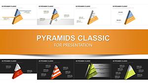
3D Pyramid PowerPoint Template for Hierarchies - Fully Editable & Instant Download


Present hierarchical relationships with dimensional impact that commands attention and clarifies complex structures. This 3D pyramid PowerPoint template delivers 40 professionally designed slides featuring three-dimensional pyramid diagrams that transform flat organizational charts into engaging visual experiences suitable for executive presentations and strategic discussions.
Ideal for leaders and consultants who need to illustrate authority chains, strategic layers, or prioritized frameworks with depth and professionalism.
Key Features
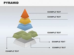
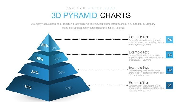
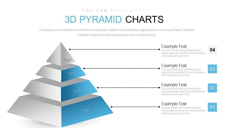
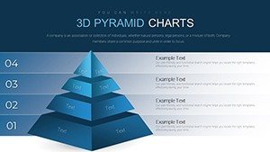
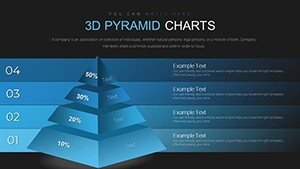
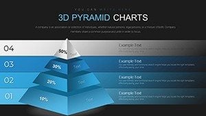
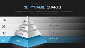
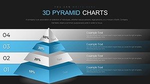
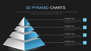
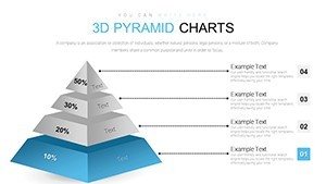
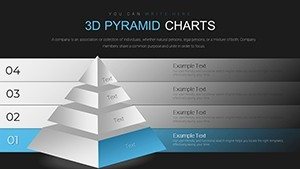
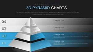
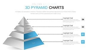
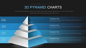
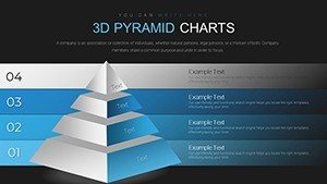
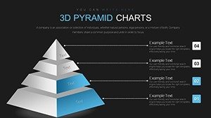
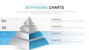
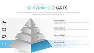
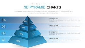
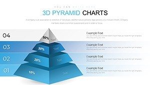
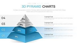
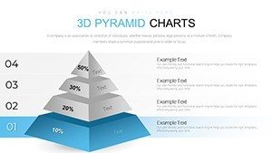
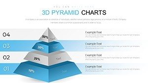
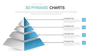
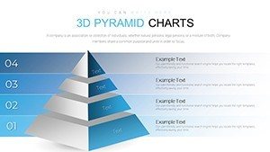
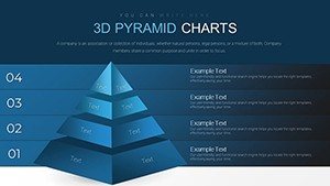
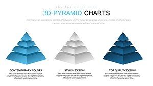
- 40 fully editable 3D pyramid slides in various configurations
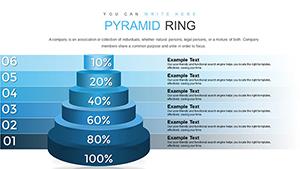
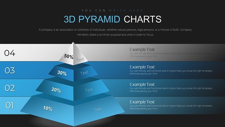
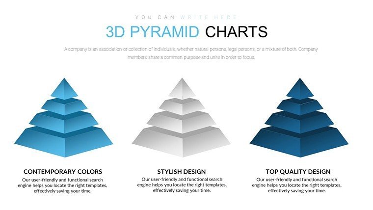
- Multiple pyramid styles for different hierarchy depths and emphasis needs
- Dimensional design that adds visual weight and professionalism
- Complete customization of colors, text, sizes, and segment content
- Native PowerPoint elements for seamless editing
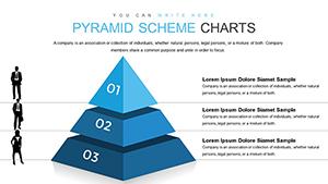
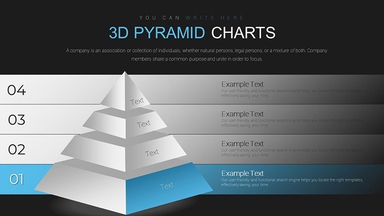
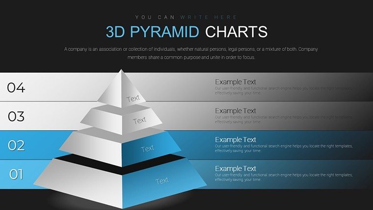
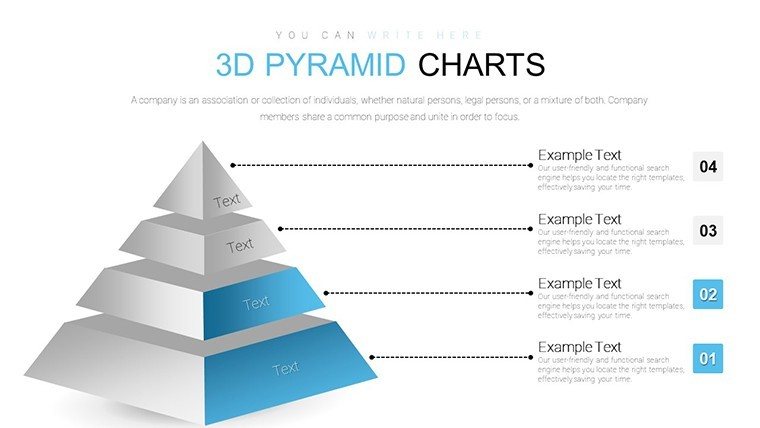
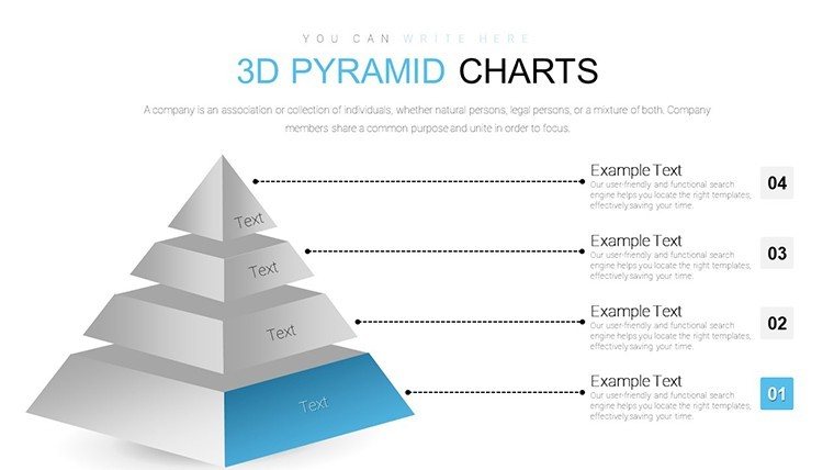
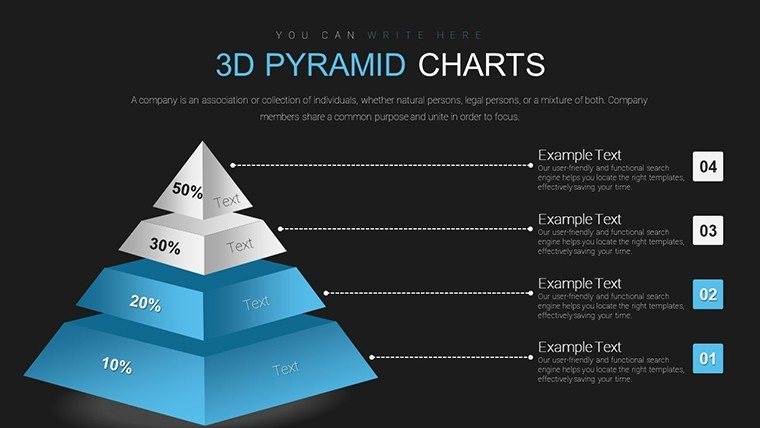
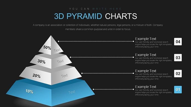
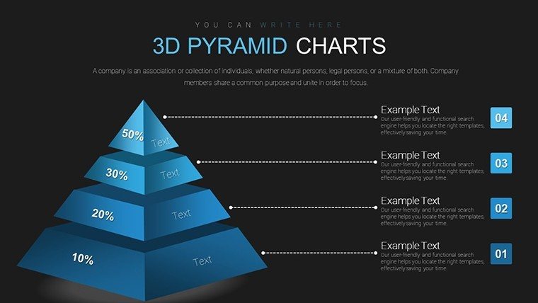
Benefits of 3D Hierarchy Visualization
Three-dimensional pyramids naturally draw the eye upward, reinforcing hierarchical concepts and helping audiences internalize relationships between levels. This template elevates standard org charts into memorable visuals that strengthen understanding of reporting structures, responsibility distribution, and strategic prioritization.
The added depth creates a premium presentation feel that reflects positively on your professionalism and attention to detail.
Professional Use Cases
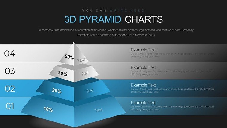
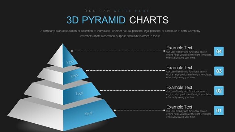
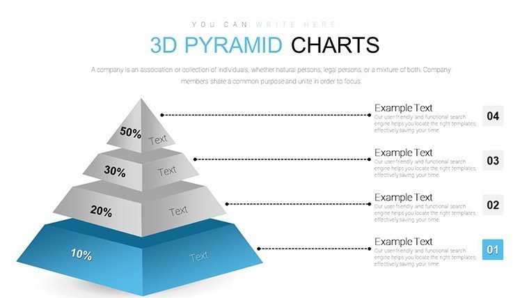
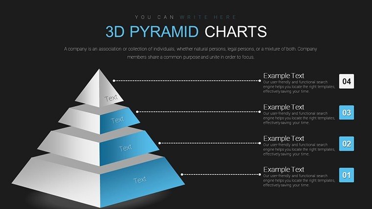
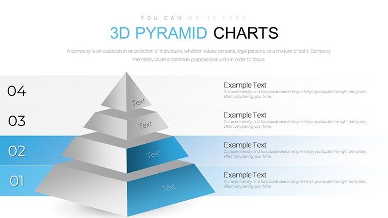
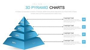
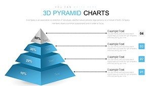
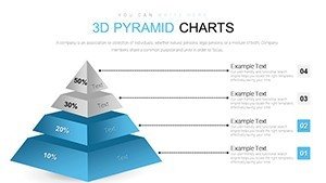
Organizational Structure: Clearly map executive leadership, management layers, and team responsibilities in company-wide presentations.
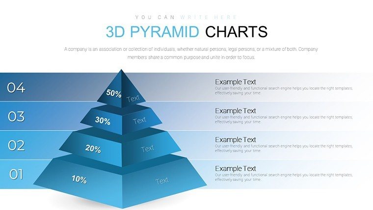
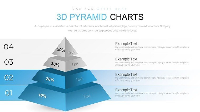
Strategic Frameworks: Illustrate market penetration strategies, product adoption hierarchies, or priority initiatives with layered pyramid models.
Consulting Deliverables: Present client organizational recommendations or change management structures with impactful 3D visuals.
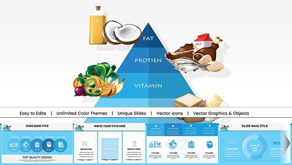
Educational Settings: Teach concepts like Maslow's hierarchy, food pyramids, or ecological levels using engaging dimensional diagrams.
How to Customize Your Pyramid Diagrams
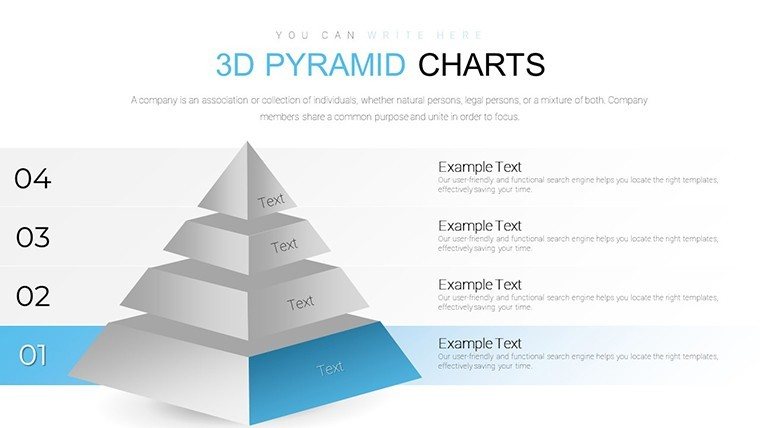
Open the template in PowerPoint and choose the pyramid layout that best fits your hierarchy depth. Edit text directly in each segment, adjust segment sizes to reflect proportional importance, and modify colors to match your branding. The 3D effects remain intact during editing, ensuring professional results with minimal effort.
For maximum impact, use contrasting colors between levels and keep text concise for readability from a distance.
Frequently Asked Questions
Are the 3D pyramid diagrams fully editable?
Yes, all pyramid elements are built with native PowerPoint shapes and effects, allowing complete customization of text, colors, sizes, and 3D rotations without losing quality.
How many slides are included in the template?
The template contains 40 unique slides with various pyramid configurations, orientations, and supporting layouts for comprehensive hierarchy presentations.
Will the 3D effects work on all PowerPoint versions?
The template is optimized for PowerPoint 2010 and newer, where full 3D formatting and rotation capabilities are supported, including Office 365.
Can I add or remove levels in the pyramids?
Yes, the pyramids are constructed from individual editable shapes, making it simple to add, remove, or reorganize levels as needed for your specific hierarchy.
Is this template suitable for both screen and printed presentations?
Absolutely - the high-resolution design ensures excellent clarity on screens, projectors, and when exported to PDF for handouts or printed materials.