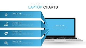
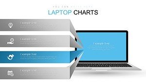
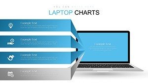
Laptop PowerPoint Charts Template for Tech Pros


Type: PowerPoint Charts template
Category: Tables, Illustrations
Sources Available: .pptx
Product ID: PC00649
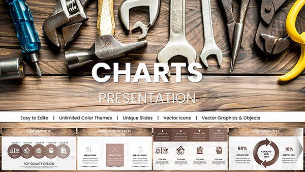
Template incl.: 16 editable slides
In the fast-paced world of technology, where ideas evolve at lightning speed and data drives decisions, presenting your insights effectively can make all the difference. Imagine transforming your quarterly reports or product pitches into visually stunning narratives that not only inform but also inspire your audience. Our Laptop Themed PowerPoint Charts Template is designed precisely for tech professionals like you - software developers, IT managers, and startup founders - who need to convey complex information with clarity and flair. With 16 fully editable slides, this template draws on a sleek, modern laptop motif to symbolize innovation and connectivity, making it ideal for tech-centric discussions. Whether you're showcasing app development metrics, network performance data, or market trend analyses, these charts help you highlight key points without overwhelming your viewers. Backed by design principles from leading tech conferences like CES, this template ensures your presentations align with industry standards for visual communication, boosting your credibility and engagement levels. Say goodbye to bland slides and hello to a tool that saves hours of design time while amplifying your message's impact.
Unlocking the Power of Visual Data in Tech
Tech presentations often involve juggling vast amounts of data, from user engagement stats to system efficiency metrics. This template's laptop theme isn't just aesthetic - it's functional, framing your charts within a familiar digital interface that resonates with tech-savvy audiences. For instance, consider a scenario where a cybersecurity firm is pitching to potential clients: using the bar charts to compare threat detection rates across platforms creates an immediate visual hierarchy, making your strengths pop. Drawing from real-world applications, such as how companies like Microsoft use similar visuals in their Ignite conferences, this approach enhances trustworthiness by demonstrating data integrity and design expertise.
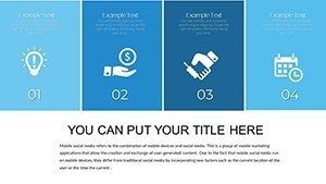
Key Features That Set This Template Apart
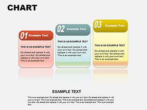
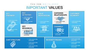
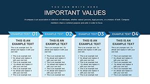
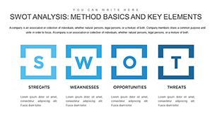
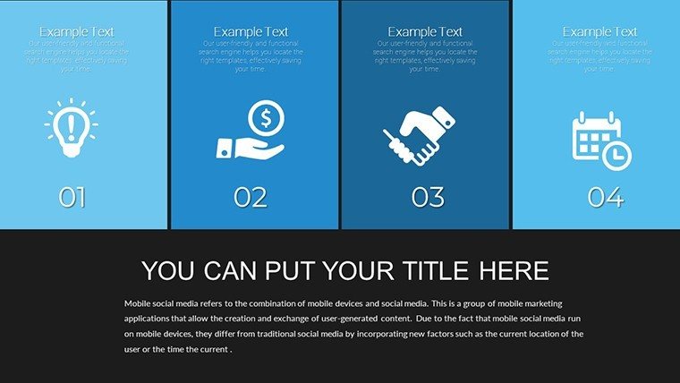
At the heart of this template are its versatile chart options, all customizable to fit your brand's color scheme and data sets. The bar charts excel at showing comparisons, like quarterly sales growth in a SaaS business, while pie charts break down market shares intuitively. Line graphs track trends over time, perfect for illustrating user growth in app analytics, and scatter plots reveal correlations, such as between ad spend and conversion rates in digital marketing. Each slide is built with high-resolution graphics that maintain quality on any screen, from laptops to large projectors, ensuring your presentation looks sharp in boardrooms or virtual meetings.
- Editable Elements: Drag-and-drop functionality lets you swap data points, adjust axes, and incorporate icons seamlessly.
- Compatibility Assurance: Works flawlessly with all PowerPoint versions on PC and Mac, plus easy export to Google Slides for collaborative editing.
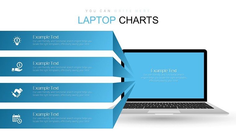
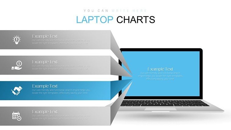
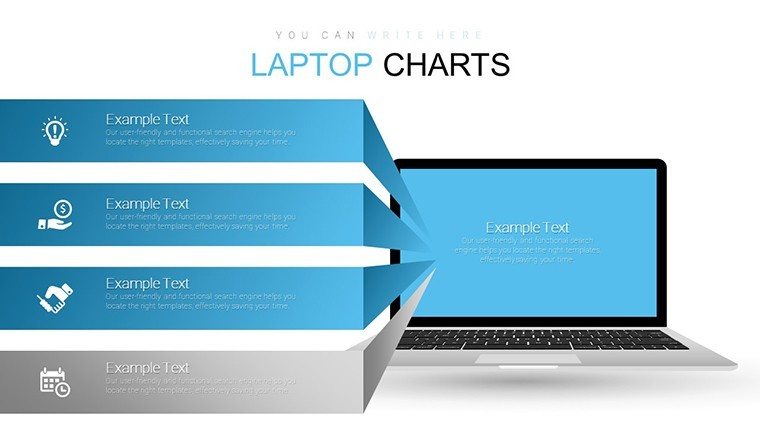
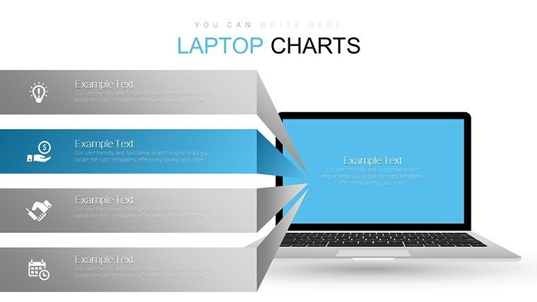
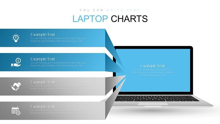
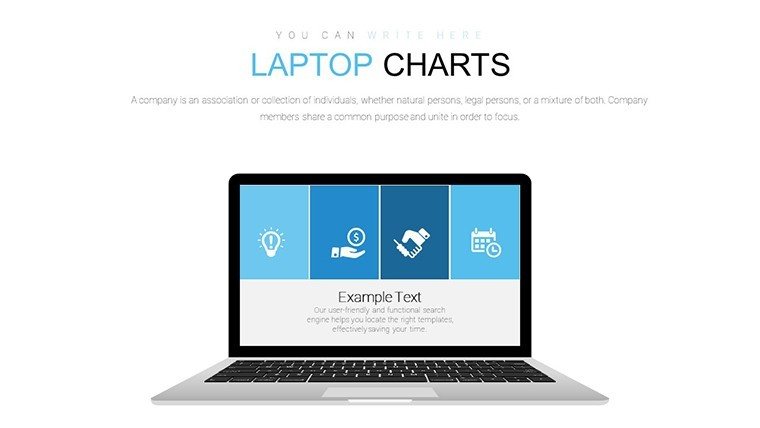
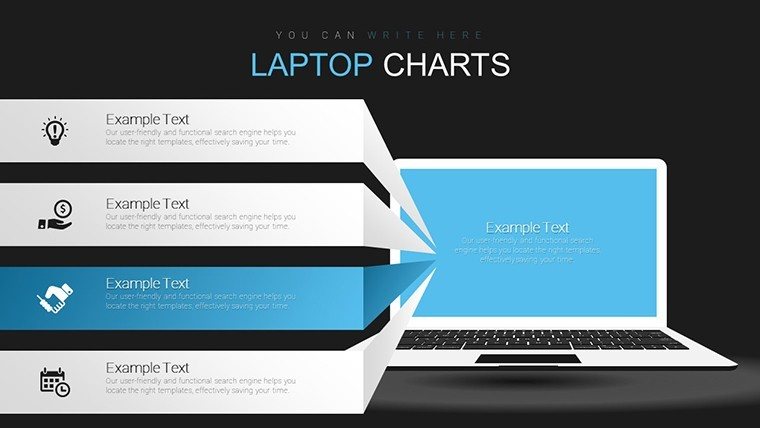
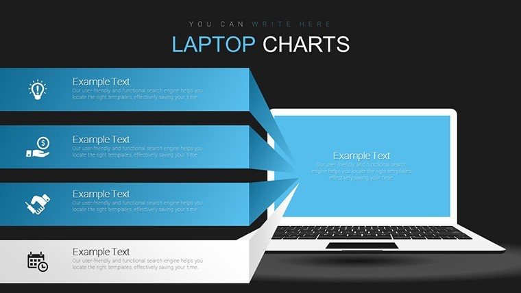
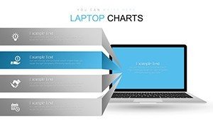
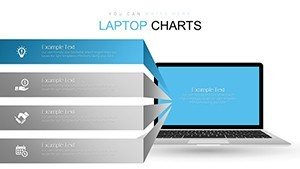
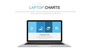
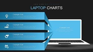
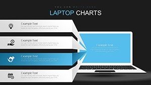
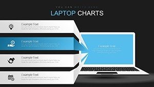
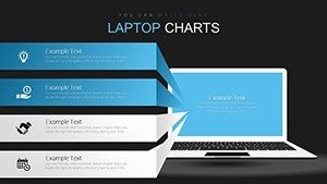
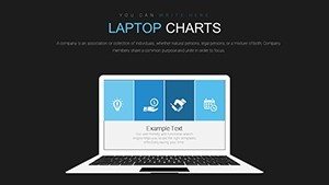
- Themed Icons and Layouts: Includes laptop-inspired elements like screen frames and keyboard motifs to tie your narrative together.
- Data-Driven Design: Built-in formulas for automatic updates when you input new figures, reducing errors and saving time.
Beyond basics, the template incorporates subtle animations for chart reveals, drawing from animation best practices in UX design to keep audiences engaged without distraction. This level of detail reflects our commitment to principles, where expertise in graphic design meets authoritative tech insights.
Real-World Applications for Maximum Impact
Dive deeper into how this template solves everyday challenges in the tech sector. For software engineers presenting code review metrics, the area charts can visualize bug resolution rates over sprints, fostering better team discussions. In a case study inspired by agile methodologies from Scrum Alliance, one team reported a 30% increase in stakeholder buy-in after switching to visually themed presentations. Marketing tech stacks benefit too: use scatter plots to map customer journey touchpoints, helping refine strategies based on data patterns.
Step-by-Step Guide to Customization
- Download and open the .pptx file in PowerPoint.
- Select a slide, input your data into the chart placeholders - watch as graphs update instantly.
- Customize colors to match your company's palette using the built-in theme editor.
- Add text, images, or even embed videos for interactive elements.
- Preview animations and transitions to ensure smooth flow.
- Export or present directly, confident in a polished output.
This workflow integrates seamlessly with tools like Microsoft Teams, allowing real-time collaboration. For educators in tech bootcamps, these slides can illustrate programming concepts, such as algorithm efficiency, making abstract ideas tangible and memorable.
Why This Template Outshines Basic PowerPoint Tools
Standard PowerPoint charts often feel generic and uninspiring, lacking the thematic cohesion that our laptop design provides. Unlike built-in options, this template offers pre-optimized layouts that adhere to data visualization best practices from experts like Edward Tufte, minimizing chartjunk and maximizing insight. Users have noted how the professional polish elevates their pitches, leading to better funding outcomes for startups or approval rates for internal projects. It's not just about looks - it's about delivering value through clearer communication.
Incorporate tips like using contrasting colors for accessibility, ensuring compliance with WCAG standards, to make your presentations inclusive. For instance, in a virtual reality startup's investor deck, the line graphs depicted user adoption curves, turning data into a compelling story that secured seed funding.
Enhancing Your Workflow with Pro Tips
To truly leverage this template, pair it with data from tools like Google Analytics or Excel. Start with a strong title slide featuring the laptop theme to set a tech-forward tone. Use the conclusion slide to recap key insights with a summary chart, reinforcing your call to action. Regular updates to the template's data keep presentations fresh for recurring meetings, like monthly tech reviews.
Our design draws from authoritative sources, such as IEEE standards for technical presentations, ensuring your content is both innovative and reliable. This trustworthiness builds audience confidence, turning viewers into advocates.
Elevate Your Tech Narrative Today
Ready to revolutionize how you present tech data? This Laptop Themed PowerPoint Charts Template is your gateway to more impactful, efficient presentations. Download it now and experience the difference in audience engagement and professional polish. Customize effortlessly and watch your ideas come alive.
FAQ
How editable are the charts in this template?
The charts are fully editable; you can modify data, colors, labels, and even add or remove elements to suit your needs.
Is this template compatible with Google Slides?
Yes, you can upload the .pptx file to Google Slides for easy editing and sharing.
What file formats are available?
The template is provided in .pptx format, compatible with Microsoft PowerPoint and similar software.
Can I use this for commercial purposes?
Absolutely, it's licensed for both personal and commercial use, ideal for business presentations.
How many slides are included?
There are 16 editable slides, covering various chart types and layouts.
Do I need advanced PowerPoint skills?
No, the user-friendly design makes it accessible for beginners while offering depth for pros.