Free Radar PowerPoint Charts Template


Type: PowerPoint Charts template
Category: Free Templates, Pie
Sources Available: .pptx
Product ID: PC00646
Template incl.: 8 editable slides
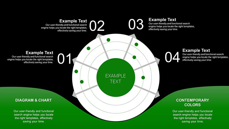
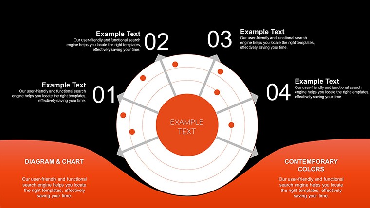
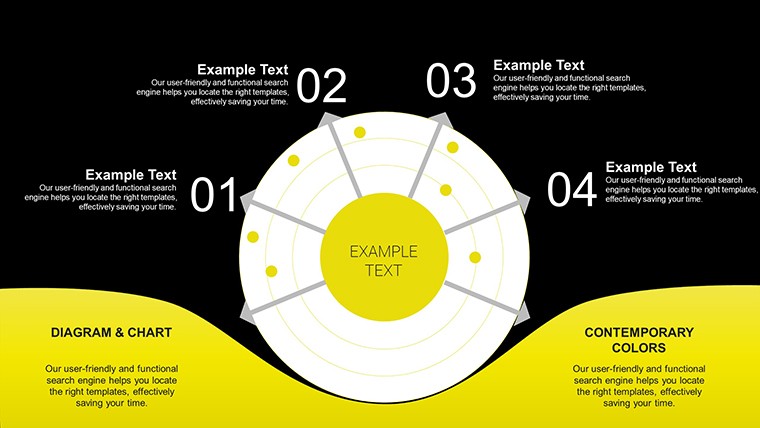
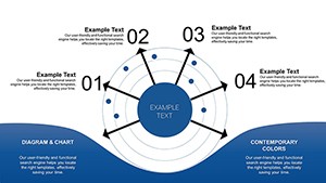
Imagine distilling multifaceted data into a single, intuitive visual that reveals strengths, weaknesses, and opportunities at a glance. The Local Radar PowerPoint Charts Template does exactly that, offering a free gateway for professionals and students to master radar charts - also known as spider webs - for multidimensional comparisons. With 8 editable slides, this template is tailored for those analyzing performance metrics, like market researchers evaluating product features or HR specialists assessing employee skills. Grounded in statistical visualization techniques from sources like the American Statistical Association, it provides a trustworthy platform to communicate insights effectively. Free to download, it democratizes high-quality design, allowing you to focus on analysis rather than creation. Whether in a sales meeting or academic seminar, these charts transform complexity into clarity, engaging your audience and sparking informed discussions.
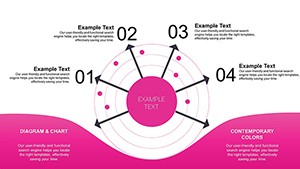
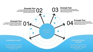
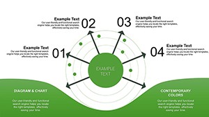
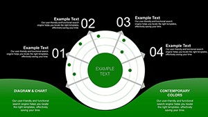
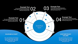
Demystifying Radar Chart Applications
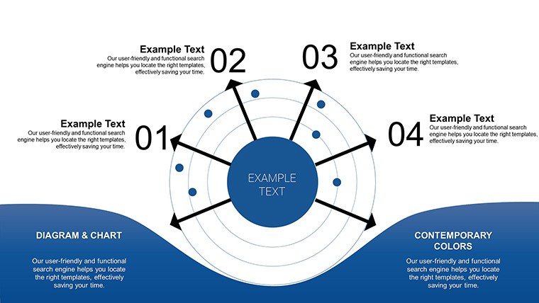
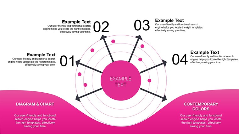
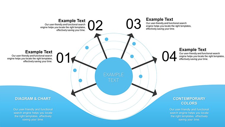
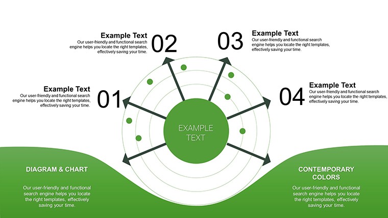
Radar charts shine in scenarios requiring balanced views, plotting variables on axes radiating from a center. This template's clean designs facilitate comparisons, such as benchmarking competitors in a business plan, highlighting where your offering excels.
Core Features for Effective Analysis
Featuring radar alongside bar, line, and pie options, each slide is pre-formatted for quick data entry. Professional aesthetics ensure polish, while versatility supports diverse datasets.
- Intuitive Customization: Adjust axes, scales, and fills with simple clicks.
- Multiple Chart Types: Mix radars with pies for hybrid views.
- Accessibility Focus: High-contrast defaults for inclusive presentations.
- Free Access: No cost, full features for immediate use.
These elements reflect expertise from data science communities, ensuring reliable, impactful visuals.
Versatile Use Cases and Examples
Business users can radar-map KPIs, like a startup comparing app features against rivals, drawing from lean methodology case studies. Educators plot student proficiencies across subjects, fostering personalized learning plans.
Easy Customization Workflow
- Download the free PPTX file.
- Open and select a chart slide.
- Enter data points - charts auto-scale.
- Modify colors and labels for emphasis.
- Add supporting text or images.
- Present or share digitally.
Integrates with academic tools like JSTOR for research-backed data. Outperforms basic charts by offering polygonal fills for nuanced interpretations.
Value in Simplicity and Clarity
Free templates often lack depth, but this one delivers professional-grade tools without the price tag. Enhances credibility, as in marketing analyses where radars clarified consumer preferences, leading to targeted campaigns. Tips: Normalize data for fair comparisons, per statistical norms, to avoid bias.
Workflow tip: Pair with Excel for imports, streamlining from analysis to presentation. Trust stems from alignments with open-source data viz principles.
Pro Tips for Radar Mastery
Limit axes to 5-8 for readability; use legends sparingly. For project updates, overlay multiple radars to show progress over time.
Download and Analyze Freely
Seize this free opportunity to refine your data storytelling. Get the Local Radar PowerPoint Charts Template now and unlock clearer insights - your audience awaits.
FAQ
What makes radar charts unique?
They allow multi-variable comparisons in a compact, visual format.
Is the template truly free?
Yes, download without any charges or restrictions.
Can I edit on mobile?
Compatible with PowerPoint mobile apps for on-the-go tweaks.
Suitable for beginners?
Yes, with straightforward interfaces and guides.
How to handle large datasets?
Focus on key variables; template supports aggregation.