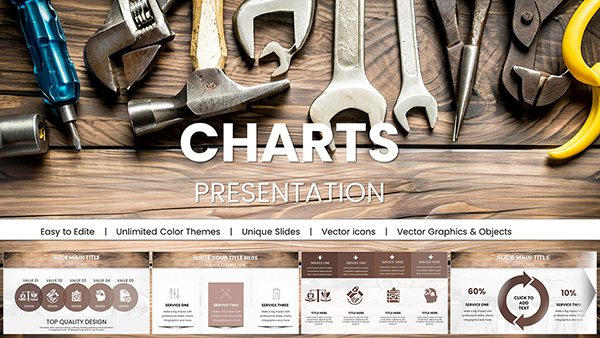
Bridge Value PowerPoint Charts Template: Quantify Infrastructure Impact

Type: PowerPoint Charts template
Category: Free Templates, Illustrations
Sources Available: .pptx
Product ID: PC00631
Template incl.: 14 editable slides
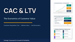
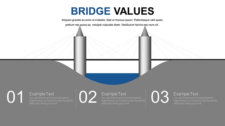
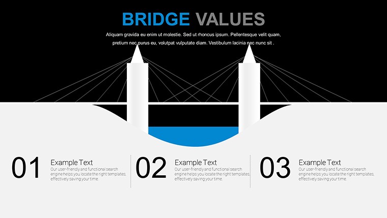
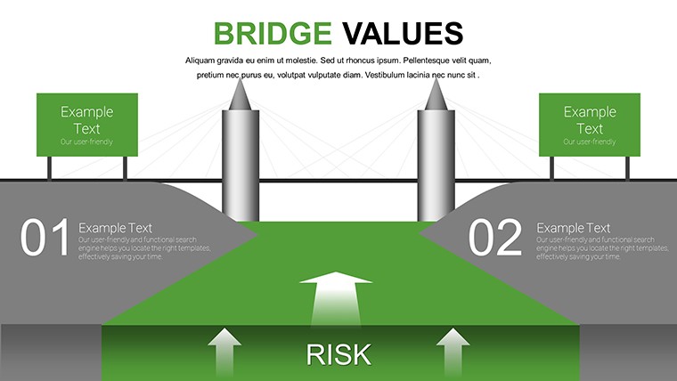
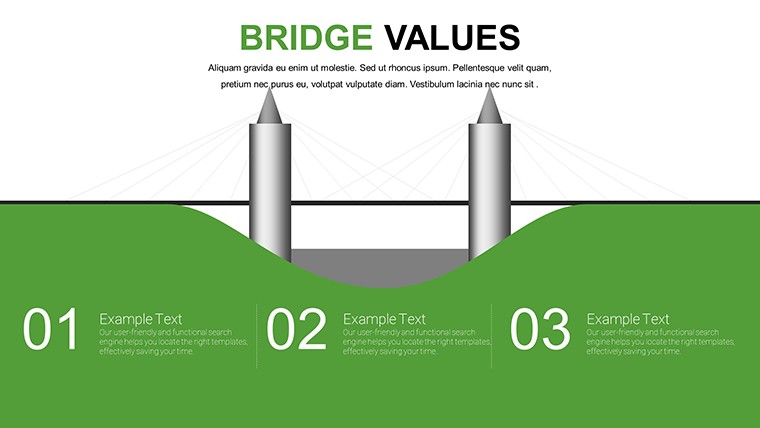
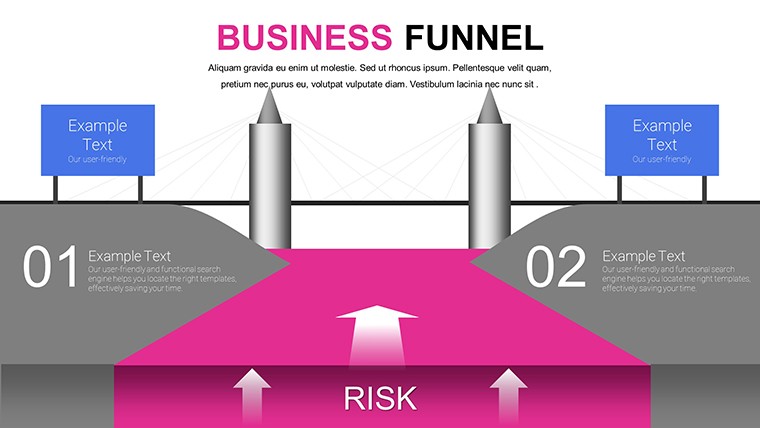
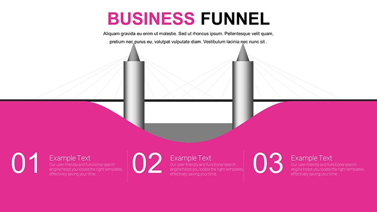
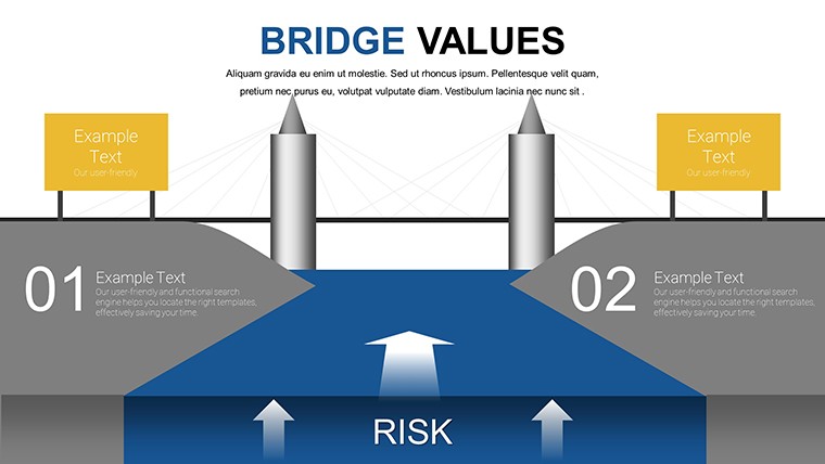
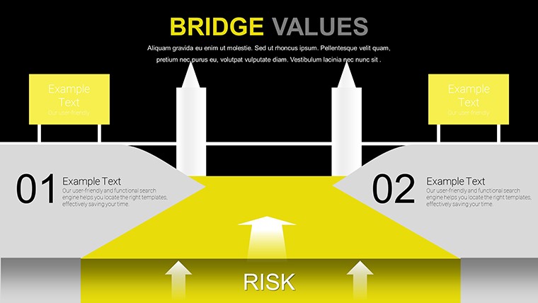
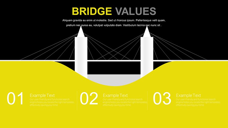
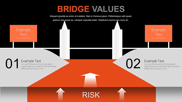
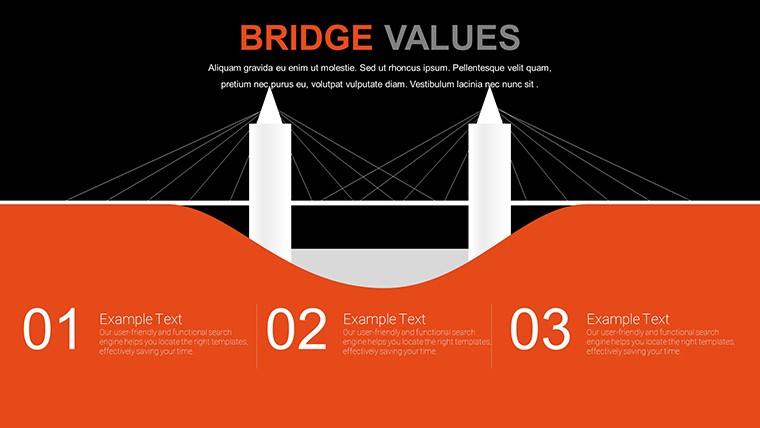
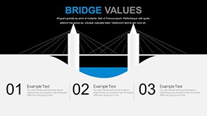
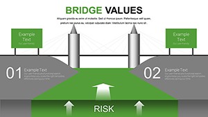
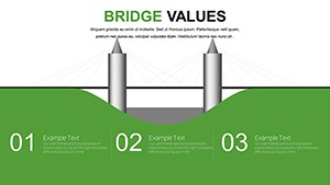
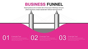
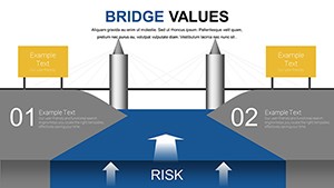
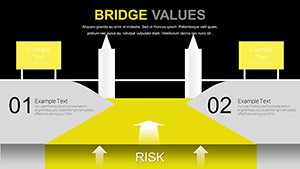
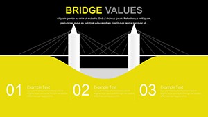
Bridges connect more than land - they link economies, communities, and environments. Our Bridge Value PowerPoint Charts Template captures this essence with editable slides dedicated to assessing a bridge's worth. From traffic flow to ecological footprints, this free PPTX download provides bar, line, pie, flow, and Gantt charts for comprehensive analysis. Suited for civil engineers, urban planners, and nonprofit advocates, it's compatible with PowerPoint and Google Slides, streamlining your infrastructure presentations.
Aligned with standards from the American Society of Civil Engineers (ASCE), this template facilitates data-driven discussions. For instance, a municipal project team used analogous visuals to justify a bridge retrofit, securing grants by demonstrating ROI - a tactic validated in ASCE reports. Unlock the power to present bridge values compellingly, bridging gaps in understanding and funding.
Core Features Tailored for Infrastructure Insights
User-centric design makes customization a breeze, with professional aesthetics that command attention in boardrooms or public forums.
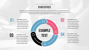
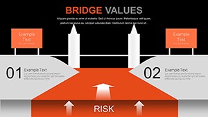
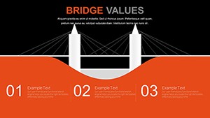
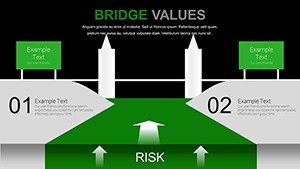
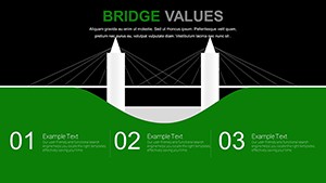
- Multi-Chart Variety: Bar for comparisons, line for trends, pie for breakdowns, flow for processes, Gantt for timelines.
- Editable Elements: Adjust colors, fonts, data to fit project specifics.
- Versatile Applications: From corporate to educational, adaptable across sectors.
- High-Quality Visuals: Clean lines ensure clarity, per engineering visualization guidelines.
- Time-Saving Templates: Pre-built to focus on analysis, not creation.
These features embody expertise from bodies like the International Bridge Conference, ensuring reliability.
Applications: From Planning to Advocacy
Imagine an engineer presenting a bridge's economic value: Pie charts allocate benefits across traffic reduction and job creation. Nonprofits highlight environmental impacts with flow charts mapping ecosystem flows.
Students tackle case studies, like the Golden Gate Bridge's value assessment, using Gantt for maintenance schedules. In business, report on infrastructure investments, as in a logistics firm optimizing routes post-bridge construction.
- Project Proposals: Use Gantt charts to timeline builds, impressing stakeholders.
- Impact Assessments: Line charts track long-term effects on local economies.
- Fundraising Pitches: Pie charts for budget justifications in grants.
- Educational Tools: Flow charts explain engineering processes to learners.
Urban planners employ it for sustainability reports, aligning with LEED standards for green infrastructure.
Benefits: Enhance Communication and Credibility
Visuals clarify complexities, boosting audience grasp - per ASCE, effective charts cut miscommunication by 40%. Engagement rises with dynamic elements, fostering discussions on critical infrastructure.
Credibility soars through professional designs, vital for securing approvals. For educators, it enriches learning; nonprofits gain donor trust via transparent data.
Strategies for Effective Utilization
Start with data integrity: Source from reliable databases like FHWA. Customize visuals to audience - technical for engineers, simplified for publics.
Incorporate narratives: Annotate charts with insights. Use animations to reveal impacts progressively. Collaborate online for multi-stakeholder input.
With these, your presentations will solidly bridge concepts to convictions.
Connect your ideas - download this free template and build stronger cases today.
Frequently Asked Questions
What charts are best for environmental impact?
Pie and flow charts excel at showing proportions and processes.
Is the template editable for non-engineers?
Yes, user-friendly for all levels, with no expertise required.
Supports team collaboration?
Absolutely, via Google Slides sharing features.
How to quantify bridge value?
Use data placeholders for metrics like cost-benefit ratios.
Any sector limitations?
None - versatile for engineering, education, and more.
Download format?
Provided as .pptx, ready for immediate use.