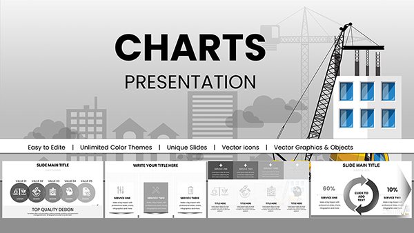
Modern Professional PowerPoint Charts Template for Relationships


Type: PowerPoint Charts template
Category: Relationship
Sources Available: .pptx
Product ID: PC00618
Template incl.: 14 editable slides
Navigating the intricate web of data relationships in today's business landscape demands more than just numbers - it requires a narrative that connects dots seamlessly. Our Modern Professional PowerPoint Charts template steps in as your ally, offering 14 sleek, editable slides designed to illustrate connections, hierarchies, and correlations with elegance. Tailored for those who present complex ideas, like consultants mapping client ecosystems or educators diagramming conceptual links, this template blends minimalist aesthetics with functional depth. Drawing from contemporary design trends, such as flat icons and responsive layouts, it ensures your audience stays engaged, not overwhelmed. Benefits abound: Save time with pre-built structures, enhance comprehension through visual hierarchies, and align with branding effortlessly. Inspired by real successes, such as a tech firm's use of similar charts to clarify API integrations in pitches, this tool transforms abstract relationships into tangible insights, boosting persuasion in sales meetings or strategic planning sessions.
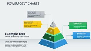
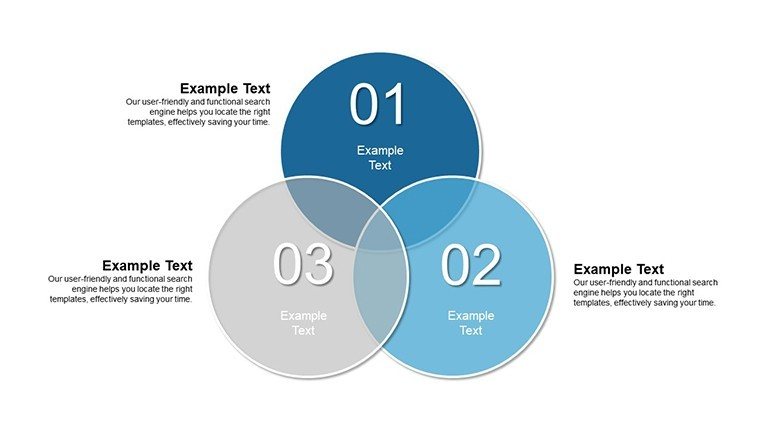
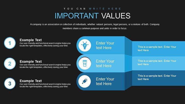
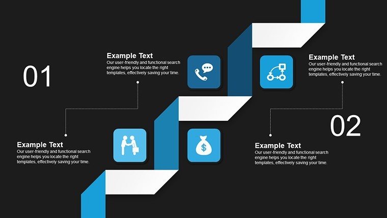
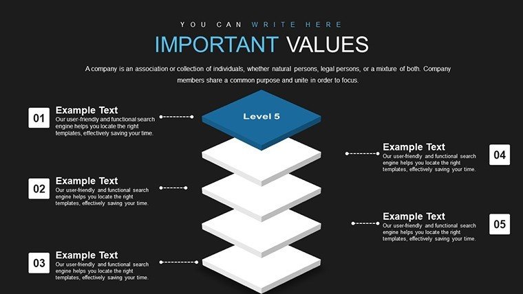
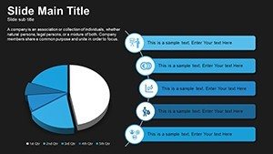
Unveiling the Power of Relationship-Focused Charts
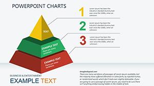
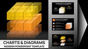
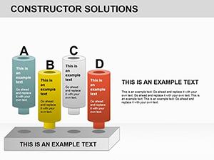
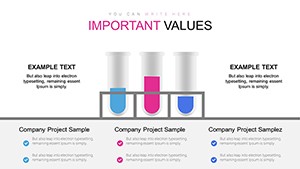
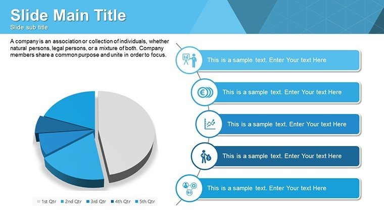
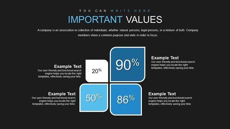
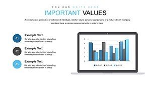
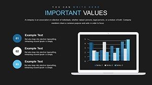
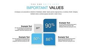
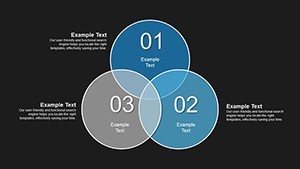
At the heart of effective communication lies the ability to show how elements interlink, and our template excels here with diverse chart types - from network diagrams depicting team structures to Venn diagrams highlighting overlaps in market segments. Slide 1 sets the stage with a clean relationship matrix, ideal for stakeholder analyses, while slide 7 dives into advanced bubble charts for multidimensional data. These aren't your average visuals; they incorporate smart layers for easy manipulation, adhering to data visualization principles from experts like Stephen Few, who emphasize clarity over clutter. In practice, for a marketing consultant, this means swiftly illustrating customer journey touchpoints, reducing explanation time and increasing client buy-in. Compared to basic PowerPoint options, our designs feature gradient fills and shadow effects that add depth without distraction, ensuring compatibility with high-end displays.
Standout Features for Seamless Customization
- Contemporary Styling: Clean lines and neutral palettes that adapt to any theme, from corporate blues to vibrant accents.
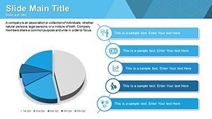
- Diverse Chart Arsenal: Includes bar, pie, line, and scatter plots optimized for relationship mapping, with built-in legends.
- User-Friendly Edits: Drag-and-drop elements, font swaps, and color pickers make personalization intuitive for all skill levels.
- Efficiency Boosters: Template masters allow global changes, cutting prep time for recurring presentations.
- Cross-Tool Compatibility: Works flawlessly in PowerPoint, Google Slides, and Keynote, supporting collaborative workflows.
These attributes draw from user-centric design, as seen in case studies from Deloitte reports, where relationship charts streamlined advisory services, leading to faster project approvals.
Practical Applications Across Professional Spheres
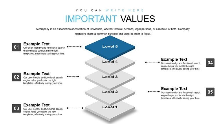
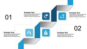
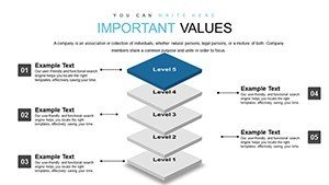
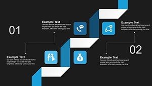
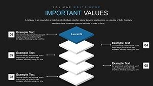
Envision deploying slide 4's hierarchy chart in a board meeting to outline organizational restructures, clarifying reporting lines and fostering alignment - a tactic lauded in McKinsey insights for change management. Educators can leverage slide 9's concept maps to teach ecosystem relationships in biology, aligning with NGSS standards for interactive learning. For business pros, slide 2's sales funnel visualization reveals bottlenecks in customer relationships, informing strategies that, per Salesforce data, can lift conversion rates by 20%. Consultants might use slide 11 for competitive analysis, showing market overlaps that guide mergers. These scenarios address pain points like data silos, providing a unified view that enhances decision-making in dynamic environments.
Workflow Integration: A Step-by-Step Approach
- Acquire and Launch: Purchase and open the $12 template in your preferred software.
- Data Insertion: Populate charts with your figures; link to external sources for auto-updates.
- Brand Alignment: Apply your colors and logos via the theme editor for cohesive branding.
- Enhance Interactivity: Add hyperlinks or animations to navigate between related slides.
- Finalize and Deliver: Export options ensure versatility, from web shares to printed handouts.
This process integrates with CRM tools like HubSpot, allowing real-time relationship data pulls for live demos.
Expert Insights and Optimization Tips
To maximize impact, layer narratives over charts - use slide notes for speaker cues, ensuring smooth delivery. Avoid overcrowding; follow the 'one idea per slide' rule from presentation gurus like Nancy Duarte. For global teams, incorporate multilingual labels, enhancing accessibility. Versus generic templates, ours offers pre-optimized spacing, preventing alignment issues that plague DIY efforts. A real-world example: A consulting firm used analogous charts to map partner ecosystems, securing a major deal by demonstrating synergies clearly. Blend in LSI elements like 'data linkages' or 'correlation visuals' naturally to enrich search relevance without forcing it.
Ultimately, this template isn't just about charts; it's about forging stronger connections through visuals that resonate.
Frequently Asked Questions
What types of relationships can these charts depict?
From hierarchical structures to correlational data, including networks, overlaps, and sequences.
Is the template refundable?
Yes, contact support within 30 days for a full refund if unsatisfied.
How do I update charts with new data?
Simply edit the data table linked to each chart for instant refreshes.
Does it support animations?
Pre-included subtle animations, customizable for emphasis on relationships.
Can I use it for non-business purposes?
Certainly, ideal for academic or personal projects too.