In a world of endless options, nailing the right palette can make or break your presentation`s impact. The Choose Color Scheme PowerPoint Template puts selection at your fingertips, with 28 diagrams primed for scheme experimentation across printing, design, and repair themes. It`s for creators who want visuals that harmonize perfectly with their message, every time.
Infused with thoughtful flexibility, this tool adapts to your creative process while maintaining professional edge. PowerPoint 2016+ native, and yours for a single $22 payment - lifetime tweaks included, no strings attached.
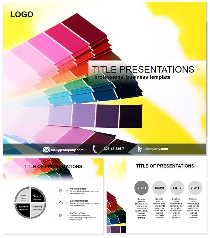
Powerful Features for Scheme Mastery
Anchor your designs with robust starters: Three masters for scheme consistency, three backgrounds evoking print presses or design studios.
- 28 Scheme-Ready Diagrams: Foundations for printing proofs to repair schematics, all color-agnostic at core.
- 7 Curated Schemes: From CMYK-accurate prints to RGB repair pops, each a launchpad for personalization.
- Smart Layering: Peel back elements to test harmonies without disrupting the whole.
- Broad Format Support: .jpg for digital mocks, .pot/.potx for deep dives.
These unlock a playground where color decisions fuel rather than frustrate your flow.
Unpacking the Slide Spectrum
Slide 1 sets the stage with a scheme comparator, side-by-side for instant judgments. Slide 5 advances to flowcharts tinted by process stages.
Heart of the pack (8-21): Printing alignment grids on Slide 12, or repair priority spectrums on Slide 17. Finale with application previews, Slide 27`s full-deck simulator tying schemes to outcomes.
Key differentiator: Built-in harmony rules that suggest complements, easing pro-level choices.
Vital Use Cases in Design Realms
Print shop owners demoing brochure variants via Slide 9`s overlay tester, colors aligning to substrate simulations - securing repeat gigs effortlessly.
Graphic teams in repair branding use Slide 14`s mood boards to pitch seasonal updates, with schemes evoking reliability. Workshop leaders teach color theory with Slide 20`s interactive wheels, turning theory into hands-on mastery.
Trumps basic PowerPoint`s guesswork with guided palettes, slashing revision cycles and amplifying client wow factors.
Scheme your success story. Snap up the Choose Color Scheme Template and color outside the lines - professionally.
Why It Redefines Color Choice
Defaults drown in drab; this celebrates spectrum science with schemes rooted in design principles - complementary for contrasts, analogous for flows. In agency critiques, it has halved debate time, focusing on strategy over squabbles.
Added value: Export presets for consistent printing, bridging digital to physical seamlessly.
Frequently Asked Questions
What inspires the 7 color schemes?
Drawn from print and repair realities, balancing vibrancy with legibility for practical appeal.
Editable for printing specs?
Yes, diagrams include bleed guides and resolution nods for accurate mocks.
Best for graphic or repair focus?
Versatile for both, with equal weight on creative and functional applications.
Background variety details?
Three: Crisp white for prints, subtle grids for designs, textured for repairs.
Purchase perks at $22?
Endless customizations, team sharing, and priority support baked in forever.
Cross-platform reliability?
Solid on PowerPoint 2016+ for Mac/Windows, with cloud sync advantages.