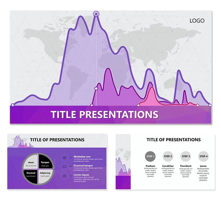
In the fast-paced world of finance, where numbers whisper secrets of trends and risks, your slides need to speak volumes. Enter the Analytical Graphics PowerPoint templates - a suite crafted for accountants, analysts, and traders who demand precision in every pixel. Boasting 28 specialized diagrams in 7 refined color schemes, backed by three masters and three backgrounds, this template distills complex data into digestible visuals that drive decisions.
Whether dissecting forex fluctuations or forecasting portfolio performances, these slides empower you to reveal patterns others miss. Swap in real-time charts from your spreadsheets, adjust scales for emphasis, and let the graphics guide the eye to insights. A hedge fund analyst recounted how a candlestick progression slide in this style clarified volatility spikes, swaying investors toward a timely pivot.
Core Elements: Precision Engineered for Data Depth
Editability is king here. Diagrams like line graphs with trend overlays or scatter plots for correlation mapping respond fluidly to inputs. The masters enforce consistency - headers that adapt to themes, footers for disclaimers - while backgrounds keep it clean, from grid patterns for technical views to subtle fades for executive summaries.
- Graph Variety: From bar clusters for comparisons to area fills for cumulative effects.
- Scheme Flexibility: Seven options, including monochromatic for reports and contrasted for pitches.
- Annotation Tools: Built-in callouts and legends that auto-update with data changes.
Optimized for PowerPoint 2016 and beyond, with Google Slides compatibility, it handles large datasets without lag. JPG exports ensure print-ready reports.
Exploring Key Diagram Configurations
The multi-axis chart stands out for dual-metric analysis - plot revenue against market index on shared timelines. Fine-tune lines for thickness or dash patterns to denote projections. For categorical breakdowns, the stacked column diagram segments shares, with hover-friendly labels in edit mode.
- Import your dataset via paste special for linked updates.
- Customize axes: log scales for wide ranges, or linear for straightforward reads.
- Select a scheme that highlights anomalies - reds for downturns, greens for upticks.
- Validate with a data table slide for cross-verification.
These configurations turn raw figures into narratives. In auditing, a pie-to-donut evolution visualizes expense allocations, simplifying audits.
Use Cases: From Trading Floors to Annual Reviews
For traders, the momentum oscillator diagram pulses with buy/sell signals, overlaid on price histories. Risk managers employ heat maps within matrix slides to flag exposure zones, color-coding severity. In budgeting sessions, waterfall charts trace variances from plan to actual, cascading adjustments visually.
Extend to economic briefings, where vector diagrams illustrate GDP components, or compliance decks mapping regulatory flows. Pros in firms akin to those handling global exchanges use these to not just present data, but provoke strategic dialogues - "What if we hedged here?"
The template`s structure supports modular builds: intro with overview graphs, body with drills, close with forecasts. It`s a framework for foresight.
Enhancement Strategies for Analytical Edge
Layer in conditional formatting for dynamic highlights - thresholds that color-code automatically. Pair with voiceover scripts in notes for narrated walkthroughs. For interactivity, hyperlink regions to detail slides. And archive versions with dated backgrounds for historical tracking.
Download the Analytical Graphics PowerPoint templates for $22 and start decoding your data`s story.
Frequently Asked Questions
What types of graphs are included?
A mix of line, bar, pie, and advanced like candlesticks for market-specific needs.
Does it support data linking?
Yes, connect directly to Excel for real-time refreshes.
Are there templates for risk analysis?
Indeed, including heat maps and scenario matrices.
Compatibility with Mac?
Fully supported in PowerPoint for Mac 2016+.
Can I add custom legends?
Absolutely, with editable text and shapes for personalization.