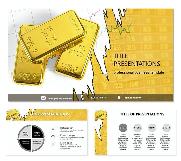
Gold`s allure isn`t just in its shine - it`s in the stories it tells about economies, investments, and futures. For finance whizzes tracking ounces to grams, our Gold Price PowerPoint template is your vault of visual gold. Packed with 28 diagrams that dissect market fluctuations, valuation models, and hedging strategies, it equips you to present precious metal insights with the finesse they deserve. Whether briefing traders on spot prices or advising clients on bullion portfolios, these slides make volatility feel navigable and opportunities irresistible.
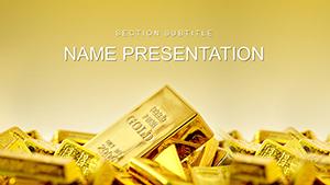
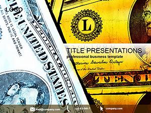
This template speaks directly to the pulse of global markets, where understanding per-gram costs or ounce conversions can swing deals. Three master slides lay a golden foundation, customizable to evoke trust - opt for metallic golds in backgrounds for investor decks or neutrals for analytical reports. With seven color schemes, you can code bull markets in greens or bears in reds, ensuring your charts resonate across cultures and currencies.
Accountants, commodity analysts, and investment bankers will appreciate how it streamlines the grind of data-heavy prep. Visualize a commodities seminar: insert live exchange rates into a candlestick chart, and the slide pulses with real-time drama, drawing nods from skeptical audiences. Or, in internal strategy sessions, the cost breakdown pyramids reveal hidden fees in gold trades, clarifying paths to profitability. It`s about more than numbers; it`s crafting presentations that mine value from every slide.
Key Elements That Glitter in Gold Analysis
The 28 diagrams form a treasure trove, editable in PowerPoint 2016+ for seamless integration. Kick off with the market overview radial, centralizing factors like inflation impacts and geopolitical shifts - tweak spokes to spotlight your thesis, like central bank reserves.
Specialized gems include bar graphs for historical price comparisons, scaling effortlessly to decades of data, and scatter plots mapping supply-demand correlations. Over 40 gold-themed icons, from ingots to scales, add authenticity without overwhelming the layout.
- Flexible Formatting: Adjust for 16:9 or 4:3 ratios, ideal for laptops to large screens.
- Smart Integration: Embed formulas for quick ounce-to-gram conversions right in cells.
- Versatile Exports: Pull .jpg assets for newsletters or .potx for team templates.
These draw from market report conventions, using clean lines to foreground trends, akin to how Bloomberg visuals prioritize clarity over flash.
Navigating Use Cases: From Trades to Forecasts
Put it to work. As a hedge fund strategist eyeing Q4 buys, grab the trend line diagram (slide 10) and layer in futures contracts - smooth curves forecast peaks, justifying positions with visual conviction.
- Collect Market Data: Pull quotes from reliable sources like bank APIs.
- Shape the Story: Use the pyramid (slide 14) to stack valuation layers, from raw costs to premiums.
- Finalize with Flair: Apply a scheme for emphasis, practicing reveals to sync with market anecdotes.
For educational webinars on precious metals, the cycle diagram (slide 19) loops mining to minting, engaging novices with its flow. Versus scratch-built charts, this saves recalibrations, letting you iterate faster on scenarios like tariff effects.
In advisory roles, the balance scale slide (slide 24) weighs gold against alternatives, quantifying diversification benefits for client peace of mind.
What Makes This Template a Market Mover
Its standout? Precision married to persuasion. Ample spacing lets prices breathe, while sans-serif fonts ensure legibility in dim trading floors. One analyst adapted it for a whitepaper on gold as inflation hedge, praising the modular builds for rapid revisions.
From ETF breakdowns to sovereign wealth overviews, it adapts, with contrast options for inclusive viewing.
Stake your claim - download for $22 and refine your gold narratives to pure profit.
Frequently Asked Questions
Does it handle real-time data?
Diagrams link to external sources, refreshing with current gold quotes on open.
Are icons included?
Yes, a curated set of 40+ relevant to commodities and finance.
Compatibility details?
Optimized for PowerPoint 2016+, with Google Slides export.
Color scheme variety?
Seven, from conservative to bold, all high-contrast for projections.
Commercial use allowed?
Fully licensed for business, reports, and client materials.