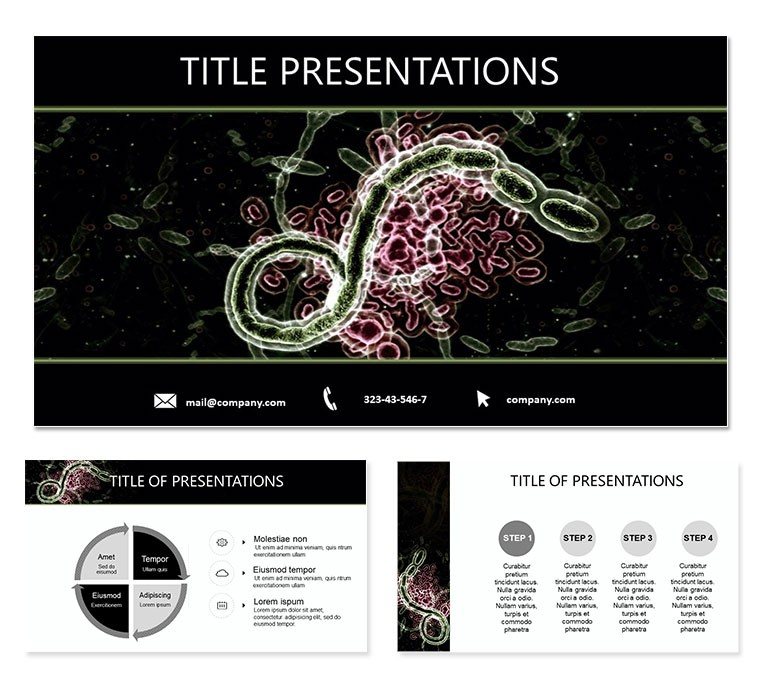
Communicating the subtle onset and devastating progression of Ebola symptoms demands visuals that cut through fear with facts, empowering healthcare teams to act swiftly. Our Ebola Symptoms PowerPoint template delivers exactly that for physicians, nurses, and public health trainers, with 28 infographics that map everything from feverish beginnings to hemorrhagic endpoints, making abstract suffering relatable and response-ready.
Compatible with PowerPoint and Google Slides, in versatile widescreen formats, it fits clinic laptops to conference screens. For a resident`s rotation talk or a community awareness drive, these slides distill WHO symptom cascades into scannable flows - envision a progressive timeline unfurling stages, or icon grids spotlighting differentials like rash versus petechiae, all primed for your case notes.
Spotlight on Symptom-Centric Tools
Precision meets empathy in the design: Three masters frame stages - incubation for intros, acute for peaks, recovery for hopes. Backgrounds vary from soft clinical whites to cautionary warms, evoking care without alarm.
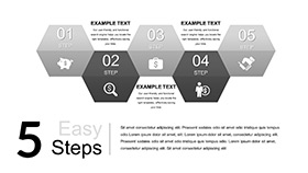
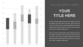
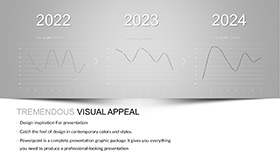
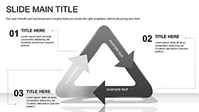
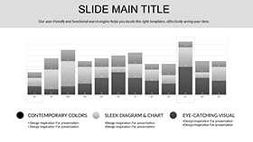
- 28 Symptom Diagrams: Body maps, timelines, and differential charts, vector-sharp for annotations.
- 7 Empathetic Color Schemes: Subdued tones for sensitivity, with accents for urgency markers.
- Interactive Elements: Hover-reveal details in Google Slides mode for deeper dives.
- Multi-Format Delivery: .potx for PowerPoint, adaptable to Slides for collab edits.
Addressing triage challenges, like distinguishing early flu mimics, a slide`s Venn diagram lets you layer local variants, aiding differential diagnoses on the fly.
From Blank to Briefing: Symptom Slide Setup
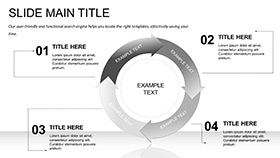
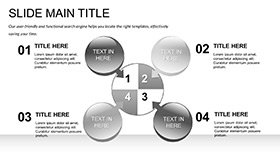
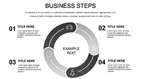
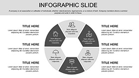
Load into PowerPoint or Slides, pick a master - the acute one for ER drills. Fill diagrams: Slide 7`s phase wheel rotates symptoms by day, placeholders for severity scores.
- Annotate Maps: Pin icons on anatomy slides for organ impacts, like GI bleeds.
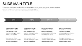
- Adjust Progressions: Stretch timelines to match incubation variances by strain.
- Layer Support: Add protocol callouts via shapes, linking to isolation steps.
- Rehearse Impact: Time builds to mirror symptom escalation, building tension thoughtfully.
This method sharpens focus, turning hours of charting into polished flows. In a med school sim, customize Slide 16`s checklist for mock assessments, integrating vitals trackers.
Deploying in Clinical and Community Contexts
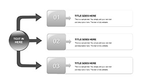
Ideal for frontline education, like outbreak drills: Slide 13`s flowchart guides symptom triage, branching to labs or evac. For patient ed, the pictorial grid on Slide 21 uses universal icons, bridging language gaps in diverse clinics.
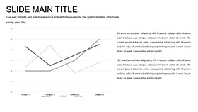
Key slides unpacked: Slide 4`s onset cluster groups prodromals, editable for cultural symptom reports. Slide 26`s recovery arc charts sequelae, informing long-term care plans.
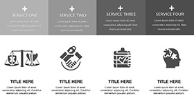
Beyond basics, its med icons - like stethoscope overlays - build trust, pairing well with EHR exports for hybrid decks.
Illuminate paths to prevention - download for $22 and symptom-proof your sessions.
Frequently Asked Questions
Are symptom icons culturally neutral?
Yes, designed with global inclusivity, using simple lines for broad recognition.
Supports Google Slides integration?
Fully, with preserved layouts and animations across platforms.
Editable for regional symptom variations?
Modular sections allow swaps, like adding dehydration emphases.
How many stages do the timelines cover?
Comprehensive: incubation, prodrome, acute, and convalescence phases.
Include space for treatment notes?
Yes, dedicated callout boxes on progression slides.
