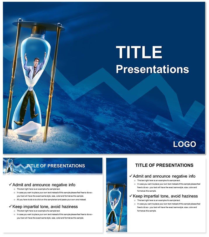
Imagine standing in a boardroom, charts flickering on the screen as you dissect the hidden costs eating away at your company`s bottom line. That`s the power this Material Losses PowerPoint Template brings to your fingertips. Designed for consultants and business leaders who need to spotlight financial vulnerabilities without the hassle of starting from scratch, this template packs 28 meticulously crafted diagrams ready to adapt to your data. Whether you`re unpacking inflation`s grip on margins or illustrating how staff turnover drains resources, these visuals turn complex losses into clear, actionable insights.
At its core, the template shines in scenarios where precision matters most - like quarterly reviews or risk assessment pitches. With seven vibrant color schemes, you can match your brand`s palette or the mood of your message, ensuring every slide resonates. Built on three master slides and three background options, it supports widescreen (16:9), standard (4:3), and 16:10 formats, making it versatile for any projector or screen. And since it`s fully editable in PowerPoint 2016 and later versions, swapping data or tweaking layouts feels intuitive, letting you focus on the story rather than the setup.
Picture a consulting firm presenting to a manufacturing client: the first diagram maps out inflation factors as interconnected nodes, showing how rising costs cascade through supply chains. A quick edit inserts real quarterly figures, and suddenly, your audience sees the urgency. This isn`t just about pretty slides; it`s about forging connections that drive decisions. Download this template for $22 and transform vague worries into targeted strategies that protect profits.
Unlocking the Core Features of the Material Losses Template
Diving deeper, the template`s strength lies in its diagram variety, each tailored to dissect different facets of material losses. From flowcharts tracing interest rate hikes to pyramid structures highlighting securities devaluation, every element is vector-based for crisp scalability. No more pixelated messes when you zoom in - these are built to impress under scrutiny.
- Inflation Impact Visuals: Use layered timelines to show how price surges erode asset values over time, perfect for economic forecasts.
- Staff-Related Loss Maps: Mind-map style slides connect turnover to productivity dips, helping HR teams advocate for retention investments.
- Securities Decline Charts: Bar and line hybrids reveal market fluctuations, ideal for finance teams explaining portfolio risks.
Customization is a breeze: select a color scheme from the seven options - think cool blues for calm analysis or bold reds for urgent alerts - and apply it across all 28 slides with one click. The three backgrounds range from minimalist grids to subtle gradients, ensuring your content stays front and center.
Step-by-Step: Integrating into Your Workflow
- Open and Import: Launch PowerPoint, insert the .potx file, and apply the master to your new presentation.
- Populate Data: Drag your Excel sheets into the editable placeholders; formulas link automatically for live updates.
- Refine and Animate: Add subtle transitions to reveal loss layers progressively, building tension like a well-paced narrative.
- Export and Share: Save as PDF for handouts or present directly - compatibility ensures it looks sharp on any device.
This streamlined process saves hours compared to cobbling together basic shapes in vanilla PowerPoint. For instance, a risk analyst at a logistics firm could swap generic icons for branded ones, aligning the deck with corporate guidelines in under 30 minutes.
Real-World Applications: From Boardrooms to Briefings
In consulting gigs, this template excels at bridging data and dialogue. Take a scenario where you`re advising on cost controls: start with an overview slide aggregating all loss categories, then drill down into staff problems via a decision tree diagram. It prompts questions like, "How does one bad hire ripple through teams?" - turning passive viewers into engaged partners.
For business educators, the financial risk causes section offers a teaching goldmine. Animate the inflation factors slide to simulate real-time value erosion, making abstract concepts tangible for MBA students. Or, in internal audits, use the securities slide to forecast mitigation steps, like diversifying holdings, with before-and-after comparisons.
Compared to standard PowerPoint tools, this template`s themed icons - think leaking buckets for losses or shields for safeguards - add narrative depth without extra design work. It`s like having a visual storyteller on your team, one that adapts to urban planning risks or retail shrinkage analyses equally well.
Tips for Maximum Impact in Risk Presentations
To elevate your delivery, pair diagrams with concise annotations: highlight key metrics in bold sans-serif fonts for readability from afar. Test on different screens to ensure color schemes pop without clashing. And for virtual meetings, leverage the widescreen layout to fit more context, keeping remote audiences hooked.
One pro tip from seasoned presenters: layer in audience polls via integrated hyperlinks, turning a static loss overview into an interactive workshop. This keeps energy high and reinforces the template`s role in fostering buy-in.
Why This Template Stands Out for Financial Storytelling
Beyond the specs, it`s the thoughtful integration of elements that sets this apart. Each of the 28 diagrams isn`t isolated; they flow logically, from broad overviews to granular breakdowns, mimicking how losses unfold in reality. Compatible with add-ins like Think-Cell for advanced charting, it scales with your expertise.
For teams juggling multiple projects, the .jpg exports mean quick mockups for stakeholder previews, while the full .potx dives deep into edits. It`s a toolkit for turning "what if" fears into "here`s how" plans, empowering you to lead with confidence.
Ready to fortify your presentations against unseen threats? Grab the Material Losses PowerPoint Template for $22 and start visualizing victory over vulnerabilities.
Frequently Asked Questions
What file formats are included with the Material Losses PowerPoint Template?
The template comes in .potx for full editing in PowerPoint and .jpg for quick previews or image-based uses.
Is this template suitable for non-finance presentations?
Absolutely - adapt the diagrams for any loss-analysis scenario, like project delays or inventory waste, by swapping labels.
How many color schemes does the template offer?
There are seven distinct color schemes, each optimized for clarity and brand alignment.
Does it support older versions of PowerPoint?
It`s designed for PowerPoint 2016 and newer, ensuring modern features like improved animations work seamlessly.
Can I use this on Mac?
Yes, it`s fully compatible with PowerPoint for Mac, maintaining all layouts and effects.