In the high-stakes world of healthcare, where every slide can influence decisions from patient care plans to research grants, the Medicine Phonendoscope PowerPoint Template emerges as your trusted stethoscope for visual storytelling. Tailored for physicians presenting case studies, nursing instructors diagramming procedures, or pharma reps unveiling trial results, this template boasts 28 infographic-rich diagrams that distill intricate medical concepts into digestible visuals. Picture transforming a dense epidemiology report into a flowchart that reveals outbreak patterns at a glance - suddenly, your audience isn`t just listening; they`re engaged, nodding along as connections click.
The beauty lies in its precision: three master slides provide a consistent framework, while three background variants offer flexibility - from sterile whites evoking clinical trust to soft blues suggesting calm diagnostics. With seven color schemes, you can theme your deck to match hospital branding or journal guidelines, ensuring cohesion without compromising on impact. Editing is intuitive; drag-and-drop elements let you insert real patient metrics or scan images seamlessly, compatible with PowerPoint 2016 and beyond for worry-free use in team huddles or virtual rounds.
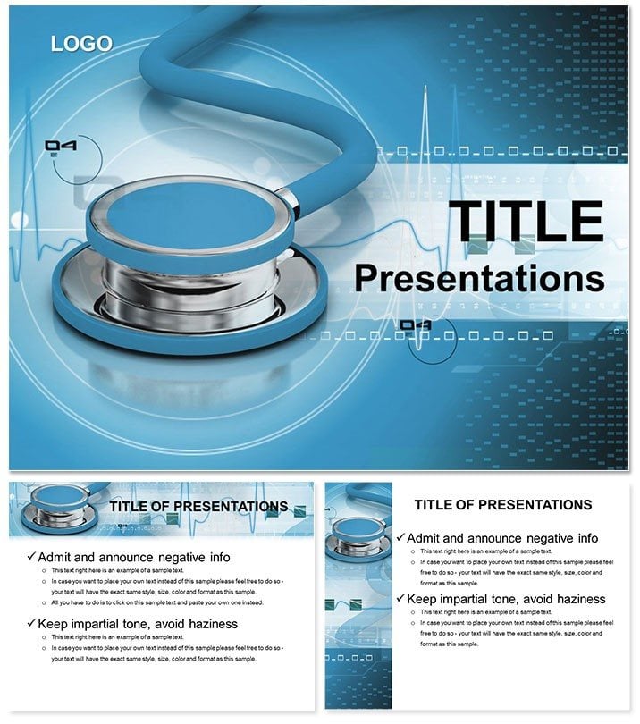
Essential Features for Healthcare Heroes
This template isn`t just slides - it`s a toolkit for turning data overload into focused insights. The charts and diagrams cover everything from organ system overviews to statistical breakdowns of treatment efficacy, all rendered in high-fidelity vectors that scale perfectly for printouts or large screens.
- Comprehensive Infographics: Venn diagrams for overlapping symptoms, bar graphs for dosage comparisons - 28 in total, ready to populate with your specifics.
- Flexible Customization: Tweak line weights on anatomical illustrations or recolor heat maps to highlight risk zones, all without distorting proportions.
- Professional Polish: Pre-set fonts like clean Calibri ensure readability from the back row, vital for auditorium lectures.
A resident I recall used the cycle diagrams to map drug interactions during grand rounds; what was once a verbal tangle became a looping visual that sparked questions and clarified doubts in minutes.
Mastering Edits: A Step-by-Step Guide
Launch the template and select your master for a unified look. For a procedure demo, start with the step-by-step sequence slides: number one for incision prep, layering in photos or icons as you go. Next, integrate timeline charts for recovery phases - adjust scales to fit weeks or months, ensuring accuracy. Finally, run a spell-check and alignment audit; PowerPoint`s grid snap makes this effortless, polishing your deck for prime time.
- Import your data via Excel links for auto-updates on evolving stats like infection rates.
- Apply subtle shadows to 3D models of phonendoscopes for depth, mimicking real-tool tactility.
- Export as PDF for journal submissions, preserving vector sharpness.
These habits streamline prep, freeing you to focus on delivery rather than design tweaks.
Practical Use Cases in Medical Settings
From ER briefings to academic symposia, this template adapts to the rhythm of healthcare. In a busy clinic, leverage the pyramid structures to prioritize triage levels - base for stable cases, apex for critical interventions - helping teams align on resource allocation. Medical students prepping for OSCEs find the labeled diagrams invaluable for anatomy reviews; color-code nerves and vessels to reinforce spatial memory without rote memorization.
Researchers pitching to funding bodies swear by the scatter plots for correlation studies - plot biomarker levels against outcomes to visually argue for grant support. Even in telemedicine, the clean layouts shine on smaller screens, with ample white space preventing visual fatigue during long consultations.
Adapting for Diverse Health Audiences
For public health campaigns, the radial charts excel at showing vaccination coverage by demographic, turning stats into calls to action. A community health worker adapted one for a flu drive, using pie segments to depict herd immunity thresholds - attendees left informed and motivated. Customize by swapping medical icons for culturally relevant symbols, broadening appeal.
Pro workflow integration: Save variants for recurring topics like annual wellness checks, and use slide master comments for team notes. For hybrid events, test audio overlays on diagram zooms to guide viewers through virtual dissections.
Elevating Beyond Standard Medical Decks
Unlike vanilla PowerPoint packs with cartoonish clipart, this template draws from real medical aesthetics - think precise line art echoing textbook illustrations, minus the yellowing pages. The seven schemes include accessibility-friendly contrasts, essential for diverse audiences including color-blind colleagues.
Enhance with hyperlinks to source studies, turning static slides into interactive hubs. For longevity, archive versions post-presentation; the modular design makes future repurposing a breeze, like recycling a process flow for policy briefs.
Insider Tips for Flawless Delivery
Build rhythm by alternating dense diagrams with breathers - a full-slide phonendoscope image post-data dive resets focus. Narrate deliberately: `As this curve illustrates, early detection halves recovery time.` Rehearse with a timer to pace reveals, ensuring no slide outstays its welcome.
Grab the Medicine Phonendoscope PowerPoint Template today and amplify your voice in the healing arts.
Frequently Asked Questions
Is this template HIPAA compliant?
Yes, with anonymized placeholders; always review for sensitive data handling.
Can I add my own medical images?
Easily - drag into frames designed for X-rays or ultrasounds without resizing issues.
What software versions does it support?
PowerPoint 2016+ and Google Slides; check for advanced features in newer builds.
Are there pre-built anatomical diagrams?
Indeed, 28 include organ layouts and procedural flows, all vector-based.
How do I change color schemes?
Via the master slide selector - seven options update all diagrams instantly.