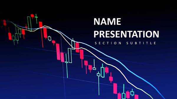
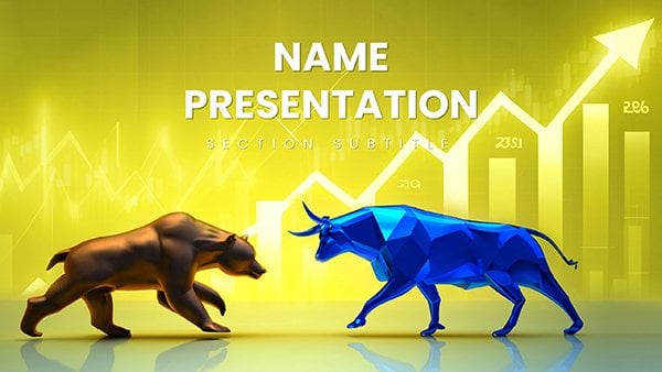
Navigating the volatile world of stock investments demands not just sharp analysis but also visuals that cut through the noise. Imagine standing before a boardroom full of stakeholders, armed with slides that don`t just list potential pitfalls but vividly illustrate them - turning abstract threats like market downturns or currency fluctuations into actionable insights. This Stock Market Risks PowerPoint Template is your ally in that high-stakes arena, offering 28 meticulously crafted diagrams designed specifically for finance professionals who need to convey uncertainty without losing credibility.
Whether you`re a portfolio manager prepping for a client review or a financial advisor breaking down risk profiles in a seminar, these slides empower you to highlight everything from volatility spikes to diversification needs. With three master layouts and three background options, plus seven versatile color schemes ranging from stark corporate grays to alert reds, customization feels effortless. Each diagram is fully editable in PowerPoint 2016 and later versions, letting you swap data points, tweak icons, or align with your brand`s palette in minutes. No more wrestling with clunky defaults; instead, focus on the story your numbers tell.
Unlocking the Core Features for Risk Communication
At the heart of this template lies a suite of diagrams tailored to dissect stock market hazards. Start with a classic risk-return scatter plot on slide one, where you can plot historical data to show how higher rewards often dance with greater dangers - perfect for underscoring the need for balanced portfolios. Move to slide five`s heatmap, visualizing sector-specific vulnerabilities like tech bubbles or energy slumps, with color gradients that make hot zones pop without overwhelming the viewer.
What sets these visuals apart is their built-in scalability. For instance, the pyramid diagram on slide 12 breaks down layered risks - from macroeconomic shifts at the base to company-specific events at the peak - allowing you to peel back layers as your narrative unfolds. And for those quarterly reports, the timeline infographic on slide 18 maps out past market crashes alongside recovery paths, helping audiences grasp patterns without drowning in dates.
- Seamless Editing: Vector-based elements ensure crisp resizing, whether you`re zooming in on a single metric or expanding for a full-screen overview.
- Icon Library: Over 50 finance-themed icons, from downward arrows for losses to shields for hedges, ready to drag and drop.
- Animation Options: Subtle builds reveal data sequentially, keeping engagement high during those pivotal "what-if" discussions.
Compatibility extends to Google Slides too, so your team can collaborate in real-time, refining risk models before the big reveal.
Real-World Applications in Finance Presentations
Picture a hedge fund strategist using slide 22`s funnel chart to demonstrate how initial investments narrow through risk filters - starting broad with market entry and tapering to net gains after accounting for fees and downturns. This not only clarifies the process but also builds trust by showing transparency. Or consider compliance training: slide 10`s compliance matrix grid lets you align regulatory risks with mitigation strategies, turning dry policy into a visual roadmap.
In client pitches, the comparative bar chart on slide 25 shines, pitting stock risks against bonds or real estate with side-by-side metrics. It`s a subtle nudge toward diversified advice, backed by clean lines that let your expertise take center stage. For educational webinars, educators at firms like Vanguard have leaned on similar setups to teach retail investors about beta coefficients, making complex Greeks accessible through intuitive flows.
Workflow integration is a breeze: import your Excel risk assessments directly into these charts via PowerPoint`s data links, updating live as markets shift. No more manual redraws - just refresh and present. And for global teams, the multilingual text placeholders support quick adaptations, ensuring your risk warnings resonate across borders.
Step-by-Step Guide to Customizing Your Risk Deck
- Select Your Base: Choose a master slide that matches your firm`s tone - minimalist for analysts, bold for exec summaries.
- Input Data: Paste your volatility figures into the pie chart on slide 7, watching sectors auto-adjust for proportional accuracy.
- Refine Visuals: Swap the default red accents for your brand green on high-risk elements, using the color scheme switcher for instant previews.
- Add Narrative: Layer in speaker notes with talking points, like "Here, we see how diversification softens the blow - much like in the 2008 playbook."
- Test Flow: Run through animations to ensure revelations build tension without rushing, then export to PDF for backups.
This methodical approach saves hours, letting you iterate from draft to polished in under an afternoon.
Why This Template Stands Out in a Crowded Market
Unlike generic PowerPoint charts that blur into blandness, these diagrams draw from proven financial storytelling techniques - think Edward Tufte`s emphasis on data-ink ratios, where every element serves the message. The result? Slides that inform without intimidating, fostering decisions rooted in clarity. Users report smoother Q&A sessions, as visuals preempt confusion on topics like leverage risks.
Extend its utility beyond stocks: adapt for crypto volatility analyses or ESG factor breakdowns, where environmental risks mirror market ones. The template`s modularity means you can mix diagrams across decks, creating a cohesive library over time.
Ready to fortify your presentations against uncertainty? Download the Stock Market Risks PowerPoint Template for just $22 and transform how you frame the unknowns.
Frequently Asked Questions
What formats are included with this template?
The download provides .potx for editing in PowerPoint and .jpg previews for quick references.
Can I use this on Mac?
Yes, it`s fully compatible with PowerPoint for Mac 2016 and newer versions.
How many color options are there?
Seven schemes, from professional neutrals to high-contrast alerts, all adjustable per slide.
Is it suitable for non-finance topics?
Absolutely - adapt the risk frameworks for project management or health safety overviews.
Does it support animations?
Built-in subtle animations are included, with options to add more via PowerPoint`s tools.
What`s the slide resolution?
High-res widescreen (16:9) for modern displays, with standard options available.