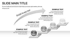
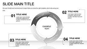
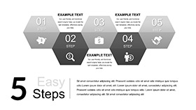
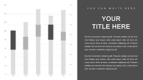
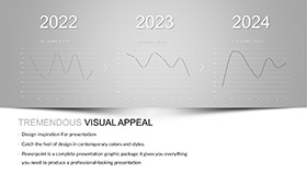
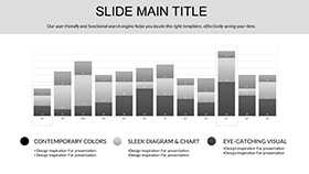
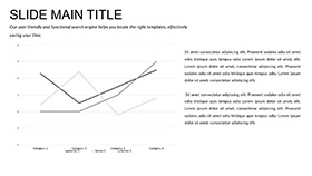
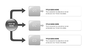
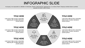
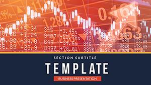
Markets shift like sand, but your visuals can anchor clarity amid the flux. The Exploring Graph PowerPoint Template equips traders, analysts, and economists with 28 diagram powerhouses in 7 color schemes to dissect trends and forecast fortunes. It`s the canvas for turning raw data into riveting revelations, perfect for forex floors or boardroom briefings.
Framed by 3 masters and 3 backgrounds with grid subtlety, editable prowess in PowerPoint 2016+ lets you plot live feeds or historical highs. From volatility vortices to equity evolutions, this template deciphers the charts, empowering you to lead with precision rather than guesswork.
Graphing Tools That Plot Precision
Precision-engineered, the 28 diagrams span bar battles to scatter stories, primed for financial finesse.
- 7 Color Schemes: Bullish golds for uptrends or cautionary reds for dips.
- 3 Masters and Backgrounds: Clean axes that scale without skew, hosting your tickers.
- Dynamic Connectors: Auto-align lines for seamless series links.
.potx portability ensures global trades view flawlessly, from desktops to dashboards.
Tracing Trends: Your Data Dance Guide
Initiate with a sector snapshot: populate the radar diagram with asset allocations, tweaking spokes for weights. Advance to predictive paths, animating curves to unveil scenarios.
- Spot Patterns: Candlestick clusters editable for timeframes, highlighting reversals.
- Assess Risks: Heat maps color-code exposures, drillable for depths.
- Project Profits: Foresight funnels narrow to net gains, formula-friendly.
This cadence charts conviction, mirroring market pulses.
Trading Tableaus That Trade Wins
A hedge fund head maps portfolio pivots: the template`s matrix multiplies metrics, clinching investor nods. Consultants chart client corridors, with expandable edges for what-ifs that widen horizons.
For academic econ classes, it unpacks exchange enigmas, fostering analytical acumen. Its data depth suits solo scans or syndicate shares, always prioritizing actionable arcs.
Axis Tweaks for Sharper Insights
Embed Excel links for auto-updates, keeping curves current. Calibrate scales to log for volatile views, or linear for steady states. Group by quarters with subtle shading, segmenting seasons sans strain.
Export subsets for reports, preserving vector vigor.
Superior to Scattershot Spreadsheets
Eschewing Excel exports` edges, this integrates natively: adaptive grids that anticipate queries, akin to quant quants` custom codes for credible curves.
$22 charts a course to clarity. Invest in the Exploring Graph PowerPoint Template and plot your path to prowess.
Frequently Asked Questions
How to link live market data?
Via OLE embeds from Excel, refreshing on open for real-time renders.
Custom axis labels possible?
Yes, text boxes snap to ticks for tailored tags.
Suits forex specifically?
Ideally, with currency pair presets in diagrams.
Animation for trend reveals?
Built-in wipes along lines, tunable for tempo.
Compatible with add-ins?
Fully, enhancing with tools like Think-Cell.


