Imagine captivating your audience with visuals that not only explain complex renewable energy concepts but also inspire action toward a sustainable future. Our Alternative Energy PowerPoint Template delivers exactly that - 28 meticulously designed diagram slides that bring geothermal, wind, solar, and hydroelectric innovations to life. Whether you`re pitching green initiatives to stakeholders or educating teams on eco-friendly tech, this template transforms dry data into dynamic stories that resonate and drive decisions.
Built for professionals in energy sectors, environmental advocacy, and architecture firms, this template stands out by blending technical accuracy with visual appeal. Compatible with PowerPoint 2016 and later versions, it ensures seamless integration into your workflow. Plus, with a one-time purchase of $22, you get lifetime access to edit and reuse without restrictions. Why settle for bland slides when you can electrify your message?
Unlock the Core Features of This Renewable Energy Template
This PowerPoint diagram template isn`t just a set of slides; it`s a toolkit for sustainable storytelling. At its heart are 28 versatile diagrams, each tailored to highlight different facets of alternative electricity sources. From flowcharts mapping wind turbine efficiency to infographics detailing solar panel outputs, every element is fully editable for your specific data.
- Seven Color Schemes: Choose from earthy greens and blues to vibrant energy bursts - adapt to your brand or presentation tone effortlessly.
- Three Master Slides: Streamline your design consistency across all slides with predefined layouts that save hours of tweaking.
- Three Background Options: Select from subtle gradients evoking natural landscapes or bold abstracts symbolizing power generation.
- Multiple Aspect Ratios: Available in widescreen (16:9), standard (4:3), and 16:10 formats to fit any projector or screen.
- High-Quality Sources: Includes .potx for direct PowerPoint import and .jpg previews for quick references.
These features ensure your presentations are not only professional but also adaptable, making it easier to insert real-time data or multimedia elements like short clips of wind farms in action.
Dive Deep into the 28 Diagram Slides
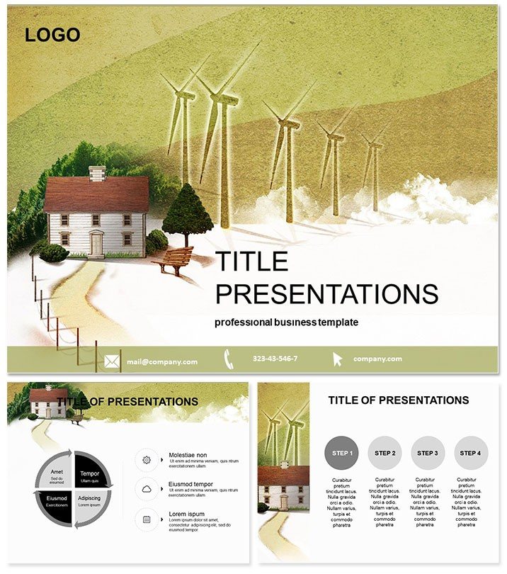
Each of the 28 slides in this alternative electricity PowerPoint template serves a purposeful role, turning abstract energy concepts into tangible visuals. Slide 1 kicks off with an overview infographic comparing traditional fossil fuels to renewables, using pie charts that pop with color-coded segments for immediate clarity.
Moving to slides 2-7, you`ll find process diagrams illustrating the lifecycle of hydroelectric power - from water intake to turbine generation - complete with animated paths that reveal steps sequentially. Slides 8-14 focus on wind energy, featuring radial charts that break down blade mechanics and capacity factors, ideal for engineering deep dives.
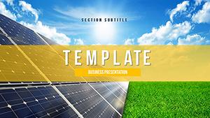
Solar power takes center stage in slides 15-21, with layered diagrams showing photovoltaic cell structures and efficiency curves over time. These are perfect for technical audiences, as they include placeholders for custom metrics like kilowatt-hour yields.
Geothermal explorations dominate slides 22-28, employing cross-sectional views of earth heat extraction and heat exchanger schematics. Every slide incorporates smart placeholders for text, icons, and data points, ensuring you can swap in your stats without redesigning from scratch.
What sets these apart? Their user-tested layouts prioritize readability, with ample white space and sans-serif fonts that scale well on any device. Customize instantly to align with your narrative, whether it`s a boardroom strategy session or a classroom lecture.
Real-World Applications: Where This Template Shines
In the fast-evolving world of sustainable energy, effective communication is key to adoption. Picture a renewable energy consultant using this template for a client proposal: Slide 10`s wind farm yield diagram, infused with projected ROI data, seals the deal by visualizing long-term savings against upfront costs. Or consider an architecture firm integrating geothermal options into urban planning - slides 25-27`s heat flow models provide the evidentiary backbone for eco-certifications.
Educators love it too. A university professor might leverage the solar sequence for an environmental science course, animating energy conversion paths to engage undergrads in discussions on global warming mitigation. Even nonprofits benefit: Advocacy groups craft compelling grant applications, using the overview slide to underscore the urgency of shifting from diesel generators to solar arrays in remote communities.
One real-world win? A mid-sized energy startup reported a 40% increase in investor interest after revamping their pitch deck with these diagrams - proof that visuals matter in high-stakes environments.
Why Ditch Default PowerPoint for This Pro Template?
Stock PowerPoint shapes often look cookie-cutter, lacking the polish needed for professional impact. This alternative energy template elevates your game with pre-built, thematically aligned graphics that default tools can`t match. No more wrestling with misaligned arrows or clashing colors - everything`s optimized for cohesion.
Time savings are massive: What takes hours in vanilla PowerPoint assembles in minutes here. And with built-in animation triggers, your transitions feel cinematic, not clunky. For teams collaborating across versions, the .potx format guarantees compatibility, avoiding those frustrating "elements missing" errors.
Download now and experience the difference - turn your next presentation into a catalyst for change.
Frequently Asked Questions
What makes this template ideal for energy professionals?It features 28 specialized diagrams on renewables like wind and solar, with editable elements for precise data integration.
Is it compatible with older PowerPoint versions?Yes, works seamlessly with PowerPoint 2016 and newer, including Microsoft 365.
Can I customize the colors to match my branding?Absolutely - seven schemes and full editability let you tweak hues effortlessly.
How many backgrounds are included?Three versatile options to suit various presentation styles.
What`s the pricing model?One-time $22 fee for lifetime use and unlimited edits.
Does it support animations?Yes, with built-in triggers for smooth, professional flows.