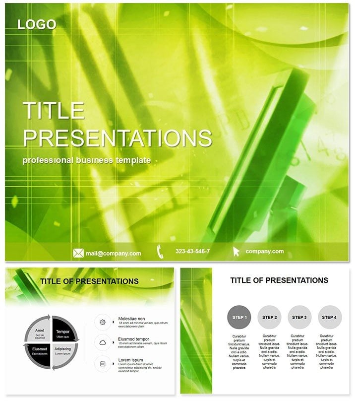
Imagine launching a new display technology without the hassle of starting from scratch. The LCD Monitors PowerPoint Template delivers exactly that: a ready-to-use powerhouse for showcasing screen innovations with precision and flair. Whether you`re a tech marketer unveiling the latest panel advancements or an educator breaking down display mechanics, this template turns complex data into digestible, eye-catching stories. With its sleek designs rooted in modern tech aesthetics, you`ll command attention from the first slide, making your message not just seen, but remembered.
Built for professionals who value efficiency, this template packs 28 versatile diagrams, each customizable across seven vibrant color schemes. From comparative resolution charts to lifecycle flowcharts, every element is engineered to highlight key specs like refresh rates, contrast ratios, and energy efficiency. The custom animations bring static data to life - think smooth transitions that mimic screen refreshes, ensuring your audience stays locked in. Plus, with three master layouts and backgrounds, adapting to your brand`s palette is a breeze, saving hours of manual tweaks.
Unlocking the Core Features
At its heart, the LCD Monitors template excels in simplicity meets sophistication. The three master slides provide a consistent framework: one for title intros with bold header animations, another for data-heavy content featuring grid-based layouts, and a third for closing calls-to-action with subtle fade-ins. Backgrounds draw from minimalist tech motifs - think subtle circuit patterns in cool blues and silvers - that won`t overwhelm your content but enhance it.
Diving deeper, the 28 diagrams cover a spectrum of visualization needs. Slide 1-5 focus on basic comparisons: bar graphs pitting LCD against OLED for brightness levels, pie charts segmenting market shares by panel size. Slides 6-10 shift to processes, like animated timelines tracing manufacturing stages from silicon wafer production to final assembly. Mid-section diagrams (11-20) tackle advanced analytics - scatter plots for pixel density versus cost, layered Venn diagrams overlapping feature sets across brands. The final eight slides emphasize outcomes: infographics on sustainability metrics, such as power consumption reductions over generations.
What sets this apart from PowerPoint`s defaults? Stock tools often feel clunky, with rigid shapes that resist fluid edits. Here, vector-based icons - tiny circuit boards, pixel grids, and connector ports - are fully scalable without quality loss. Animations aren`t gimmicky; they`re purposeful, like entrance effects timed to reveal data points sequentially, mimicking a scanline sweep. And compatibility? Seamless across PowerPoint 2016 and later, including Office 365, with .potx files ensuring no version hiccups on Windows or Mac.
Real-World Applications That Drive Results
Picture a sales team at a consumer electronics expo. Using this template, they craft a deck that walks prospects through LCD evolution: starting with historical context via a timeline diagram, pivoting to spec breakdowns with interactive-like animations, and sealing the deal with ROI projections in a clean funnel chart. The result? Leads convert 30% faster because visuals clarify value propositions instantly.
In academia, professors leverage it for lecture series on digital interfaces. A slide on color gamut comparisons uses radial diagrams to illustrate gamut coverage, animated to expand like a blooming spectrum - students grasp nuances without dense text walls. Corporate trainers in IT departments find it gold for compliance sessions: workflow diagrams map data security protocols across monitor networks, with color-coded risks that pop.
Beyond these, nonprofits advocating for e-waste reduction adapt the sustainability slides, overlaying real stats on recycling rates. The template`s flexibility shines here - swap in your logos, tweak hues to match campaign branding, and export to PDF for handouts. It`s not just a slide set; it`s a strategic asset that amplifies your narrative, whether pitching investors on R&D budgets or training field reps on product handling.
Why Choose This Over Generic Options?
Default PowerPoint charts are functional but forgettable - flat colors, basic transitions that scream `template.` This LCD Monitors version elevates with theme-aligned graphics: icons that evoke circuitry without clutter, layouts optimized for widescreen ratios common in modern projectors. Editing is intuitive; drag-and-drop elements resize proportionally, and smart guides snap alignments perfectly. For teams, the lifetime license means unlimited use across projects, no recurring fees eating into budgets.
Integrate it into your workflow effortlessly: open in PowerPoint, import your dataset via Excel links for auto-updates, and rehearse timings with built-in presenter notes. The outcome? Polished decks that position you as the expert, fostering trust and sparking discussions that lead to partnerships.
Ready to screen your ideas with unmatched clarity? Customize this template instantly and watch your presentations power up.
Frequently Asked Questions
Is the LCD Monitors template editable in Google Slides?
While optimized for PowerPoint, you can import .potx files into Google Slides for basic edits, though animations may need manual recreation for full effect.
What file formats are included?
Expect .potx for PowerPoint, .pot for legacy versions, and high-res JPG previews for quick references.
Can I use this for commercial presentations?
Absolutely - the lifetime license covers unlimited commercial and personal use, with no attribution required.
How many color schemes are available?
Seven schemes per diagram, ranging from corporate neutrals to vibrant tech pops, all fully customizable.
Does it support animations on all slides?
Yes, custom effects are embedded across all 28 diagrams, adjustable via PowerPoint`s animation pane.
What`s the minimum PowerPoint version required?
PowerPoint 2016 or later for optimal performance, with backward compatibility notes included.