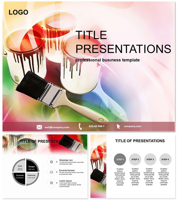
Unlock the spectrum of possibilities in your next project pitch with the Dyes and Pigments PowerPoint Template. This vibrant resource is designed for architects, designers, and contractors who need to illustrate material choices and repair strategies with vivid accuracy. From showcasing pigment applications in estate developments to detailing dye processes in construction workflows, it brings technical details to life in a palette of professional elegance.
Built for PowerPoint 2016 compatibility, the template`s layered diagrams allow precise customization, ensuring your audience sees the full hue of your vision. In an industry where color and composition matter, this tool paints a persuasive picture that elevates proposals from sketches to showstoppers.
Core Features That Bring Designs to Life
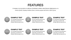
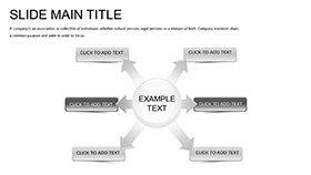
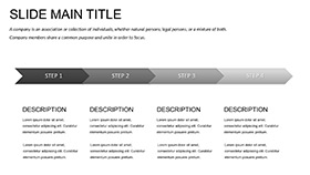
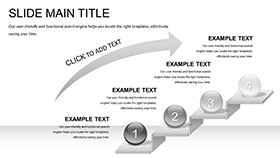
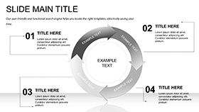
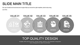
At the forefront, three master slides anchor your theme, complemented by three backgrounds mimicking material textures like canvas or concrete. The 28 diagram slides, enhanced by seven color schemes inspired by pigment families, offer endless variation for brand-specific tuning.
- Layered Color Swatches: Interactive palettes for demonstrating fade resistance or mixing ratios.
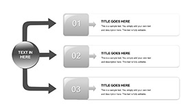
- Process Blueprints: Flow diagrams tracing dye application from lab to site.
- Material Mockups: 3D-like projections for visualizing pigment impacts on structures.
- $22 Lifetime License: Perpetual rights for all your creative endeavors.
These attributes streamline complex explanations, making your expertise accessible and admired.
Unpacking the 28 Diagram Slides
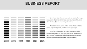
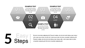
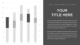
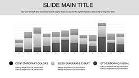
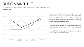
Slide 1 sets the tone with a color wheel overview, segmenting primary pigments for foundational discussions. Slides 2-5 explore bar charts as spectrum bands, comparing dye fastness across environmental factors.
Slides 6-10 map chemical compositions via molecular structures turned into org charts, linking elements to outcomes. For repair scenarios, slides 11-15 use Sankey diagrams to flow restoration costs from assessment to completion.
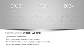
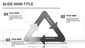
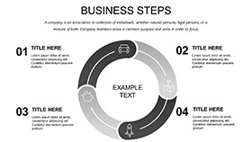
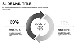
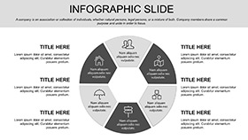
Slides 16-20 highlight sustainability with lifecycle infographics, circling eco-impacts of pigment choices. Concluding slides 21-28 feature gallery layouts for before-and-after comparisons, with gradient fills simulating aged versus restored surfaces.
Vector precision ensures scalability, perfect for large-format prints or digital zooms.
Applications in Design and Construction
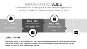
Architects adore it for client walkthroughs: the radial menu on slide 17 fans out facade options, aiding selections that streamlined a high-rise reno by 20%. Contractors use the timeline on slide 4 to sequence pigment applications, coordinating teams for on-schedule deliveries.
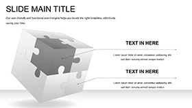
In graphic design firms, it`s for portfolio reviews - the mosaic charts on slide 22 tile project evolutions, impressing agencies with cohesive narratives. A restoration specialist once used it to win a heritage site bid, its diffusion models on slide 13 diffusing doubts about material authenticity.
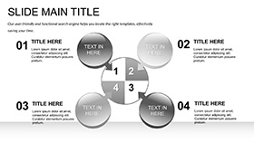
Versatile for workshops too, teaching color theory with interactive quadrants that engage learners hands-on.
Better Than Basic PowerPoint for Visual Pros
Stock tools blend colors like watered-down paints - flat and uninspired. This template layers with depth, offering gradient tools and opacity controls absent in defaults, for realistic renderings. It also auto-generates harmonies, cutting design iterations by half.
With embedded color profiles for print accuracy, it bridges digital to physical seamlessly. Choose vibrancy over vanilla.
Paint Your Path Forward: Get It Now
Infuse your slides with color and conviction. Download for $22 and claim lifetime access to designs that dazzle.
Frequently Asked Questions
Perfect for architecture pitches?
Yes, pigment diagrams vividly convey material visions and benefits.
Works with PowerPoint Online?
Affirmative, optimized for web-based editing too.
Include hex codes?
Each scheme provides exact values for precise matching.
Easy for beginners?
Guided placeholders make pro looks achievable fast.
Commercial licensing?
Lifetime covers business uses comprehensively.
Export to PDF?
Seamlessly, preserving colors and layouts.
