Data doesn't speak for itself - it needs a voice, and the Analytics and Metrics PowerPoint Template gives it one that's clear, compelling, and credible. Built for data scientists unveiling patterns, project managers tracking milestones, or financial teams auditing outcomes, this template distills metrics into narratives that inform and inspire action. With 28 purpose-built diagrams, it handles everything from KPI dashboards to trend regressions, making complex stats approachable.
Think of a product owner using the funnel attrition slide to pinpoint drop-offs, or a marketer mapping engagement heatmaps for campaign tweaks. Three masters anchor the flow: a dashboard-centric one for overviews, sequential for progress tales, and summary for takeaways. Three backgrounds - subtle grid for precision, gradient for depth - keep focus sharp. Seven color schemes, neutral to bold, adapt to your report's tone. At $22, it's efficiency encoded.
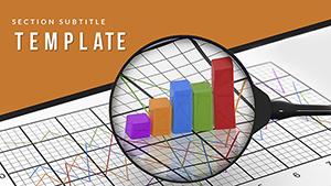
Key Pillars: Metrics Made Visual
At its core, precision plotting. Diagrams include gauge dials for threshold tracking, scatter plots for correlations, and stacked areas for composition breakdowns - all editable with formula-friendly placeholders.
Masters unify: dashboard with modular widgets, sequential with milestone markers. Backgrounds support without stealing scene - a faint axis for charts, soft wave for flows. Typography prioritizes legibility, with scalable elements for any venue.
- Palette Power: Seven schemes, data-viz optimized for differentiation and accessibility.
- Embed Ease: Slots for tables, graphs, or media from tools like Tableau.
- Format Flexibility: Exports retain interactivity for digital decks.
Step Guide: From Data to Deck
Open in PowerPoint 2016+ or Slides; thumbnails guide you. Choose dashboard master: populate KPIs, then layer the overview matrix.
- Quantify Core: Slide 4's performance pyramid hierarchies priorities, resizing tiers for emphasis.
- Trace Trails: Slide 11's cohort analysis lines track retention, coloring by segment.
- Synthesize: End with insight carousel, rotating key learnings.
A PM described how the variance bars clarified budget variances, averting overruns. Animate sequentially for build-up, revealing metrics progressively.
Practical Plays: Metrics in Motion
Versatile as APIs, it fits reports to retrospectives. In sales, conversion cascades detail journeys; finance favors balance funnels for liquidity views.
Project leads use Gantt variants for timelines, bars adjustable for delays. Educators adapt metric wheels for lesson efficacy, spokes for rubrics. A trainer once used the correlation constellation to link variables, illuminating causal links.
For updates, progress rings quantify achievements, filling dynamically. It bridges raw numbers to strategic shifts across fields.
Optimization Nuggets for Data Delivery
Contextualize with benchmarks; test resolutions for shares. Add drill-down links for depth, and recap with visual abstracts.
Get the Analytics template and metric your way to mastery.
Frequently Asked Questions
Supports live data updates?
Yes, via linked objects from Excel or similar.
Compatible with older PowerPoint?
2016 minimum, with Google Slides parity.
Suitable for financial audits?
Ideal, with precise chart tools for compliance visuals.
Number of masters?
Three, each tailored to presentation phases.
Editable for custom metrics?
Fully, with flexible axes and labels.
Best for team trainings?
Yes, interactive elements engage learners effectively.