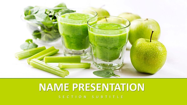
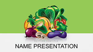
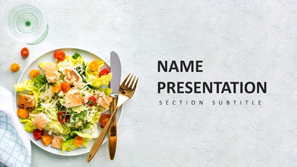
Behind every thriving eatery or booming agribusiness lies a story told through flavors and forecasts, and your slides should tantalize as much as a signature dish. The Food Industry PowerPoint Template serves up that appeal, a $22 essential for restaurateurs unveiling menus, marketers pitching product launches, or suppliers charting harvest yields.
Fresh as a just-picked salad, it layers 28 diagrams over seven lively schemes, with greens and earth tones evoking farm-fresh authenticity. Customizable to the core, it turns ingredient lists into irresistible invitations, helping you connect with audiences who hunger for more than words.
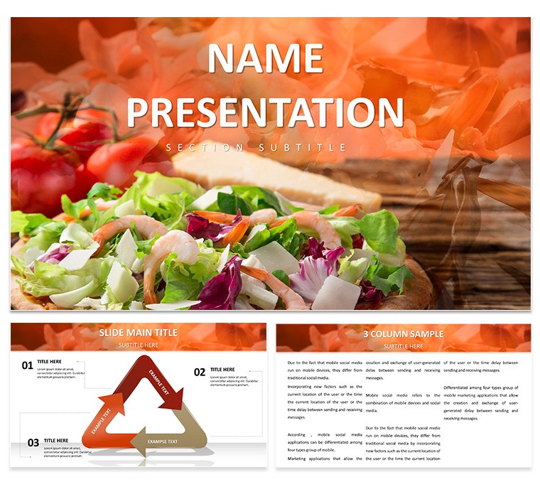
Flavorful Frameworks for Every Course
Open with the menu showcase slide, a three-column grid framing dishes with placeholder photos and tasting notes, where hover effects could reveal allergen flags - chefs use this to build anticipation in tasting events.
The market analysis pyramid stacks trends from base consumer prefs to apex opportunities, with sliceable segments for drilling into vegan surges or organic demands. For sustainability talks, the lifecycle loop traces seed to shelf in a circular flow, annotating eco-impacts at each turn.
- Recipe Breakdowns: Step infographics with timed icons for prep sequences, scaling to multi-course overviews.
- Sales Spectrum: Funnel visuals from awareness to loyalty, tagged with promo touchpoints like social campaigns.
- Harvest Horizons: Radial timelines circling seasons, plotting yields against weather variables.
These bitesize builds ensure your content digests easily, blending visuals with narratives that nourish decisions.
From Kitchen to Keynote: Delicious Deployments
In a product rollout for a new sauce line, the comparison matrix pits flavor profiles side-by-side, using spectrum bars to rate heat levels - buyers grasp pairings instantly, much like how brand managers leverage it for shelf-space arguments.
For farm co-ops, the yield forecast dashboard clusters bar charts by crop, with variance lines for risk assessments, empowering grant applications with data-driven optimism. Culinary educators adore the technique timeline, sequencing knife skills to plating in phased arrows that guide apprentices visually.
- Source Your Ingredients: Swap stock images for proprietary shots, aligning with your story's authenticity.
- Season with Stats: Infuse pie charts with survey slices on preferences, keeping portions proportional.
- Taste-Test Transitions: Fade between slides like flavor layers, maintaining a cohesive palate.
Post-pitch, clients often request decks for internal shares, their appetizing design making complex concepts memorable.
Whisking It All Together: Adaptation Essentials
Leveraging .potx for master flavors and .pptx for plated presentations, it melds with PowerPoint's tools, from shape libraries to photo editors. Three backgrounds - rustic textures or sleek whites - set tables for any venue, from trade shows to Zoom calls.
Pro plating: Group utensil icons into smartart for recipe hierarchies, recoloring to match seasonal themes. Unlike plain palettes, this template's thematic cohesion means evolving a bakery deck to brewery by subbing loaves for lagers seamlessly, versatile as a Swiss Army knife in the kitchen.
Ready to plate presentations that leave them wanting seconds? Download for $22 and cook up connections that last.
Frequently Asked Questions
Can I incorporate my photos?
Yes, high-res slots fit custom images perfectly, enhancing personal branding.
Are layouts mobile-friendly?
Optimized for screen shares, with scalable elements for seamless remote viewing.
How many diagram types?
28 varied ones, from flows to matrices, covering industry angles.
Color customization options?
Seven schemes plus full palette access for bespoke vibrancy.
Suitable for startups?
Ideal, with scalable designs that grow with your venture.
Animation included?
Yes, gentle reveals mimic cooking steps for engaging flows.