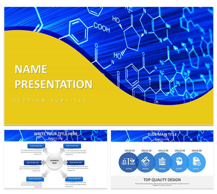
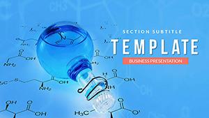
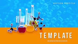
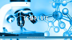
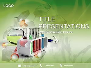
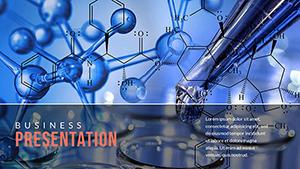
In the fast-paced world of scientific discovery, where a single insight can redefine understanding, your presentations need to match that spark. Enter the Scientific Breakthrough PowerPoint Template, a dedicated toolkit for researchers and educators eager to illuminate hypotheses, experimental results, and paradigm shifts. Tailored for academic conferences or team huddles, it weaves in motifs like interlocking molecular chains and abstract waveform patterns, symbolizing the interconnectedness of knowledge. With 28 meticulously crafted diagrams spanning seven vibrant color schemes - from cool lab blues to energizing greens - this template turns dense data into digestible visuals that foster curiosity and comprehension. Compatible with PowerPoint 2019 onward, it supports seamless edits, letting you infuse your unique findings without technical hurdles. Whether decoding genomic sequences or modeling climate impacts, this deck empowers you to bridge the gap between lab bench and lecture hall. Why settle for static slides when you can ignite discussions? Grab this template now and let your breakthroughs shine.
Essential Features That Drive Scientific Storytelling
This template's backbone consists of three master layouts, each primed for scientific discourse: a header-focused master for paper abstracts, a grid-based one for multi-panel results, and a full-bleed option for immersive timelines of discovery. Backgrounds vary from sterile white evoking cleanroom precision to subtle helix overlays that nod to DNA's elegance, all while preserving readability for projected displays.
The star attractions are the 28 diagrams, each a canvas for precision. Consider the network graph on diagram page 4, where nodes represent variables in a biochemical pathway - connect them with weighted lines to show interaction strengths, then animate paths to reveal causal flows. Or the scatter plot matrix on pages 9-11, ideal for correlation studies; cluster points with regression lines that fade in sequentially, highlighting statistical significance without jargon overload.
- Seven Thematic Color Schemes: Schemes like "Quantum Flux" in purples for physics talks or "Bio Helix" in earth tones for ecology, applied globally for thematic unity.
- Integrated Icons Library: Over 40 symbols, from pipettes to electron orbits, all scalable vectors for high-res outputs.
- Animation Presets: Built-in fades and zooms that mimic experimental reveals, controllable via slide transitions.
Such elements draw from established practices, like those in Nature journal supplements, where visuals prioritize clarity to aid peer review.
Applying the Template: From Hypothesis to Highlight Reel
For an academic conference, kick off with the title slide from master two, embedding your abstract as a layered text box over a faint spectrograph background. Transition to methodology via the flowchart on page 6: outline steps as sequential bubbles, each popping to detail reagents or controls. Present results with the heatmap on page 13, color-coding expression levels to spot anomalies, then drill down with linked detail slides.
In research proposals, use the Gantt-style timeline on page 16 to project phases, bars scaling to resource needs - adjust durations by dragging endpoints for what-if scenarios. For lectures, the concept map on page 2 branches core theories into evidence branches, fostering interactive Q&A. A step-by-step for educators:
- Select the infographic master and insert lecture objectives.
- Populate pyramid diagrams on pages 21-23 with foundational to advanced concepts.
- Embed equations via text boxes that animate to solutions.
- Conclude with discussion prompts on a mind-map slide.
This mirrors how professors at institutions like MIT structure seminars, blending visuals with narrative to sustain engagement.Team collaborations benefit from the Venn diagram on page 7 for overlapping expertise areas, or the Sankey flow on page 24 for resource allocation in grants. Science communicators adapt the abstract patterns for public talks, simplifying axes to demystify quantum entanglement for lay audiences.
Hands-On Customization for Deeper Insights
Launch in PowerPoint, navigate to slide master, and tweak fonts to something crisp like Arial Narrow for captions. Recolor schemes through the variants pane, previewing against your institution's palette. Ungroup diagrams for granular edits - say, recolor bonds in a molecular model on page 19 - or insert live charts from Excel for real-time data pulls.
Enhance with subtle tips: Use opacity layers on overlays to simulate depth in 3D models, avoiding visual noise. Limit animations to key reveals, ensuring they underscore rather than distract, as recommended in APA presentation guidelines. Output to high-res PDF for journal submissions or MP4 for virtual webinars, extending your reach effortlessly.
The Edge This Template Provides in Scientific Communication
Unlike generic slides, this template anticipates scientific workflows, offering placeholders for citations and error bars that auto-format. It's a force multiplier for PhD candidates juggling theses defenses or lab heads briefing funders, delivering polish that elevates credibility. Envision a biologist employing the evolutionary tree on page 28 to trace species divergence, branches expanding to reveal genetic markers - transforming a routine update into a riveting expedition.
Or a physicist leveraging radial charts on page 15 for particle trajectories, vectors curving dynamically to illustrate forces. These applications underscore its versatility, turning potential chaos into coherent symphonies of science.
Frequently Asked Questions
What makes this template suitable for academic use?
Its scientific motifs and data-focused diagrams align with conference standards, promoting clear hypothesis-to-conclusion flows.
Can I add my own images or data visualizations?
Yes, placeholders support drag-and-drop for photos, and charts link to external sources like CSV files.
Is it optimized for virtual presentations?
Absolutely, with widescreen ratios and transition timings tuned for Zoom or Teams compatibility.
How editable are the molecular graphics?
Fully - vectors allow path modifications, color swaps, and scaling without quality loss.
Does it include templates for statistical summaries?
Yes, pages 10-12 feature box plots and histograms ready for p-value annotations.
Are animations customizable for different audiences?
Indeed, access via the animations pane to adjust speed, order, or disable for print versions.