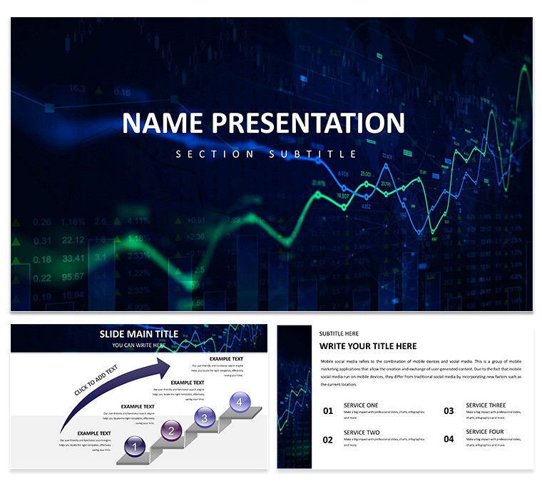
Imagine turning a sea of spreadsheets into a narrative that not only informs but inspires action. That's the power of the Financial Data Visualization PowerPoint Template, crafted for professionals who need to make numbers speak volumes without overwhelming their audience. Whether you're a financial analyst prepping for a board meeting or a consultant outlining investment opportunities, this template equips you with 28 meticulously designed diagrams across seven versatile color schemes. With three master slides and three background options, you can tailor every aspect to match your brand's voice, ensuring your presentations feel polished and purposeful from the first slide.
At its core, this template addresses the common frustration of data dumps - those dense tables that lose viewers halfway through. Instead, it offers intuitive layouts that highlight trends, comparisons, and projections with ease. Compatible with PowerPoint 2016 and later versions, it works seamlessly in .pptx, .potx, and even exports to .jpg for quick shares. Dive into pie charts that break down revenue streams or line graphs tracing market fluctuations, all fully editable so you can swap in your latest figures without starting from scratch.
Core Features That Drive Impact
Every element here is built for clarity and efficiency. The 28 diagrams cover a spectrum from basic bar charts to advanced infographics, each optimized for readability on any screen size. Choose from seven color schemes - ranging from professional blues for conservative reports to vibrant greens for growth-focused pitches - to set the right tone. The three masters provide a consistent framework: one for data-heavy slides, another for narrative breaks, and a third for calls to action.
- Editable Vectors: Resize and recolor icons and shapes without quality loss, perfect for emphasizing key metrics like ROI or EBITDA.
- Layered Backgrounds: Subtle gradients and textures that enhance without distracting, drawing eyes straight to your data points.
- SmartArt Integration: Built-in connections to PowerPoint's native tools, so timelines for fiscal quarters flow naturally into process maps.
These aren't just slides; they're tools to build trust. Picture a CFO using the waterfall chart to dissect cost variances - suddenly, the room shifts from skepticism to strategy sessions.
Real-World Applications for Financial Pros
Financial presentations often hinge on precision, but they thrive on persuasion. This template shines in quarterly evaluations, where stacked area charts visualize year-over-year growth, helping teams spot opportunities before they fade. For investment strategies, leverage the scatter plot diagrams to plot risk versus return, making abstract concepts tangible for stakeholders.
Streamlining Quarterly Reviews
- Start with the agenda slide from the master set, outlining key sections.
- Insert your balance sheet data into the clustered column charts - watch as automatic scaling keeps everything proportional.
- Transition to forecast slides with radar charts, comparing scenarios side-by-side for quick buy-in.
- Wrap with a donut chart summary, pulling in executive highlights for memorable closes.
In one case, a mid-sized firm's finance lead adapted these for their Q2 review, transforming a routine update into a forward-looking dialogue that secured additional funding. It's that shift from reporting to recommending that this template facilitates.
Economic Forecasts and Beyond
When forecasting economic trends, the template's combo charts blend lines and bars to layer inflation rates over GDP projections, revealing correlations at a glance. Consultants love it for client pitches, where a simple treemap can segment portfolio allocations by sector, sparking deeper discussions. And for keynote speeches, the infographic-heavy slides add visual punch, ensuring your message resonates long after the lights dim.
Compared to vanilla PowerPoint charts, this template cuts customization time in half by pre-building responsive elements - no more wrestling with alignment tools. Integrate it into your workflow by importing Excel data directly, and let the animations (subtle fades on data reveal) guide the eye without gimmicks.
Tips to Maximize Your Financial Narratives
To get the most out of this template, focus on storytelling arcs. Begin slides with a bold question - like "What if we doubled our margins?" - then answer with visuals. Use the color schemes strategically: cool tones for challenges, warm for wins. For team meetings, the process flow diagrams map budgeting workflows, fostering collaboration over confusion.
Don't overlook the thematic icons bundled in - currency symbols, trend arrows, and balance scales - that add context without clutter. A quick tip: Layer text over semi-transparent shapes for emphasis, creating depth that standard slides lack. Ready to make your data undeniable? Download this template now and watch your presentations gain the edge they deserve.
Frequently Asked Questions
What makes this template compatible across devices?
Designed for PowerPoint 2016 and newer, it renders crisply on desktops, laptops, and projectors, with vector-based elements ensuring no pixelation.
How editable are the diagrams?
Fully customizable - change data, colors, and labels via simple drag-and-drop, no advanced skills required.
Can I use it for non-financial presentations?
Absolutely; the versatile charts adapt well to sales metrics or project timelines in any business context.
Does it include animation presets?
Yes, subtle entrance effects are pre-applied to diagrams, but you can tweak or remove them easily.
What file formats are provided?
You'll get .pptx for editing, .potx for templates, and .jpg previews for quick references.
Is there support for dark mode?
The color schemes include high-contrast options that work well in both light and dark themes.