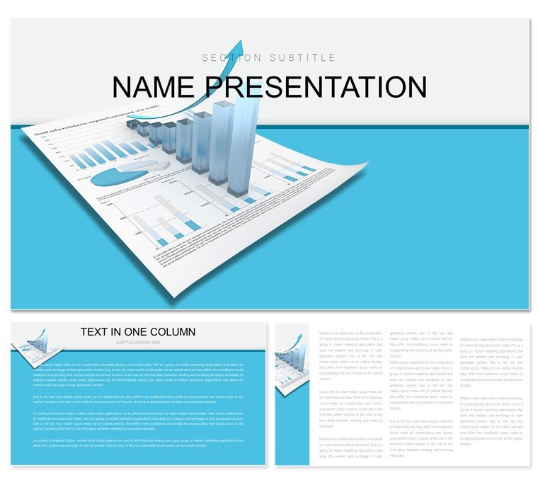
Picture your quarterly review where charts don't merely report - they reveal opportunities hidden in the numbers, sparking boardroom breakthroughs. The Graphic Analysis PowerPoint template is engineered for finance experts craving that edge, offering a refined canvas to dissect budgets, forecast revenues, and audit performances. Ideal for accountants mapping ledgers or CFOs charting fiscal health, it transforms spreadsheets into strategic stories that command attention.
Packed with 28 precision diagrams, three master frameworks for thematic unity, and three background variants from stark white to subtle grids, this tool bends to your fiscal narrative. Seven color palettes - crisp blues for stability, bold reds for alerts - ensure brand harmony, all within PowerPoint 2016+. Priced at $22, it's the affordable ally for presentations that balance detail with dazzle.
Essential Tools for Fiscal Visualization
The template's ethos is clarity amid complexity, with typography that parses dense figures like a seasoned auditor. Begin with a master slide etched in ledger lines, priming viewers for analytical depth.
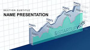
Spanning 28 diagrams, you'll encounter waterfall breakdowns for profit variances, radar plots for portfolio risks, and donut visuals for expense slices. Edit freely: recalibrate scales for currency fluctuations, infuse icons of gears and graphs, or sequence animations to trace cash cycles. Multimedia slots welcome embedded Excel dashboards or voice-annotated balance sheets for layered insights.
- Analytical Depth: Funnel charts for conversion funnels in investment pipelines.
- Effortless Tweaks: Swap datasets to refresh variance analyses on the fly.
- Interactive Layers: Hyperlink segments to drill-down appendices.
Hands-On Guide: Crafting Your Finance Deck
Fire up the file, pick a grid background for that spreadsheet vibe, then jump to slide 6 - a combo chart blending bars and lines for revenue vs. costs. Input your trial balance figures; the template's formulas handle dual-axis syncing, spotlighting margins effortlessly.
Advance to diagram 16's treemap for asset allocations - resize blocks for equity shifts, applying spin animations to prioritize high-yield quadrants. Echo techniques from Deloitte's annual visuals, tailoring to your firm's KPIs for reports that resonate with precision.
- Embed pivot tables for dynamic slicing during live queries.
- Overlay trend arrows with custom thresholds for alert visuals.
- Validate flows in outline view for logical progression.
Targeted Deployments: From Audits to Forecasts
In finance's fast lane, this template accelerates understanding. A controller might harness slide 23 - a Pareto chart - to isolate top variances, Pareto principle in action, directing audits where impact peaks.
For strategic planning, diagram 27's scenario matrix weighs bull-bear outcomes, with quadrants customized for sensitivity tests. This fosters foresight, akin to how PwC frames risk matrices. Tax advisors could adapt slide 11's timeline for deduction tracks, annotating with policy icons for client clarity.
Outpacing basic tools, its finance-tuned shapes - like balance scales - infuse relevance sans rework. Insight: Anchor each graphic with a fiscal implication note, bridging numbers to narratives.
Custom Fits for Accounting Arenas
For forensic work, pyramid diagrams (4-9) stack fraud indicators, apexing at red flags. Insert evidentiary hyperlinks for thorough probes. Budgeteers favor modular stacks in later slides, building variance bridges with adjustable spans.
In advisory roles, collage overviews merge KPIs with sector benchmarks via photo integrations. Sync with QuickBooks exports for accuracy, then finesse here for executive polish. Claim your analytical advantage - grab this template and illuminate the ledgers.
Advanced Tactics for Impactful Delivery
Amplify engagement by syncing visuals to queries: for earnings calls, use clickable pie slices linking to reconciliations. Vary schemes - monotones for compliance docs, contrasts for growth pitches - to modulate focus.
Drawn from practitioner feedback, it guarantees fidelity across formats for virtual audits or in-person briefings. More than metrics, it's the lens sharpening fiscal foresight in uncertain times.
Frequently Asked Questions
Compatible with older PowerPoint versions?
Designed for 2016+, but check animations in trial runs for legacy setups.
How versatile are the diagrams for custom data?
All 28 adapt seamlessly, from revenue streams to risk matrices.
Supports Excel integration?
Yes, link charts directly for auto-refreshing financial models.
Best for team collaborations?
Export to shared drives or Google Slides for joint refinements.
Any tips for animation timing?
Sync to 2-3 seconds per reveal, aligning with speaking pace.