In the fast-paced world of finance, where numbers tell stories louder than words, the right visuals can turn complex data into compelling insights. Enter the Financial Charts PowerPoint template - a powerhouse of 28 precision-engineered diagrams designed for professionals who need to distill budgets, forecasts, and performance metrics into digestible masterpieces. Tailored for CFOs, analysts, and team leads, this template eliminates the drudgery of building charts from scratch, letting you focus on strategy instead of styling.
What makes it indispensable? Its ability to reveal patterns at a glance, like spotting revenue dips before they snowball or highlighting investment returns with elegant lines. Compatible with PowerPoint 2016 and beyond, it's your go-to for quarterly reviews, investor pitches, or client reports, ensuring every slide reinforces your narrative with unshakeable authority.
Discover Features Built for Fiscal Precision
This template isn't just a collection of slides; it's a toolkit for financial fluency. With seven color schemes per diagram, you can align visuals to corporate palettes - subtle grays for conservative reports or vibrant accents for growth-focused decks. Every element is vector-scalable and fully editable, from data labels to axis ticks.
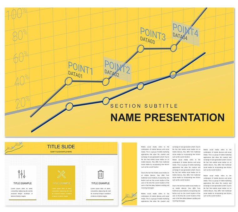
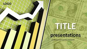
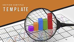
- Diverse Chart Arsenal: Bar graphs for expense breakdowns, line charts for trend tracking, and pie slices for portfolio allocations.
- Smart Animations: Sequential builds that unveil metrics progressively, building suspense like a well-timed earnings call.
- Professional Icons: Built-in symbols for currencies, stocks, and ledgers to add context without clutter.
These features shine in action: a stacked area chart can layer operating costs over time, making seasonal fluctuations pop without overwhelming the viewer.
Effortless Editing: Tailor to Your Data Story
Customization here is intuitive, empowering even non-designers. Start with one of three master layouts, apply a background from the trio of options, and populate your chosen diagram. PowerPoint's native tools handle the rest - link to Excel for live updates, or manually input figures with auto-formatting.
- Launch the .pptx and navigate to your slide deck of 28 options - perhaps the waterfall chart for cash flow analysis.
- Edit data points directly; formulas recalculate on the fly.
- Fine-tune visuals: adjust scales for outlier-heavy datasets or add trendlines for projections.
- Preview in presenter view to sync with your talking points.
Extend functionality by embedding pivot tables or linking to external dashboards, keeping your presentation dynamic for ongoing projects.
Practical Scenarios: Where Finance Meets Impact
For a mid-sized firm's annual audit, this template's donut charts clarify asset distributions, helping stakeholders prioritize reallocations. In venture capital pitches, radar charts compare startup metrics against benchmarks, visually arguing for funding with data-driven poise.
Financial advisors find it gold for client meetings: use the combo chart to overlay actual vs. projected returns, turning abstract advice into concrete roadmaps. A controller once adapted the Gantt-style timeline for project budgeting, aligning timelines with cost curves to preempt overruns.
Beyond corporates, it's handy for personal finance workshops - bubble charts mapping risk vs. reward in investment choices, making concepts accessible to novices.
Versus Basic Builds: The Edge in Efficiency
Default PowerPoint charts often lack finesse, with rigid grids that fight custom data. This template's responsive designs adapt fluidly, and the pre-configured schemes save recalibration time. It's like having a seasoned analyst on your design team - polished output, minimal effort.
Expert Strategies for Data-Driven Decks
Amplify engagement by animating outliers first, drawing eyes to key variances. For dense reports, layer info with hyperlinks to appendix details. Ensure mobile compatibility by testing exports, ideal for on-the-go execs.
Build consistency by standardizing chart styles across your fiscal year series, creating a branded thread that builds trust over time.
Empower your financial narratives - secure this template for $22 and let your charts do the convincing.
Frequently Asked Questions
Does it integrate with Excel data?
Yes, charts link seamlessly to Excel for automatic updates.
Can I change the chart types?
All diagrams are editable, allowing swaps or hybrids as needed.
What if I need more than 28 slides?
Duplicate and modify existing ones to expand your deck infinitely.
Is it optimized for large datasets?
Vector elements handle complex data without performance lags.
How do the color schemes work?
Apply any of the seven per diagram for quick thematic shifts.