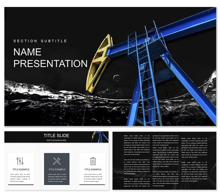
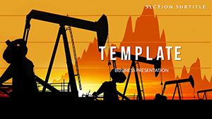
Imagine standing in a boardroom, charts flickering on the screen as you unpack the ripple effects of fluctuating crude oil prices on global economies. For oil importers, it's a breath of fresh air - lower fuel costs easing inflation and boosting consumer spending. For exporters, it's a wake-up call to diversify strategies. This Crude Oil Prices Market PowerPoint template turns those complex dynamics into clear, visually striking narratives. With 28 ready-to-use diagrams, three master slides, and three background options, it's built for professionals in the energy sector who need to communicate market trends without the hassle of starting from scratch.
Whether you're preparing a report for stakeholders on how price drops benefit importers by slashing energy bills or highlighting challenges for exporters like reduced revenues, this template equips you with tools that blend data precision and design elegance. Compatible with PowerPoint 2016 and later, it comes in .pptx, .potx, and .jpg formats, ensuring seamless integration into your workflow. At just $22, it's an investment that pays off in hours saved and audiences captivated.
Unlocking Key Features for Impactful Energy Presentations
The heart of this template lies in its versatility. Start with the three master layouts, each tailored to different presentation styles: one for data-heavy overviews, another for timeline-based forecasts, and the third for comparative analyses. Switch between three backgrounds - subtle gradients evoking oil fields or clean corporate blues - to match your brand's tone.
At the core are the 28 diagrams, each editable to fit your specifics. Picture slide one: a line graph tracing historical oil price volatility, with customizable axes for adding recent Brent or WTI benchmarks. Or slide 12, a pie chart breaking down importer savings across sectors like transportation and manufacturing - simply drag to resize segments and update labels. With seven color schemes, from earthy tones for a grounded feel to vibrant contrasts for emphasis, your visuals adapt to any light, be it a dim conference hall or a bright webinar.
- Editable Elements: Every shape, icon, and text box is fully customizable, letting you swap in real-time data without design glitches.
- Icon Library: Over 50 energy-themed icons, like barrel symbols and pipeline graphics, to illustrate supply chains intuitively.
- Animation-Ready: Built-in subtle transitions for revealing data points sequentially, keeping viewers engaged without overwhelming them.
Streamlining Your Workflow with These Diagrams
Let's walk through a practical application. Suppose you're briefing a team on exporter vulnerabilities. Open slide 5, a bar chart comparing revenue losses across major producers. Input your figures - say, Saudi Arabia's dip versus Russia's resilience - and the template auto-adjusts scales for clarity. Add annotations via the integrated text overlays, drawing direct lines to implications like investment shifts toward renewables.
For importers, slide 18 shines: a flowchart mapping cost savings to economic multipliers, such as reduced logistics expenses fueling infrastructure projects. Edit the nodes to include local examples, like how lower oil prices could accelerate urban transit upgrades in emerging markets. This isn't just about pretty slides; it's about making abstract economics tangible, helping decision-makers spot opportunities amid volatility.
Real-World Applications in the Oil Sector
In the fast-paced world of energy markets, clarity wins deals. A commodities analyst might use this template to forecast price scenarios for a client pitch, layering in geopolitical factors via the infographic on slide 22. Customize the world map overlay to highlight trade routes, color-coding risk zones for instant insight.
Consider a scenario from a recent industry forum, where presenters dissected OPEC decisions' downstream effects. With this tool, you could replicate that: slide 9's Sankey diagram visualizes flow from extraction to end-user pricing, editable to show subsidy impacts in importing nations. It's like having a conversation starter baked into your deck - viewers lean in, questions flow, and your expertise stands out.
Beyond forecasts, apply it to sustainability reports. Slide 25's Venn diagram overlaps oil dependency with green transitions, perfect for discussing hybrid strategies. Tweak intersections to reflect policy shifts, ensuring your presentation aligns with forward-thinking agendas.
Step-by-Step Guide to Customizing for Your Pitch
- Import Data: Copy-paste Excel stats into charts; the template's smart links update visuals automatically.
- Theme Alignment: Select a color scheme that echoes your company's palette - test on slide 3's scatter plot for supply-demand correlations.
- Add Narratives: Use placeholder text on slide 15 to weave in stories, like how price stability aids small exporters in diversifying crops.
- Preview and Polish: Run through animations on slide 20's timeline of price cycles, adjusting fades for smooth delivery.
- Export Ready: Save as PDF for handouts, retaining vector quality for prints.
This process typically takes under an hour, transforming raw numbers into a polished story that resonates.
Why This Template Outshines Basic PowerPoint Builds
Stock PowerPoint shapes often feel clunky, requiring manual alignment that eats time. Here, pre-aligned elements ensure professional polish from the get-go. Unlike generic templates, these diagrams are oil-market specific - think dedicated sliders for volatility metrics on slide 7, absent in standard libraries.
Users appreciate the focus on accessibility: high-contrast options in every scheme make data legible for all, while scalable vectors prevent pixelation on large screens. Integrate it with tools like Tableau exports for dynamic embeds, elevating your deck beyond static slides.
Download this Crude Oil Prices Market PowerPoint template today for $22 and turn market chaos into clear strategy sessions.
Frequently Asked Questions
Is this template compatible with older PowerPoint versions?
It's optimized for PowerPoint 2016 and newer, but .pptx files open in earlier versions with minor adjustments.
How many color options are available?
Seven distinct schemes, each with coordinated diagrams for quick swaps.
Can I use it for Google Slides?
Yes, export to Google Slides via .pptx, though some animations may need tweaking.
Are the diagrams fully editable?
Absolutely - resize, recolor, and replace data effortlessly.
Does it include icons for energy themes?
Yes, a curated set of 50+ icons tailored to oil and market visuals.
What's the file size for downloads?
Around 10MB, including all formats for easy sharing.