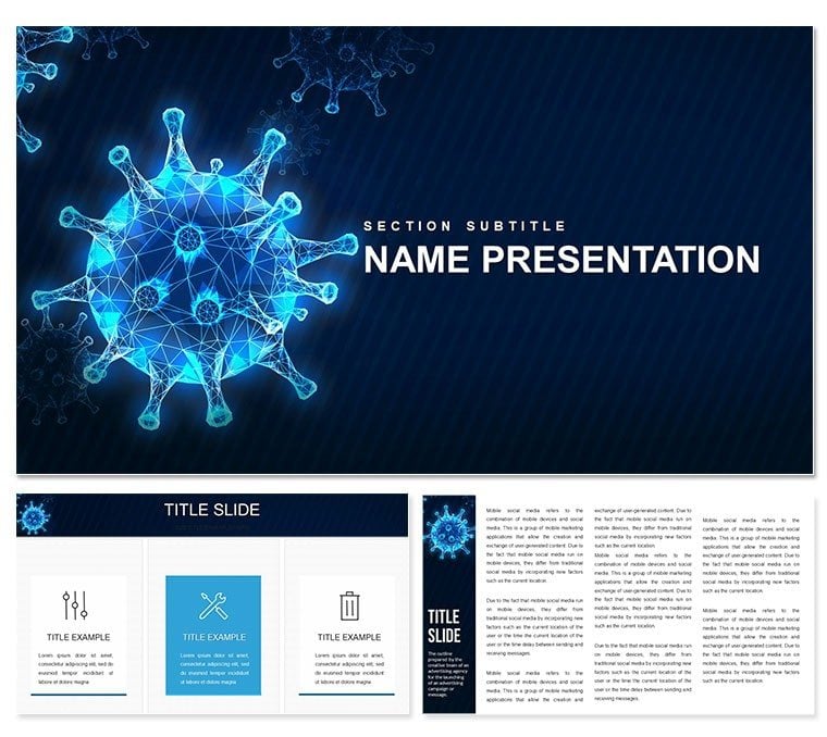
In the realm of medical education and research, conveying the intricacies of viral infections demands visuals that are as precise as they are powerful. Enter the Virus Moderna PowerPoint template, a specialized resource designed for professionals dissecting the epidemiology of microorganisms that plague humans, animals, and plants. This isn't your standard slide deck; it's a 28-diagram powerhouse with seven color schemes, engineered to illuminate the parasitic dance of viruses within host cells.
Targeted at virologists, pharma researchers, and health educators, this template transforms complex data into digestible narratives. Envision mapping outbreak patterns on a geospatial slide or detailing replication cycles with layered animations - all fully customizable in PowerPoint 2016 or newer, and even Google Slides for collaborative tweaks. Drawing inspiration from real-time reporting like those in global health briefings, it equips you to foster understanding without overwhelming your audience.
Why settle for abstract sketches when you can deploy infographics that mirror the structured chaos of viral spread? This template's clean lines and thematic motifs - think electron microscope-inspired icons - make it a go-to for lectures or lab reports. If you're gearing up for a conference talk on emerging strains, this is your canvas. Let's explore how it can sharpen your message.
Core Elements: Diagrams That Decode Viral Dynamics
The template's backbone is its three master layouts, each tailored to narrative phases: introductory overviews with broad timelines, deep-dive sections for molecular details, and conclusive summaries with key takeaways. Paired with three background variants - from sterile lab whites to gradient evoking cellular membranes - these ensure a unified look that underscores scientific rigor.
Diving into the 28 diagrams, each serves a pivotal role in viral storytelling. Slide 3's cycle diagram traces the lytic pathway, with editable segments for incubation periods and symptom onset, allowing you to input strain-specific timelines. Slide 11 introduces a vector map for transmission routes, complete with pin icons for zoonotic hotspots, scalable to regional or global scales. These aren't mere placeholders; they're vector-based for crisp prints or zooms, compatible across devices.
Seven color schemes add nuance: cool blues for asymptomatic phases, warming reds for outbreak alerts, all adjustable via theme switcher. This flexibility means adapting for veterinary contexts or human-focused pharma pitches with minimal effort, much like modular lab protocols.
- Molecular Visuals: Helix structures and protein spike models ready for data overlays on mutation rates.
- Epidemiology Tools: Bar graphs for R0 values and scatter plots for case fatality correlations.
- Intervention Highlights: Flowcharts depicting vaccine efficacy stages.
Streamlining Your Research Presentation Workflow
Implementation is intuitive: Unzip the download, launch the .pptx in PowerPoint, and use the outline view to rearrange slides. For a transmission model on slide 16, drag in your SIR data - susceptible, infected, recovered - and let formulas auto-update curves. Export as interactive PDF for journal submissions, or share via OneDrive for peer reviews.
This mirrors workflows in research teams, where visuals accelerate hypothesis testing. A pharma analyst might recount how such structured decks clarified trial endpoints during regulatory filings, bridging gaps between lab findings and approvers.
Practical Scenarios: From Classroom to Conference Hall
Picture a university lecture on pandemics: Kick off with slide 1's overview infographic of viral families, then pivot to slide 9's phylogenetic tree illustrating evolutionary branches. By slide 22, a risk assessment matrix weighs containment strategies, engaging students in debate. This progression builds comprehension layer by layer, turning passive note-taking into active inquiry.
In corporate settings, leverage it for R&D updates: The host-pathogen interaction diagram on slide 19 becomes a canvas for novel antiviral mechanisms, with callouts for binding affinities. Compared to ad-hoc builds, this template's pre-vetted layouts cut iteration cycles, freeing time for lit reviews.
- Educational Modules: Dissect replication strategies to demystify antiviral targets for undergrads.
- Policy Briefs: Visualize surveillance gaps to advocate for funding in public health forums.
- Lab Meetings: Track experiment progress with milestone timelines tied to viral load metrics.
Health communicators have found these tools invaluable for outbreak simulations, where clarity can influence response protocols.
Navigating Challenges in Viral Communication
Distilling intracellular parasitism often trips up presenters - too much jargon, not enough flow. Here, pyramid diagrams on slide 7 stratify infection stages, from entry to egress, easing audiences into technical depths. Versus basic PowerPoint, which scatters elements haphazardly, these enforce logical sequencing, with subtle animations revealing layers progressively.
For diverse crowds, icon glossaries on appendix slides define terms like "quasispecies," promoting inclusivity. Pro tip: Pair with hyperlinks to PubMed abstracts for deeper dives, transforming your deck into a navigable resource.
Expert Strategies to Amplify Your Impact
Layer narratives strategically: Frame viruses as antagonists in a host-defense saga, using hero-villain motifs sparingly for engagement. Audit for accessibility - ensure alt text on images describes "viral envelope diagram" - to meet presentation standards. Collaborate by locking master elements, allowing team edits without style drift.
This template elevates beyond utility, becoming a partner in persuasion. As one epidemiologist reflected, it reframed dry data into compelling cases, swaying grant committees with visual eloquence. Secure yours today to decode the viral frontier with unmatched clarity.
Frequently Asked Questions
What is the focus of the Virus Moderna template?
It centers on viral infectious diseases, covering epidemiology, replication, and host interactions through specialized diagrams.
Are the diagrams editable in detail?
Yes, every element - from shapes to data labels - is fully vector-editable for precise customization.
Does it work with older PowerPoint versions?
Optimized for 2016+, but backward-compatible tweaks via save-as ensure usability in earlier editions.
Can this be used for animal health presentations?
Absolutely, with adaptable visuals for zoonotic and veterinary contexts.
How do the color schemes enhance usability?
They differentiate phases like incubation (cool tones) from peaks (warm tones), aiding quick comprehension.