Craft Compelling Headlines: Versatile Shapes Keynote Template


Type: Keynote Shapes template
Category: Tables
Sources Available: .key
Product ID: KS00047
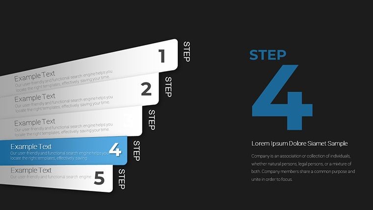
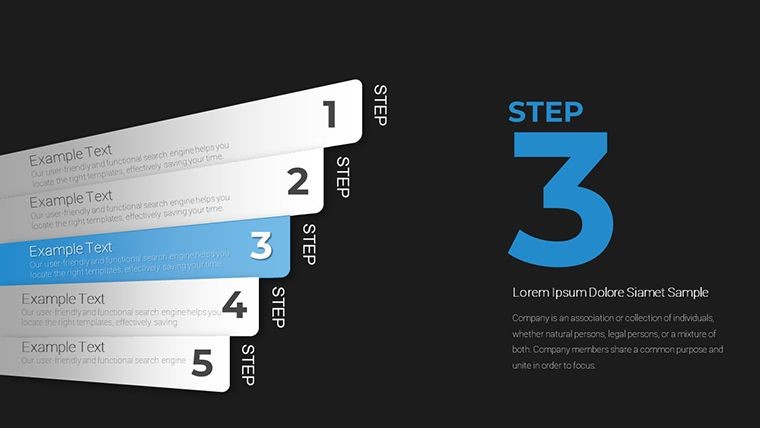
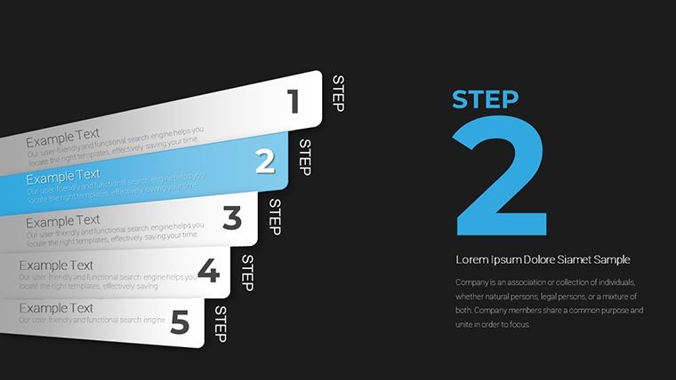
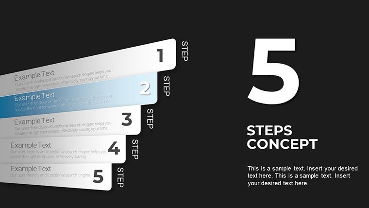
Template incl.: 15 editable slides
Headlines aren't just words - they're the hooks that reel in your audience, especially when paired with metrics that tell a story of success. If you're tired of bland title slides that fail to frame your data effectively, our Headline Keynote Shapes Template is here to revolutionize your approach. Boasting 15 editable slides optimized for showcasing values, lists, and key performance indicators, this template turns everyday presentations into polished masterpieces. Tailored for professionals who juggle numbers daily - think analysts, project leads, or sales reps - this collection draws from design principles championed by experts like Edward Tufte, emphasizing clarity over clutter.
Why settle for default Keynote shapes when you can have versatile, metric-focused designs that adapt to your narrative? Each slide is a canvas for bold headlines that command attention, seamlessly integrating numerical lists without overwhelming the viewer. Compatible with Keynote's robust editing suite, these shapes export effortlessly to PowerPoint or Google Slides, ensuring your vision travels across platforms. Join the ranks of users who've slashed design time by half while boosting audience retention - let's unpack how this template can supercharge your metrics storytelling.
The Power of Shapes in Metrics Mastery
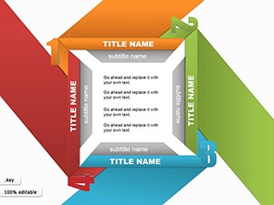
In data-heavy worlds, shapes aren't mere decorations; they're structural anchors that guide the eye and amplify impact. This template redefines headline integration by offering geometric elegance - circles for holistic overviews, rectangles for linear progressions, and arrows for directional insights. Imagine a slide where your quarterly revenue headline sits atop a cascading list of regional breakdowns, each value encapsulated in a tailored shape that echoes your brand's geometry.
The perks? Enhanced scannability reduces cognitive load, allowing viewers to grasp trends at a glance. In one testimonial from a fintech consultant, deploying these shapes in client reviews led to 40% more follow-up queries - proof that visual framing drives dialogue. Plus, with built-in accessibility features like high-contrast options, your presentations resonate inclusively.
Spotlight on Standout Features
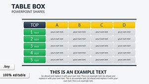
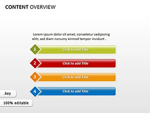
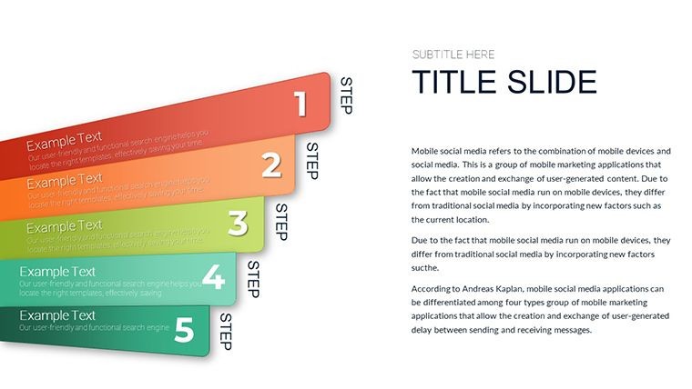
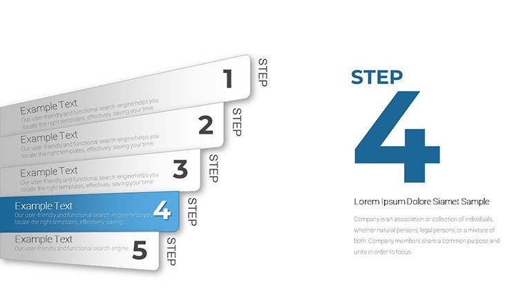
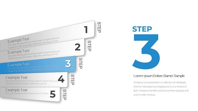
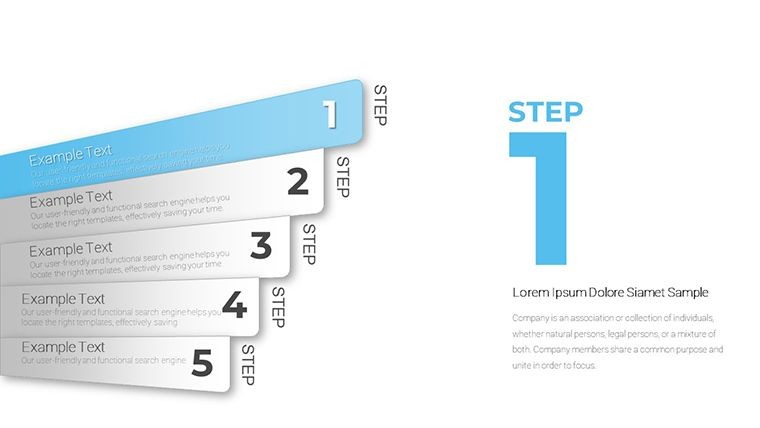
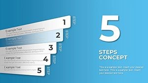
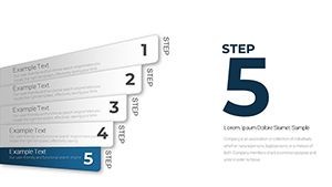
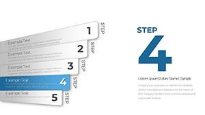
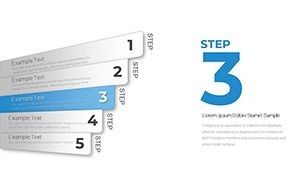
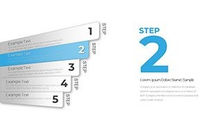
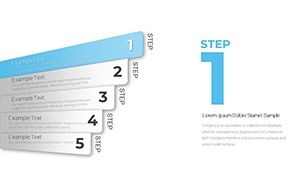
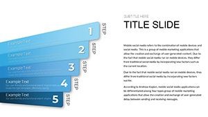
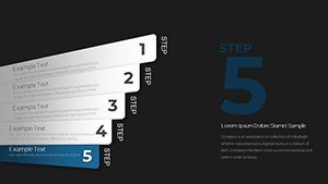
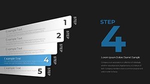
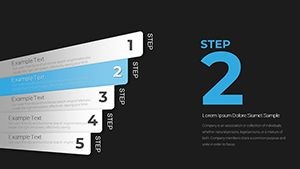
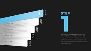
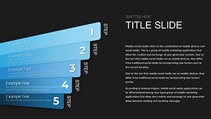
- 15 Customizable Slides: Dedicated layouts for single metrics, comparative lists, and hierarchical data displays.
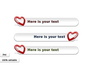
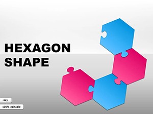
- Shape Versatility: Mix-and-match elements like hexagons for innovation metrics or timelines for sequential values.
- Metric Integration: Pre-formatted text boxes and number placeholders that auto-scale for legibility.
- Color Harmony: A palette of 20+ scheme variations, from corporate neutrals to vibrant accents, all vector-sharp.
- Cross-Platform Ready: Flawless Keynote core, with tips for PowerPoint tweaks to maintain fidelity.
These aren't off-the-shelf fillers; they're precision tools forged to elevate your metrics from mundane to magnetic, solving the eternal struggle of making numbers narrate without narrating over your points.
From Boardrooms to Breakouts: Tailored Use Cases
Picture a sales director prepping for the monthly pipeline review. Slide one: A headline "Q3 Wins" crowned by a starburst shape enclosing top deals, followed by a bulleted list of conversion rates in aligned ovals. It's not just data - it's a victory lap visualized.
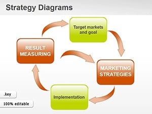
Shift to education: A professor illustrating economic indicators uses stacked bar shapes under a "Global Trends" header, each segment color-coded for instant differentiation. Or in project management, timeline shapes under "Milestone Metrics" track deliverables, turning Gantt-like complexity into digestible headlines.
Real-world ripple: A marketing agency adopted this for campaign recaps, reporting smoother stakeholder alignments as shapes intuitively clustered ROI highlights. Whether dissecting user engagement stats for app developers or budgeting breakdowns for event planners, this template adapts, proving its worth in diverse arenas.
Your Roadmap to Radiant Presentations
- Select Your Shape Story: Choose layouts matching your data type - linear for lists, radial for aggregates.
- Populate with Precision: Input values via Keynote's formula bar for dynamic calculations on the fly.
- Style for Impact: Apply gradients or shadows sparingly to add depth without distraction.
- Test Transitions: Animate shape reveals to pace your delivery, building suspense around key metrics.
- Export and Share: Generate PDFs or videos for post-meeting recaps, keeping the shine alive.
This sequence streamlines creation, letting you focus on insights over ink. Users rave about the "aha" moments when shapes align perfectly, mirroring the harmony of well-orchestrated data.
Why This Template Outshines the Rest
Forget bloated libraries of mismatched shapes; our template curates for metrics alone, ensuring every element serves your headlines. Versus stock Keynote options, these boast advanced layering for overlays - like nesting values within parent shapes for drill-downs - without the learning curve.
Infuse LSI richness: Think "KPI visualization packs" or "data headline frameworks" to broaden appeal. The result? Decks that don't just inform but inspire action, backed by design ethos prioritizing user empathy over flashy effects.
Shape Your Success Story Now
Don't let flat metrics flatten your message. Download this Headline Shapes Template today, mold it to your metrics, and headline your way to acclaim. Your audience awaits the reveal - make it shapely and unforgettable.
Frequently Asked Questions
What makes these shapes ideal for metrics?
Their geometric precision and scalable vectors ensure metrics display cleanly, enhancing readability and focus.
Are animations included?
Yes, subtle build-in effects are pre-set, customizable to match your pacing needs.
Can I resize shapes freely?
Absolutely - vector-based design allows infinite scaling without quality dips.
Is Google Slides compatibility available?
Export to PPTX first, then import; most elements transfer smoothly with minor adjustments.
How many color options are there?
Over 20 themed palettes, plus full RGB control for bespoke branding.