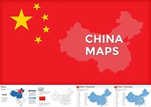
China Maps Keynote Template: Unlock Regional Insights with Precision


Type: Keynote Maps template
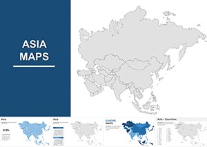
Category: Asia
Sources Available: .key
Slide size: widescreen (16:9) , standart (4:3) , widescreen (16:10)
Product ID: KM00073
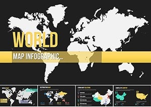
Template incl.: 54 editable slides
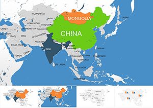
Imagine standing before a room full of stakeholders, effortlessly guiding them through the intricate web of China's diverse regions - from the bustling metropolises of the east to the vast western plateaus. That's the power of our China Maps Keynote Template, a meticulously crafted collection of 54 editable slides designed specifically for professionals who need to convey complex geographical and economic data with clarity and flair. Whether you're an architect plotting urban development sites across provinces or a business analyst dissecting market potentials, this template transforms raw data into compelling visual stories that resonate.
In today's globalized world, understanding regional nuances in China is crucial for success. Our template draws on real-world applications, like how firms such as Gensler use similar mapping tools to align international projects with local contexts, ensuring compliance with standards like those from the China Architecture Society. With fully customizable elements, you can adapt maps to highlight everything from infrastructure timelines to demographic shifts, saving hours of design time while elevating your presentation's professionalism.
Key Features That Set This Template Apart
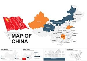
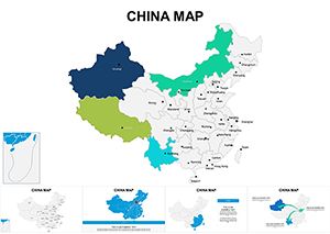
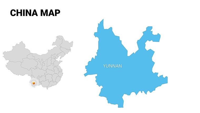
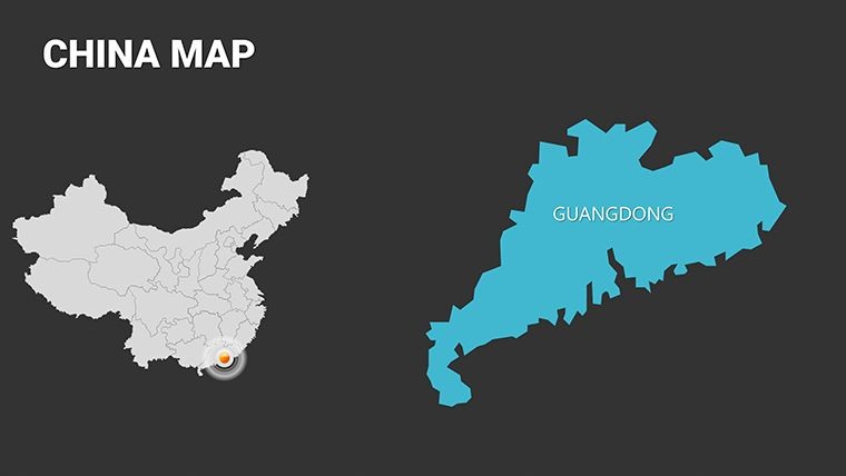
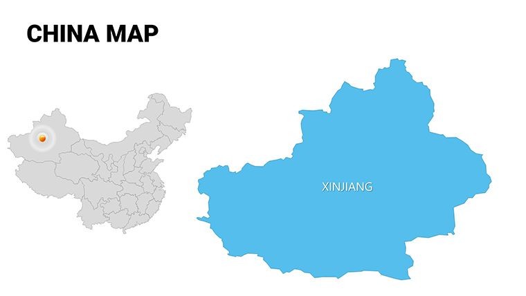
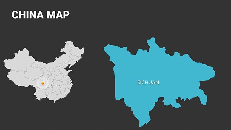
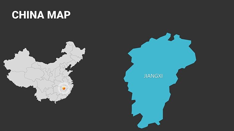
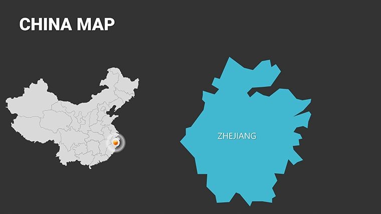
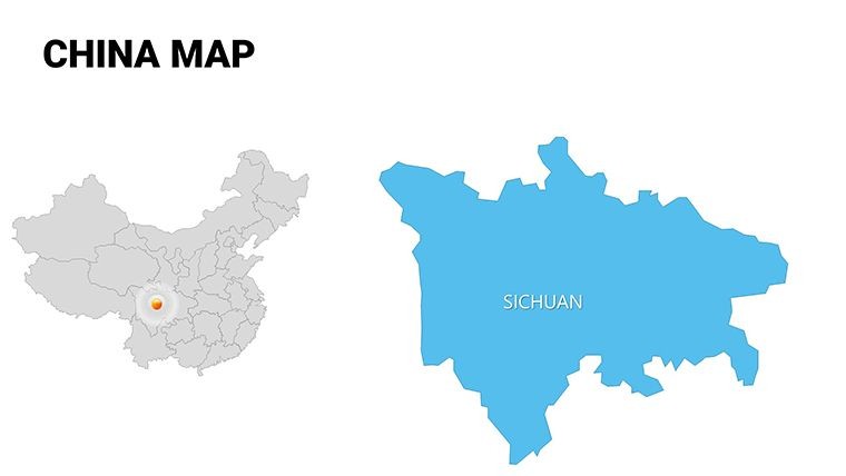
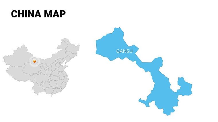
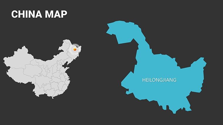
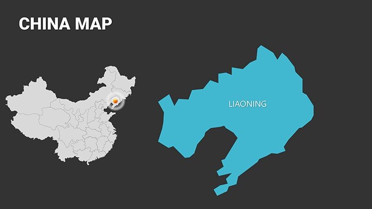
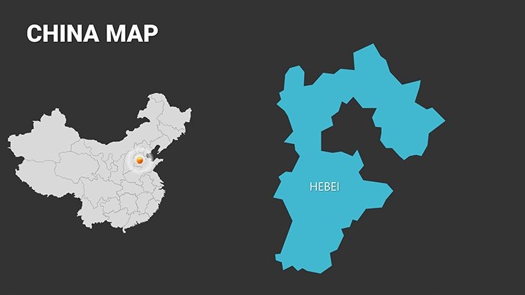
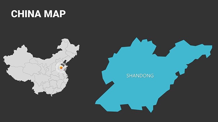
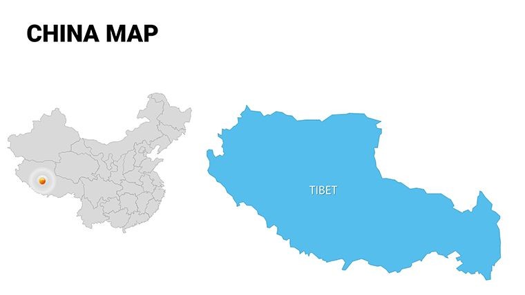
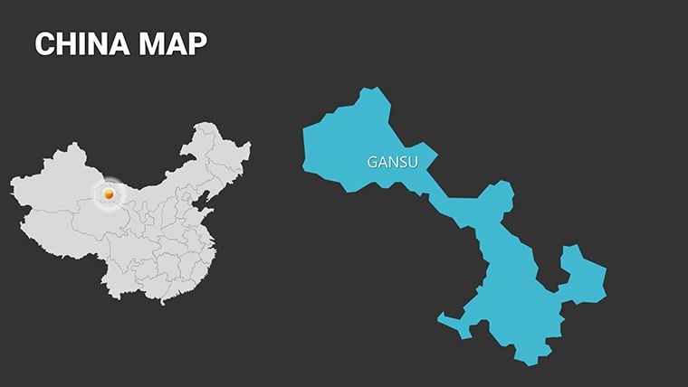
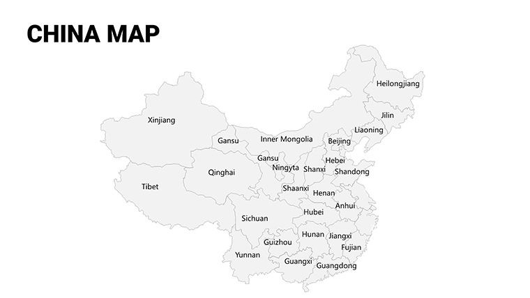
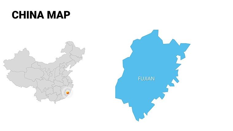
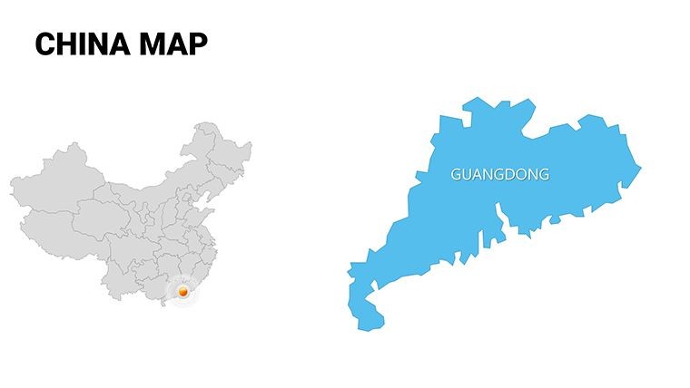
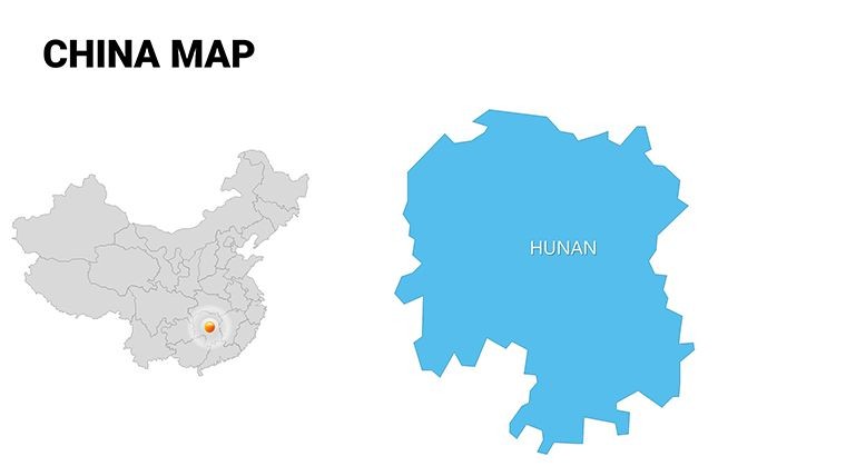
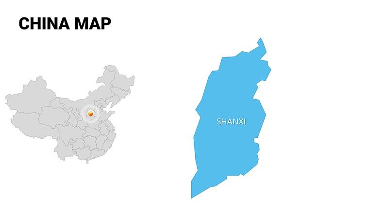
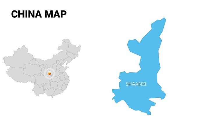
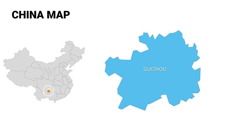
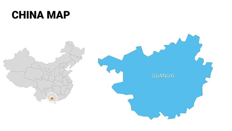
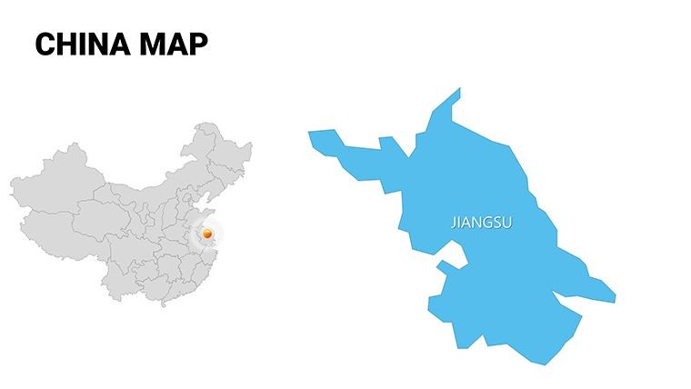
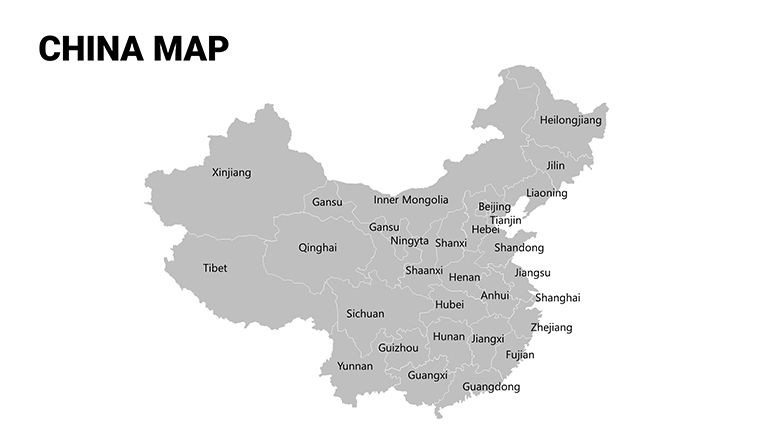
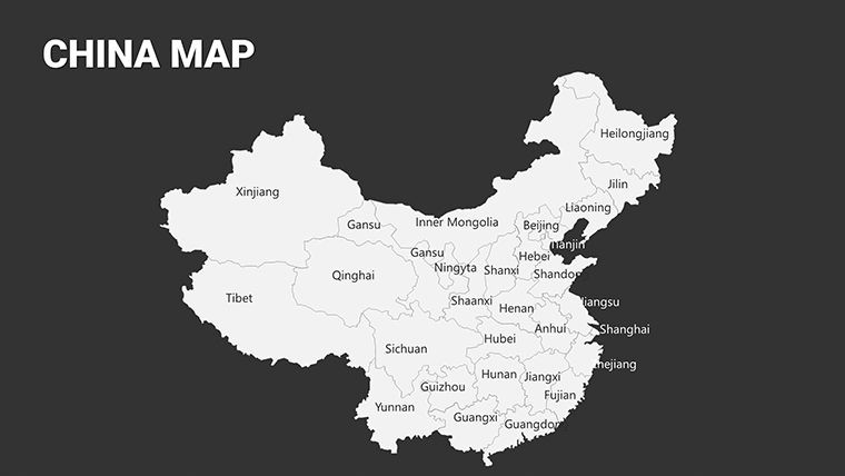
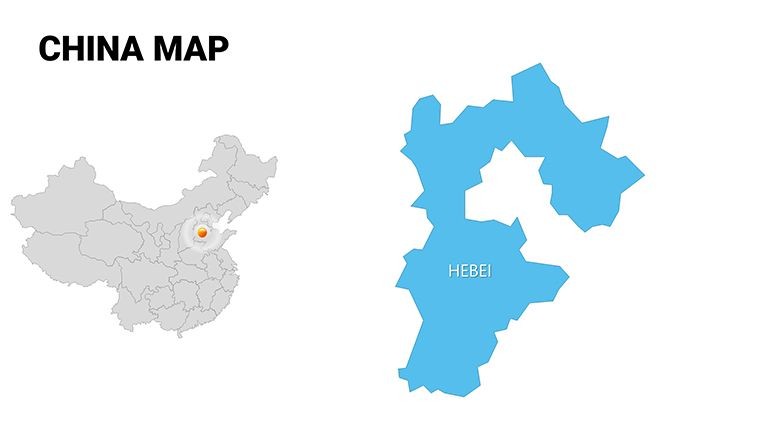
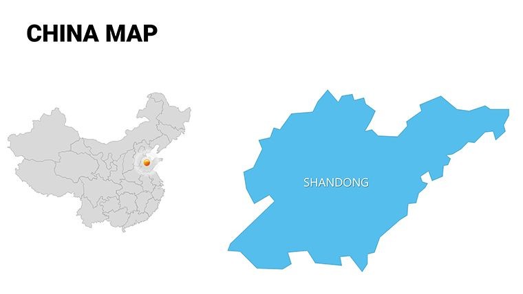
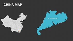
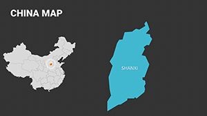
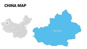
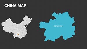
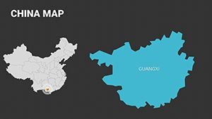
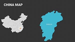
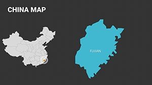
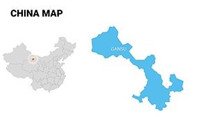
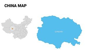
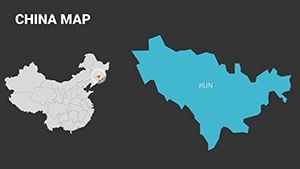
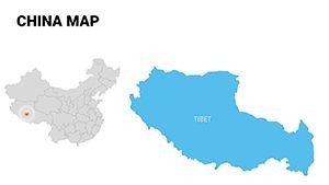
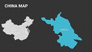
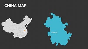
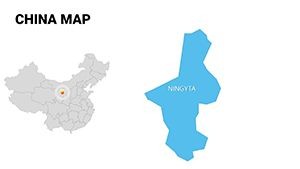
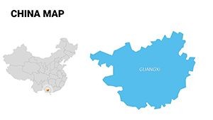
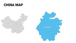
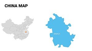
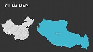
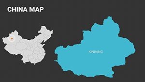
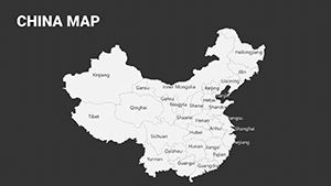
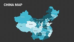
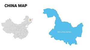
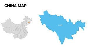
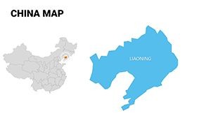
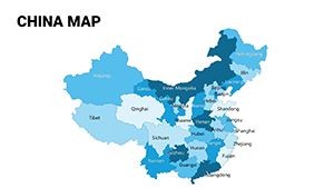
What makes this China Maps Keynote Template a standout choice? It's not just about the slides; it's about the thoughtful integration of tools that make your workflow seamless. Starting with the core: 54 high-resolution, vector-based maps covering all major regions, including detailed breakdowns of provinces like Guangdong, Sichuan, and Xinjiang. Each map is pre-layered for easy editing - toggle visibility on transportation networks, population densities, or economic zones without starting from scratch.
- Editable Vector Graphics: All elements, from city markers to boundary lines, are scalable and modifiable in Keynote, ensuring crisp visuals even on large screens.
- Themed Icon Sets: Over 100 region-specific icons, such as factories for industrial areas or high-rises for urban centers, inspired by authentic Chinese design motifs to add cultural relevance.
- Integrated Charts and Graphs: Pair your maps with dynamic pie charts for GDP distribution or line graphs tracking Belt and Road Initiative progress, all linked for real-time updates.
- Color-Coded Schemes: Five professional palettes, including earthy tones for geographical accuracy and vibrant contrasts for emphasis, compliant with accessibility standards like WCAG for inclusive presentations.
Beyond the basics, this template includes timeline slides for historical context - think visualizing the evolution of Shanghai's skyline - and infographic layouts for comparing regional disparities, such as urbanization rates between coastal and inland areas. For architects, slides like the site analysis overlay allow you to superimpose project blueprints onto provincial maps, demonstrating how designs fit within local landscapes.
Real-World Use Cases: From Urban Planning to Market Strategy
Let's dive into how this template shines in practical scenarios. Consider an architecture firm pitching a sustainable development project in the Yangtze River Delta. Using slide 12's customizable regional map, you can overlay environmental impact data, showing how your eco-friendly towers integrate with existing waterways and green spaces. This not only impresses clients but also aligns with AIA-equivalent guidelines in China for environmentally conscious design.
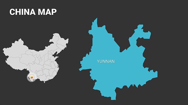
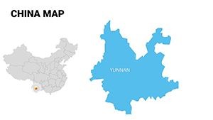
In business settings, slide 28's economic heatmap is perfect for sales teams analyzing consumer trends. Highlight hotspots in e-commerce growth across Hebei versus traditional markets in Yunnan, backed by data from sources like the National Bureau of Statistics. One user, a consultant at McKinsey-inspired firms, reported cutting presentation prep time by 40% while boosting engagement through interactive map zooms.
- Project Pitches: Architects use the template's layered maps (slides 5-15) to illustrate site selections, factoring in seismic zones and transportation hubs for resilient builds.
- Educational Seminars: Professors layer demographic data on slides 20-30 to teach about migration patterns, making abstract concepts tangible.
- Investor Meetings: Finance pros on slides 35-45 visualize FDI inflows, using bar graphs synced to maps for a holistic view of investment viability.
Compared to generic PowerPoint defaults, this Keynote-native template offers superior animation controls - fade in regions sequentially to build narrative tension, something clunky exports from other tools can't match. Plus, export seamlessly to PDF or Google Slides for team collaboration, ensuring your vision stays intact across platforms.
Customization Tips for Maximum Impact
Getting started is straightforward: Open in Keynote, select a map layer via the inspector panel, and input your data. For a touch of inspiration, try animating icons to "grow" with economic indicators, mimicking real-time development. Pro tip: Integrate with tools like Tableau for live data feeds, turning static slides into dynamic dashboards. We've seen urban planners use this to simulate traffic flows in Beijing, impressing city officials with forward-thinking visuals.
This template isn't just a tool; it's a strategic asset. With its focus on China's unique regional dynamics - from the tech hubs of Shenzhen to the agricultural heartlands of Henan - it empowers you to tell stories that drive decisions. Whether navigating regulatory landscapes or forecasting growth, these maps provide the geographical backbone your presentations deserve.
Why Choose This Template for Your Next Presentation?
In a sea of bland visuals, our China Maps Keynote Template stands out by blending precision with creativity. It's built for those who understand that great design isn't accidental - it's intentional. Architects, you'll appreciate how it facilitates compliance visualizations, like zoning overlays that reference local building codes. Marketers, leverage the infographics to spotlight regional consumer behaviors, drawing from case studies like Alibaba's expansion strategies.
Don't settle for outdated clipart maps. This 54-slide powerhouse, priced affordably, delivers ROI through enhanced persuasion and efficiency. Customize it today and watch your audience's understanding - and approval - deepen.
Ready to map out success? Download the China Maps Keynote Template now and transform your regional analyses into unforgettable narratives.
Frequently Asked Questions
What software is required to use this template?
This template is optimized for Apple Keynote, with .key files included. It can be exported to PowerPoint or Google Slides for broader compatibility, though some animations may need adjustment.
Are the maps fully editable for custom data?
Yes, every map, chart, and icon is vector-based and fully editable. You can add your own data points, change colors, or resize elements without losing quality.
Is this suitable for architecture presentations?
Absolutely. It's ideal for urban planning, site analysis, and project pitches, with layers for overlaying blueprints and environmental data on Chinese regions.
How many slides are included?
There are 54 editable slides, covering detailed regional maps, timelines, and infographics tailored to China's geography.
Can I use this for commercial purposes?
Yes, once purchased, you have full rights for commercial use in presentations, reports, and client deliverables.
Does it include icons or charts?
Yes, over 100 themed icons and integrated charts like heatmaps and timelines to enhance your data visualization.