Dynamic World Weather Keynote Maps Template


Type: Keynote Maps template
Category: World
Sources Available: .key
Product ID: KM00060
Template incl.: 19 editable slides
Weather shapes our world in profound ways, from daily forecasts to long-term climate strategies. Our World Weather Keynote Maps Template brings this vitality to your presentations with 19 editable slides designed for impact. Whether you're an environmental scientist tracking hurricane patterns, a business leader assessing supply chain risks from monsoons, or an educator explaining El Ni�o effects, this tool equips you to visualize data compellingly. Crafted for Keynote on Mac, it offers seamless customization, high-quality visuals, and time-saving features that let you focus on insights rather than design, turning raw meteorology into memorable narratives.
Visualizing Weather Patterns with Style and Substance
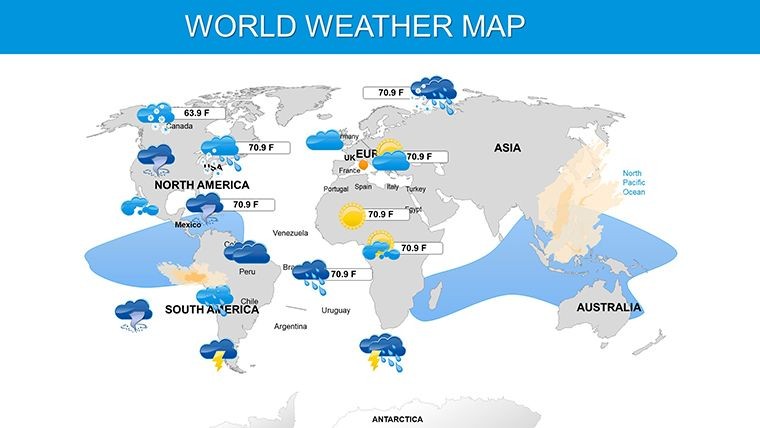
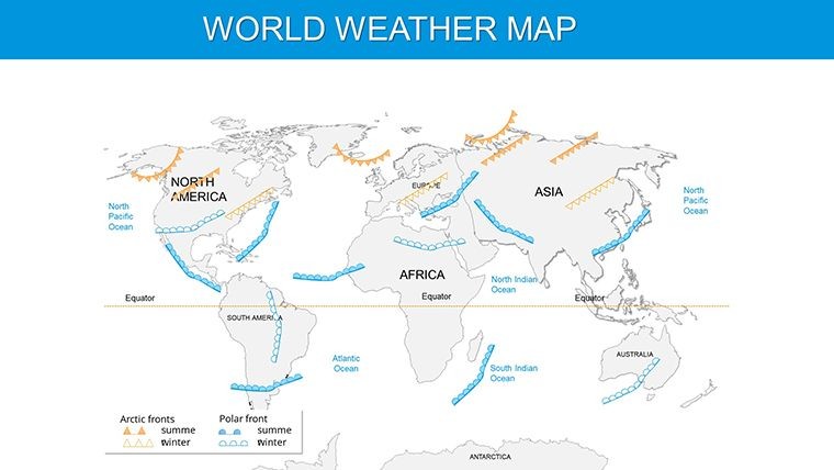
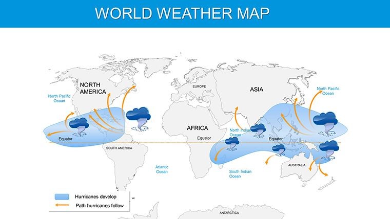
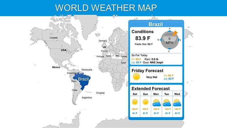
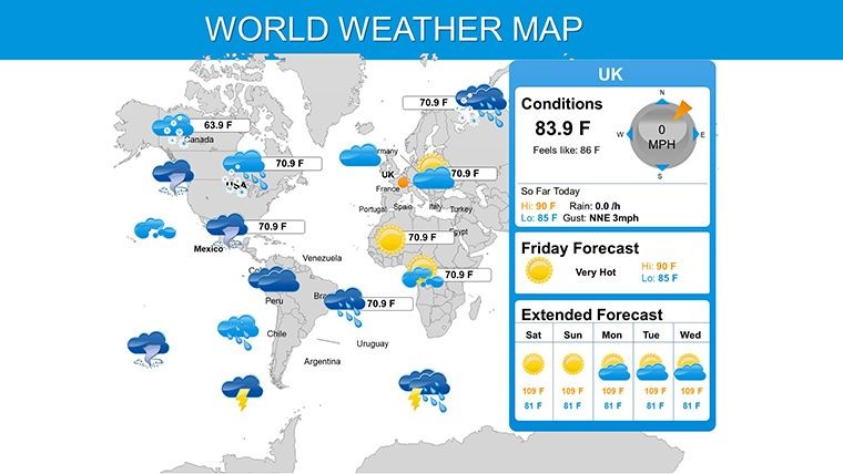
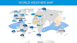
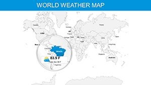
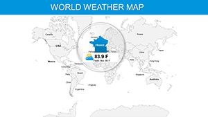
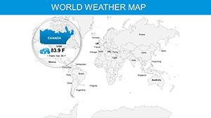
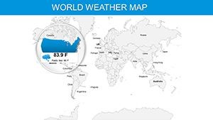
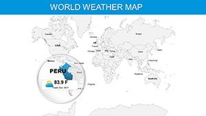
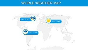
Global weather is a canvas of extremes - blizzards in the Arctic, droughts in Africa. This template captures it all with maps tailored for temperature zones, precipitation levels, and atmospheric phenomena. Customize layouts to show seasonal shifts or real-time alerts, using vibrant colors to differentiate climates. For instance, in a sustainability pitch, animate rising sea levels on coastal maps, drawing parallels to IPCC reports for authoritative backing.
The professional, clean aesthetic ensures your slides command attention, with options for various styles that adapt to your message's tone.
Core Features Driving Visual Excellence
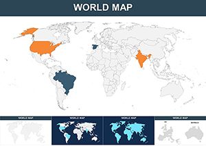
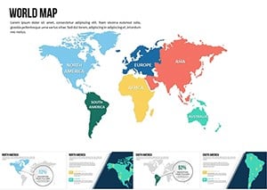
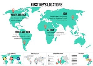
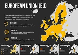
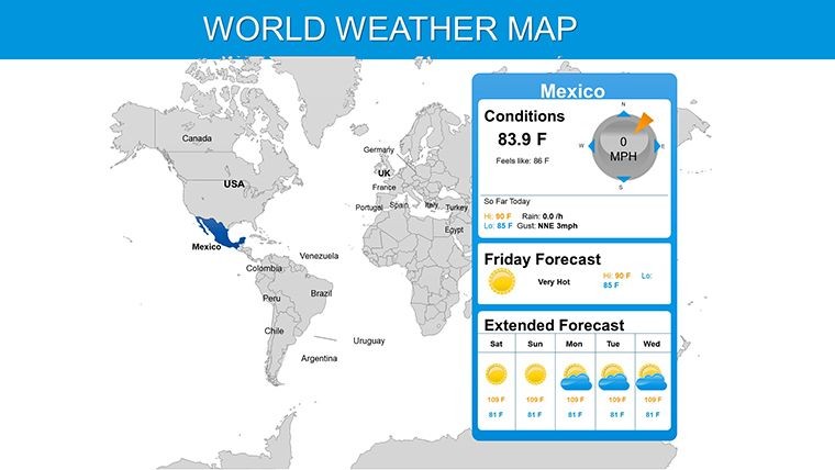
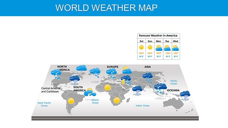
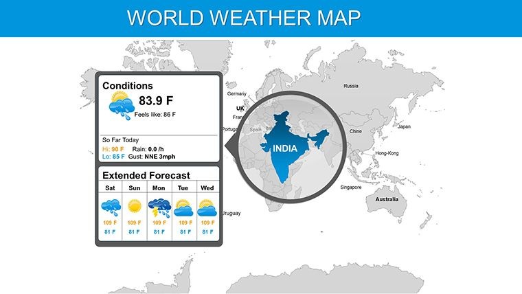
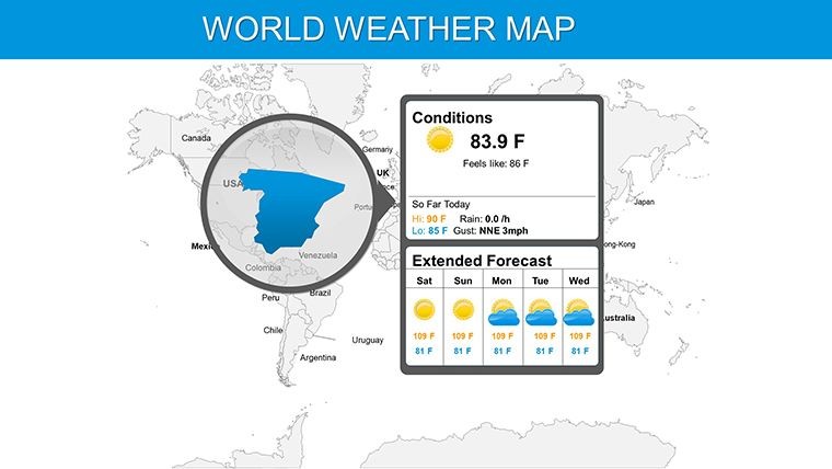
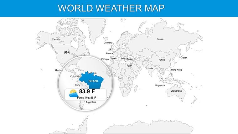
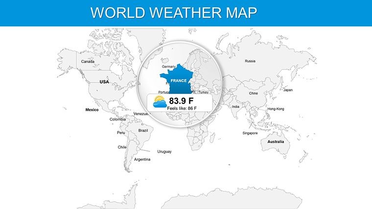
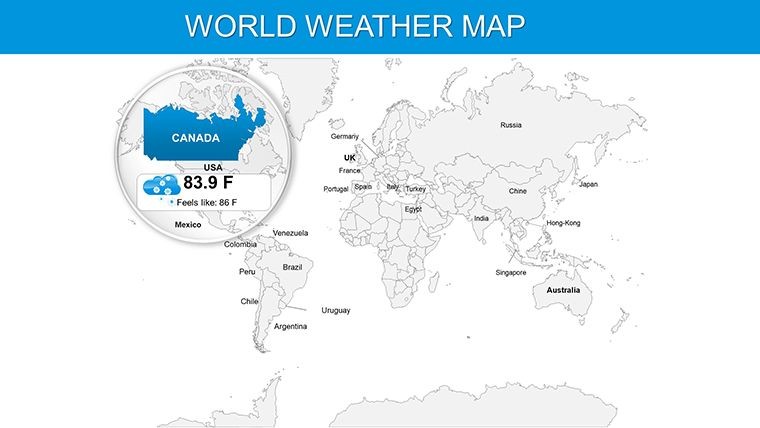
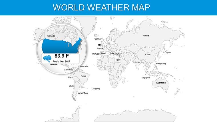
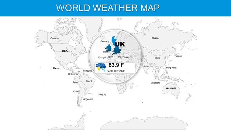
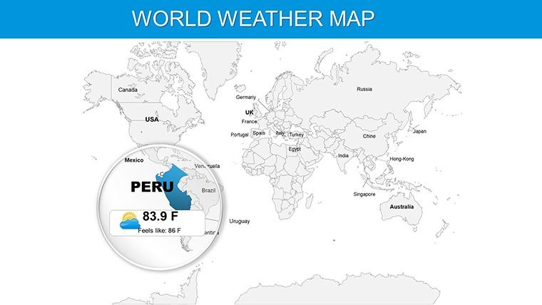
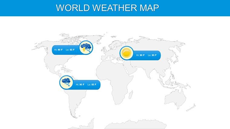
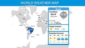
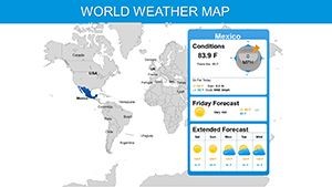
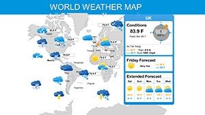
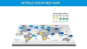
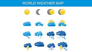
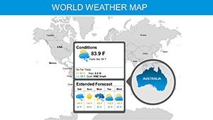
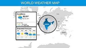
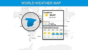
- 19 Editable Slides: Diverse layouts for global overviews and focused regional weather maps.
- Customization Variety: Adjust colors, styles, and layouts to match data needs.
- Animation Integration: Add dynamic effects to simulate weather movements.
- High-Quality Design: Created by experts for authority and visual appeal.
- Easy Use: Download, import, and edit in Keynote without hassle.
These elements surpass basic templates by incorporating SEO-optimized design principles, ensuring your content resonates in digital shares.
Applications That Weather Any Storm
In environmental sectors, use it for climate impact assessments - map deforestation effects on rainfall, inspired by WWF case studies, to advocate for change.
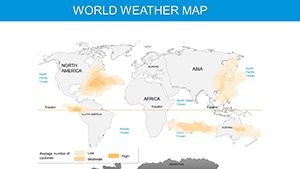
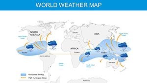
Businesses leverage it for risk management: Visualize storm paths affecting logistics, enhancing preparedness like strategies from global insurers.
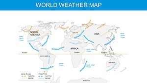
Educators make abstract concepts tangible, animating wind currents for geography classes, aligning with interactive learning trends from educational bodies.
Effortless Creation Workflow
- Acquire and Open: Download the .key file and start in Keynote.
- Tailor Maps: Select layouts, color-code for variables like humidity.
- Add Dynamics: Incorporate animations for evolving forecasts.
- Refine Content: Insert data points or icons for clarity.
- Deliver Impact: Present or export with professional finesse.
This process mirrors efficient design workflows, boosting productivity.
Insights for Optimal Weather Presentations
Pair maps with timelines for trend analysis, using subtle humor like "Don't let your data get lost in the fog" to engage. Ensure color accessibility for all viewers.
Avoid data overload; the template's layouts promote balance. For pros, layer with Keynote's charts for hybrid visuals.
Grounded in meteorological accuracy, it builds trust for critical discussions.
Weather the competition - grab this template and forecast success in your next presentation.
Frequently Asked Questions
- What types of weather data can I visualize?
- Temperature, precipitation, storms, and more, with customizable maps.
- Are the slides animation-ready?
- Yes, easily add effects to show dynamic patterns.
- Suitable for global or regional focus?
- Both, with flexible layouts for any scale.
- How do I customize layouts?
- Edit colors, styles, and elements intuitively in Keynote.
- Ideal for which audiences?
- Scientists, businesses, educators - anyone needing weather visuals.