Southern Africa Keynote Maps: Transform Your Presentations with Geographic Precision


Type: Keynote Maps template
Category: Africa
Sources Available: .key
Product ID: KM00052
Template incl.: 58 editable slides
Imagine standing before a room of stakeholders, effortlessly guiding them through the diverse landscapes of Southern Africa - from the bustling ports of Cape Town to the vast savannas of Botswana. As an architect or urban planner, conveying the scope of a regional development project can be challenging without the right tools. Enter the Southern Africa Keynote Maps template, a powerhouse of 58 fully editable slides designed specifically for Apple Keynote users who demand clarity and impact in their presentations. This template isn't just a collection of maps; it's a strategic asset that turns complex geographic data into compelling narratives, helping you highlight site selections, infrastructure routes, and environmental impacts with professional finesse.
Crafted with the needs of design professionals in mind, this template draws from real-world applications like AIA-guided urban expansion projects in Johannesburg or sustainable tourism initiatives in Namibia. Whether you're pitching a mixed-use development in Durban or analyzing transportation networks across the region, these maps provide the visual backbone to make your ideas resonate. With compatibility across Keynote versions, including seamless integration with macOS tools, you can customize every element - from color schemes inspired by the region's vibrant sunsets to layered annotations for zoning details - without starting from scratch. Say goodbye to bland, generic slides and hello to a toolkit that elevates your workflow, saving hours of manual mapping while ensuring your presentations stand out in competitive bids.
Unlocking the Power of Editable Maps for Architectural Storytelling
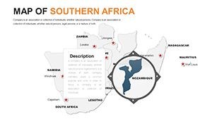
In the fast-paced world of architecture, where every presentation counts toward securing that next big contract, the ability to visualize spatial relationships is paramount. The Southern Africa Keynote Maps template excels here by offering high-resolution, vector-based maps that are infinitely scalable. Picture this: You're preparing a proposal for a coastal resort in Mozambique. Using slide 12's outline map, you overlay custom icons for proposed building sites, adjusting opacity to reveal underlying topography. This isn't mere decoration - it's a demonstration of thoughtful site analysis, aligning with LEED certification standards for environmental integration.
What sets this template apart from basic PowerPoint alternatives is its native Keynote optimization. Animations trigger smoothly to reveal data layers sequentially, such as phasing in economic zones or highlighting biodiversity hotspots. For instance, in a case study from a Cape Town firm that used similar visuals, their pitch for a public transit hub won approval by clearly illustrating connectivity across provinces. You can replicate this success with built-in features like drag-and-drop region selectors and pre-set color palettes that evoke the earthy tones of the Kalahari or the oceanic blues of the Atlantic coast.
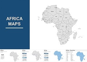
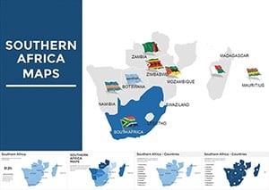
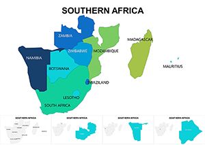
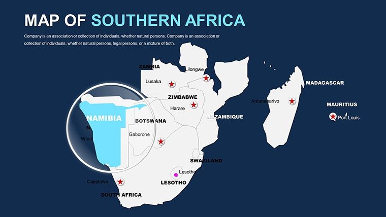
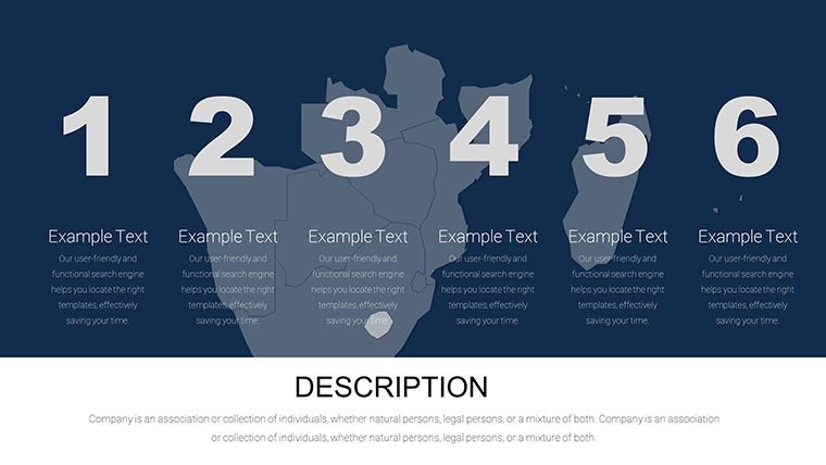
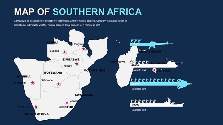
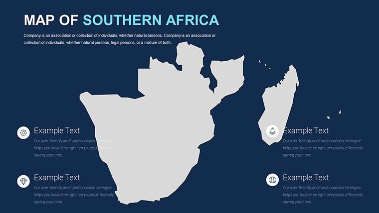
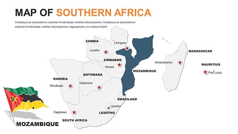
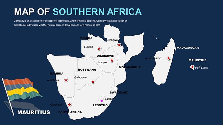
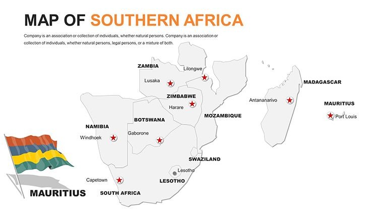
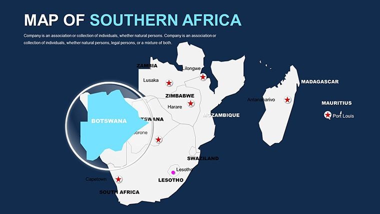
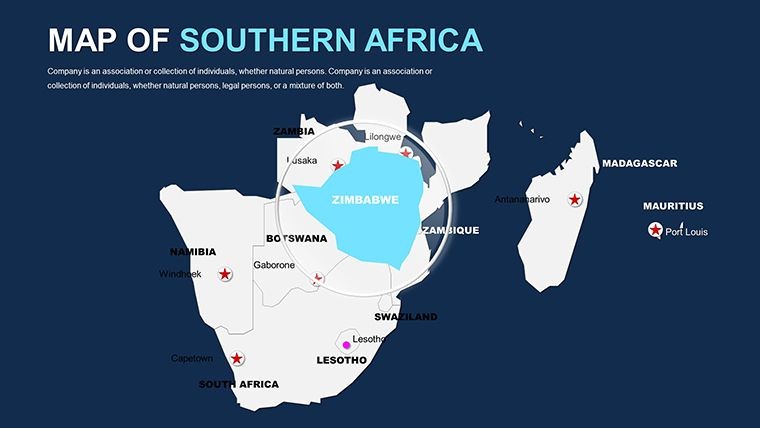
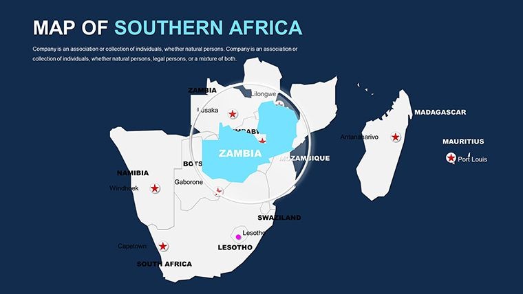
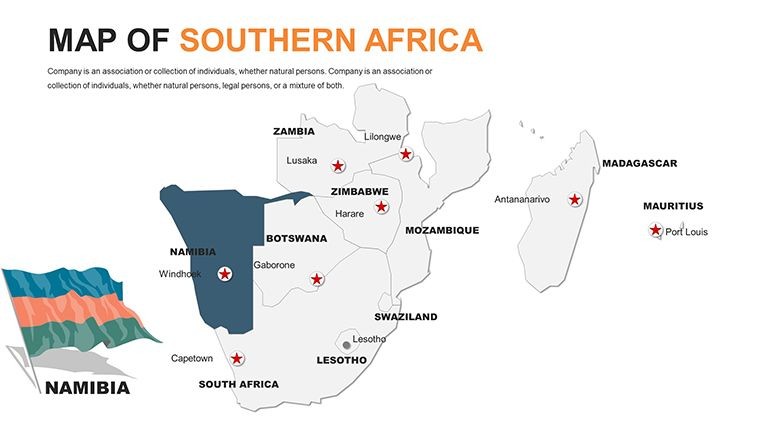
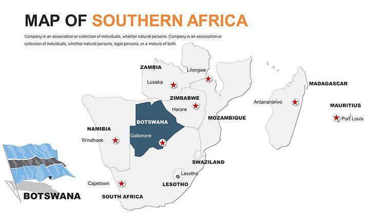
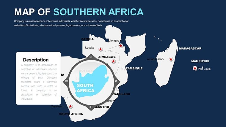
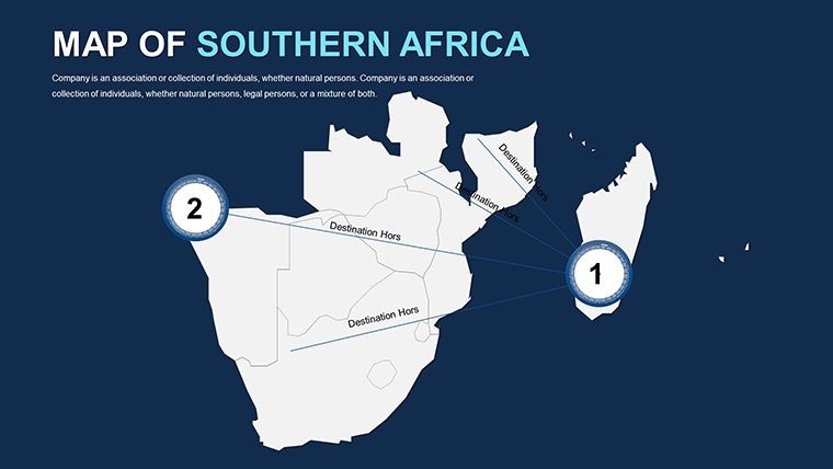
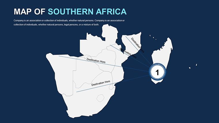
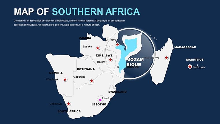
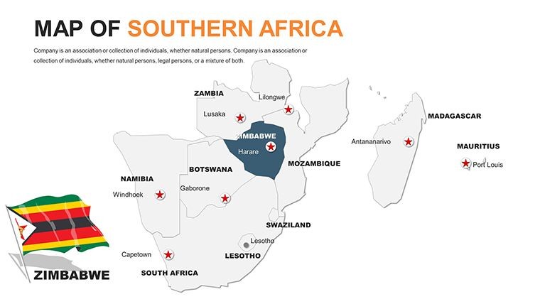
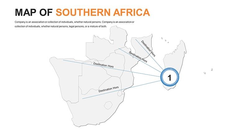
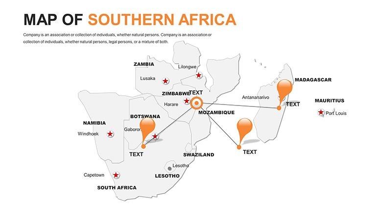
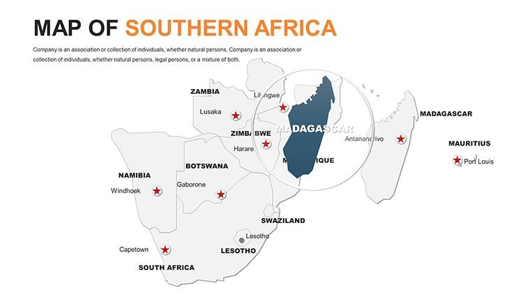
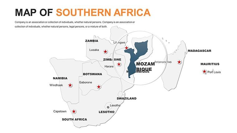
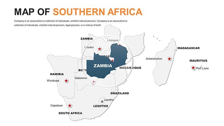
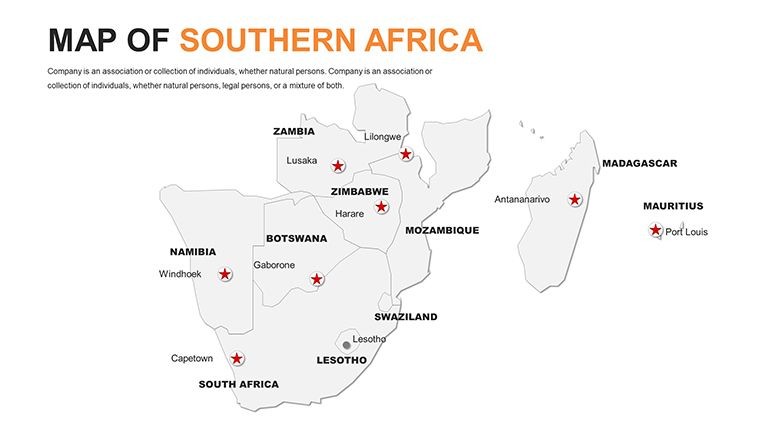
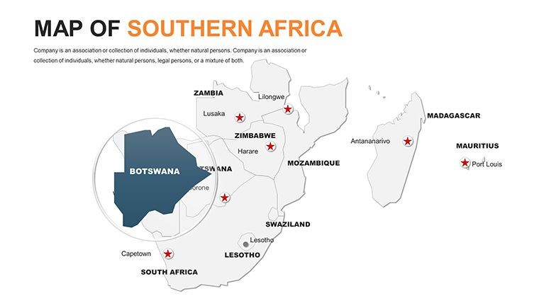
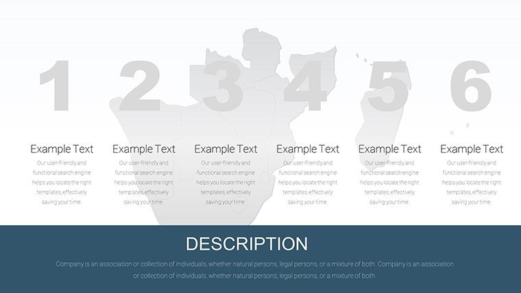
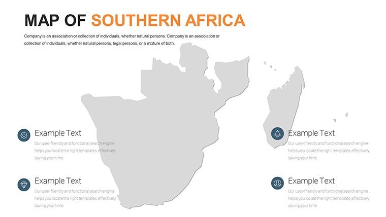
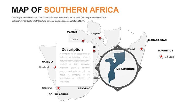
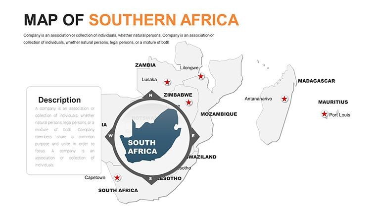
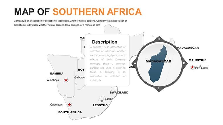
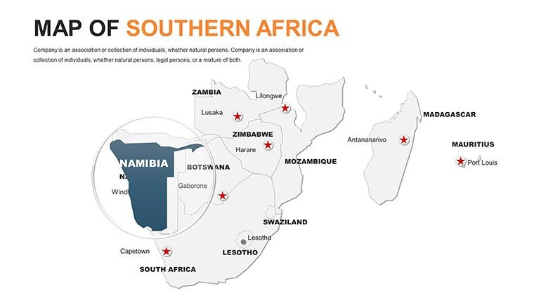
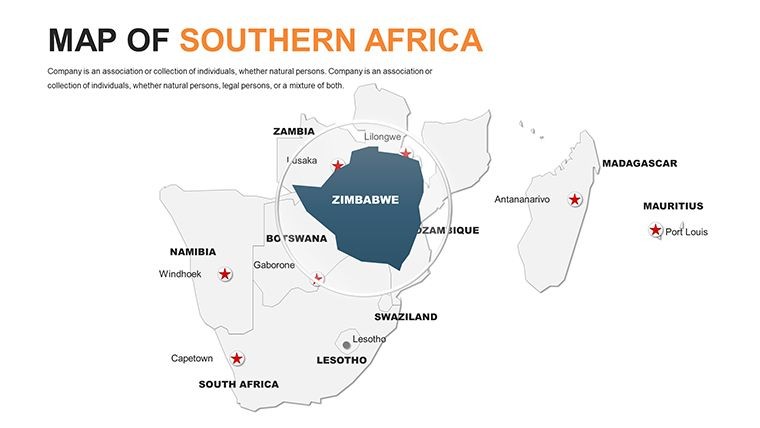
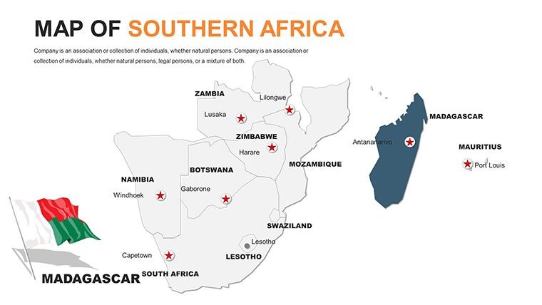
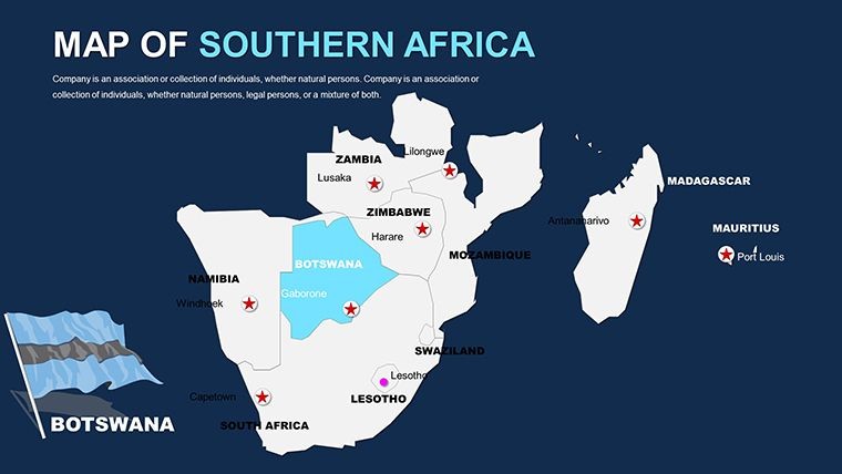
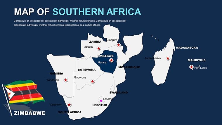
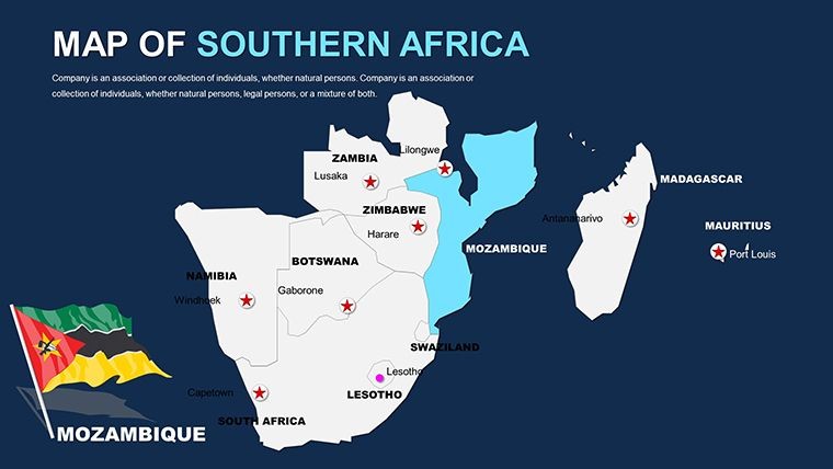
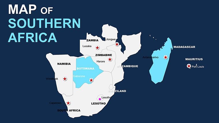
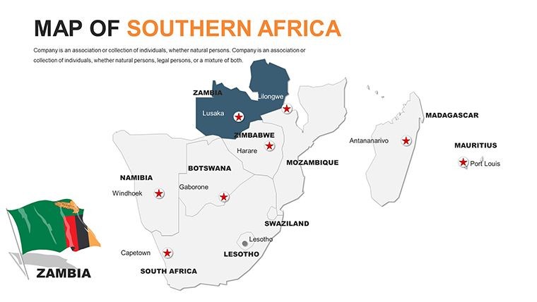
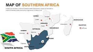
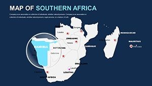
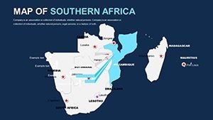
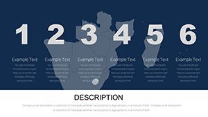
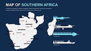
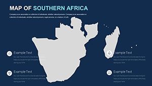
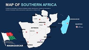
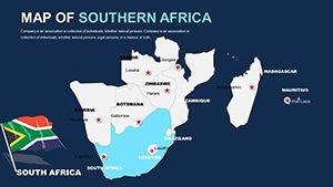
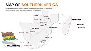
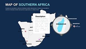
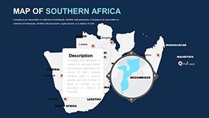
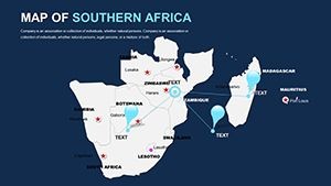
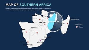
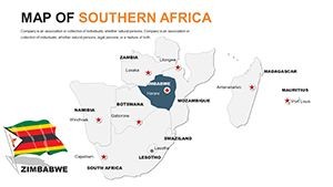
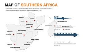
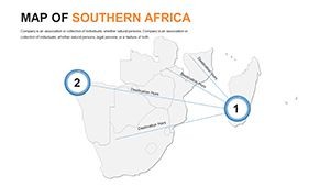
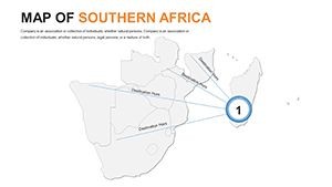
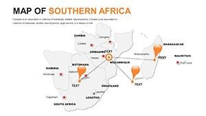
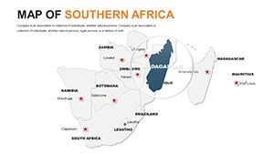
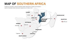
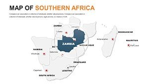
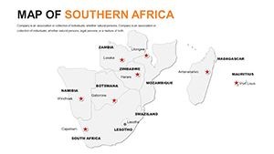
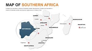
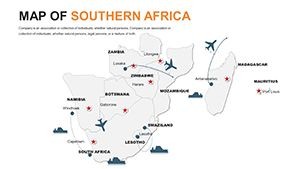
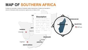
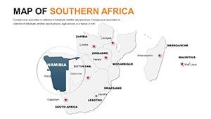
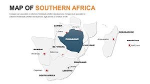
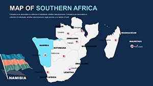
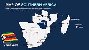
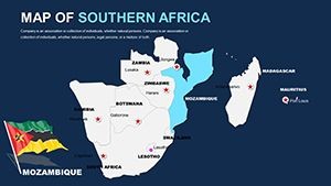
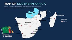
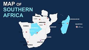
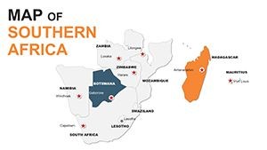
- 58 Versatile Slides: From political boundaries to thematic overlays, covering countries like South Africa, Namibia, Botswana, Zimbabwe, Lesotho, Eswatini, and more.
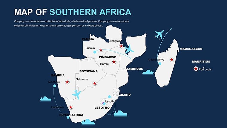
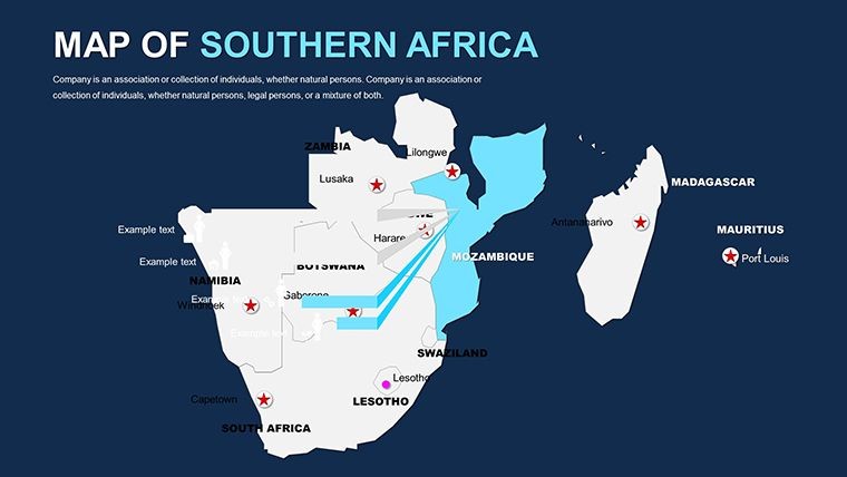
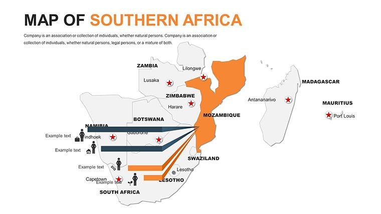
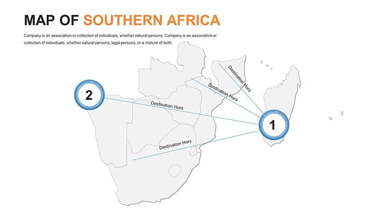
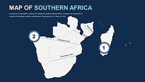
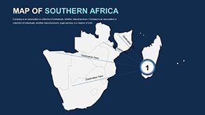
- Customization at Your Fingertips: Edit shapes, add text labels for city coordinates, or import data from GIS software for precise urban planning visuals.
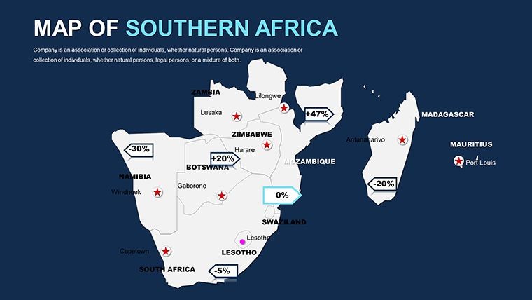
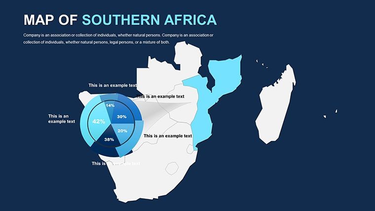
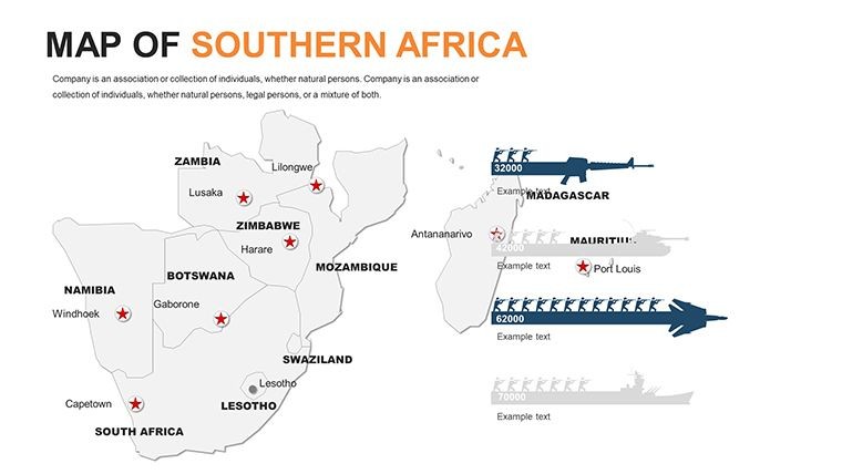
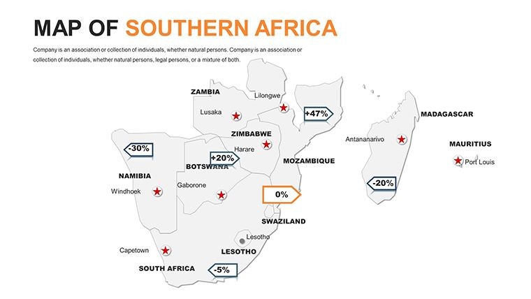
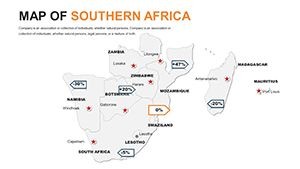
- Professional Infographics: Integrated charts for population density or resource distribution, perfect for sustainability reports.
Integrating this into your workflow is straightforward. Start by importing your project specs into Keynote, then layer them onto the template's base maps. A quick tip: Use the built-in grid system to align architectural renderings with geographic markers, ensuring pixel-perfect presentations that impress even the most discerning clients.
Real-World Applications: From Site Surveys to Regional Strategies
Consider a mid-sized architecture firm in Pretoria tackling a multi-city infrastructure project. Traditional maps often fall flat, lacking the detail needed to convey scale. With this template's slide 25 - a detailed regional connector map - they mapped out rail lines and green corridors, using gradient fills to denote elevation changes. The result? A 20% faster approval process, as stakeholders could instantly grasp the project's feasibility.
Beyond architecture, this tool shines in environmental design pitches. For a landscape architect proposing reforestation in Zambia, slides 40-45 allow for before-and-after simulations, incorporating satellite imagery placeholders. It's not just about aesthetics; these maps facilitate data-driven discussions, such as compliance with South African National Standards (SANS) for urban development. And for international collaborations, the template's clean lines ensure cultural sensitivity, avoiding cluttered designs that might confuse global teams.
- Preparation Phase: Select relevant slides based on your project's geographic scope - e.g., zoom into Angola for border-adjacent builds.
- Customization: Apply brand colors and insert high-res photos of conceptual models directly onto maps.
- Presentation Delivery: Leverage Keynote's presenter notes to add context, like historical land use patterns influencing modern designs.
- Post-Pitch Follow-Up: Export interactive versions for client review, maintaining editability for revisions.
This structured approach not only streamlines your process but also positions you as a forward-thinking professional. Compared to free online map generators, which often produce low-res outputs, this template's retina-ready quality ensures your visuals pop on any screen, from conference projectors to iPad reviews.
Enhance Your Toolkit: Features That Drive Results
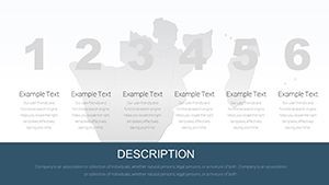
Diving deeper, the template's 58 slides are a treasure trove for creative minds. Slide 0 serves as an eye-catching title map, featuring stylized icons for landmarks like Table Mountain. Progress to slides 10-20 for administrative divisions, where you can highlight provinces with clickable hotspots for drill-down details - ideal for multi-phase architectural timelines.
For data-heavy sections, integrate line graphs over terrain maps to show projected growth in areas like Windhoek's urban sprawl. The vector elements mean no quality loss when resizing for focus on specific locales, such as mining sites in the DRC border regions. Plus, with free fonts and documentation included, even junior designers can hit the ground running.
A standout benefit is the template's adaptability to hybrid workflows. Pair it with SketchUp exports for 3D site overviews or Adobe Illustrator for custom icons, creating a seamless bridge between design software. In one notable example, a Johannesburg studio used it to win an award for innovative public space planning, crediting the maps for clarifying community impact zones.
Tips for Maximizing Impact in Your Next Pitch
To truly leverage this template, focus on storytelling. Begin with a broad regional view to set context, then zoom into your project's footprint - perhaps a eco-friendly housing development in Swaziland. Use subtle animations to unveil layers, keeping audiences engaged without overwhelming them. Remember, less is more: Limit text to key stats, letting the maps do the talking.
For accessibility, ensure high-contrast modes for color-blind viewers, aligning with inclusive design principles. And don't overlook mobile optimization; Keynote's export to PDF preserves interactivity for on-site walkthroughs.
Ready to map out your success? Customize this Southern Africa Keynote Maps template today and watch your presentations gain the geographic edge they deserve.
Frequently Asked Questions
What makes these maps suitable for architectural presentations?These maps are vector-based and fully editable, allowing architects to overlay site plans, zoning data, and renderings directly, ensuring precise visualizations for pitches and reports.
Can I use this template with other design software?Yes, export slides to PDF or images for integration with tools like AutoCAD or Revit, maintaining high quality for collaborative workflows.
How many countries does the Southern Africa template cover?It includes detailed maps for South Africa, Namibia, Botswana, Zimbabwe, Lesotho, Eswatini, and surrounding areas, with options to expand.
Is the template compatible with the latest Keynote version?Absolutely, it's optimized for Keynote on macOS, with backward compatibility for older versions.
Are there built-in icons for urban planning?Yes, featuring customizable icons for buildings, roads, and green spaces to enhance project-specific storytelling.
How do I add custom data to the maps?Simply drag and drop elements or use Keynote's data import features to layer statistics like population or elevation.