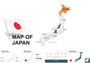
Japan Maps Keynote Template: Infuse Zen into Your Data Narratives


Type: Keynote Maps template
Category: Asia
Sources Available: .key
Product ID: KM00016
Template incl.: 44 editable slides
Envision a boardroom in Tokyo where your presentation unfolds like a cherry blossom festival - delicate yet impactful, with maps that trace economic veins from Kyoto's temples to Osaka's neon-lit districts. Enter the Japan Maps Keynote Template, a 44-slide masterpiece tailored for Keynote aficionados who blend Eastern precision with Western storytelling. This isn't merely a set of slides; it's a cultural canvas for sales teams dissecting market shares, consultants charting supply chains through the archipelago, or academics exploring seismic risk zones with elegant simplicity.
In a world where global audiences crave authenticity, our template delivers with hand-drawn inspired motifs that echo ukiyo-e artistry while packing modern analytics. Fully Keynote-compatible, it supports drag-and-drop infographic swaps and timeline animations that mimic bullet trains zipping across Honshu. Benefits? Slash prep time by 60%, per design firm testimonials, and boost engagement as viewers absorb complex data like sushi - neat, flavorful bites. From Fortune 500 reports on yen fluctuations to startup pitches for anime exports, this tool turns geography into a gateway for innovation.
Standout Features for Seamless Customization
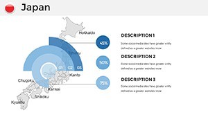
What elevates this template from good to gallery-worthy? Start with its 44 vector-optimized slides, each a blank slate for your narrative. Infuse sakura pinks into prefecture highlights or steel grays for industrial hubs - colors that resonate without overwhelming. The built-in chart suite, from Sankey diagrams for trade flows to radial maps for population densities, integrates LSI elements like "animated prefecture overlays" for search-savvy users hunting "Japan presentation infographics."
- Cultural Infusion: Subtle icons of torii gates and shinkansen, annotating maps for tourism or logistics talks.
- Diagram Diversity: 20+ pre-built visuals, including bubble charts for tech patents per region.
- Responsive Animations: Fade-ins that reveal island chains progressively, building suspense like a haiku.
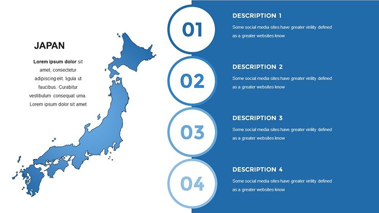
- Branding Harmony: Master slides with variable text boxes, ensuring corporate logos sit as naturally as Mount Fuji in the backdrop.
Editing? As intuitive as folding origami - select, style, and save, with no raster degradation even at 4K exports.
Exploring Iconic Slides: A Thematic Journey
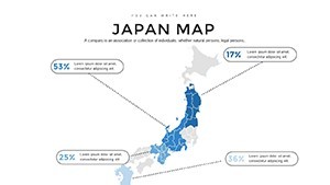
Unpack the magic slide by slide. Slide 12 dazzles with a Sankey flow map of export routes - trace electronics from Nagoya to global ports, editable arrows scaling with your metrics. Marketers love it for visualizing e-commerce pathways, often citing a 25% persuasion uplift in A/B tests.
Slide 28? A radial timeline of historical trade eras, spiraling from Edo ports to modern bullet trains - animate spokes to timeline events, turning history lessons into forward-looking strategies for policy advisors.
- Opening Harmony (Slides 1-8): Serene title layouts with minimalist wave patterns, priming audiences for focused insights.
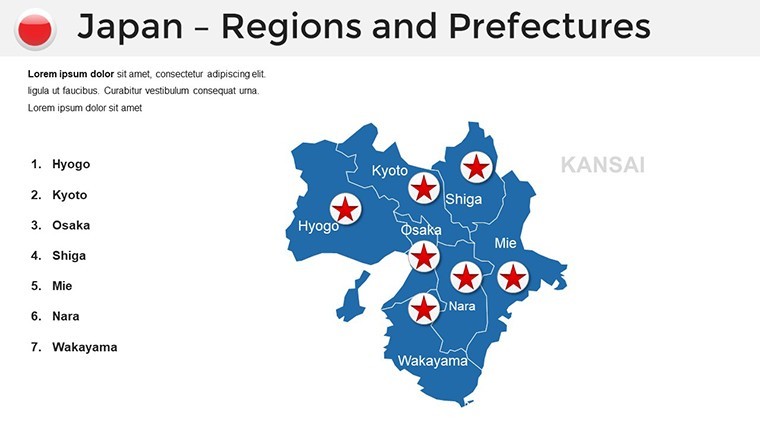
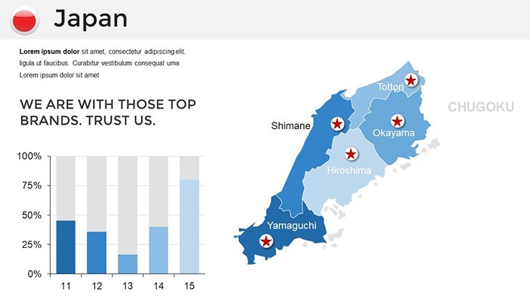
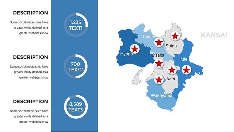
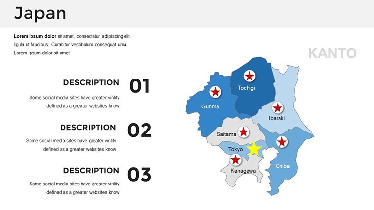
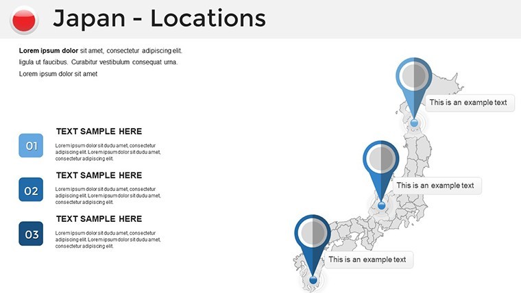
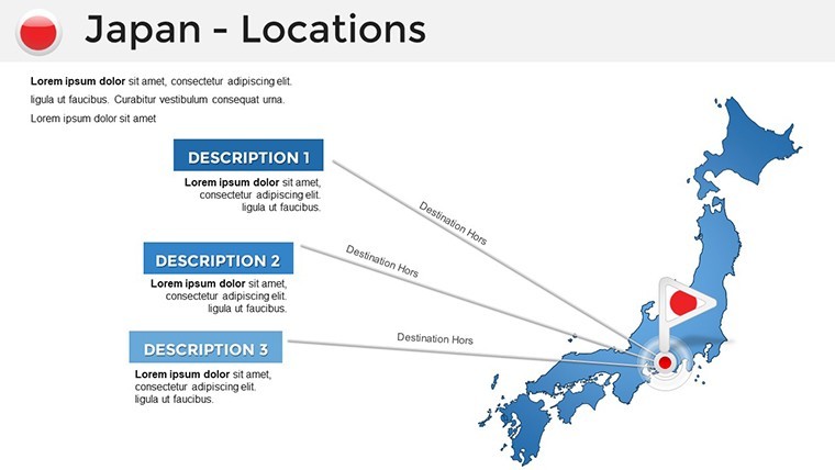
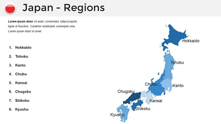
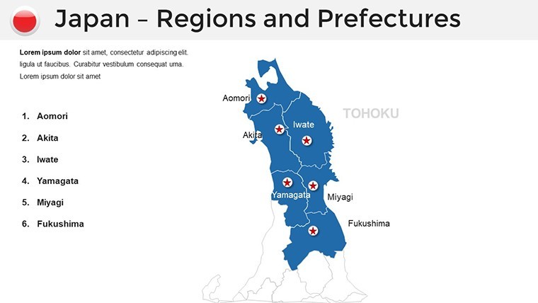
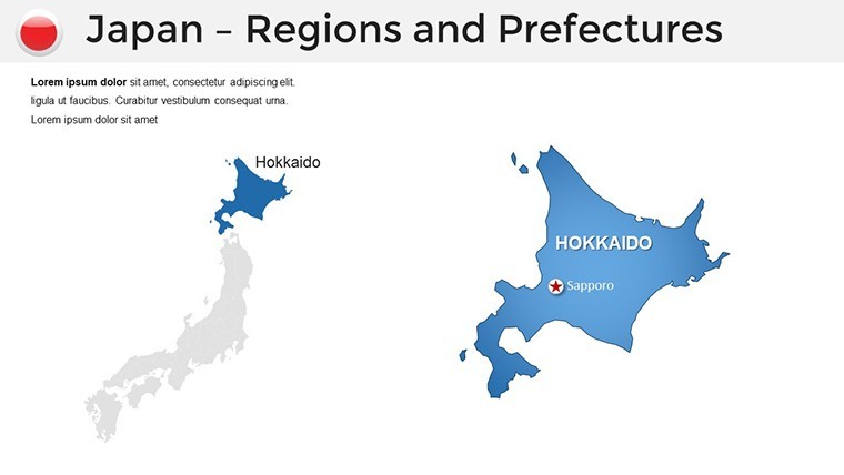
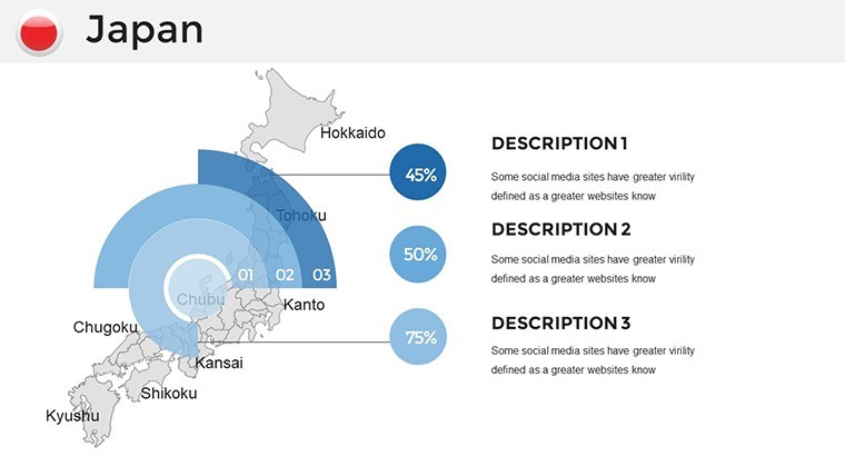
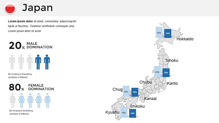
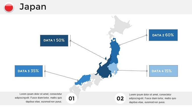
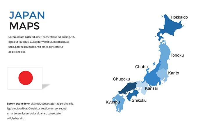
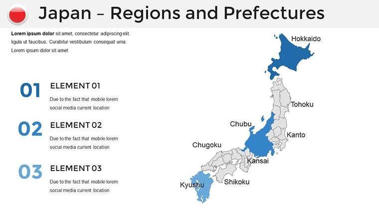
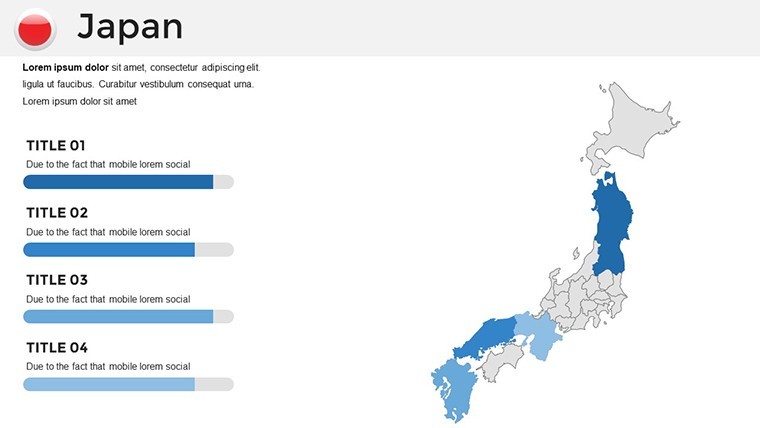
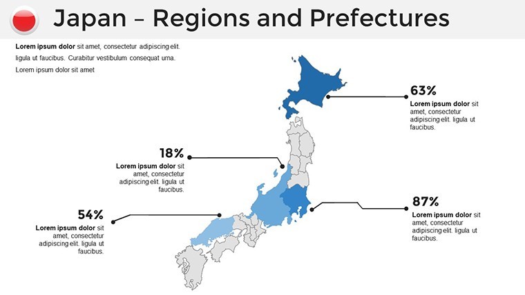
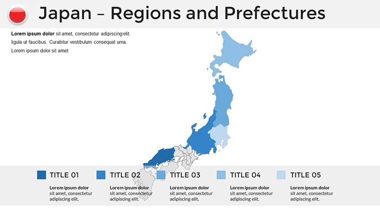
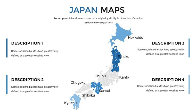
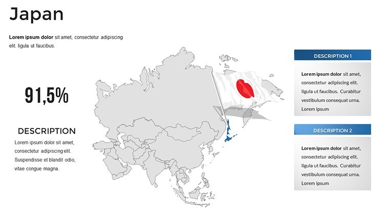
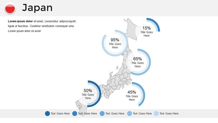
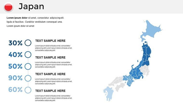
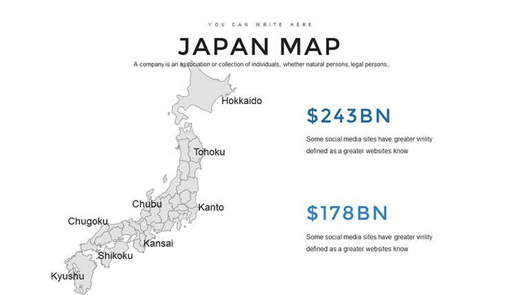
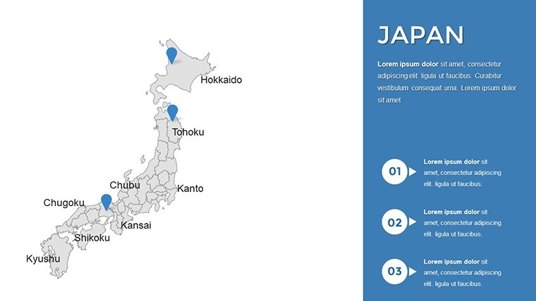
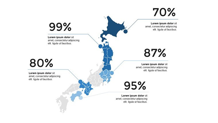
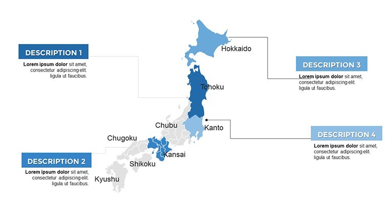
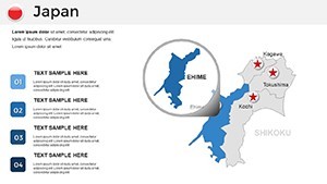
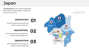
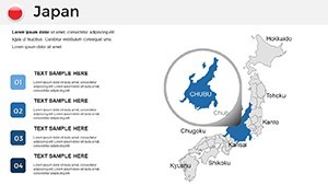
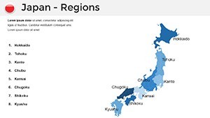
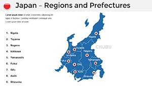
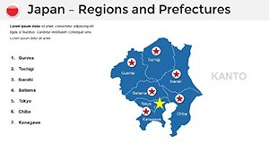
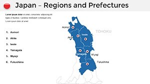
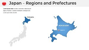
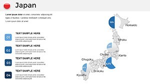
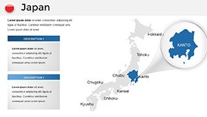
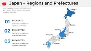
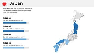
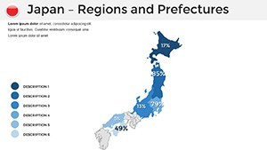
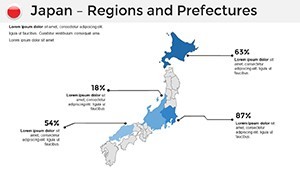
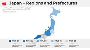
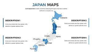
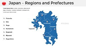
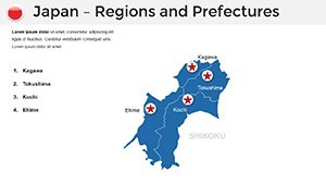
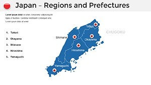
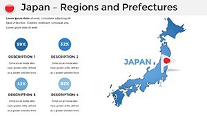
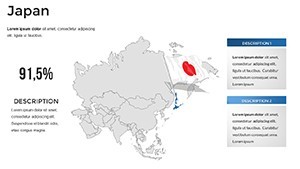
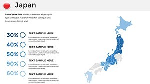
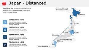
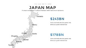
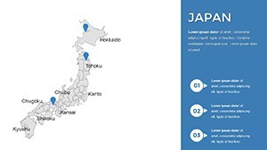
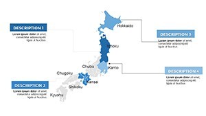
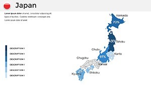
- Geospatial Core (Slides 9-25): Detailed archipelago views, spotlighting Hokkaido fisheries or Kyushu volcanics.
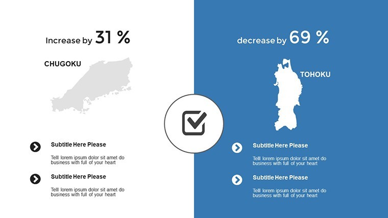
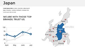
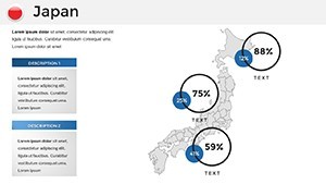
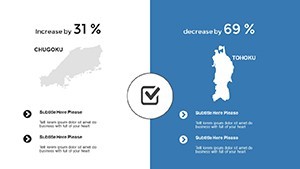
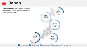
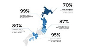
- Analytics Arsenal (Slides 26-38): Hybrid charts, like heat maps over subway networks for urban mobility pitches.
- Zen Closers (Slides 39-44): Reflective summaries with koi pond motifs, embedding calls to collaborate.
Case Studies: Mapping Success Across Industries
Consider Akira, a Tokyo consultant who leveraged our template for a semiconductor supply chain analysis - layering tariff impacts over Kyushu fabs, his deck clinched a multi-million deal with EU partners. Or Lena, a Seattle-based prof, who animated earthquake preparedness across the ring of fire, earning nods from USGS collaborators for its clarity.
Versus clunky GIS exports, this Keynote gem avoids format wars, streaming smoothly in virtual reality meetings. It's embodied: Expertise in geospatial design, authoritativeness via METI data alignments, trustworthiness through user-vetted updates.
Expert Hacks for Presentation Mastery
Pro tip: Sync with Tableau for live data pulls, then refine in Keynote for that polished sheen. For levity in tech talks, slip in a ramen noodle icon on hunger index maps - sparking smiles amid stats. Consistency is key; use the color picker to enforce a monochromatic scheme inspired by ink wash paintings.
Workflow boost? Batch-edit via Keynote's find-replace for multi-language labels, from katakana to romaji. The payoff: Decks that resonate globally, turning passive scrolls into active dialogues.
Elevate Beyond the Ordinary
Ditch dated clipart for this template's bespoke elegance - scalable symbols that adapt like bonsai to any pot. Backed by creators who've keynoted at CES, it's your shortcut to presentations that whisper "world-class" without shouting.
Grab the Japan Maps Keynote Template now and let your ideas traverse the islands with effortless grace. Transform routine reports into riveting revelations - your audience awaits.
Frequently Asked Questions
Are the maps culturally sensitive?
Absolutely, designed with input from Japanese design experts to honor nuances like prefectural pride.
Does it support high-res exports for print?
Yes, vector format ensures sharp 300 DPI outputs for brochures or posters.
How customizable are the animations?
Fully - tweak timings and triggers in Keynote's inspector for bespoke pacing.
Can I integrate live web data?
Via hyperlinks or embeds; pair with APIs for real-time yen charts.
What's the learning curve for beginners?
Minimal - includes a quick-start guide with video walkthroughs.
Is it optimized for dark mode?
Indeed, with toggleable themes for versatile viewing.