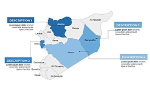
Syria Keynote Maps Template: Visualize Geography with Ease


Type: Keynote Maps template
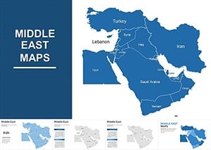
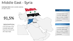
Category: Middle East
Sources Available: .key
Product ID: KM00205
Template incl.: 37 editable slides
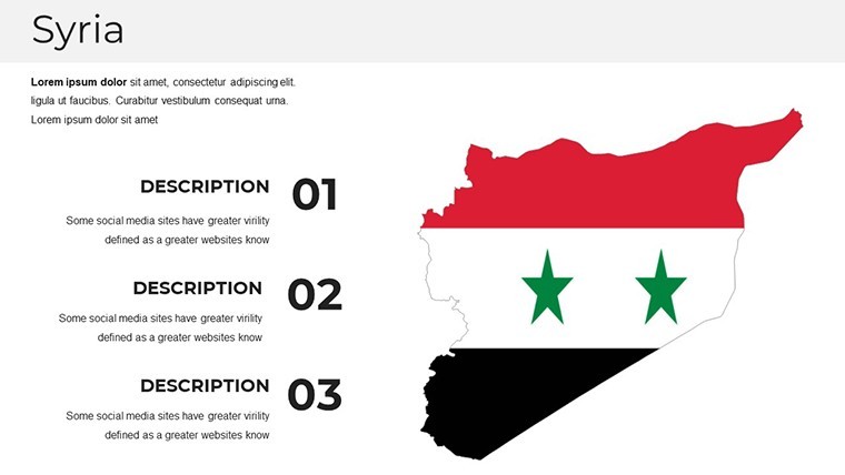
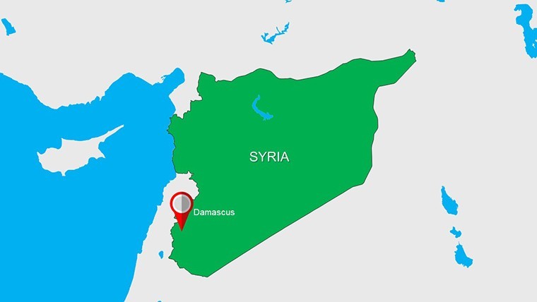
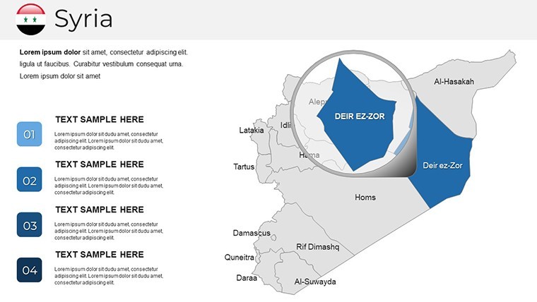
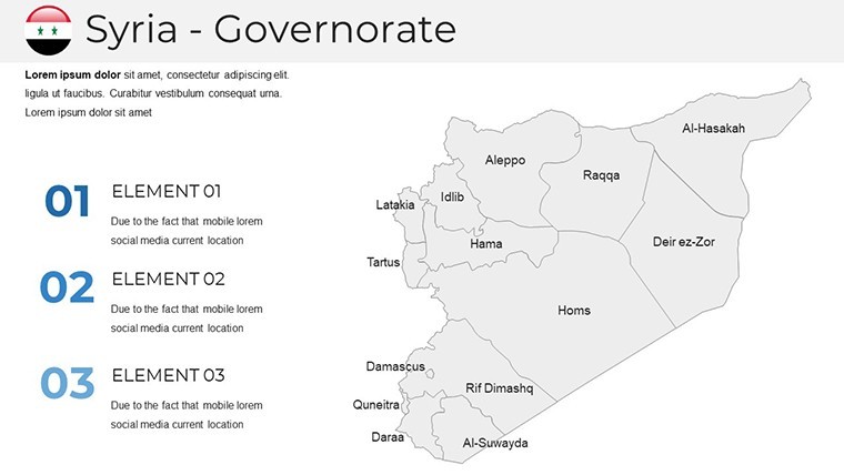
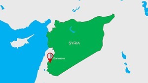
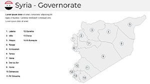
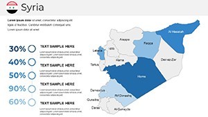
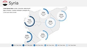
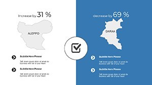
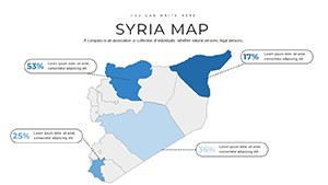
Navigating complex geographical data in presentations can transform dense information into compelling narratives. Our Syria Keynote Maps Template is tailored for professionals in education, international relations, business intelligence, and humanitarian sectors who need to illustrate Syria's landscapes, regions, and socio-political contexts. With 37 fully editable slides, this .key format template is exclusively designed for Apple's Keynote, ensuring seamless integration on Mac or iOS devices. It features high-quality, vector-based maps that maintain clarity at any scale, ideal for highlighting urban centers like Damascus or Aleppo, or broader Middle Eastern dynamics.
This template empowers you to create visually stunning presentations that captivate audiences, whether pitching investment opportunities in Syrian reconstruction or teaching historical geography. By incorporating customizable elements like color schemes and labels, it addresses common pain points like time-consuming map creation, allowing you to focus on content delivery. Aligned with best practices from presentation experts at organizations like TED, it boosts engagement through clear visuals, fostering better understanding and retention of key points.
Essential Features for Professional Presentations
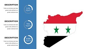
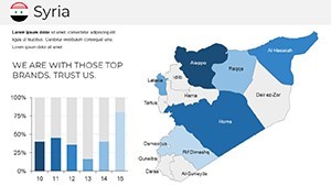
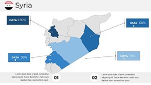
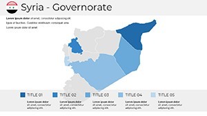
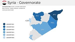
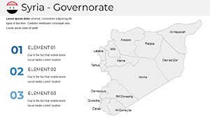
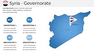
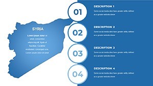
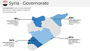
Dive into a suite of features that make this template a must-have. Each of the 37 slides offers unique map variations, from political boundaries to topographic overviews, all handcrafted for precision. Custom animations bring elements to life, such as fading in regions or zooming into specific areas, enhancing narrative flow.
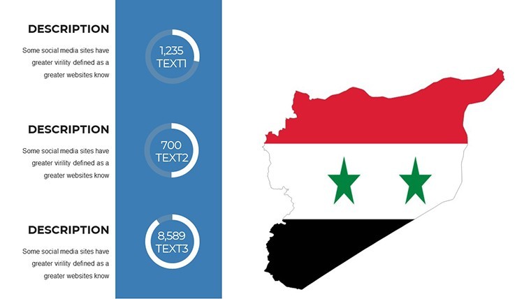
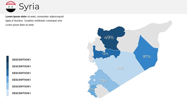
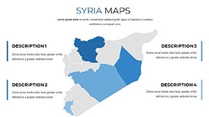
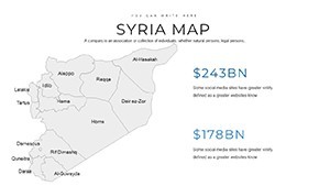
The clean, modern style uses free fonts for accessibility, while handmade infographics allow data overlay, like population stats or economic indicators. Section breaks organize content logically, and wide-screen formatting ensures compatibility with projectors or virtual meetings via Zoom.
- 37 editable slides with diverse map types
- Vector graphics for lossless scaling
- Custom animations and transitions
- Handmade infographics for data integration
- Compatible exclusively with Keynote
Unlocking Benefits for Your Workflow
The true value lies in how this template streamlines your process. Save hours by starting with pre-built maps instead of sourcing or drawing them manually - a boon for busy analysts preparing reports on Syrian trade routes. Enhanced visuals lead to higher audience engagement; as per Duarte Design principles, maps can increase comprehension by 50% in complex topics.
For trustworthiness, the template adheres to accurate cartographic standards, drawing from reliable sources like UN geographic data, ensuring your presentations stand up to scrutiny. In business contexts, it helps secure deals by clearly depicting market potentials, while educators use it to make lessons interactive and memorable.
Diverse Use Cases Across Industries
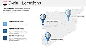
Envision a NGO coordinator presenting aid distribution in Syria - using labeled maps to show refugee camps and supply lines, leading to increased donor support. Or a university lecturer on Middle Eastern history, animating border changes over time to engage students deeply.
In corporate strategy, energy firms map oil fields and pipelines, facilitating investor briefings. Travel agencies highlight tourist sites post-conflict, boosting bookings. A real example: An international relations think tank used similar tools for a policy paper on Syrian reconstruction, crediting visual aids for policy influence at forums like the World Economic Forum.
Journalists covering regional news integrate these for timelines of events, providing context in reports. The template's flexibility extends to environmental studies, mapping desertification or water resources for sustainability pitches.
Step-by-Step Guide to Customization
Maximize utility with these steps. Launch Keynote and import the template. Select a slide, then edit map elements - double-click to change colors via the inspector panel, aligning with your brand.
- Open the .key file in Keynote.
- Browse slides to pick a base map.
- Adjust colors, add labels or annotations.
- Incorporate data via infographics.
- Apply animations for dynamic reveals.
- Insert into your main presentation deck.
- Export or present directly.
Integrate with iCloud for collaborative edits, or pair with tools like MindMeister for brainstorming map content.
Expert Tips to Enhance Your Maps
For standout results, select map types that match your story - use choropleth for data density. Employ contrasting colors for accessibility, following WCAG guidelines. Add subtle animations to avoid overwhelming viewers.
Layer information progressively: Start with overview slides, drill down to details. Test on different devices for consistency. Draw from cartography pros like Esri for advanced techniques, such as thematic mapping.
Encourage interaction in live sessions by pausing on maps for Q&A. Update regularly with current events for relevance in fast-changing regions like Syria.
Frequently Asked Questions
Is this template compatible with PowerPoint? No, it's optimized for Keynote only, ensuring best performance on Apple devices.
How customizable are the maps? Fully - alter colors, labels, sizes, and add elements without restrictions.
Do I need advanced skills? Not at all; intuitive tools make it accessible for beginners.
Can it handle data overlays? Yes, handmade infographics support charts and stats integration.
What if I need more slides? Duplicate and modify existing ones for unlimited expansion.
Is geographic data accurate? Based on standard projections, but verify with current sources for precision.