Ecuador Keynote Maps Template: Craft Compelling Narratives with Editable South American Visuals


Type: Keynote Maps template
Category: South America
Sources Available: .key
Product ID: KM00180
Template incl.: 36 editable slides
Picture this: You're preparing a keynote on Ecuador's unique position in South America, from its Andean heights to the Galapagos wonders, and you need visuals that do justice to its diversity. Our Ecuador Keynote Maps Template delivers exactly that with 36 editable slides, engineered for professionals who demand accuracy and flair. Created by seasoned designers familiar with geographic storytelling, this resource turns intricate data into digestible, eye-catching presentations suitable for executives, researchers, and teachers alike.
Ideal for exploring Ecuador's equatorial charm, including its Pacific coast and volcanic landscapes, the template empowers you to customize every detail. Swap colors to reflect the vibrant Quito markets, integrate graphs for biodiversity stats, or map out economic corridors like the oil-rich Amazon basin. With compatibility across Keynote platforms and export options to PDF, it's a versatile ally in your presentation arsenal. Users in fields like environmental science and international trade find it indispensable for conveying complex ideas without overwhelming the audience.
Explore the Depth of Ecuador's Political and Geographical Maps
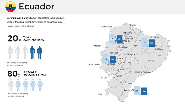
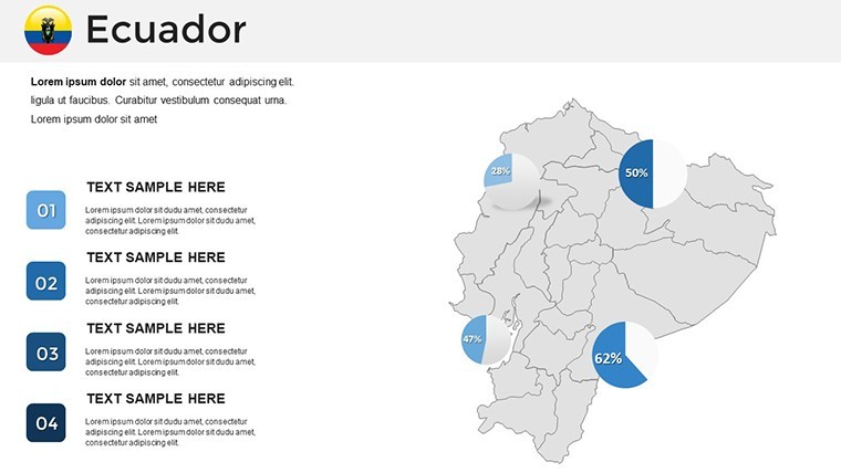
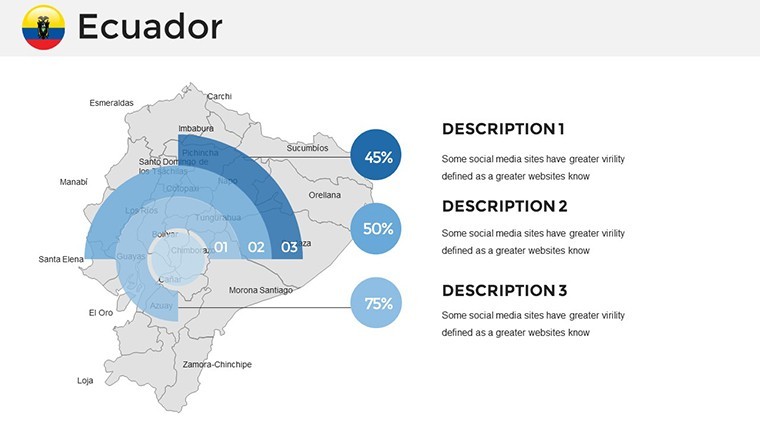
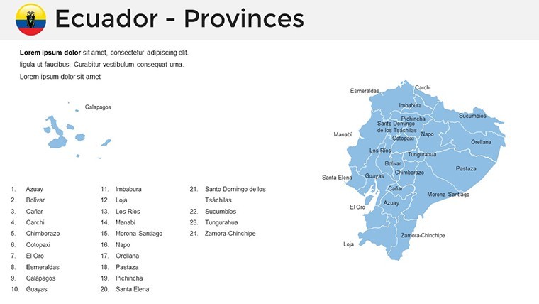
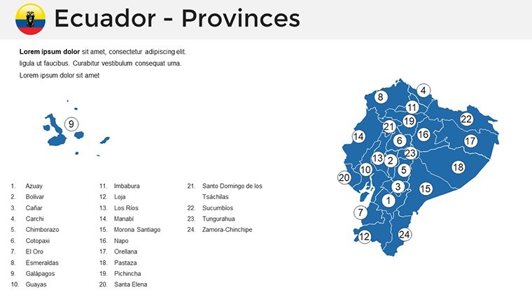
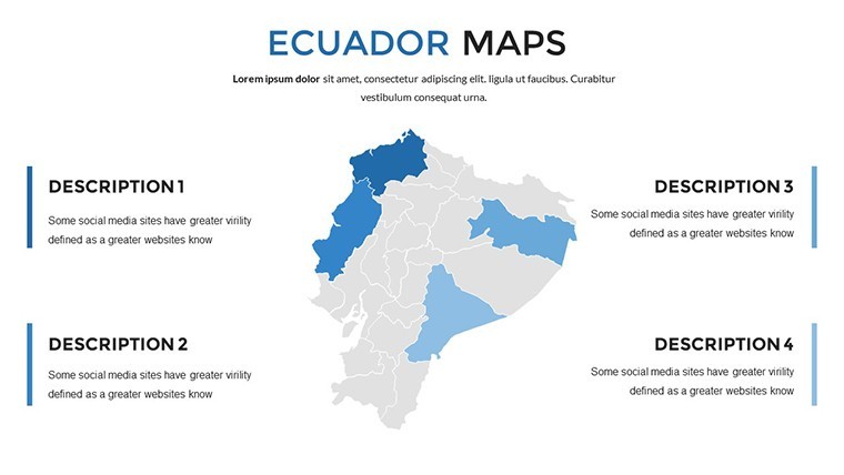
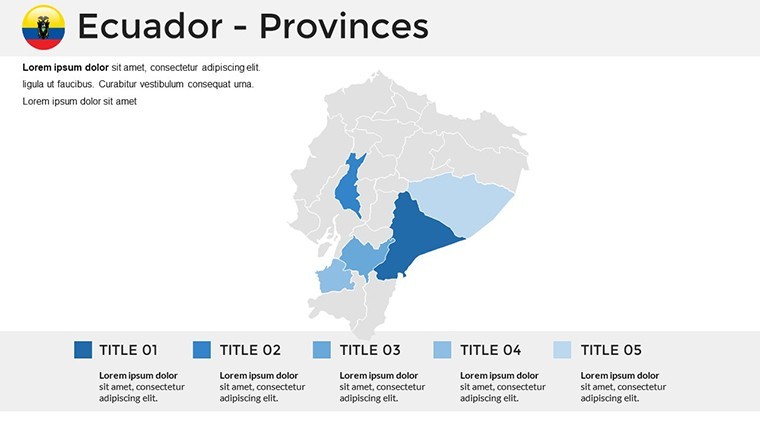
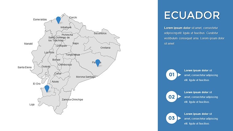
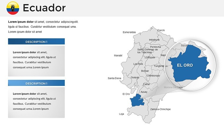
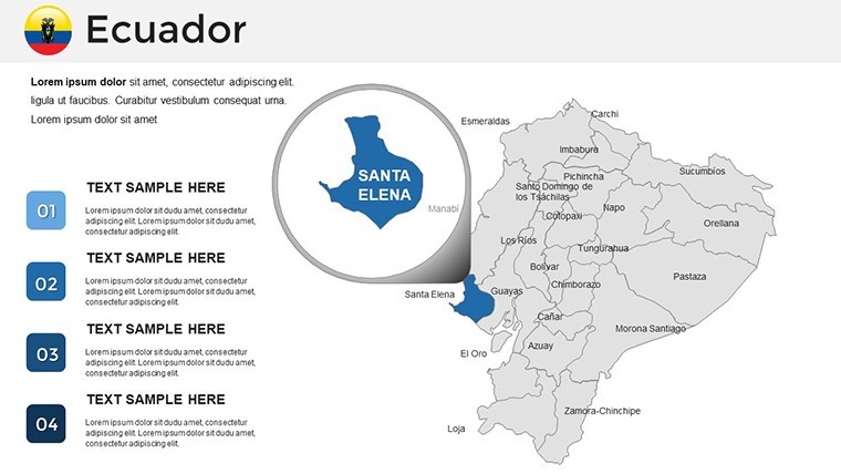
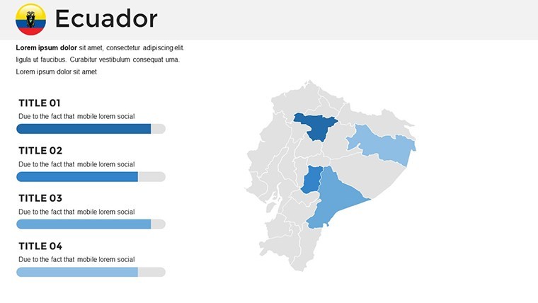
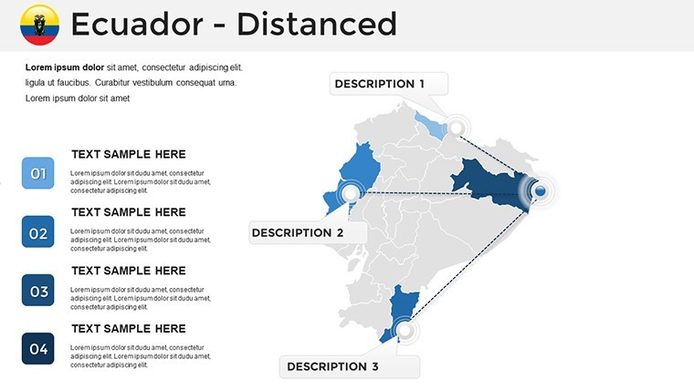
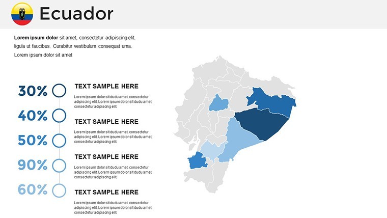
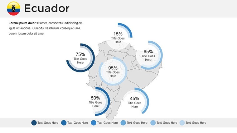
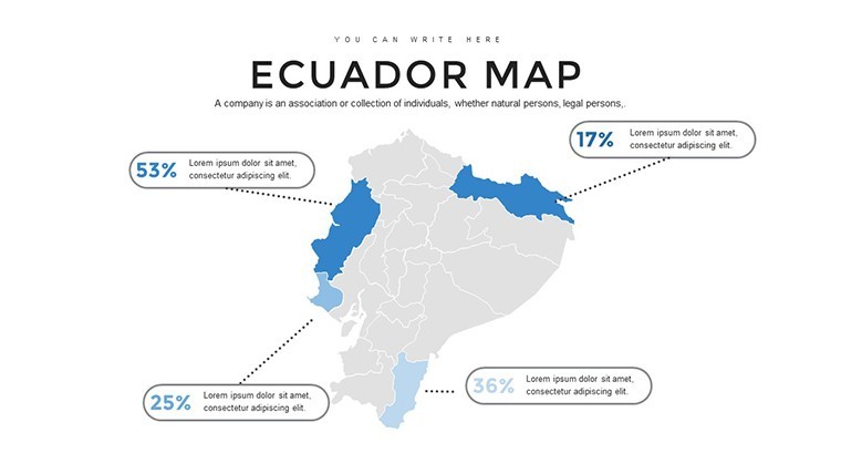
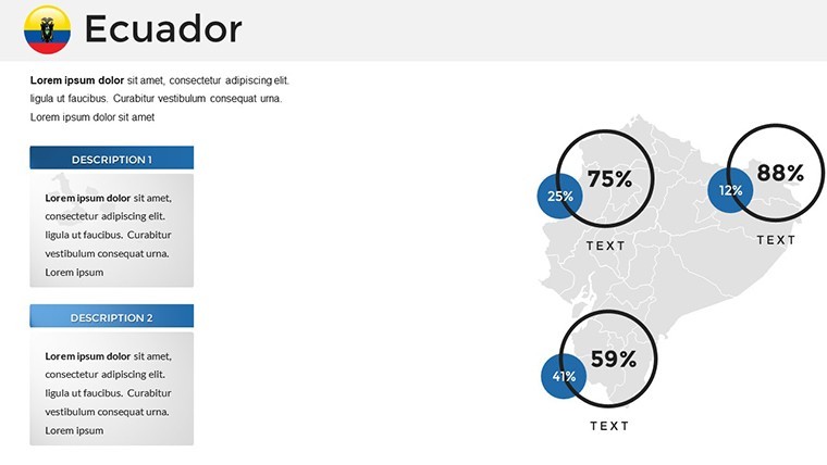
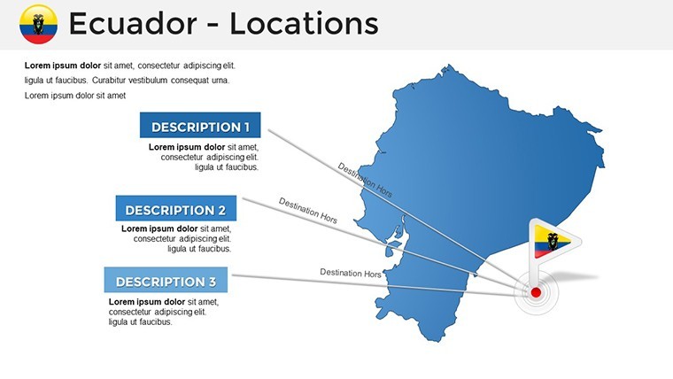
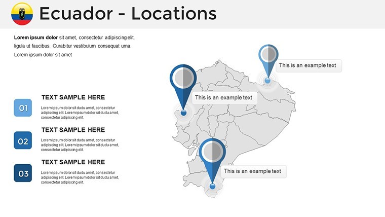
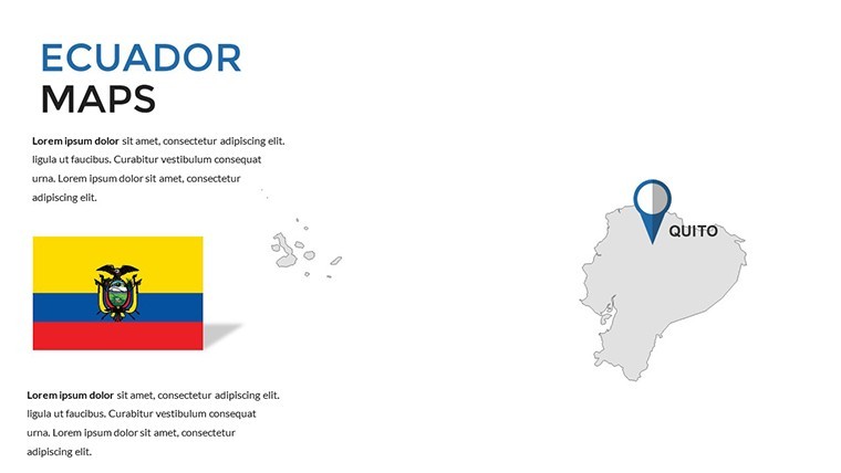
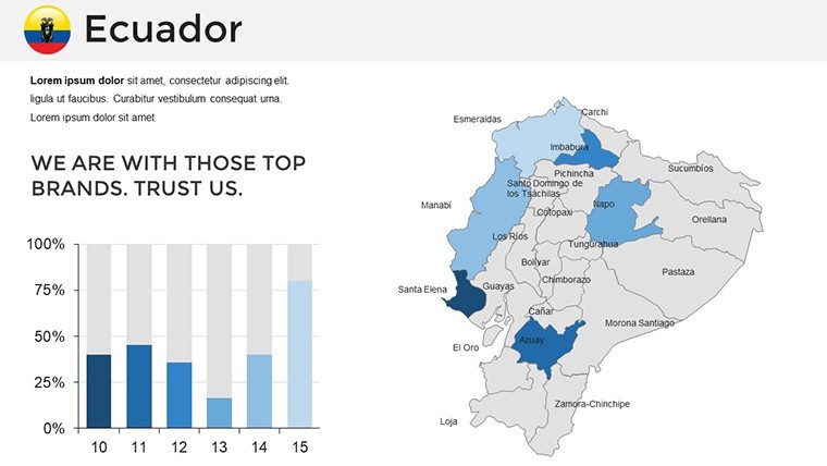
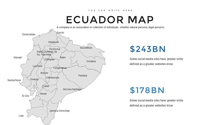
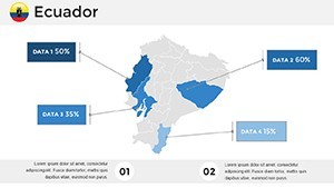
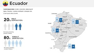
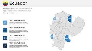
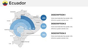
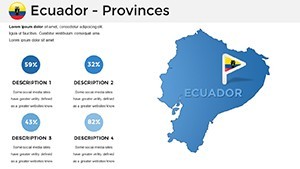
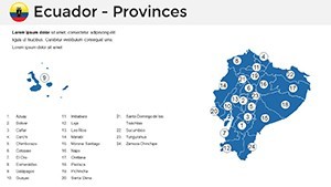
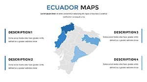
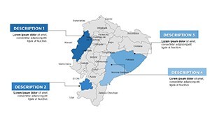
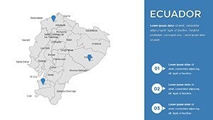
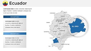
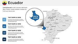
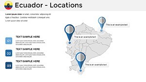
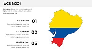
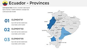
This template centers on Ecuador, a nation straddling the equator with territories spanning mainland South America and the iconic Galapagos Islands. Slides feature detailed political maps outlining provinces from Pichincha to Galapagos, complete with editable states and regions. Vector symbols for landmarks - like the Cotopaxi volcano or the Darwin Research Station - can be resized or recolored without pixelation, maintaining professional quality.
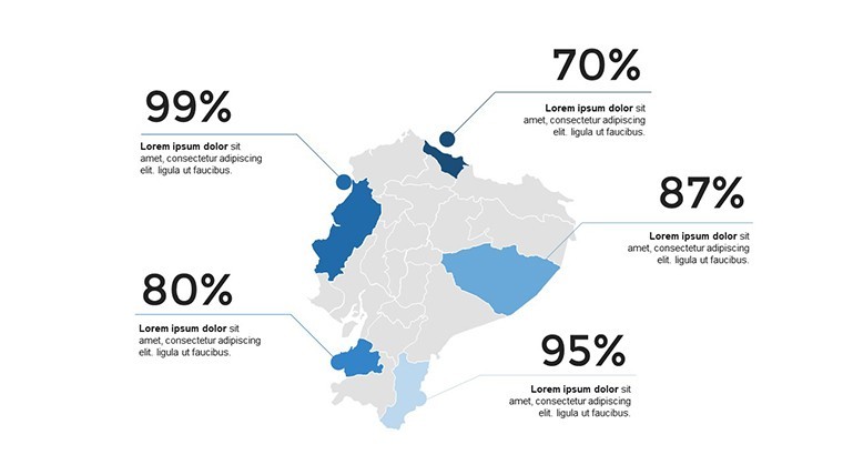
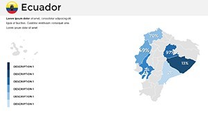
Unlike generic map generators, this offers tailored infographics: axis-adjustable charts for seismic activity data, customizable grids for urban planning visuals, or diagrams highlighting export routes for bananas and shrimp. A researcher might use it to depict deforestation trends in the Yasuní National Park, combining maps with timelines to advocate for conservation at global forums like the UN Climate Conference.
Essential Features for Dynamic Presentations
- Vector Scalability: Stretch or modify symbols seamlessly, ideal for high-definition displays.
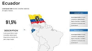
- Color and Font Flexibility: Adapt to themes, such as earthy tones for Andean regions or oceanic blues for coastal areas.
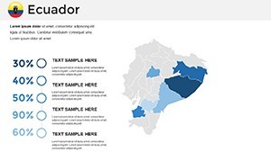
- Grid and Axis Customization: Fine-tune for precise data representation, like population density maps.
- Political Focus: Editable boundaries for in-depth analyses of regional governance.
- Cross-Device Support: Edit on desktop or tablet, ensuring mobility for on-the-go professionals.
These attributes align with standards from bodies like the International Cartographic Association, emphasizing clarity and adaptability in visual aids.
Diverse Applications Across Industries
In corporate environments, use these maps to chart market expansions - overlay sales data on provinces to identify growth in cities like Guayaquil. Educators can animate lessons on Darwin's evolutionary theories, using Galapagos-focused slides to engage students interactively. For NGOs, illustrate humanitarian efforts in earthquake-prone areas, integrating relief distribution maps with impact metrics.
Consider a case from the Ecuadorian Ministry of Tourism: Similar templates helped promote the "Train to the Clouds" route, boosting visitor numbers by visualizing scenic paths and cultural stops, as noted in tourism industry analyses.
Practical Steps to Build Your Presentation
- Choose a Foundation Slide: Start with a basic outline or a detailed island map.
- Personalize Elements: Adjust colors for thematic consistency, adding tick marks for scale accuracy.
- Embed Data Visuals: Import stats to populate diagrams, such as GDP contributions from oil sectors.
- Enhance with Symbols: Incorporate icons for wildlife or infrastructure to enrich narratives.
- Finalize and Share: Test animations, then export for distribution.
This method streamlines creation, drawing from agile design principles to foster iterative improvements.
Superiority Over Basic Mapping Tools
Standard Keynote inserts pale in comparison, often lacking the depth for specialized content like Ecuador's archipelagic extensions. Our template's pre-built elements reduce design fatigue, with users reporting enhanced audience retention through vivid, data-backed stories. Its .key format ensures native performance, avoiding compatibility hiccups.
For international consultants, it's a game-changer in pitches for sustainable projects, like those funded by the World Bank in Quito's urban renewal.
Expert Tips for Optimal Use
Leverage Keynote's morph transitions to evolve maps dynamically - reveal island chains gradually for dramatic effect. Collaborate via shared links for multicultural input, ensuring representations respect indigenous perspectives like those of the Kichwa people. Always verify data sources for credibility, enhancing your in presentations.
One innovative application: A biologist adapted slides for a TEDx talk on Galapagos conservation, blending maps with photos for a standing ovation.
Embrace this template to bring Ecuador's stories to life - download and start customizing for presentations that resonate.
Frequently Asked Questions
What types of maps are included?
Primarily political maps with editable states, regions, and vector symbols for landmarks.
Can I modify the grid and axes?
Yes, adjust the number of tick marks and add grids for precise visualizations.
Is it suitable for non-commercial use?
Absolutely, perfect for education, research, or personal projects.
How do vector symbols work?
They can be stretched or modified without quality loss, maintaining sharpness.
Does it support data import?
Yes, easily integrate spreadsheets into charts and diagrams.