Population Keynote Diagrams Template


Type: Keynote Diagrams template
Category: Flow, Illustrations
Sources Available: .key, .kth
Product ID: KD00204
Template incl.: 20 editable slides
Demographic shifts shape our world, from urban planning to policy-making, and presenting this data compellingly is key to driving change. Our Population Keynote Diagrams Template steps in as your ally, providing 20 meticulously designed editable slides that turn raw statistics into vivid narratives. Drawing from expertise in data visualization - think inspirations from Hans Rosling's Gapminder approaches - this template helps you highlight trends like migration patterns or age distributions with clarity and flair, making it indispensable for researchers, policymakers, and educators alike.
Beyond mere charts, this collection under Flow and Illustrations categories enables seamless storytelling. Picture a sociologist mapping population growth in emerging markets; the flow diagrams illustrate movements intuitively, fostering deeper insights during discussions. Real-world applications abound, such as in UN reports where similar visuals have clarified global challenges, leading to informed strategies and collaborative efforts.
Standout Features for Demographic Mastery
This template excels in its focused design: 20 slides in .key and .kth formats, optimized for Keynote's intuitive interface. Customize bar graphs for density comparisons, pie charts for ethnic breakdowns, flowcharts for migration routes, and maps for geographic distributions - all with drag-and-drop ease.
- Customizable Visuals: Adjust scales, labels, and colors to reflect accurate data representations.
- Professional Polish: Expert-crafted elements ensure your slides meet publication standards, like those from the Census Bureau.
- Efficient Workflow: Pre-populated data placeholders speed up creation, freeing time for analysis.
- Interactive Potential: Built-in hyperlinks for deeper dives into sources, enhancing credibility.
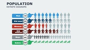
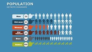
Unlike generic tools, it incorporates demographic-specific icons, such as population pyramids, elevating your presentations above standard fare.
Practical Use Cases in Action
Apply this template across sectors: In public health, use maps to show disease prevalence by region, aiding resource allocation - as seen in CDC briefings. For urban planners, flowcharts depict commuter flows, optimizing infrastructure plans. Step-by-step guide: Open in Keynote, choose a slide like the population pyramid, enter census data, refine aesthetics, and animate for emphasis in live sessions.
Business analysts might employ pie charts for market segmentation by age, informing product strategies. Inspired by case studies from Pew Research, these visuals have transformed dense reports into accessible overviews, boosting stakeholder buy-in.
In-Depth Slide Exploration
Key slides include:
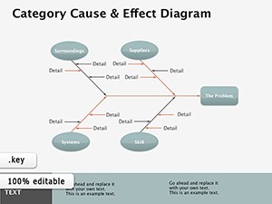
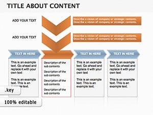
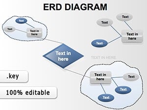
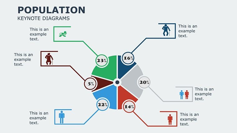
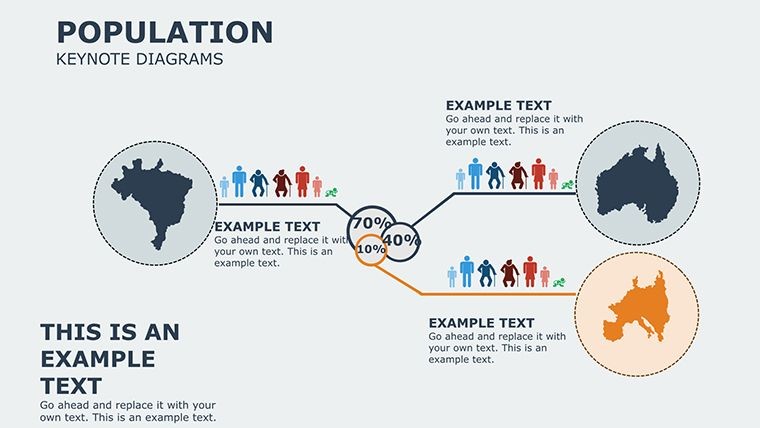
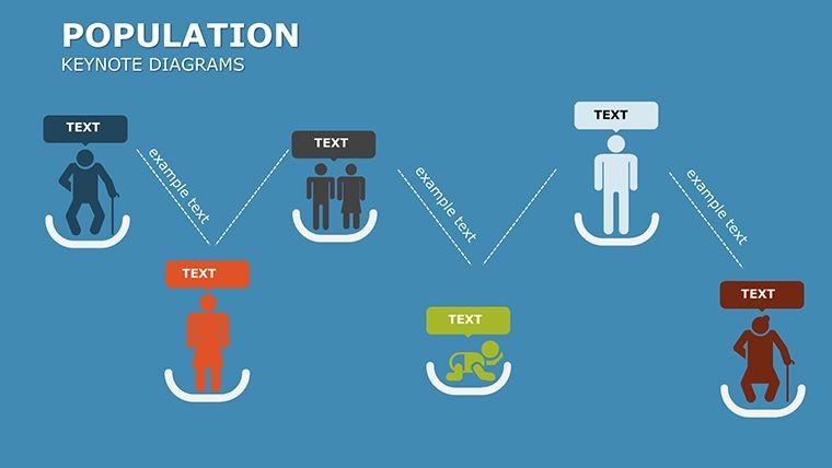
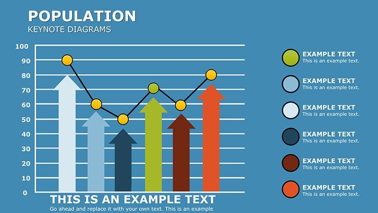
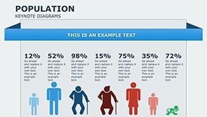
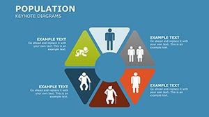
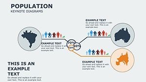
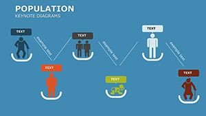
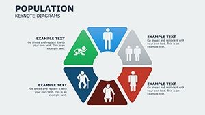
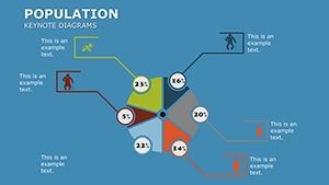
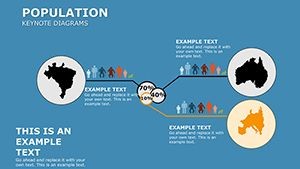
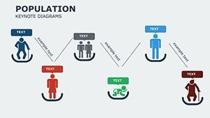
- Slide 1-4: Flow Diagrams � Track population movements with arrows and nodes, ideal for refugee or urbanization stories.
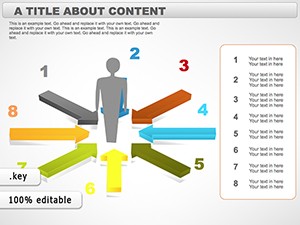
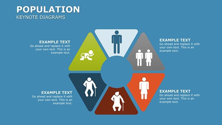
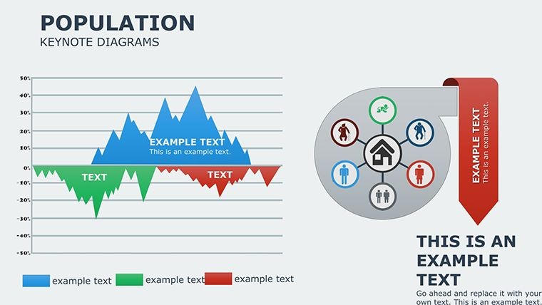
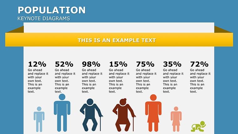
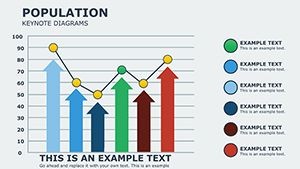
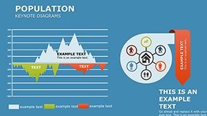
- Slide 5-8: Illustrations of Trends � Artistic depictions of growth curves, engaging for educational contexts.
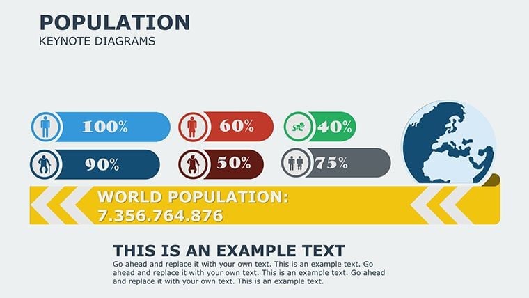
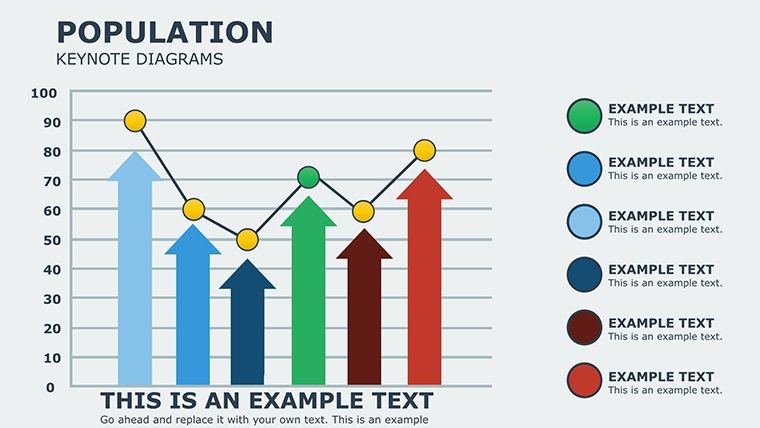
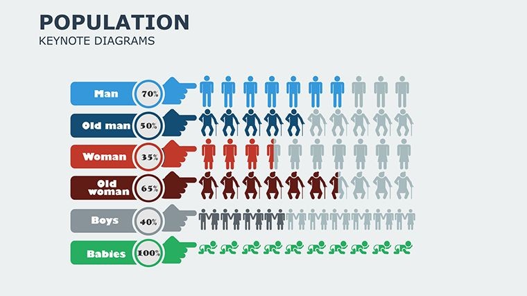
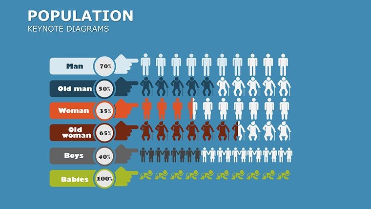
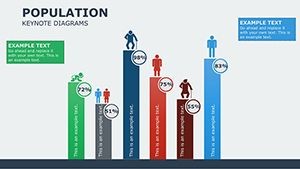
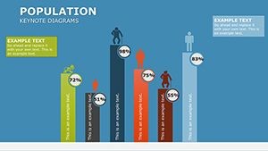
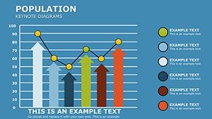
- Slide 9-12: Bar and Pie Charts � Compare demographics across groups, with tooltips for details.
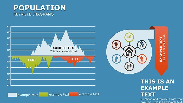
- Slide 13-16: Maps and Geospatial � Overlay data on world maps, customizable for regional focus.
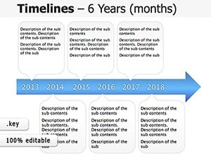
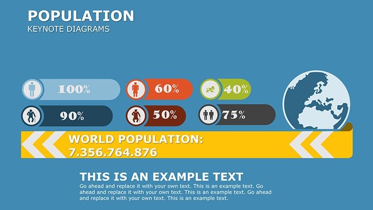
- Slide 17-20: Integrated Analyses � Combine elements for comprehensive overviews, like fertility rates over time.
Tip: Leverage Keynote's magic move transitions to show data evolution smoothly.
Pro Tips for Demographic Presentations
Craft narratives that resonate: Start with global overviews, zoom into specifics, and end with implications. Add light touches, like a witty caption on a growth chart - "Booming Ahead!" - to maintain interest. Ensure ethical data use by citing sources inline, building trust as per journalistic standards.
Integrate with tools like Excel for data import, or export for web sharing. This template's design adheres to visualization best practices, avoiding clutter for maximum impact.
Empower your voice on population matters - grab this template and start visualizing tomorrow's insights today.
Download and Demystify Data Now
Step up your game with the Population Keynote Diagrams Template. Purchase it seamlessly and begin crafting presentations that not only inform but inspire action.
Frequently Asked Questions
- What types of data visualizations are included?
- Bar graphs, pie charts, flowcharts, maps, and more, all tailored for population metrics.
- Can I add my own data sources?
- Yes, easily import from CSV or manual entry, with full editability.
- Is it suitable for academic use?
- Definitely, with professional designs that align with research presentation norms.
- How do I customize the maps?
- Use Keynote's shape tools to overlay data, with color-coding for clarity.
- Are updates available?
- Purchased templates include access to minor updates for compatibility.
- Does it support animations?
- Yes, pre-configured for smooth data reveals.