Available Types Keynote Diagrams: Visualize Data Cycles with Precision


In a data-saturated world, the difference between a forgotten report and a standing ovation lies in how you illustrate the story behind the numbers. Our Available Types Keynote Diagrams template rises to that challenge, offering 15 editable slides dedicated to unraveling variables, performance metrics, and cyclical patterns. Tailored for Keynote users (.key format), this tool empowers analysts, marketers, and strategists to transform raw datasets into compelling visuals that drive decisions and spark discussions.
Why settle for bland spreadsheets when you can deploy dynamic graphs that adapt to your narrative? This template shines in scenarios where one variable's shift ripples across another - like sales forecasts tied to seasonal cycles or user engagement fluctuating with marketing campaigns. Drawing from real-world analytics pros who've leveraged similar assets to pivot business strategies, it ensures your presentations aren't just informative but influential. With Keynote's robust editing suite, every element from axes to legends is tweakable, supporting seamless integration of live data pulls for up-to-the-minute insights.
At 15 slides strong, it covers a spectrum from basic line charts tracking quarterly growth to intricate cycle diagrams mapping feedback loops in project management. The focus on comparative clarity means audiences grasp nuances instantly - no more squinting at fine print. Whether you're in a corporate boardroom or a virtual strategy session, these diagrams bridge the gap between data dumps and actionable intelligence, all while maintaining a clean, professional aesthetic that aligns with modern design standards.
Essential Features That Fuel Insightful Presentations
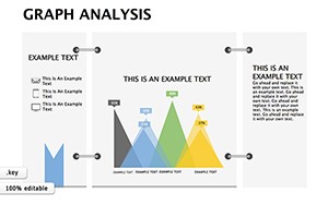
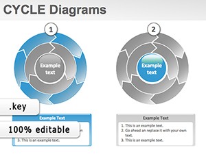
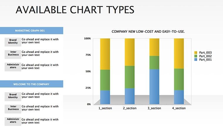
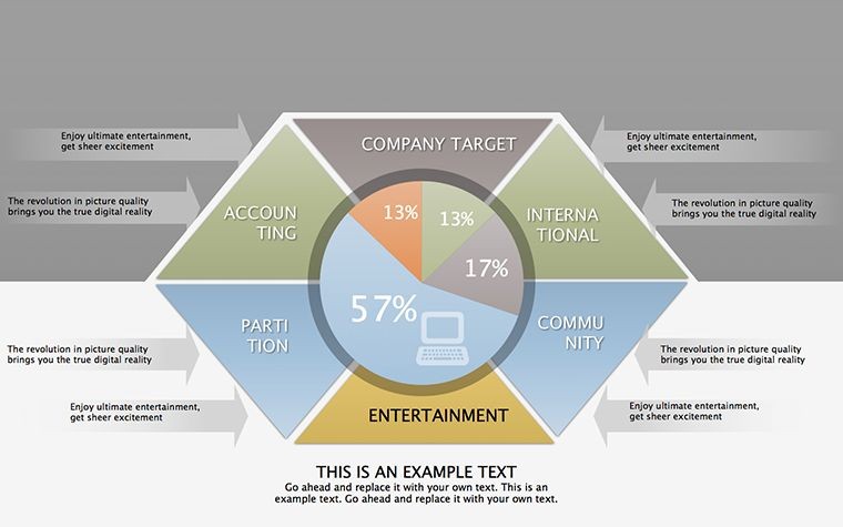
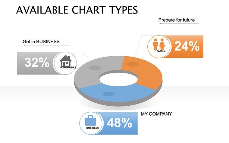
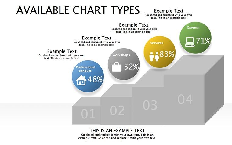
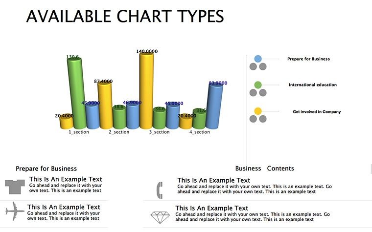
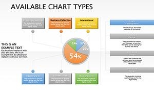
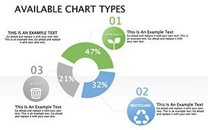
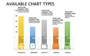
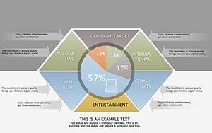
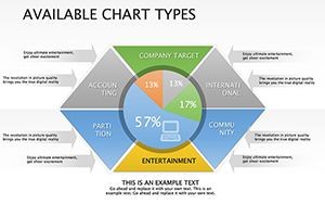
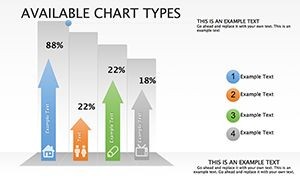
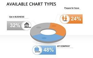
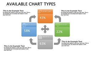
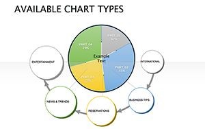
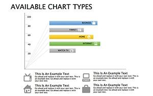
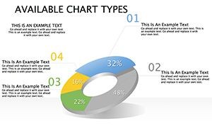
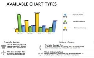
Each slide is a building block for your data symphony. Slide 1 introduces a foundational bar graph for side-by-side variable comparisons, with customizable scales to highlight disparities in performance metrics. Progress to Slide 5, where pie charts dissect market shares, editable segments allowing for on-the-fly reallocations during Q&A. The cycle-focused slides (7-10) excel here: Radial diagrams that loop dependencies, perfect for illustrating supply chain interlocks or customer journey orbits.
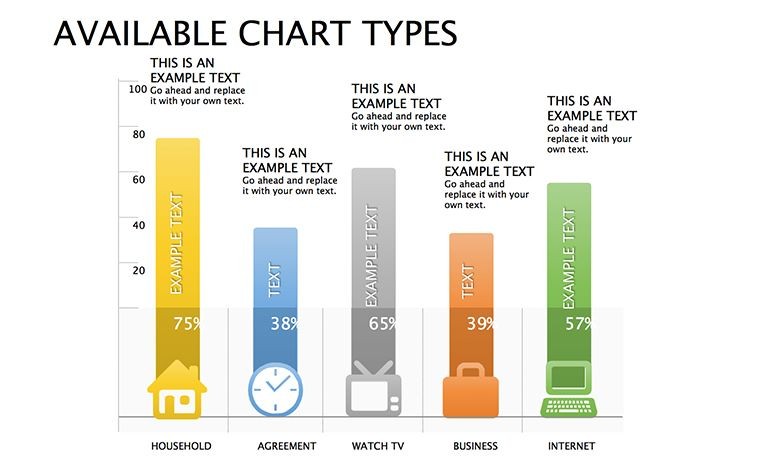
- Graph Variety: Line, bar, scatter, and radial types, all vector-scaled for high-DPI exports.
- Editability Depth: Formula-linked data tables beneath visuals, auto-updating charts as inputs change.
- Theme Flexibility: Neutral palette with accents in teal and orange, evoking trust and energy - swap via color wells.
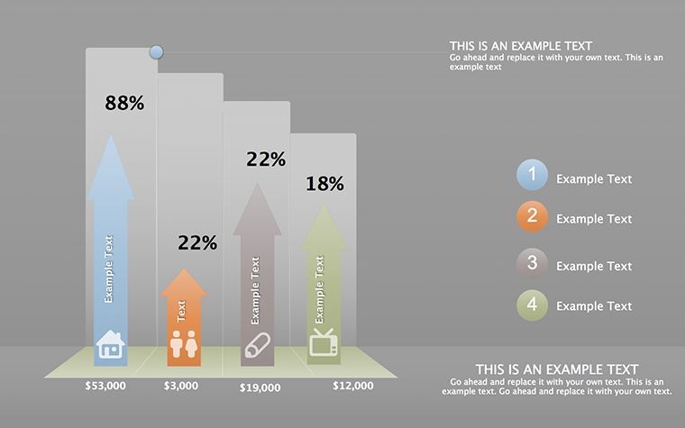
- Annotation Tools: Built-in callouts and trend lines for emphasizing key inflection points.
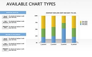
Slides 11-15 ramp up complexity with multi-axis plots, ideal for bivariate analysis like ROI versus effort. Keynote's magic touch? Smooth morph transitions between graph states, turning static slides into evolving stories that hold attention longer than any monologue.
Targeted Use Cases: From Analytics to Advocacy
Envision a marketing director unveiling campaign ROI: Using the line graph slide, overlay actuals against projections, with cycle diagrams revealing content recycle efficiencies. This not only justifies budgets but forecasts future wins, much like how data viz experts at Gartner recommend for stakeholder buy-in. In education, professors employ these for econometric models, where scatter plots correlate variables like GDP and innovation indices, making abstract econ tangible.
Spotlight: Revolutionizing Project Reviews
A tech firm case: During agile retrospectives, the team customized cycle slides to map sprint velocities, identifying bottlenecks that slashed delivery times by 25%. The template's modularity allowed color-coding phases - green for sprints, red for impediments - turning reviews from rote to revelatory. Unlike generic Excel embeds, Keynote's native handling prevents formatting glitches, ensuring reliability in high-stakes environments.
For sales teams, the comparative bars shine in competitive analyses: Stack product features against rivals, with editable metrics that flex to regional data. Pro workflow hack: Link to Google Sheets via Keynote scripts for real-time syncs, keeping decks evergreen without manual updates.
Enhancing Collaborative Data Storytelling
- Import CSV data into the master table for auto-population.
- Layer interpretations via text overlays, fostering narrative depth.
- Export as animated GIFs for social recaps, extending reach.
This sequence not only streamlines prep but amplifies post-presentation impact, as seen in user-shared success stories from analytics forums.
Pro Tips for Data Diagram Domination
Maximize with Keynote's advanced features: Use build orders to reveal data points sequentially, building suspense like a thriller. For accessibility, embed alt text in shapes and ensure high-contrast modes. Inject personality - caption a quirky outlier as "the black swan event" - to humanize stats without undermining credibility. LSI terms like "performance visualization" or "trend mapping" weave in naturally, boosting relevance in searches for analytical tools.
Versus basic diagramming apps, this template's Keynote optimization means faster renders and richer interactions, ideal for Mac-centric creatives.
Elevate Your Analytics Game - Download Today
Seize the 15-slide arsenal for $20 and craft presentations that don't just show data - they tell tales that transform. Start visualizing victories now.
Frequently Asked Questions
How many graph types are included?
15 slides cover bars, lines, pies, cycles, and scatters, each tailored for specific comparisons.
Is it compatible with Google Slides?
Primarily Keynote, but export to PDF for cross-platform viewing; no native Google integration.
Can I add my own data sources?
Yes, editable tables support CSV imports and formula edits for dynamic updates.
What's best for beginner analysts?
Start with simple bar slides, then layer complexity - includes tooltips for guidance.
Does it handle large datasets?
Optimized for up to 1,000 points per slide, with aggregation options for bigger sets.
Any animation customization?
Fully - tweak timings and effects in Keynote's animate tab for bespoke flows.