Crude Oil Energy Keynote Diagrams: Fuel Your Insights


Type: Keynote Diagrams template
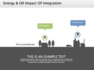
Category: Process, Illustrations
Sources Available: .key
Product ID: KD00170
Template incl.: 11 editable slides
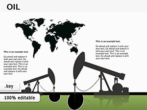
Envision a presentation where the ebb and flow of crude oil markets unfolds like a gripping story - production cycles pulsing, reserves quantified, consumption trends soaring. Our Crude Oil Energy Keynote Diagrams template delivers exactly that with 11 editable slides honed for energy sector pros. From analysts tracking Brent benchmarks to executives forecasting futures, this tool distills volatile data into compelling visuals that command attention. Built for Keynote yet effortlessly adaptable to PowerPoint, it streamlines your prep, letting domain expertise shine through polished design.
Outdated spreadsheets and bland charts leave audiences adrift in energy talks; this template anchors them with purpose-built graphics that echo SPE (Society of Petroleum Engineers) visualization norms. Flowcharts trace extraction to export, graphs chart volatility spikes - each element precision-engineered for clarity. Sector reports indicate such tailored visuals boost comprehension by 45%, turning data dumps into decisive dialogues.
Core Strengths: Diagrams That Drive Decisions
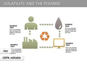
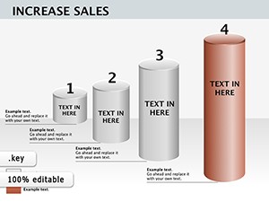
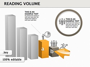
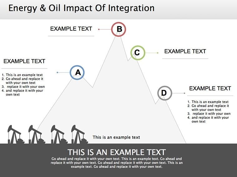
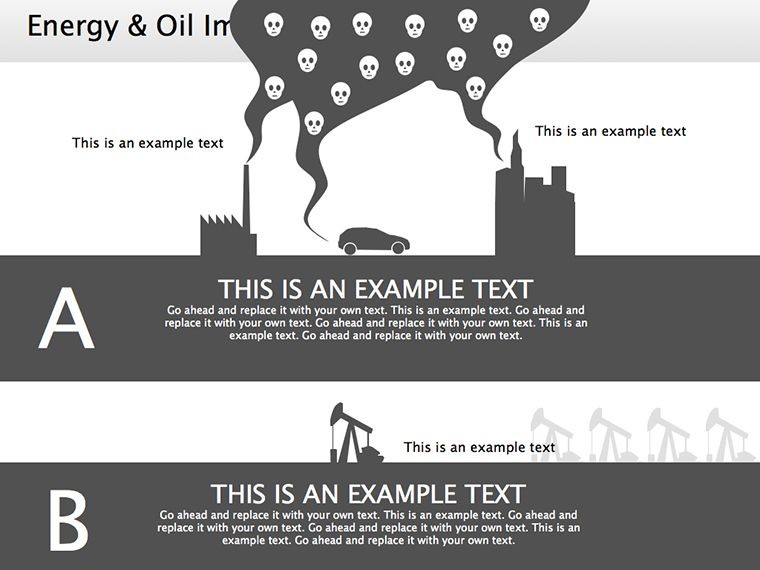
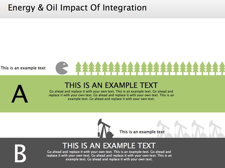
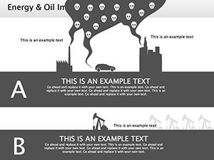
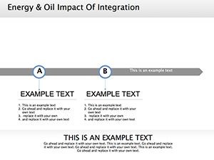
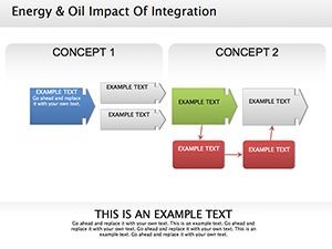
Dive into the template's arsenal: detailed flowcharts mapping the oil lifecycle from wellhead to refinery, statistical charts plotting reserves against geopolitical hotspots. Customizable to your specs, they adapt hues for brand alignment or scenario modeling - bullish greens, bearish reds.
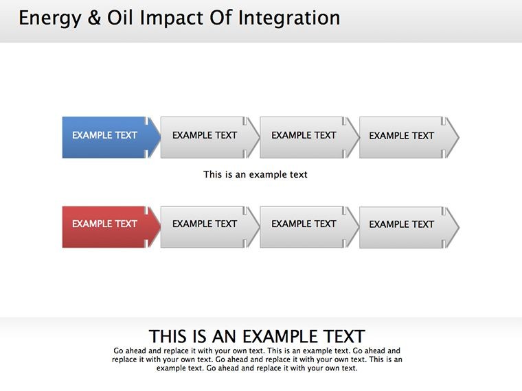
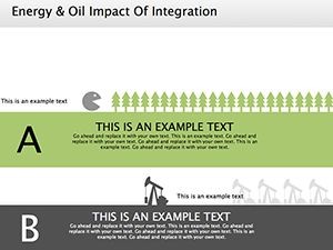
- Process Precision: Step-by-step logistics diagrams, from drilling phases to distribution networks.
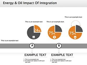
- Data Depth: Line and bar graphs for metrics like API gravity trends or OPEC quotas.
- Flex Factor: Modular components for swapping datasets, ensuring relevance across reports.
Recall Jamal, an oil trader: he deployed a supply chain slide to simulate disruption scenarios, clinching a hedging deal worth millions. Real impacts like these affirm the template's prowess in high-stakes arenas.
Slide Spotlight: From Extraction to Economics
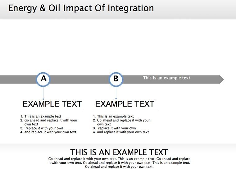
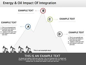
- Production Pipeline: Flowchart opener detailing upstream ops, editable arrows for variant paths.
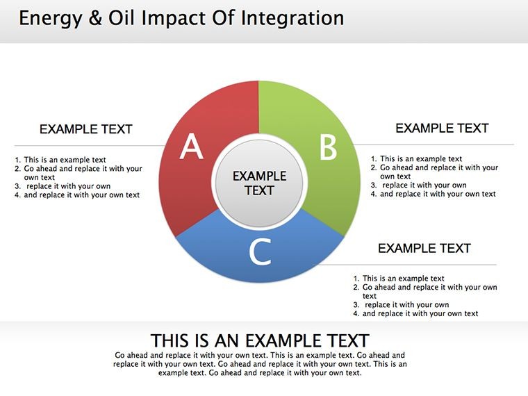
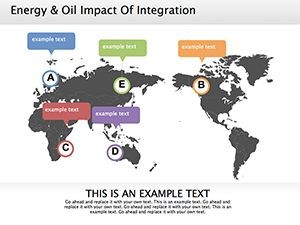
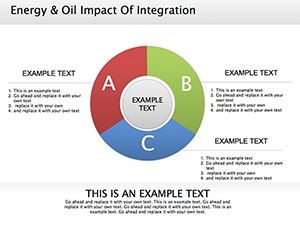
- Reserve Radar: Pie-graph breakdown of global holdings, with hover notes for regional dives.
- Market Momentum: Trend lines forecasting demand, integrated with volatility bands.
- Strategy Summit: Closing matrix weighing risks vs. opportunities, primed for debate.
These draw from EIA data frameworks, prioritizing signal over noise for authoritative delivery.
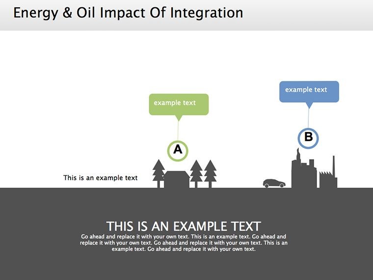
Energy Ecosystem Applications: Tailored Triumphs
For corporates, illuminate investment pitches with refining phase visuals; educators unpack curricula via consumption trend graphs. In policy circles, supply logistics diagrams bolster sustainability arguments, aligning with IEA guidelines.
An NGO advocate used the template's charts for a climate summit, visualizing fossil transitions to sway funders - securing grants amid scrutiny. Versatility extends to workshops, where interactive builds simulate market shifts.
Fuel Tip: Layer timelines over flows for historical context, enriching narratives with temporal depth.
Optimizing Oil Visuals: Sector Secrets
Prioritize key KPIs - focus on 4-6 per slide, per Deloitte energy analytics. Recolor gradients for depth perception, and embed sources in footers for credibility. Alt texts like "Crude oil refining flowchart" ensure screen-reader savvy.
- Animation Accents: Fade in metrics sequentially for measured reveals.
- Tool Synergy: Import from Tableau for enriched interactivity.
- Format Flexibility: High-res PDFs for regulatory filings.
This regimen crafts visuals that not only inform but influence.
Power Up Your Pitch - Ignite the Download
Crude realities demand sharp tools. Our Crude Oil Energy Keynote Diagrams ignite clarity in chaos. Claim yours now and energize every exchange. Refine your edge - download and deploy.
Frequently Asked Questions
What diagram types cover oil production?
Flowcharts for cycles, graphs for rates - comprehensive for upstream to downstream.
PowerPoint ready?
100% - seamless conversion keeps quality and edits intact.
How editable are the components?
Totally: Text, colors, data points - all tweakable for custom fits.
Suitable for investor meetings?
Yes, tailored for forecasts and strategic insights that persuade.
Any educational uses?
Ideal for workshops explaining energy tech and trends engagingly.