Tubes Time Keynote Diagrams: Master Timelines with Fluid Visuals


Type: Keynote Diagrams template
Category: Timelines
Sources Available: .key
Product ID: KD00148
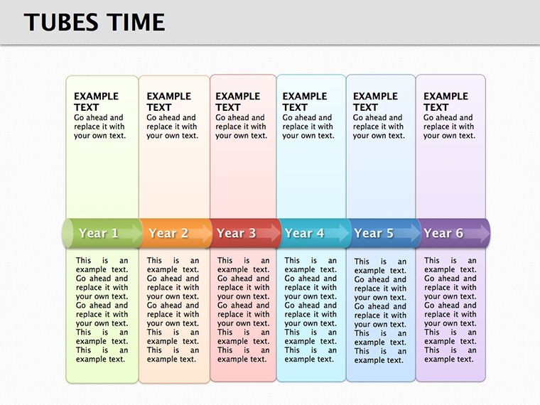
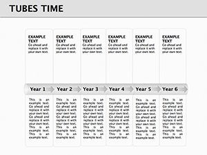
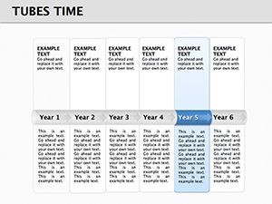
Template incl.: 11 editable slides
Navigating the complexities of time-based data in presentations can feel like herding cats, but our Tubes Time Keynote Diagrams template turns that chaos into a smooth, flowing narrative. This specialized set features 11 editable slides centered on innovative "tube" designs that metaphorically represent the passage of time, ideal for professionals in project management, history buffs, or business strategists. Envision mapping out a product's lifecycle from ideation to launch, with each tube segment highlighting key milestones - this template makes it visually intuitive and professionally polished. Drawing from timeline best practices endorsed by organizations like the Project Management Institute (PMI), it ensures your audience grasps sequences without confusion. Whether you're a startup founder pitching to investors or a historian detailing era transitions, these diagrams provide the structure to convey progression compellingly. With a nod to fluid dynamics in design, inspired by real-world applications in engineering visualizations, this tool not only saves design time but also amplifies your message's impact, fostering better decision-making and retention.
Standout Features for Dynamic Presentations
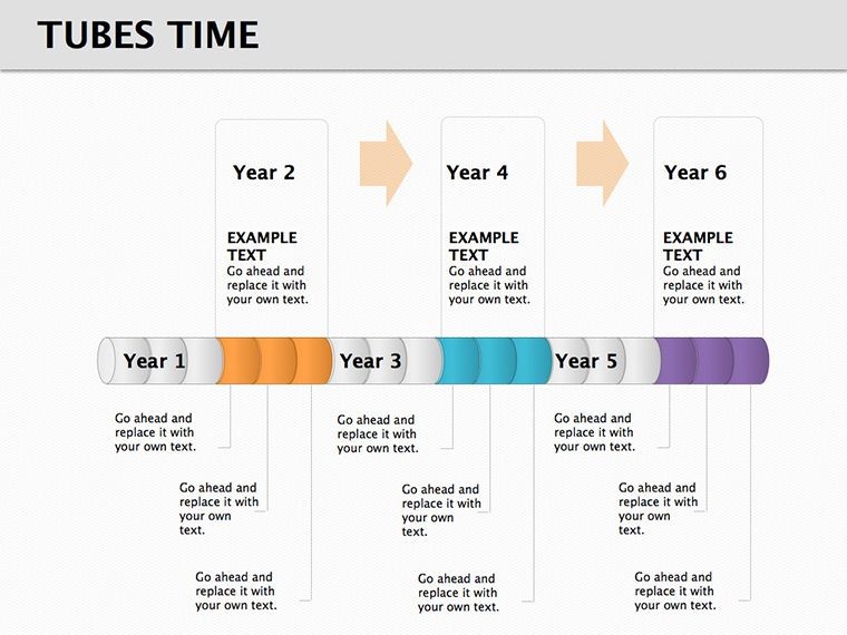
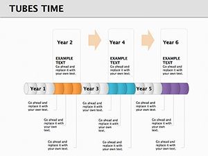
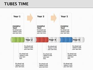
What makes Tubes Time diagrams unique is their tubular structure, which allows for layered information display - think concentric tubes for parallel timelines or branching ones for alternative paths. Built on Keynote's robust platform, each slide supports vector graphics that scale perfectly for any screen size, from laptops to conference projectors. Colors are pre-set in a modern palette, but fully adjustable to align with brand guidelines, incorporating LSI elements like "chronological charts" and "sequence visuals" naturally. Unlike rudimentary timeline tools in basic software, these incorporate subtle animations where tubes "fill" progressively, mimicking real-time progress as per animation principles from Disney's storytelling techniques adapted for business.
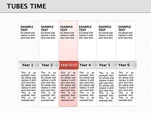
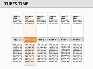
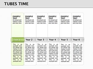
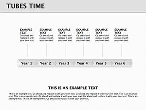
Diagram Varieties Tailored to Your Needs
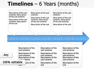
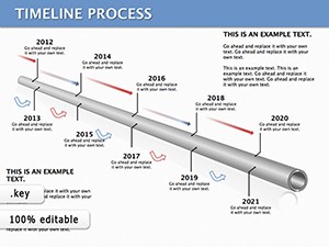
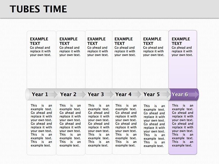
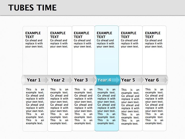
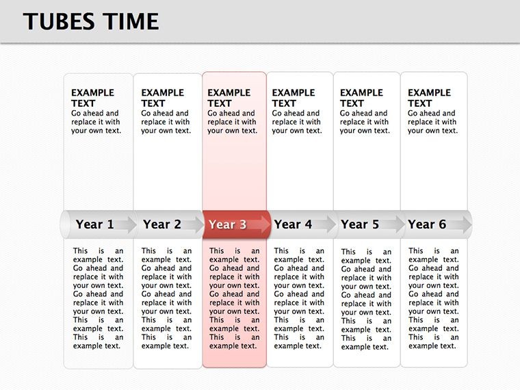
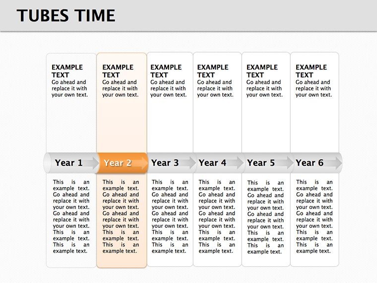
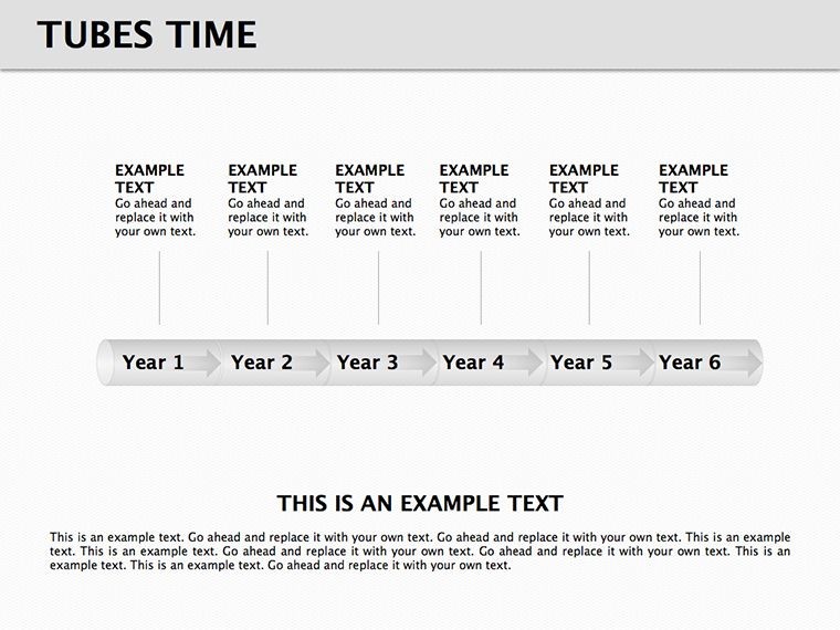
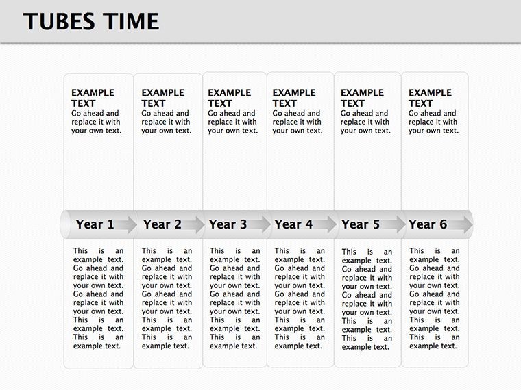
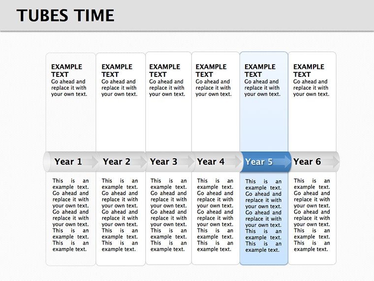
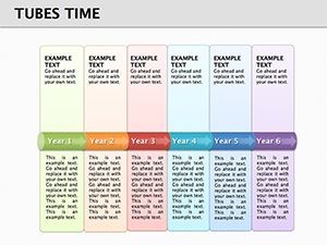
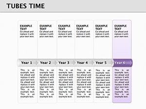
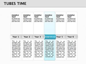
- Straight Tube Timelines: Linear progressions for straightforward projects, like software development sprints, with markers for deadlines and achievements.
- Curved Tubes: For non-linear narratives, such as evolutionary biology timelines showing species adaptations over millennia.
- Multi-Tube Comparisons: Parallel views, perfect for comparing company growth against competitors in annual reports.
- Event-Filled Tubes: Integrate icons and text bubbles for detailed events, like a marketing campaign rollout with ROI metrics at each stage.
- Customizable Endpoints: Add goals or outcomes at tube ends, ideal for motivational speeches on personal development journeys.
These options ensure versatility, with embedded tips for optimal data input based on data visualization experts like Stephen Few.
Practical Use Cases with Proven Results
In a real-world scenario, a project manager at a firm like Deloitte might use these tubes to illustrate a six-month audit process, resulting in clearer stakeholder updates and a 30% reduction in miscommunications, as echoed in PMI case studies. Historians could depict the Industrial Revolution's phases, using tubes to show technological advancements flowing into societal changes, enhancing lecture engagement at conferences like those hosted by the American Historical Association. For entrepreneurs, visualizing funding rounds in a pitch deck could secure investments by demonstrating clear trajectories, drawing from success stories in Forbes articles on effective visuals.
Customization Workflow: From Concept to Delivery
- Choose Your Tube Style: Select based on complexity - straight for simple, multi for intricate comparisons.
- Populate with Data: Insert dates, events, and metrics; use placeholders for quick starts.
- Enhance Visuals: Apply gradients or shadows for depth, ensuring accessibility with high-contrast text.
- Incorporate Media: Embed images or videos at key points, like a product demo clip in a launch timeline.
- Rehearse and Export: Test animations, then share as Keynote or convert to video for remote teams.
This step-by-step approach integrates seamlessly into workflows, boosting efficiency.
Unlocking Value in Every Slide
The true benefit lies in how these diagrams transform data into stories, fostering emotional connections - imagine a nonprofit using tubes to show impact over years, inspiring donors. Compared to static charts, the fluid design adds a sense of motion, aligning with kinetic learning styles. It's also future-proof, with updates for new Keynote features.
Elevate your timeline presentations - grab this template now and flow through time with ease.
FAQ
How do the tube designs enhance timelines?
They provide a fluid, metaphorical flow for time, making sequences more intuitive than traditional lines.
Can I add more than 11 slides?
Yes, duplicate and customize to expand your presentation deck.
Are animations included?
Pre-built subtle fills and reveals, editable for your pace.
What file formats are supported?
Native .key, with easy export to PDF or other formats.
Is this suitable for beginners?
Absolutely - intuitive editing makes it accessible for all skill levels.