8 Graph Plan Keynote Diagrams - Instant Download | ImagineLayout


Files and Formats Included
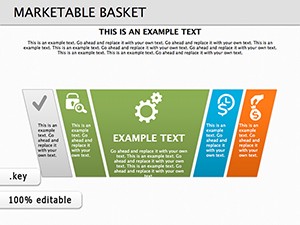
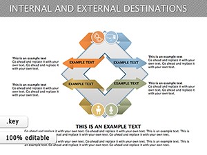
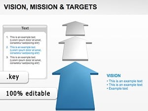
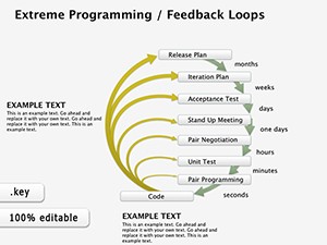
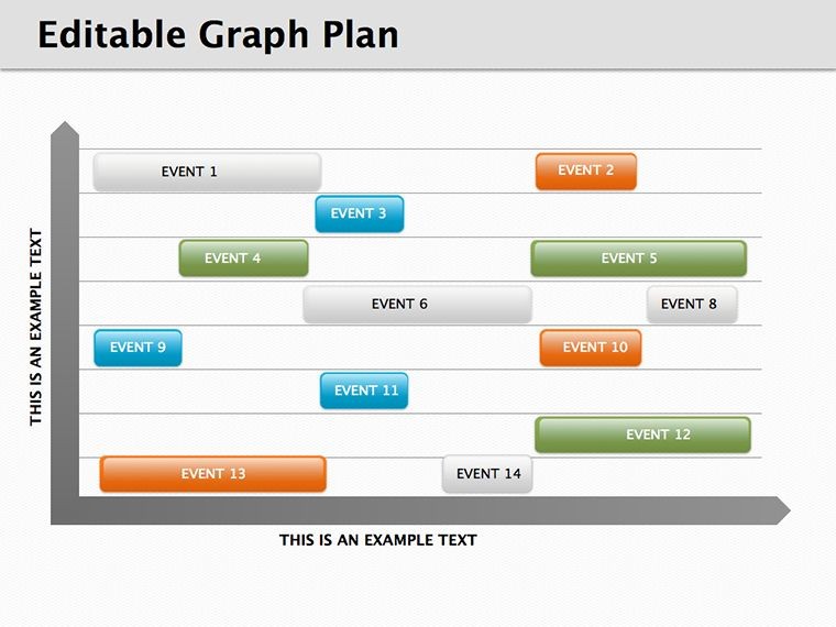
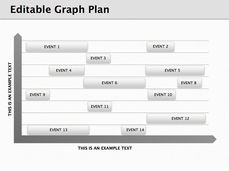
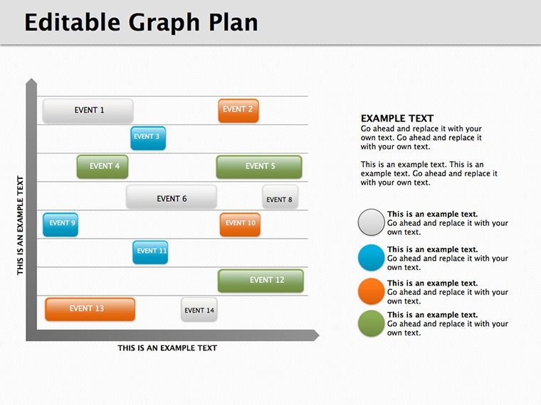
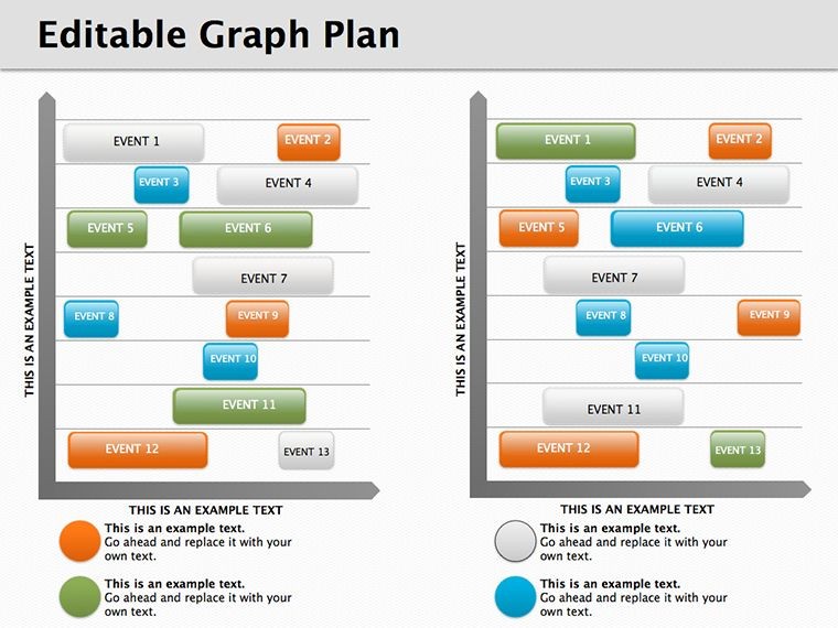
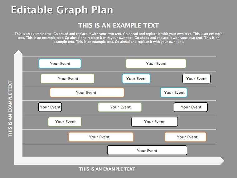
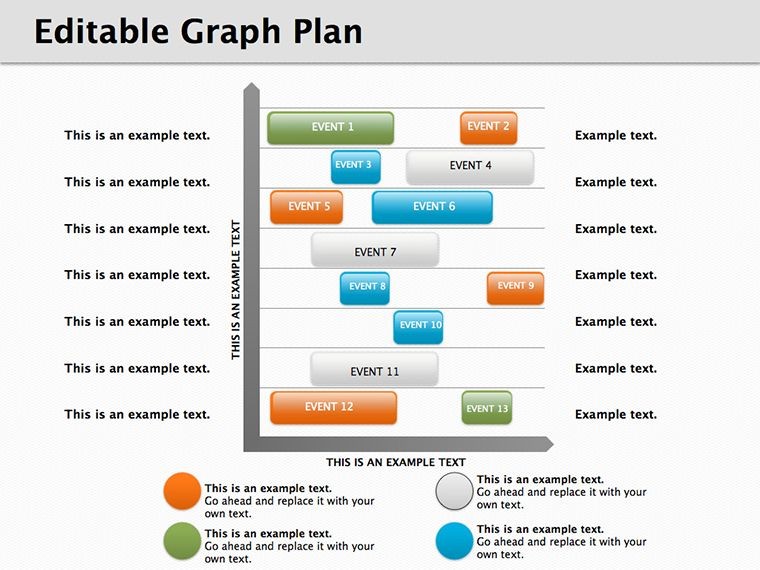
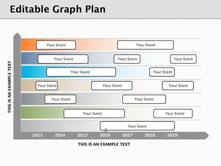
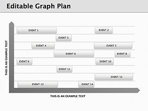
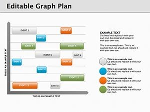
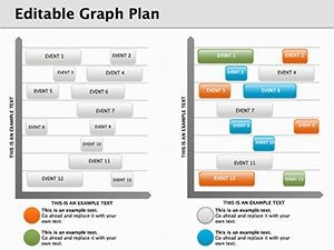
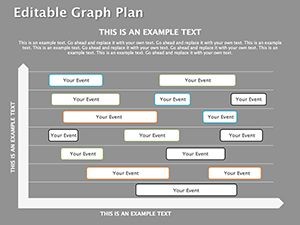
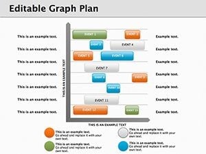
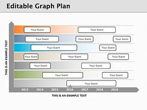
Eight diagrams sit inside the KEY file. Work plan graphs occupy the first layouts. Milestone timelines fill additional slides. Adjustment placeholders exist for every element. Export remains simple to PDF.
Diagrams link sequentially to show complete project progression. Layout composition keeps data readable across multiple views.
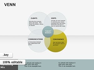
Flat design with adjustable connectors distinguishes the set from venn intersections. It supports project tracking in internal reporting better than isolated charts because data flows connect naturally. Single purchase delivers all eight slides with full editing.
Editing Capabilities at a Glance
| Feature | Details |
|---|---|
| Diagrams included | 8 with independent segments |
| Diagram categories | plan graphs and milestone timelines |
| Editable elements | shapes text connectors icon layers |
| Aspect ratio | 16:9 standard |
| Keynote compatibility | version 12 and later |
| Color schemes | master palette updates |
Text updates without group unlock. Icons swap without affecting alignment. PDF export works instantly.
Edit, Brand, Present: The Workflow
Step 1 - Open the .key file in Keynote 12 or later (1 minute). Step 2 - Replace placeholder text with your content (3 minutes). Step 3 - Apply brand colors through the master slide palette (2 minutes). Step 4 - Edit diagram labels and connectors (4 minutes). Step 5 - Export as .key or PDF (1 minute).
Editing difficulty stays moderate. Beginners manage text changes fast. Advanced users refine connector weights.
Three Situations Where This Pays Off
Project managers in technology run internal reporting sessions. They update milestones and reuse the file across four quarterly reviews. Preparation drops from three hours to forty-five minutes. Data analysts in consulting adapt graphs for client proposals. The outcome shows uniform visuals in three reports.
Strategic planners in manufacturing use it for workshops. They swap data sets for five consecutive briefings. Results keep teams aligned.
Download the template now and streamline your project tracking.
Why This Template, Not a Blank Slide
Creating matching graphs manually demands three hours and moderate skill. Labels inside shapes often vanish on large screens. This layout keeps labels outside with thin connectors. Colors segment phases for hierarchy. The method preserves readability during live sessions.
Get the template and save design time today.
Which Keynote versions does this template support?
The template opens in Keynote 12 and all later releases on macOS. Earlier versions may lose some shape effects or color adjustments. Test the file immediately after download. Reach support with your exact version number if issues appear.
How do I change the color scheme?
Open the slide master view in Keynote. Select the master slide that holds the color palette. Update the theme colors there. All diagrams update automatically across the eight slides. Save and close the master to apply changes everywhere.
What does the license allow?
You may use the diagrams in paid client work and internal company presentations. Internal training sessions also qualify. Resale of the file or sublicensing remains prohibited. Redistribution as standalone assets violates the terms.
Are free and paid versions different?
The page lists only the paid version at twelve dollars. It includes all eight editable slides and masters. No free tier appears in the description. Purchase grants immediate full access to every diagram.
What file format opens the template?
The single KEY file opens directly in Keynote. PDF export serves distribution needs. No other formats ship with the download. Keynote handles all editing and export tasks.
Does the template support animations?
No built-in animations ship with the diagrams. You can add custom animations inside Keynote after opening the file. Remove or modify any added effects freely. The base layout stays clean without them.