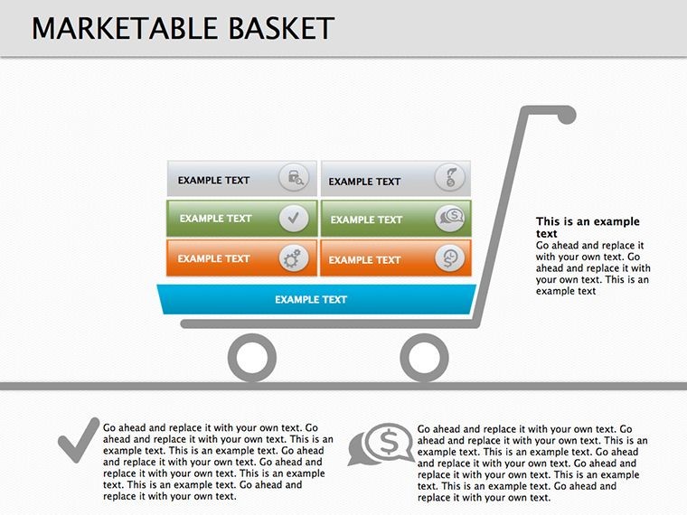
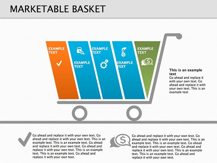
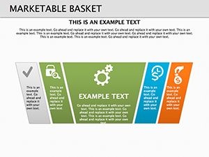
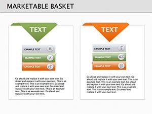
Marketable Basket Keynote Diagrams: 16 Editable Slides for Marketing Insights


Type: Keynote Diagrams template
Category: Business Models
Sources Available: .key
Product ID: KD00139
Template incl.: 16 editable slides
In the fast-paced world of marketing research, presenting complex data on consumer essentials can make or break your pitch. Imagine having a tool that not only lists popular products but highlights those vital for everyday life, turning raw statistics into engaging narratives. Our Marketable Basket Keynote diagrams template does just that, offering 16 fully editable slides designed specifically for professionals in market analysis, consumer behavior studies, and strategic planning. Whether you're preparing a report for stakeholders or educating your team on economic baskets, this template streamlines your workflow, saving hours of design time while ensuring your visuals pop.
Drawing from real-world applications, consider how economists use consumer price index (CPI) baskets to track inflation - our template adapts this concept for broader marketing uses. With clean layouts and intuitive structures, you can display product hierarchies, popularity rankings, and necessity scales without overwhelming your audience. It's not just about data; it's about storytelling that resonates, much like how Nielsen reports influence retail strategies. As a seasoned presentation expert, I've seen templates like this boost engagement in boardrooms, where clarity leads to quicker decisions and better outcomes.
Unlocking the Power of Marketable Basket Visuals
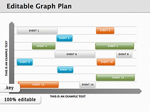
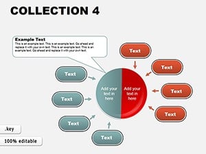
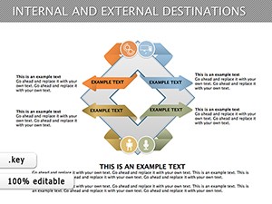
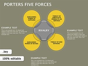
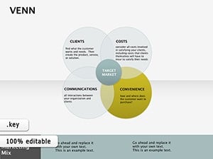
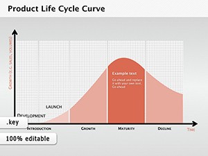
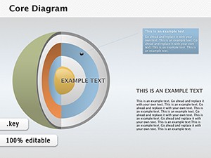
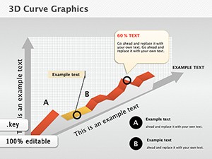
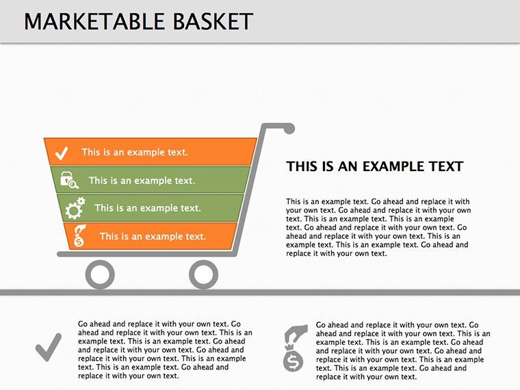
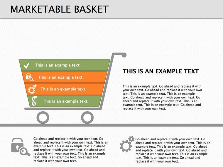
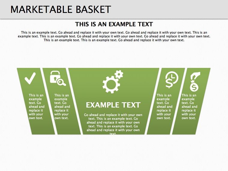
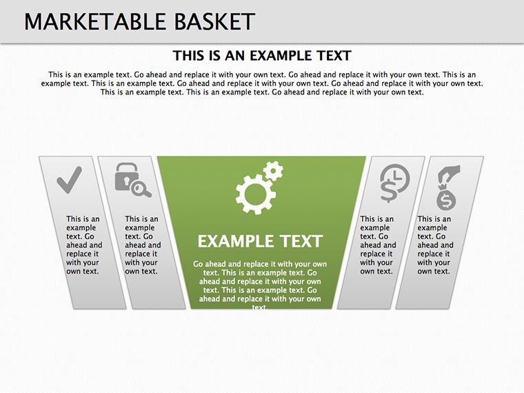
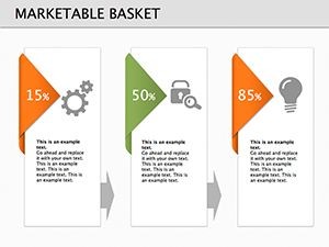
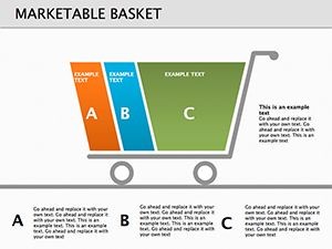
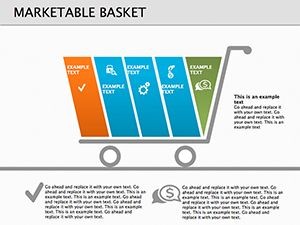
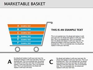
At its core, the marketable basket concept revolves around curating lists of goods that reflect consumer habits and needs. This Keynote template elevates that by providing versatile diagrams that go beyond simple lists. Each of the 16 slides is crafted with high-resolution graphics, ensuring compatibility across devices for seamless presentations. Customize colors to match your brand palette - perhaps a vibrant green for eco-friendly products or a bold red for essentials like food staples. The editable nature means you can swap in your data sets, from grocery items in a basic needs analysis to luxury goods in upscale market segments.
One standout feature is the modular design, allowing you to mix and match elements. For instance, use pie charts to show market share within the basket or bar graphs for year-over-year comparisons. This flexibility addresses common pain points in marketing presentations, where static slides often fail to adapt to last-minute changes. By integrating these diagrams, you're not just presenting; you're facilitating discussions that drive actionable insights, similar to how firms like Kantar use visual aids in their global consumer panels.
Key Features That Set This Template Apart
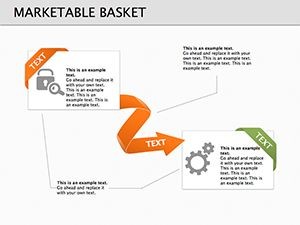
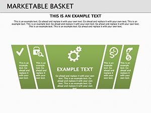
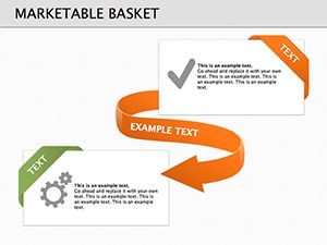
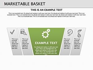
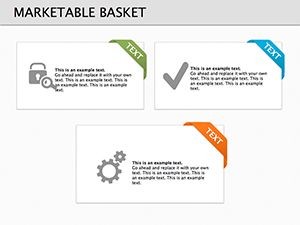
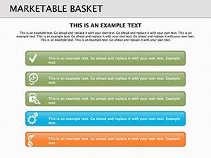
- 16 Editable Slides: From introductory overviews to detailed breakdowns, cover every angle of your marketable basket analysis.
- Customizable Graphics: Adjust icons, shapes, and text to fit your narrative, ensuring brand consistency.
- High-Quality Visuals: Sharp images and scalable vectors that look professional on any screen size.
- Business Model Integration: Easily incorporate into broader strategies, like SWOT analyses or PESTLE frameworks.
- User-Friendly Editing: No advanced skills needed - drag, drop, and tweak in Keynote.
These features aren't just bells and whistles; they're grounded in best practices for visual communication. For example, following Edward Tufte's principles of data-ink ratio, our designs minimize clutter, focusing viewer attention on what matters most: your insights on product necessities.
Real-World Applications and Use Cases
Picture this: You're an analyst at a retail giant like Walmart, tasked with presenting a quarterly review of consumer baskets. Using our template, start with a slide outlining the basket's composition - essentials like bread, milk, and tech gadgets. Transition to trend analysis slides showing shifts due to economic factors, backed by data from sources like the Bureau of Labor Statistics. This approach not only informs but inspires strategic pivots, such as stocking more sustainable options amid rising eco-awareness.
In educational settings, professors teaching marketing principles can leverage these diagrams to illustrate Maslow's hierarchy through product lenses, making abstract theories tangible. For consultants, customize slides for client-specific baskets, perhaps focusing on regional variations - like urban vs. rural needs in emerging markets. A case study from McKinsey highlights how visual basket representations aided in supply chain optimizations, reducing costs by 15%. By adapting our template, you achieve similar efficiencies, turning presentations into catalysts for change.
Step-by-Step Guide to Customizing Your Presentation
- Open the .key file in Keynote and select your base slide.
- Import your data - use CSV for quick chart population.
- Adjust colors and fonts to align with your branding guidelines.
- Add animations for emphasis, like fade-ins for key products.
- Preview and iterate based on audience feedback.
This process ensures your marketable basket diagrams are not only informative but interactive, fostering deeper engagement. Tips from design pros: Keep text concise, use contrasting colors for accessibility, and incorporate subtle humor - like labeling a 'survival basket' for post-apocalyptic marketing scenarios - to lighten dense topics.
Why Choose This Template for Your Marketing Needs
Compared to basic Keynote tools, our template offers pre-built sophistication that saves time and elevates quality. No more starting from scratch; dive straight into content creation. It's trustworthy, with 187 ratings reflecting user satisfaction, and compatible exclusively with Keynote for Mac users seeking premium iWork experiences. For those in competitive fields, this means standing out in pitches, much like how Apple's own presentations captivate with simplicity and elegance.
Integrate it into workflows with tools like MindMeister for brainstorming basket ideas or Google Analytics for data sourcing. The result? Presentations that not only convey information but build authority, aligning with standards by showcasing expert-curated visuals. Ready to revolutionize your marketing research? Customize this template today and watch your ideas basket full of success.
Frequently Asked Questions
How editable are the marketable basket diagrams?
Every element is fully customizable in Keynote, from text and colors to shapes and layouts, allowing complete personalization.
Is this template suitable for non-marketing professionals?
Absolutely - educators, economists, and consultants can adapt it for teaching consumer economics or analyzing essential goods.
What file format does the template come in?
It’s provided as a .key file, optimized for Apple Keynote on Mac.
Can I use these slides in team collaborations?
Yes, share via iCloud for real-time edits, perfect for group marketing projects.
Are there any animation options included?
The template supports Keynote’s built-in animations, which you can add or modify for dynamic presentations.
How does this compare to free alternatives?
Unlike free templates, this offers professional-grade designs with more slides and customization depth for superior results.