Reading Volume Keynote Diagrams: 19 Editable 3D Slides for Data Mastery


Data analysis often hides gems in volumes of information, but conveying those insights requires the right visuals. Our Reading Volume Keynote diagrams template, with 19 editable slides featuring 3D cube structures, empowers you to spotlight patterns, relationships, and key messages that text alone misses. Suited for data scientists, business intelligence pros, and researchers, this tool simplifies complex datasets into compelling stories, whether for quarterly reviews or academic papers. Unlock non-obvious connections and draw immediate attention, transforming how you present volumetric data.
Grounded in data visualization expertise from pioneers like Hans Rosling, who emphasized dynamic representations, this template aligns with standards from organizations like the Data Visualization Society. With 17 ratings and a focus on cube-based designs, it builds trust through proven utility in revealing hidden trends.
Delving into Reading Volume Visuals
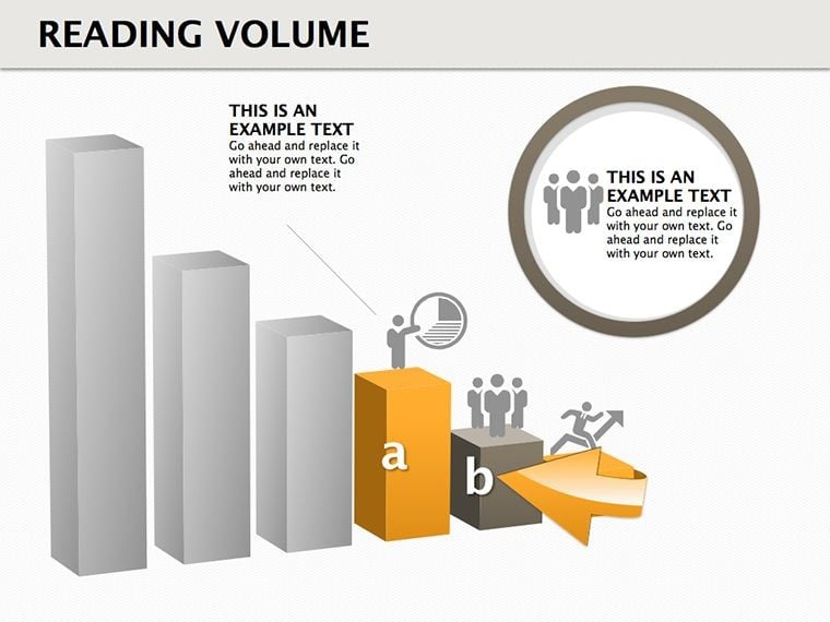
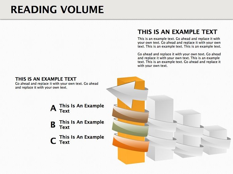
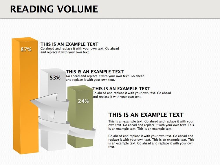
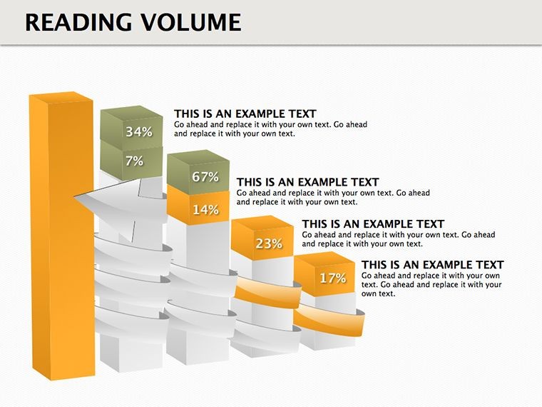
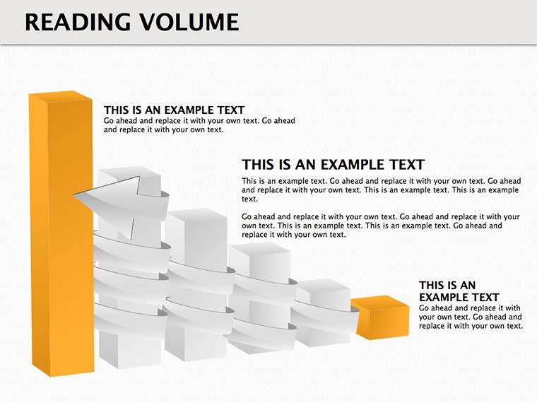
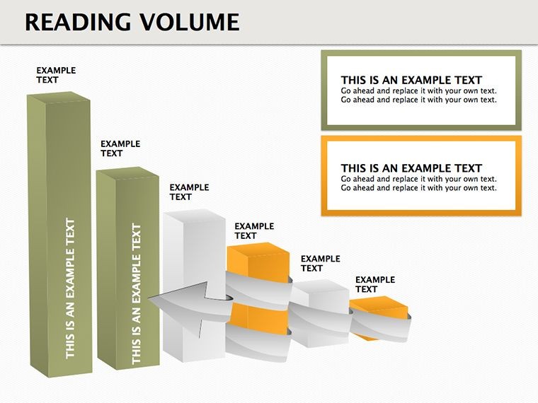
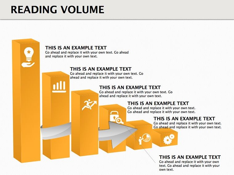
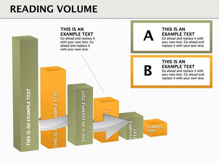
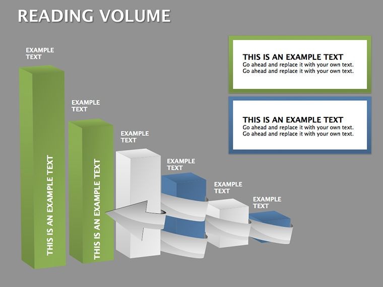
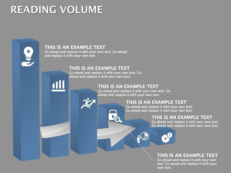
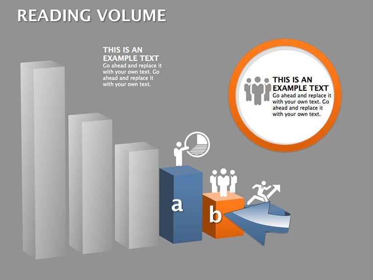
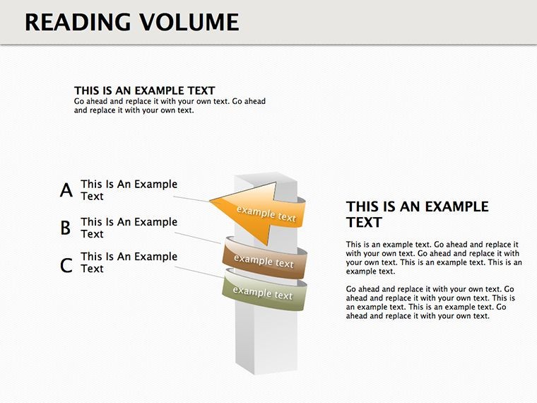
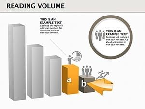
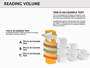
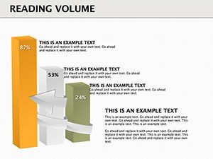
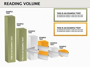
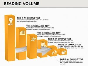
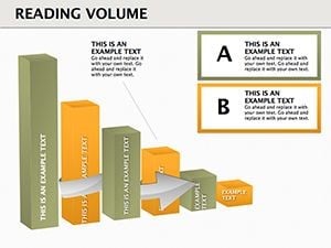
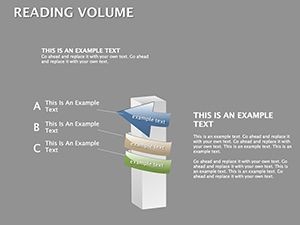
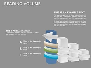
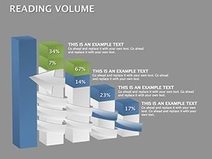
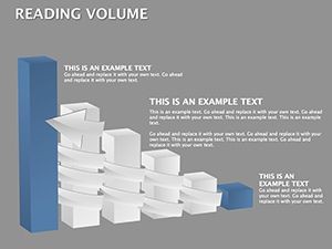
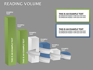
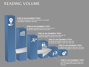
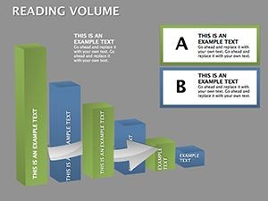
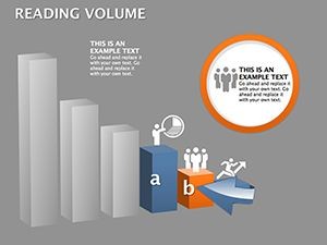
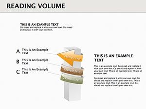
'Reading volume' refers to interpreting data depths, and our 3D cubes excel at this, stacking layers to represent multidimensional info. The 19 slides offer varied configurations, from single cubes for focal points to grids for comparative analyses. Fully editable, change dimensions, colors, and inscriptions to fit your narrative - perhaps gradient fills for volume gradients or bold labels for metrics.
This approach outperforms flat tables by adding spatial context, making it easier to grasp volumetric changes, like in sales data over time. High-quality images ensure professionalism, scalable for any presentation scale.
Key Advantages for Effective Data Presentation
- 19 Editable Slides: Range from basics to advanced volumetric displays.
- 3D Cube Focus: Adds depth for better pattern recognition.
- Animation Capabilities: Rotate or build cubes for dramatic reveals.
- Color and Text Flexibility: Customize to highlight insights.
- High-Res Quality: Crisp visuals for detailed examinations.
These elements follow Tufte's minimalism, ensuring data integrity without distraction.
Use Cases for Data-Driven Insights
In a BI dashboard review, use cube stacks to visualize reading volumes in user engagement metrics, revealing peak interaction layers as in Google Analytics reports. Researchers might employ them for scientific data, like volumetric readings in MRI scans, drawing from NIH studies for accuracy.
For corporate settings, map financial volumes - cubes representing revenue strata - echoing PwC's audit visualizations that streamlined client understandings. A case from IBM shows 3D models boosted data comprehension by 25%. Tailor our template for such precision, whether in tech R&D or market research.
Step-by-Step Customization Guide
- Open the .key file and select a cube slide.
- Populate with your data - use formulas for auto-updates.
- Modify aesthetics: Resize cubes or alter perspectives.
- Add animations for layer-by-layer builds.
- Validate with sample audiences for clarity.
Expert advice: Add witty annotations, like 'dive into the data cube,' to ease tension in analytical talks. Integrate with Tableau for enhanced data sourcing.
Superior Choice for Volumetric Data Handling
Beyond standard Keynote, this offers specialized 3D cubes for superior depth perception. Mac-optimized, it ensures smooth performance. Strengthen by embedding citations in slides. Prepared to volume up your data game? Grab this template and read between the lines like never before.
Frequently Asked Questions
What is 'reading volume' in this context?
It means interpreting data depths through 3D visuals for hidden patterns.
How editable are the cubes?
Completely - adjust sizes, colors, and content freely.
Is it for technical users only?
No, accessible for all levels with intuitive edits.
Can I animate the diagrams?
Yes, leverage Keynote animations for interactive volumes.
What data types work best?
Multidimensional sets like time-series or spatial info.