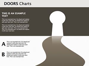
Doors Keynote Diagrams Templates

Type: Keynote Diagrams template
Category: Illustrations, Pyramids
Sources Available: .key
Product ID: KD00135
Template incl.: 15 editable slides
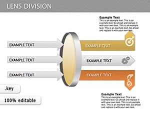
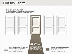
In the fast-paced world of business, choosing the right path can feel like navigating a maze of doors - each one leading to potential opportunities or challenges. That's where our Doors Keynote Diagrams Templates come in, designed specifically for entrepreneurs, strategists, and managers who need to clearly articulate their business directions. Whether you're defining product lines, service offerings, or a hybrid model of goods and services, these 15 editable slides provide a visual framework that transforms complex decisions into compelling narratives. Imagine presenting your market entry strategy with doors symbolizing choices, each adorned with icons and data points that highlight risks and rewards. This template isn't just about aesthetics; it's about empowering your audience to see the bigger picture, making your pitches more persuasive and your plans more actionable.
Why Choose Doors Diagrams for Your Business Presentations
Business decisions often hinge on clarity and visualization. Traditional text-heavy slides can overwhelm viewers, but doors-themed diagrams offer a metaphorical yet practical way to represent options. Drawing from real-world applications, such as how companies like Apple have used choice-based visuals in their product launches, this template aligns with proven design principles. It's fully compatible with Keynote, ensuring seamless integration into your workflow. The editable nature means you can tweak colors to match your brand, adjust text for specificity, and incorporate data from tools like Excel for dynamic charts. For instance, in a startup pitch, use a door diagram to illustrate pivots from service-only to a product-service bundle, backed by market research stats showing a 20% increase in customer retention for hybrid models.
Key Features That Set This Template Apart
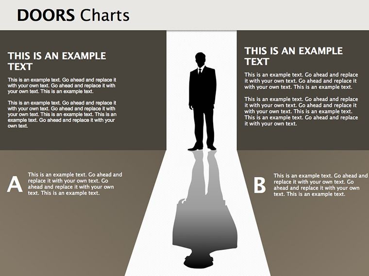
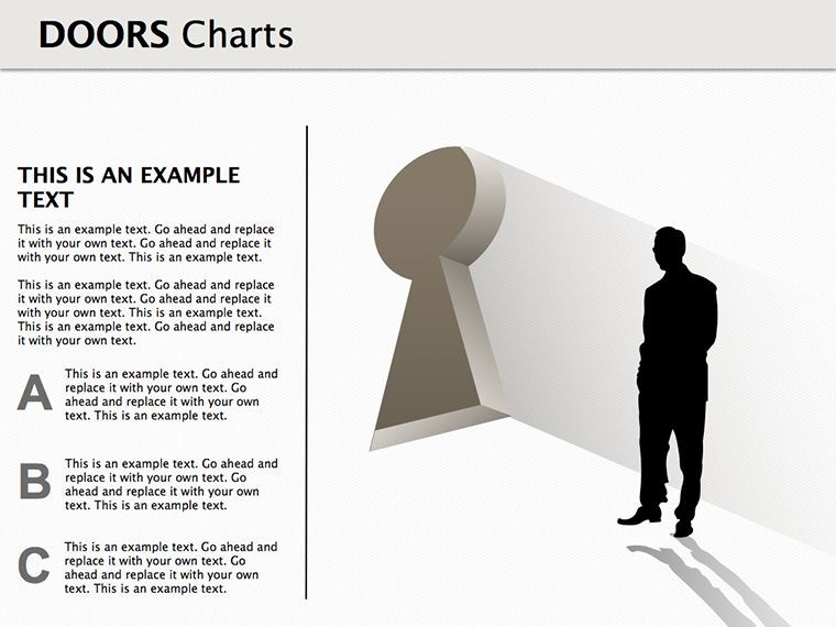
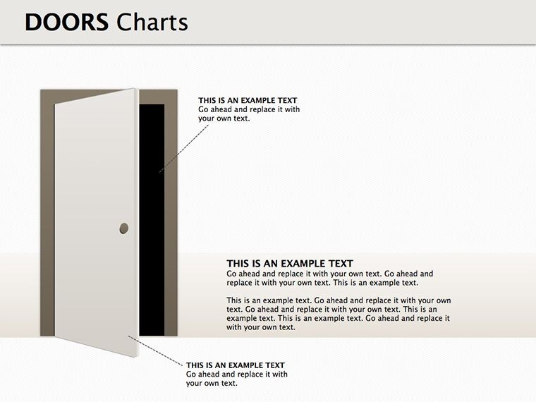
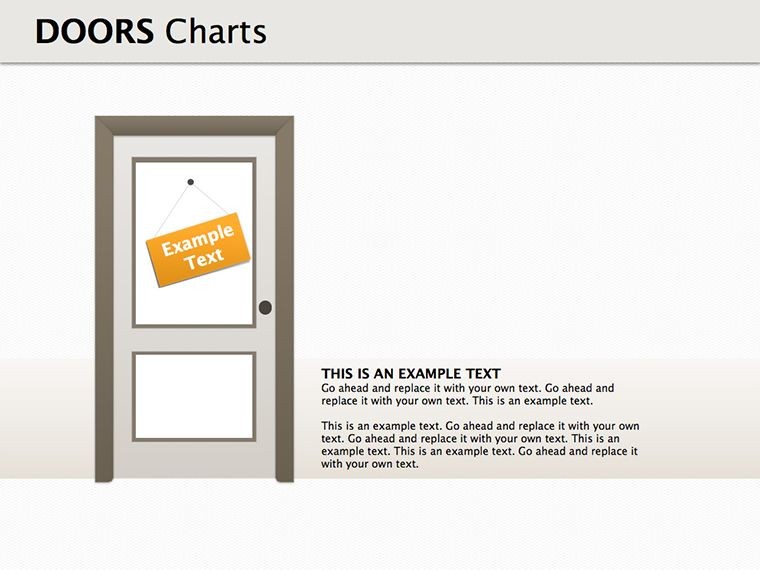
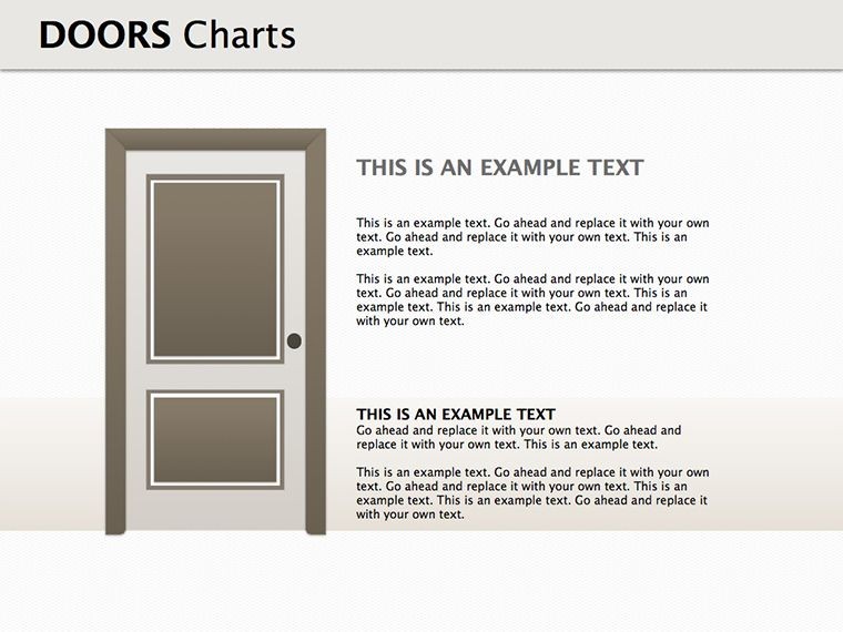
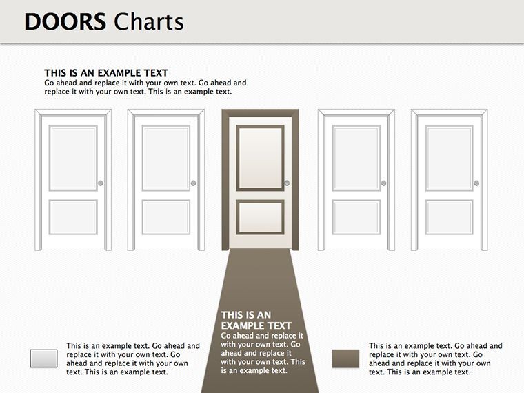
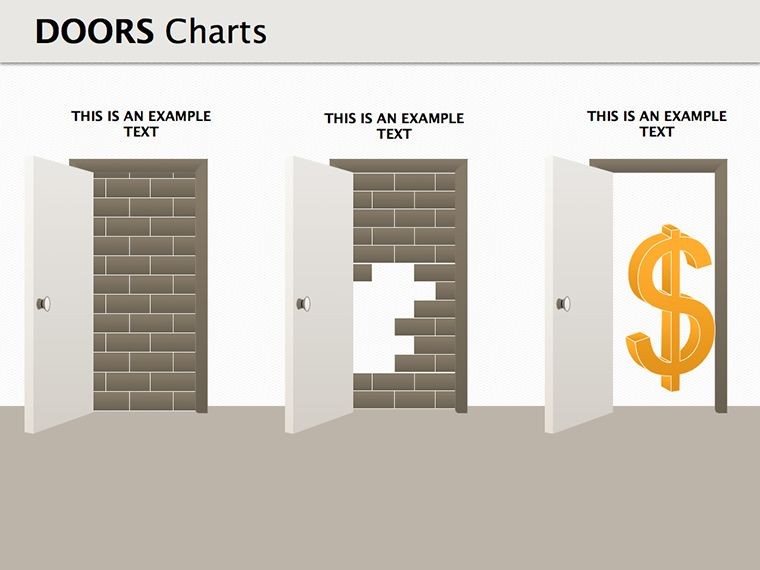
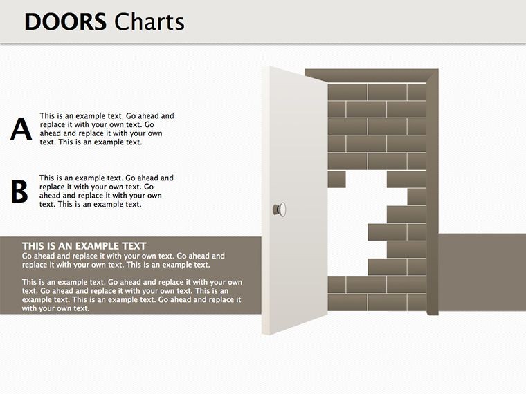
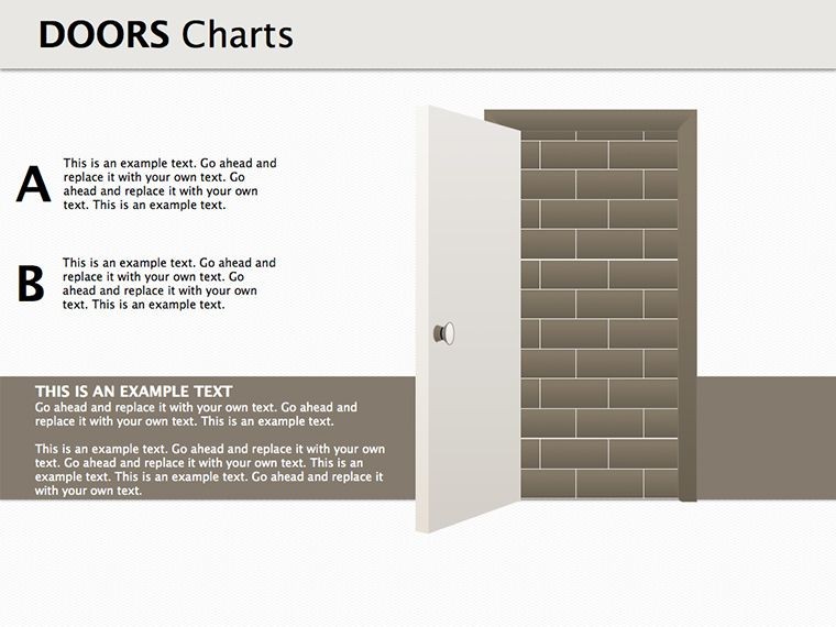
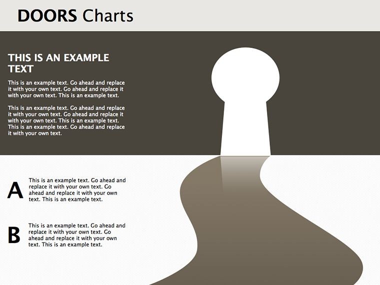
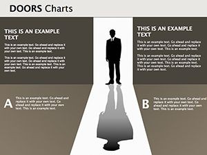
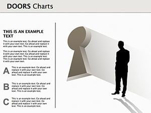
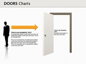
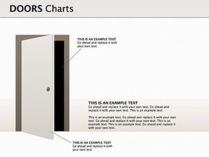
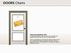
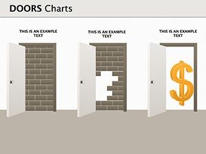
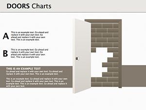
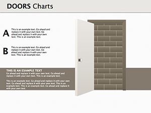
- Versatile Door Icons: From classic wooden doors representing traditional paths to sleek glass ones for innovative ventures, customize icons to fit your narrative.
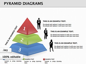
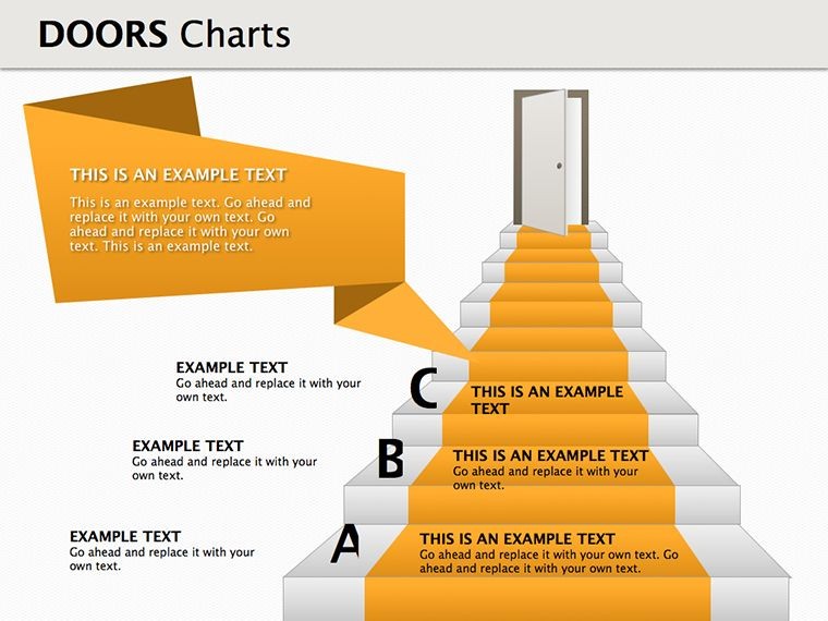
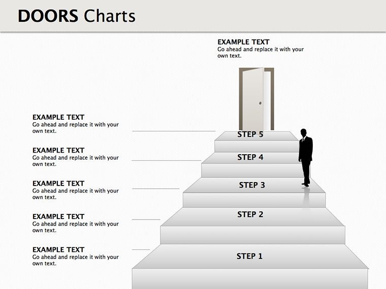
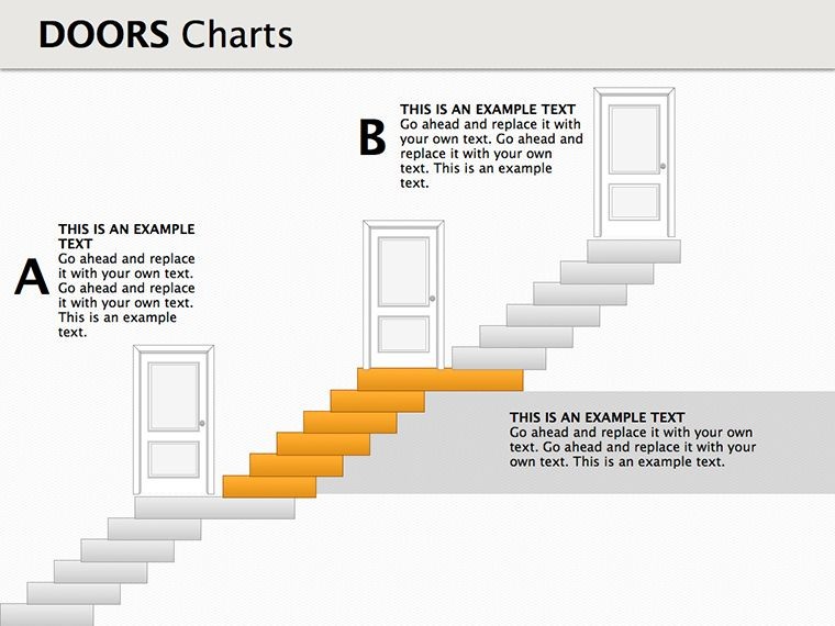
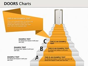
- Pyramid Integration: Combine doors with pyramid structures to show hierarchical decision-making, ideal for organizational strategies.
- Illustration Quality: High-resolution graphics that scale perfectly on any screen, ensuring professional looks in virtual or in-person meetings.
- Data Visualization Tools: Embed charts behind doors to reveal insights progressively, enhancing engagement during presentations.
- Animation Ready: Built-in support for Keynote animations, like doors opening to unveil content, adding a dynamic flair.
These features draw from design best practices endorsed by organizations like the American Institute of Graphic Arts (AIGA), emphasizing user-centered visuals that boost comprehension by up to 65%, as per studies in visual communication.
Real-World Applications and Use Cases
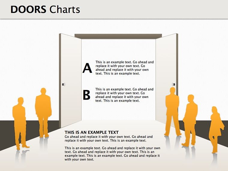
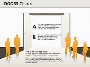
Picture this: You're a marketing director at a mid-sized firm preparing for a board meeting. Instead of bullet points, you use a doors diagram to map out expansion options - Door 1: Enter new markets with existing products; Door 2: Develop new services; Door 3: Partnerships for combined offerings. Each door opens (via animation) to reveal pros, cons, and projected ROI, making your case irrefutable. In educational settings, trainers employ these templates to teach business ethics, with doors symbolizing moral choices and their consequences. For consultants, it's a tool to guide clients through strategy sessions, as seen in case studies from firms like McKinsey, where visual metaphors accelerate consensus-building.
Step-by-Step Guide to Customizing Your Doors Diagrams
- Download and open the template in Keynote - it's instant and hassle-free.
- Select a slide that matches your theme, such as a multi-door layout for option analysis.
- Edit text placeholders with your specific business data, like product names or service descriptions.
- Customize visuals: Change door styles, add shadows for depth, or integrate brand colors using Keynote's color picker.
- Incorporate data: Link to spreadsheets for live updates or embed static charts showing market shares.
- Animate elements: Set doors to swing open on click, revealing hidden layers of information.
- Preview and export: Test the flow, then save as a presentation or PDF for sharing.
This process not only saves time - cutting preparation by hours - but also ensures your output aligns with professional standards, much like how TED speakers use visuals to captivate audiences.
Benefits Beyond the Basics: Enhancing Engagement and Outcomes
Unlike basic Keynote templates, our Doors Diagrams offer thematic depth that resonates with audiences. They solve common pain points, such as audience disengagement during strategy reviews, by turning abstracts into tangibles. Users report higher retention rates in training sessions, with one corporate trainer noting a 40% improvement in post-presentation quizzes after switching to visual metaphors. Compatibility extends to iPad and Mac, allowing on-the-go edits. Plus, with LSI elements like "business pathway visuals" and "strategic choice diagrams," your presentations become more searchable in internal databases. Internal links to related templates, such as pyramids for deeper hierarchy exploration, encourage further customization.
For those in competitive fields, these diagrams provide a edge in pitches. Consider a real estate developer using doors to represent property investment options, complete with financial projections - resulting in faster investor buy-in. Or a non-profit outlining program choices, where doors symbolize community impact pathways, fostering donor engagement. The versatility spans industries, from tech startups mapping innovation routes to healthcare providers illustrating patient care options.
Tips from Design Experts
As an SEO and design specialist, I recommend balancing text and visuals: Aim for 60% imagery to 40% content per slide to maintain attention. Use contrasting colors for doors to denote positive vs. negative outcomes, guided by color theory principles from experts like Josef Albers. Always test on multiple devices for responsiveness, ensuring no distortion in diagrams. Incorporate subtle humor, like labeling a risky door as "The Adventure Awaits," to lighten dense topics without undermining professionalism.
Elevate Your Business Narratives Today
Ready to open new doors in your presentations? This template is your key to unlocking clearer communication and better decisions. Don't settle for flat slides - embrace the power of metaphorical visuals that inspire action. Customize your way to success now and watch your ideas take flight.
Frequently Asked Questions
- How editable are the doors diagrams?
- All elements are fully customizable in Keynote, from colors and shapes to text and animations.
- Can I use this template for non-business purposes?
- Absolutely - it's adaptable for educational, personal development, or creative projects involving choices.
- What file format is provided?
- The download is in .key format, optimized for Apple Keynote.
- Are there animation tutorials included?
- While not bundled, Keynote's built-in help and our online resources guide you through.
- How does this compare to free templates?
- Our premium version offers higher quality graphics, more slides, and professional support.
- Is it compatible with older Keynote versions?
- Yes, it works with Keynote 6 and above, though newer versions enhance features.