Column Graph Keynote Diagrams: Visualize Market Dynamics with Ease


Type: Keynote Diagrams template
Category: Graphs
Sources Available: .key
Product ID: KD00089
Template incl.: 8 editable slides
In the fast-paced world of business strategy, where data drives decisions, having a clear visual edge can mean the difference between insight and oversight. Enter the Column Graph Keynote Diagrams template - a powerhouse for analysts, marketers, and managers who need to forecast scenarios, spot risks, and outline opportunities without the clutter of spreadsheets. This collection of eight editable slides transforms raw numbers into compelling stories, tailored for Keynote users on Mac who demand precision and polish in their presentations.
Crafted for those pivotal moments - like quarterly strategy sessions or investor updates - this template leverages column graphs to stack facts logically. Imagine towering bars that rise to highlight growth projections or dip to flag potential pitfalls, all animated to unfold progressively. Compatible with iWork Keynote across recent versions, it ensures your visuals render flawlessly on any Apple device, from iPads in meetings to large displays in conference rooms.
Core Features Driving Data Storytelling
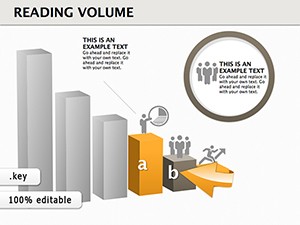
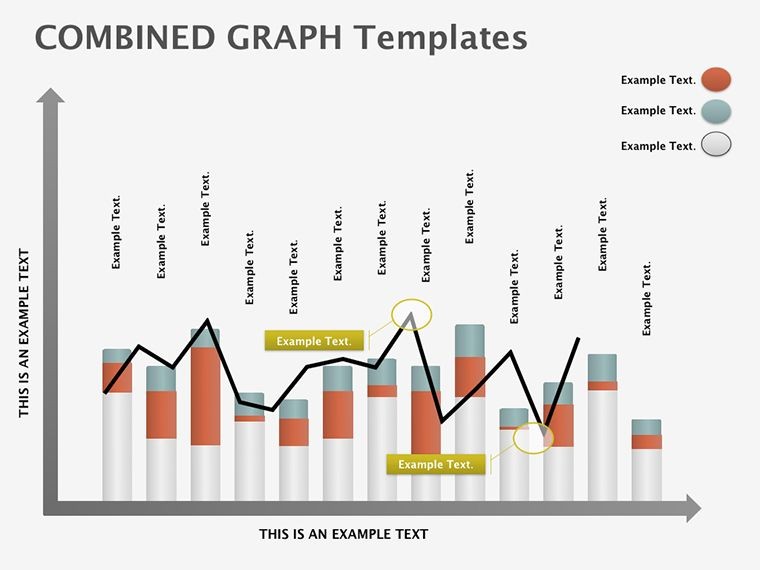
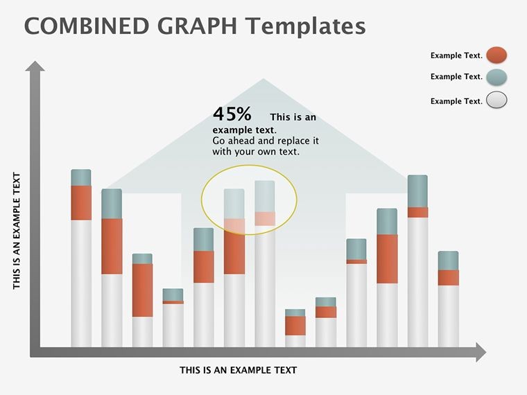
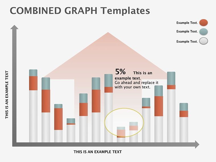
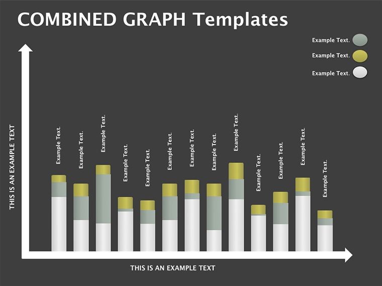
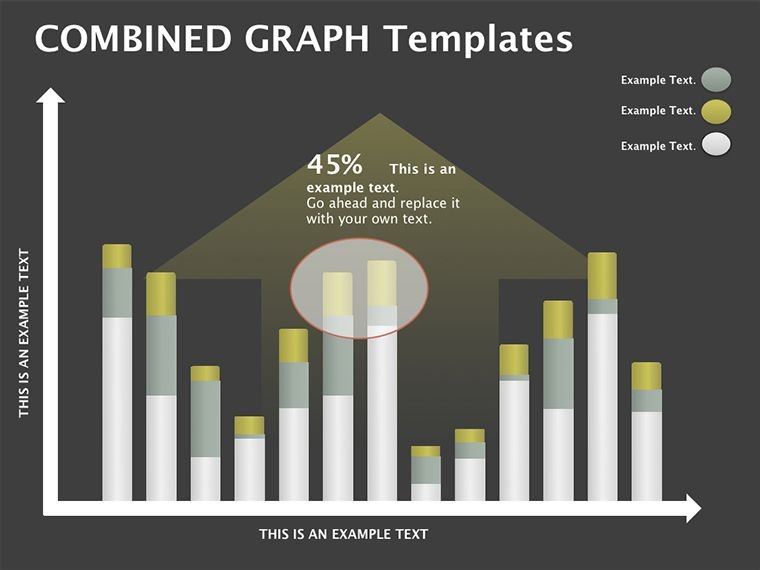
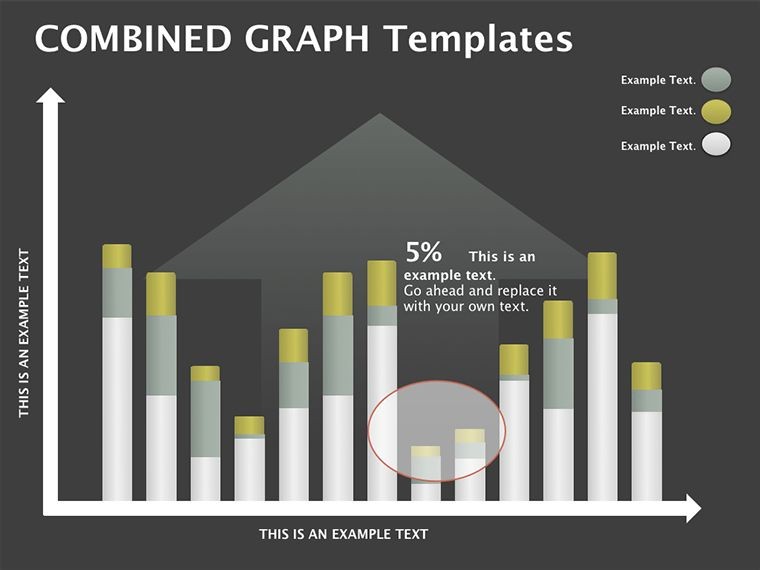
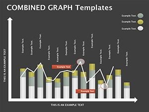
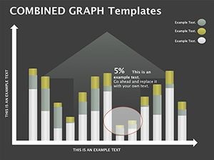
At the heart of this template are its robust graphing tools, designed to handle everything from simple comparisons to layered forecasts. Slide one kicks off with a baseline column setup, where bars represent baseline metrics - think sales by quarter. Progress to slide three, and you'll find clustered columns for multi-variable analysis, ideal for juxtaposing actuals against targets.
- Dynamic Animations: Columns build from the ground up, mimicking real growth, with options to sequence by category for focused reveals.
- Full Editability: Swap data via Keynote's chart editor, tweak bar widths for emphasis, or overlay trend lines for deeper context.
- High-Quality Assets: Crisp vector graphics and scalable inscriptions that maintain sharpness at any zoom.
- Color Customization: Intuitive palette swaps to match brand guidelines, with gradients for added depth.
These features make complex data approachable; a market researcher, for example, used the grouped columns in slide five to dissect regional performance, echoing techniques from Nielsen reports where visual stacking clarifies variances at a glance.
Effortless Customization for Your Data
Editing feels as natural as plotting points on graph paper. Keynote's native tools let you input data directly into tables linked to charts - no exports needed. Adjust axis labels for clarity, add data labels atop peaks for instant takeaways, or incorporate photos as bar textures for thematic flair, like industry icons.
- Double-click a column to access the data source pane.
- Update values and watch charts regenerate in real-time.
- Apply transitions like scale effects to simulate data accumulation.
- Preview in presentation mode to ensure pacing aligns with your narrative.
This streamlined approach cuts prep time, allowing more energy for interpreting trends rather than formatting fights.
Targeted Use Cases: From Strategy to Summaries
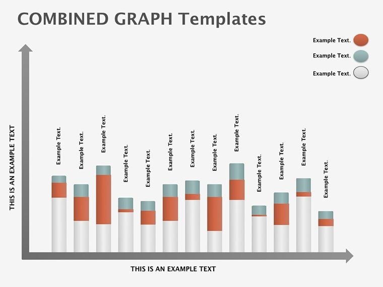
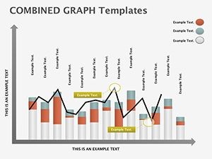
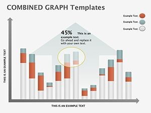
For marketing teams, this template excels in scenario planning - slide seven's stacked columns break down budget allocations, revealing where investments yield the highest ROI. Risk managers appreciate the side-by-side comparisons in slide four, plotting threats versus mitigations in a glanceable format that supports proactive discussions.
In management summaries, use the full set to weave a cohesive arc: start with opportunity columns, pivot to risk assessments, and close with forecasted outcomes. A product manager adapted slide two for launch timelines, where bars denoted phase durations, fostering team alignment much like agile retrospectives emphasize visual retrospection.
Even in non-corporate settings, educators employ these graphs for economic lessons, stacking historical data to illustrate market cycles. The template's versatility ensures every bar contributes to understanding, not just decoration.
Pro Tips for Graph Mastery
To amplify impact, limit columns to five per slide - beyond that, consider sub-charts. Use consistent scaling across slides for continuity, and incorporate subtle shadows for 3D depth without overwhelming flat designs. For remote shares, export as animated GIFs of key graphs to embed in emails, extending reach.
Accessibility matters: ensure color-blind-friendly palettes and descriptive alt text, such as "clustered column graph showing Q1 sales by region."
Standing Tall Against Standard Charts
Unlike Keynote's default graphs, which often feel utilitarian, this template infuses personality through themed animations and preset styles. Where basics require add-ons for flair, here everything's baked in - saving clicks and sparking creativity. Presenters note quicker audience buy-in, as rising columns intuitively convey upward trajectories.
Seize the advantage in your next analysis. Download the Column Graph Keynote Diagrams template for $10.99 and chart your path to clearer insights.
Frequently Asked Questions
Are the slides fully customizable?
Yes, every element from bars to labels is editable in Keynote.
What Keynote versions are supported?
Compatible with iWork Keynote 2016 and later.
Can I add my own data easily?
Absolutely, via linked tables that update charts instantly.
Is it suitable for animations?
Yes, with built-in sequences for engaging reveals.
Does it include photo integration?
Yes, easily overlay images on bars for custom visuals.