Cause-Effect Keynote Diagrams: Unlock the Power of Visual Connections


Type: Keynote Diagrams template
Category: Process
Sources Available: .key
Product ID: KD00082
Template incl.: 14 editable slides
Imagine standing in front of a room full of stakeholders, unraveling a tangled web of factors influencing a project's outcome - from market shifts to resource constraints - without a single yawn from the audience. That's the magic of cause-effect Keynote diagrams. This template pack, with its 14 meticulously crafted, editable slides, is your go-to toolkit for transforming abstract ideas into crystal-clear visuals. Tailored for strategists, analysts, and educators who juggle interconnected data daily, it spotlights how one element ripples into another, making your narratives not just informative but compelling.
Whether you're dissecting environmental impacts on urban development or tracing sales drivers in a quarterly review, these diagrams breathe life into dry stats. Each slide leverages intuitive shapes, flowing arrows, and subtle color gradients to highlight dependencies, ensuring your message lands with precision. And because they're fully vector-based and compatible with Keynote 2016 and later, tweaking them to fit your brand's palette or adding custom icons takes mere minutes. Picture this: a slide showing how climate variables cascade into agricultural yields, with layered categories branching out like a decision tree - suddenly, your pitch isn't a lecture; it's a revelation.
Why These Diagrams Elevate Your Storytelling
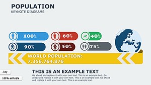
In a world drowning in data, the real skill lies in connection-making. Cause-effect diagrams excel here by stripping away the noise, focusing on what truly drives results. Unlike static charts that list numbers in isolation, these slides create a dynamic flow, guiding viewers through logical progressions. For instance, in a sustainability report, you could map pollution sources to ecosystem responses, using concentric circles to denote intensity levels. This isn't just visual flair; it's a proven way to foster deeper understanding, much like how environmental consultants use similar layouts to advocate for policy changes.
The template's strength shines in its versatility. Slides range from simple linear chains - ideal for quick team huddles - to intricate radial maps for boardroom deep dives. All elements are drag-and-drop ready, so you spend less time formatting and more on refining your insights. Plus, with built-in animation triggers, you can reveal connections sequentially, building suspense and retention as your audience pieces the puzzle together.
Core Features That Make a Difference
- Fully Editable Vectors: Resize, recolor, or reshape without quality loss - perfect for adapting to any theme.
- Intuitive Layouts: Pre-arranged categories with smart guides for effortless alignment.
- Icon Library Integration: Over 50 thematic icons (from gears for processes to leaves for eco-factors) to symbolize elements vividly.
- Responsive Design: Scales seamlessly across devices, from MacBooks to projected screens.
Real-World Applications: From Boardrooms to Workshops
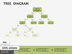
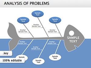
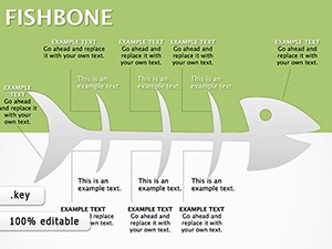
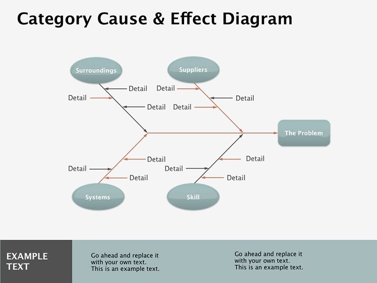
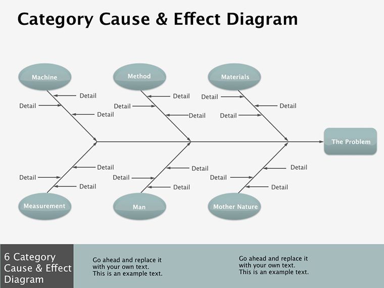
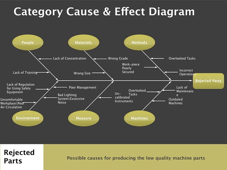
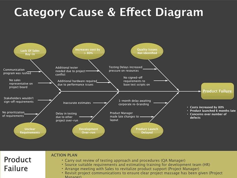
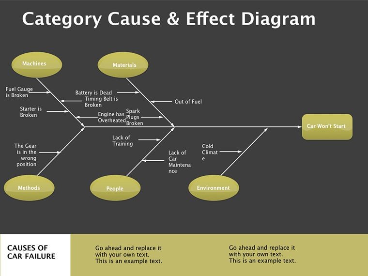
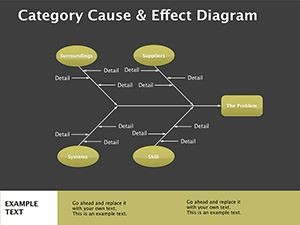
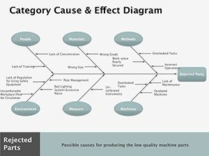
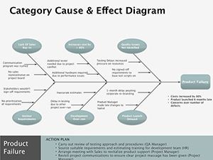
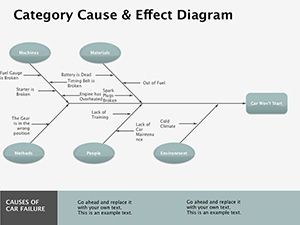
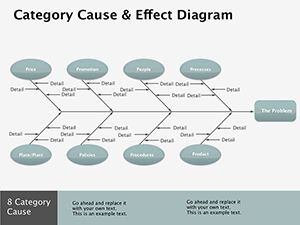
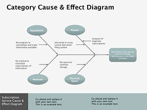
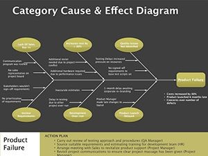
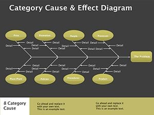
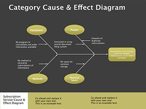
Let's dive into how these diagrams fit into your workflow. Start with a project risk assessment: Use a fishbone-style slide (one of the template's standouts) to branch causes like budget overruns and supply delays into a central "effect" node - delayed launch. Customize the spines with your data, add photos of affected sites, and voila: a slide that prompts actionable discussion rather than passive nodding.
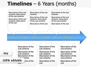
Or consider educational settings. A history teacher mapping the chain of events leading to a policy shift could employ a timeline-infused cause-effect layout, layering arrows to show escalating influences. The result? Students grasp causality not as rote facts but as an interconnected story.
Step-by-Step: Building Your First Diagram
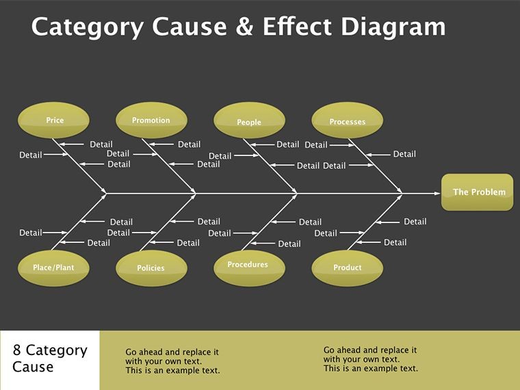
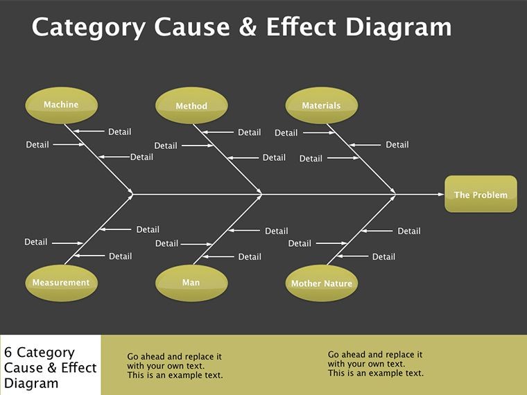
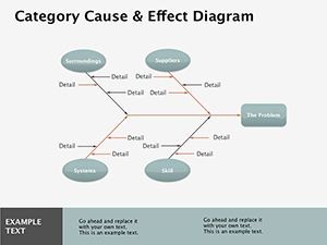
- Select Your Slide: Choose from the 14 options - say, the multi-level cascade for broad overviews.
- Input Categories: Replace placeholder text with your variables, like "Economic Factors" or "Tech Disruptions."
- Draw Connections: Drag arrows to link causes to effects; adjust thickness to indicate strength.
- Enhance Visually: Swap icons and colors - greens for positives, reds for risks - to guide the eye.
- Animate and Test: Add build-ins for reveal order, then rehearse on Keynote's presenter view.
This process, honed from designs inspired by classic infographic principles, turns novices into pros overnight. Compared to cobbling together basic Keynote shapes, it saves hours while delivering polished results that rival agency work.
Spotlight on Standout Slides
Slide 3's radial hub-and-spoke design is a gem for brainstorming sessions, centralizing a core effect (e.g., customer churn) with spokes fanning out to root causes like service gaps. It's editable down to the node labels, allowing you to nest sub-categories for depth without clutter.
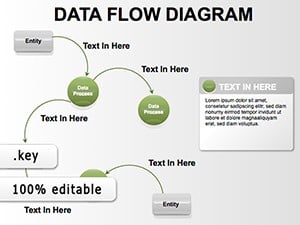
Meanwhile, Slide 9 offers a flowchart variant, blending cause-effect with decision points - think troubleshooting a manufacturing bottleneck, where each path leads to preventive measures. These aren't generic placeholders; they're thoughtful frameworks that anticipate common presentation pitfalls, like overcrowding info.
For a lighter touch, Slide 12's minimalist loop diagram suits feedback cycles, such as iterating on design prototypes where user input loops back to refinements. Integrate it with Keynote's hyperlinks to jump to supporting data slides, creating an interactive experience that keeps engagement high.
Tips for Maximum Impact
- Limit to 5-7 categories per slide to avoid overwhelm - focus on the high-impact links.
- Pair with concise speaker notes: Use the diagram as a visual anchor while verbalizing nuances.
- Test with a small group: Gauge if connections click intuitively, tweaking arrows for clarity.
In essence, this template isn't just slides; it's a strategic ally for anyone wrestling with "why" behind the "what." It empowers you to craft presentations that don't just inform but inspire action, turning viewers into advocates for your ideas.
Ready to map out your next big reveal? Download this cause-effect Keynote diagram template today and watch your stories connect like never before.
Frequently Asked Questions
What makes these cause-effect diagrams suitable for Keynote?
Designed natively for Keynote, they use vector graphics and native animations, ensuring smooth performance and easy edits without compatibility issues.
Can I use this template for non-business presentations?
Absolutely - its flexible layouts work for educational, scientific, or personal projects, like mapping personal goal dependencies.
How many customization options are there?
With 14 slides and elements like colors, icons, and text, you have endless tweaks to match your style or branding.
Is animation included, and how does it work?
Yes, build-in animations are pre-set for sequential reveals; adjust timing in Keynote's inspector for your pace.
What's the file format and compatibility?
It's a .key file compatible with Keynote 2016 and newer versions on macOS.