Flow Values Keynote Template: Illuminate Hidden Data Connections


Ever tried explaining a system's inner workings only to see eyes glaze over? The Flow Values Keynote Template changes that narrative with 18 meticulously designed slides that turn tangled data webs into elegant, understandable flows. Crafted for data analysts, business intelligence pros, and strategists who wrestle with non-obvious links, this template is your secret weapon for making the complex feel approachable.
At heart, it's about capturing the dance of values: inputs feeding calculations, outputs signaling results, and internal storages holding the threads together. Whether you're dissecting supply chain efficiencies or modeling financial forecasts, these diagrams spotlight patterns that numbers alone can't convey. Editable to the core, they let you infuse your specifics - swap datasets, tweak arrows, refine labels - while Keynote's polish ensures every reveal lands with precision.
This goes beyond basic charts; it's a storytelling scaffold that draws viewers into your logic, fostering "aha" moments over confusion. Compatible across Keynote versions from 2016 up, it's versatile for solo tinkering or team shares. If your presentations often hit a wall at "how does this connect?", this template builds the bridge. Ready to flow through the details?
Key Features That Reveal the Flow
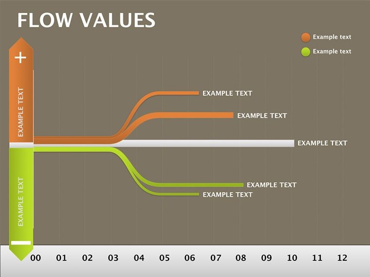
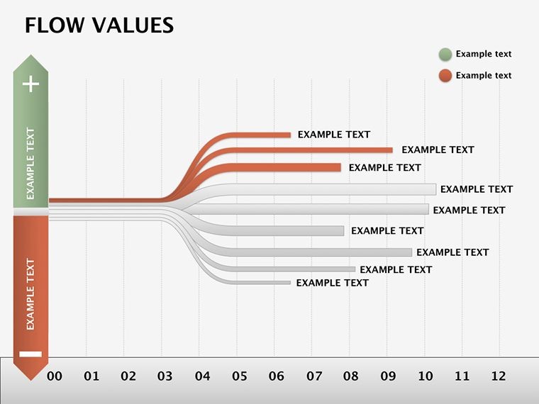
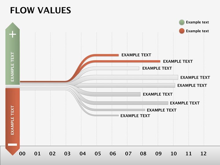
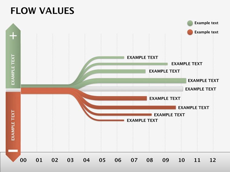
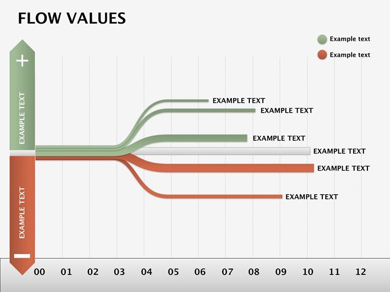
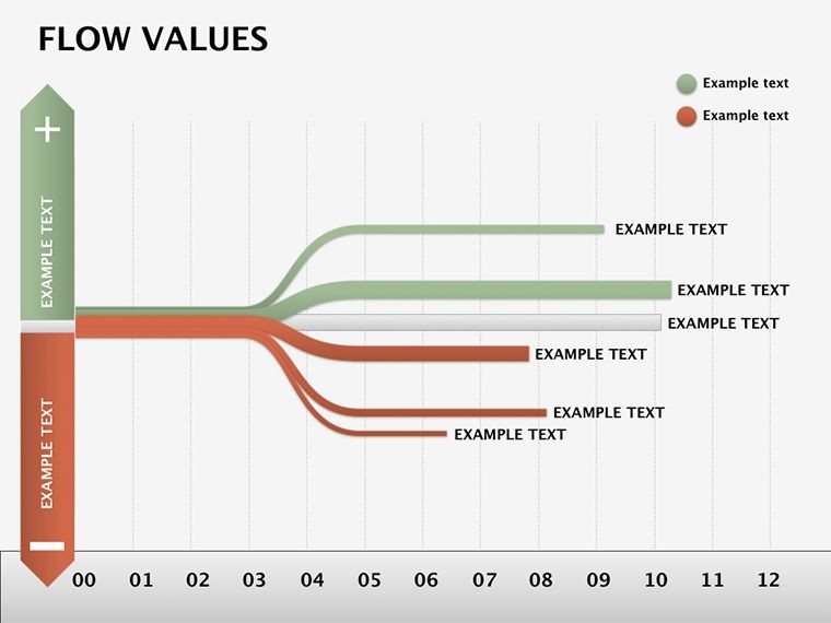
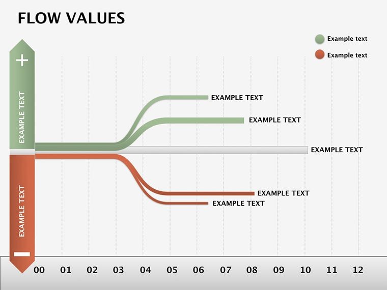
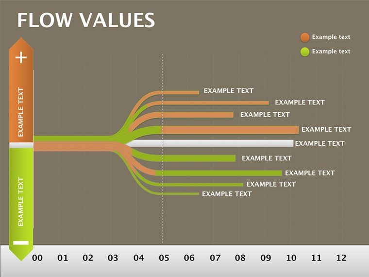
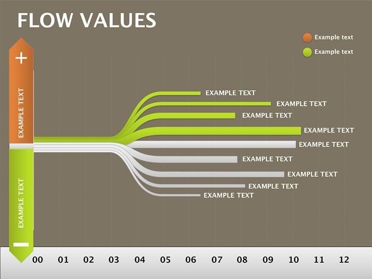
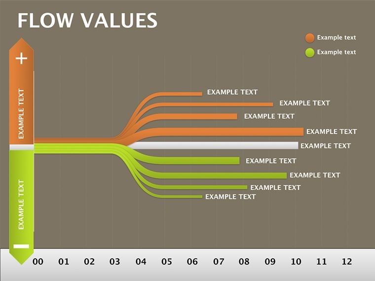
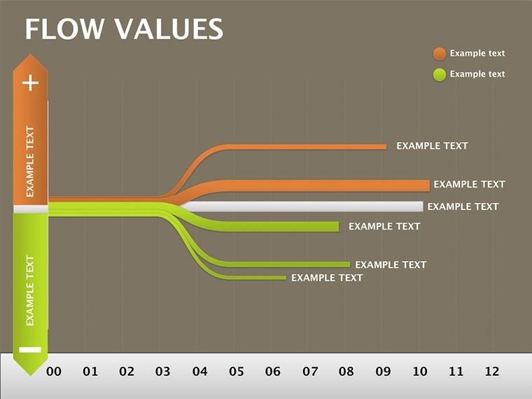
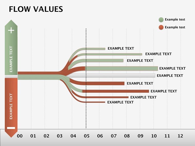
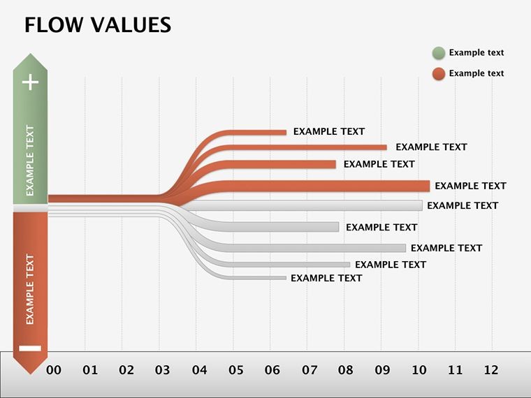
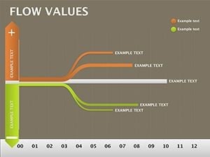
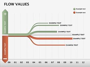
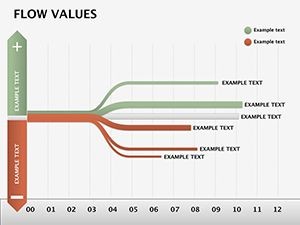
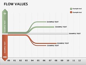
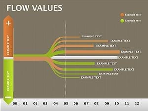
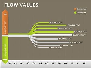
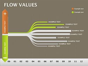
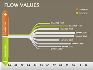
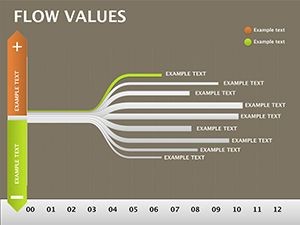
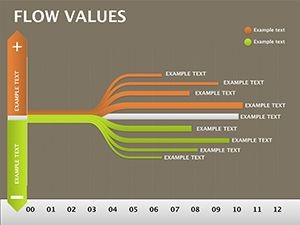
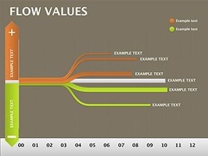
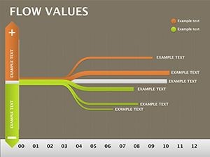
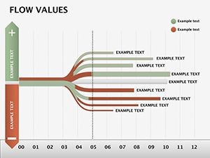
The template unfolds progressively, starting with foundational inputs on Slide 1: a clean funnel diagram where you drop variables like raw metrics or user inputs. Slides 2-6 build the computation core, using linked nodes to trace transformations - think revenue streams branching into cost allocations, with color codes for positive/negative impacts.
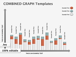
- Input-Output Pipelines: Straightforward arrows with capacity indicators, editable for volume visuals like bar overlays.
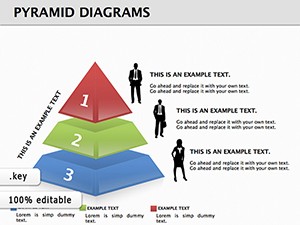
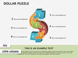
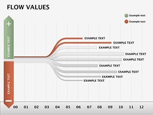
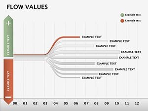
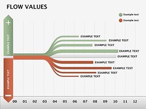
- Internal Storage Maps: Slides 7-12 depict caches and buffers as layered containers, ideal for showing data persistence or state changes.
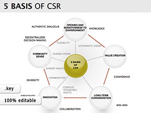
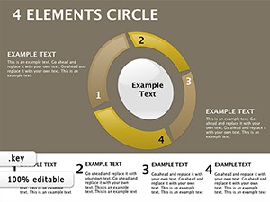
- Relationship Webs: Culminating in holistic overviews (Slides 13-18), these spider-like charts connect disparate elements, highlighting dependencies at a glance.
Vector precision means no pixelation during zooms, and built-in gradients add depth without clutter. Keynote animations gently unpeel layers, mimicking the data's natural progression.
Keynote's Role in Data Flow Mastery
What elevates this in Keynote? The app's curve tools for organic paths, which the template pre-configures for fluid edits. It's lighter than dedicated diagramming software, focusing your energy on insights over infrastructure.
Targeted Applications: From Analytics to Strategy
Picture a logistics coordinator untangling warehouse throughput: They mapped inventory ins to shipment outs, using storage slides to pinpoint bottlenecks - transforming a routine report into a proactive overhaul. In healthcare analytics, flow values clarified patient journey metrics, linking intake data to outcome predictions for board-level buy-in.
To weave it into your routine:
- Gather Your Streams: Input base values on Slide 1 via Keynote tables, auto-linking to downstream nodes.
- Trace Transformations: On computation slides, adjust formulas in text boxes to reflect your model's math.
- Visualize Interplays: Build the web on Slide 15 by connecting pins, then animate to reveal causal chains.
- Polish and Present: Use master themes for consistency, exporting with hyperlinks to source spreadsheets.
These uses underscore the template's versatility, turning data dumps into directed narratives that drive decisions.
Building Trust Through Transparent Flows
Effective data viz trusts the audience with clarity, much like Edward Tufte's principles of sparing ink for maximum signal. Here, minimize extraneous lines - focus flows on 3-5 key paths per slide. A handy hack: Leverage Keynote's shadows for depth in storage visuals, subtly emphasizing critical holds.
This approach not only explains but engages, inviting questions that deepen understanding rather than derailing it.
Flow Into Clarity Now
Stop struggling with opaque data tales. Grab the Flow Values Keynote Template for $22 and craft presentations that connect the dots effortlessly. Download today and let your insights shine.
Frequently Asked Questions
How editable are the flow connections?
Fully - drag endpoints to reroute paths, or use the line tool to add branches, with automatic snapping for alignment.
Can this template handle quantitative data?
Yes, embed Keynote charts within nodes to display metrics like flow rates or value deltas alongside qualitative links.
What's included for complex relationships?
Bidirectional arrows and conditional icons allow modeling if-then scenarios, keeping even nested dependencies clear.
Is it suitable for non-technical audiences?
Designed that way - simplify by hiding layers via builds, revealing only what's needed for the story at hand.
How do animations enhance the flows?
Sequential reveals trace value journeys step-by-step, building comprehension without overwhelming the viewer.