Process Arrow Keynote Diagrams: Adapt & Visualize


Type: Keynote Diagrams template
Category: Hierarchy, Process, Business Models
Sources Available: .key
Product ID: KD00046
Template incl.: 10 editable slides
Imagine navigating the whirlwind of market shifts without losing your direction. That's the power of Process Arrow Keynote diagrams, a set of 10 meticulously crafted slides designed to map out evolving business processes with precision and flair. Whether you're outlining a product launch in a volatile industry or charting organizational hierarchies that flex with new regulations, these diagrams turn abstract strategies into visual roadmaps that resonate. Built for professionals who demand clarity amid chaos - like consultants dissecting supply chain disruptions or executives plotting agile responses - these templates ensure your Keynote presentations don't just inform, but inspire action.
At their core, these arrow-based visuals emphasize flow and adaptability, highlighting how fundamental factors influence outcomes in a constantly shifting landscape. Each slide is fully editable, allowing you to tweak colors, adjust arrow curvatures for emphasis, or layer in data points that reflect real-time insights. Compatible with Keynote on macOS, they integrate seamlessly into your workflow, saving hours on design so you can focus on strategy. Picture a slide where arrows cascade like a river, showing the progression from research to implementation - suddenly, your audience grasps the interconnectedness of risks and opportunities.
Core Features That Drive Clarity
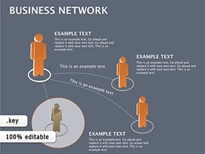
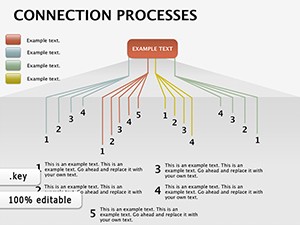
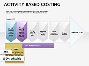
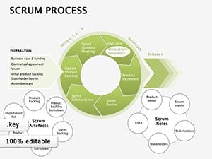
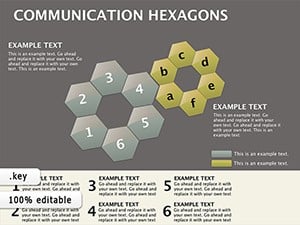
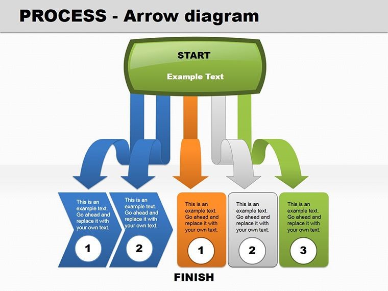
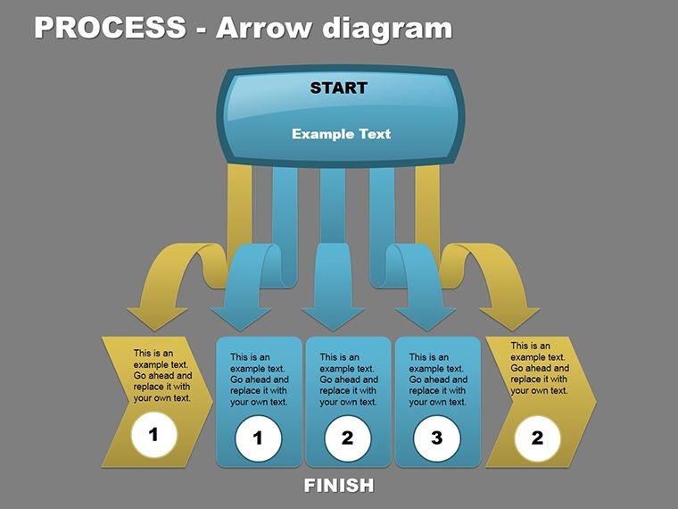
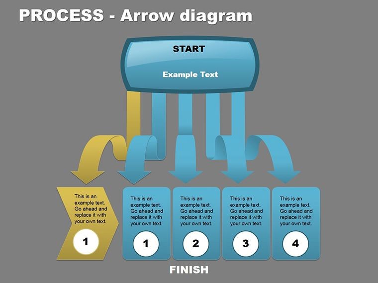
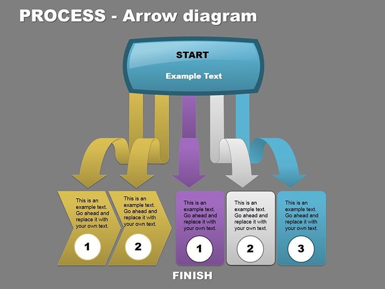
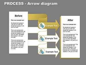
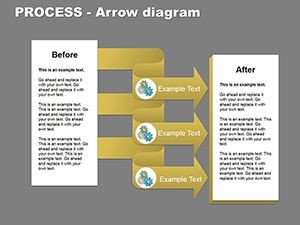
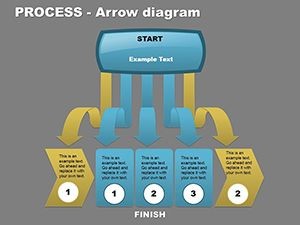
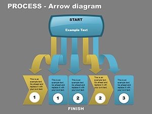
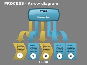
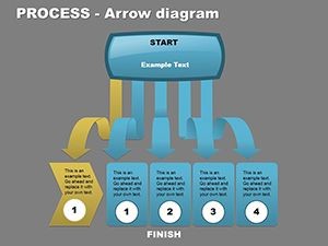
These diagrams aren't just lines on a slide; they're strategic tools honed for impact. Start with the foundational process arrow layout, where sequential steps build momentum, ideal for demonstrating systematic research protocols. Then, explore the hierarchy variant, which uses branching arrows to delineate decision trees, making complex org structures digestible at a glance.
- Editable Vectors: Resize, recolor, and reposition arrows without quality loss, ensuring your visuals scale to any screen size.
- Themed Icons Integration: Subtle icons at arrow heads denote actions like "analyze" or "execute," adding context without clutter.
- Animation-Ready Paths: Built-in transitions let arrows "draw" themselves, guiding eyes through the narrative flow during live pitches.
One standout slide features a circular arrow loop, perfect for cyclical processes like feedback loops in project management. Customize it by swapping in your branding colors - say, a tech firm's electric blue - to make it unmistakably yours. These elements combine to create presentations that feel alive, not static, helping you convey how staying attuned to environmental changes isn't optional, but essential.
Streamlining Your Workflow with Step-by-Step Customization
Getting started is straightforward. Open the .key file in Keynote, select an arrow element, and use the build inspector to animate its path. For instance, to illustrate a market adaptation strategy:
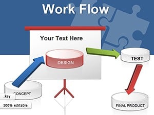
- Layer the Base: Drop in the primary arrow chain, labeling nodes with key phases like "Monitor Trends" and "Pivot Resources."
- Add Depth: Insert branching arrows for contingencies, using opacity adjustments to show probability levels visually.
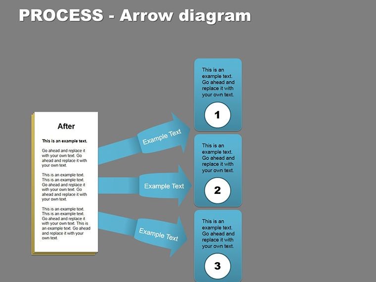
- Enhance with Data: Embed simple charts at intersections, ensuring they align with arrow directions for intuitive reading.
- Test Flow: Preview animations to confirm the sequence builds tension toward your call to action.
This approach, drawn from real-world applications in agile consulting, transforms vague ideas into compelling stories. Unlike basic Keynote shapes, which often look amateurish, these pre-built paths maintain professional polish while inviting personalization.
Real-World Applications for Dynamic Environments
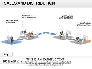
In today's fast-paced business world, where a single overlooked factor can derail plans, these diagrams shine in scenarios demanding quick adaptation. Consider a sales director using the linear arrow slide to map a funnel in a disrupted economy: arrows widen at pain points, narrowing to conversion wins, making the pitch unforgettable.
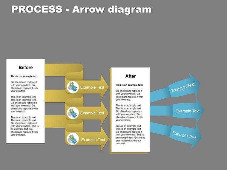
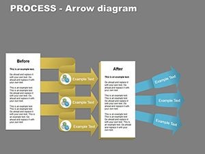
For broader use, the business model canvas variant adapts arrows to segment value propositions, risks, and revenue streams. A startup founder might employ this during investor meetings, arrowing from customer segments to cost structures, revealing scalable paths forward. Even in non-profits, where resource allocation shifts with donor trends, these visuals clarify impact pathways without overwhelming details.
Another gem is the divergent arrow design for scenario planning. Here, a central node splits into multiple trajectories, each tipped with outcome icons - ideal for risk assessments in finance or logistics. Users report that such structures foster deeper discussions, turning passive viewers into engaged collaborators.
Tailoring for Your Industry's Unique Flows
Adaptability is key, so consider sector-specific tweaks. In healthcare, arrow a patient journey from diagnosis to recovery, incorporating compliance checkpoints. For marketing teams, loop arrows around campaign cycles, highlighting A/B test integrations. These aren't one-size-fits-all; they're canvases for your narrative, ensuring every presentation aligns with your goals.
Compared to standard diagramming tools, which require manual alignment, these Keynote templates offer drag-and-drop simplicity, preserving vector sharpness across devices. Integrate them into larger decks by copying slides directly, maintaining theme consistency effortlessly.
Unlocking Benefits That Elevate Your Presentations
Beyond aesthetics, the true value lies in how these diagrams bridge gaps between data and decisions. They simplify systematic research by visualizing factor interdependencies, reducing miscommunication in team huddles. Audiences absorb information faster when guided by purposeful arrows, leading to more actionable feedback.
Professionals like strategy analysts find them indispensable for quarterly reviews, where arrow flows spotlight efficiencies gained from environmental scans. The result? Presentations that not only inform but propel initiatives forward, fostering a culture of proactive change.
Ready to map your next big move? Download the Process Arrow Keynote diagrams today and turn uncertainty into a clear path to success.
Frequently Asked Questions
What makes these arrow diagrams suitable for dynamic processes?
They emphasize flow and adaptability with branching and looping paths, helping visualize how changes in one area ripple across others.
Are the slides fully editable in Keynote?
Yes, all elements including arrows, text, and icons are vector-based and customizable without losing quality.
Can I use these for non-business presentations?
Absolutely - adapt them for project timelines in education or event planning, where sequential flows are key.
What file formats are included?
Sources come in .key format, compatible with recent Keynote versions on macOS.
How do animations work with the arrows?
Built-in paths allow sequential reveals, customizable via Keynote's animate tab for smooth transitions.