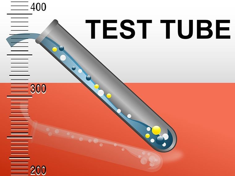
Test Tube Keynote Diagrams: Science Slides Simplified


Type: Keynote Diagrams template
Category: Medicine - Pharma, Illustrations
Sources Available: .key
Product ID: KD00040
Template incl.: 15 editable slides
Imagine standing before a room of curious students or fellow researchers, ready to unravel the mysteries of a chemical reaction or experimental sequence. Instead of fumbling with static text or clunky charts, you pull up a sleek visual that flows like a lab procedure itself - test tubes lined up, colors popping to highlight phases, labels crisp and intuitive. That's the power of the Test Tube Keynote Diagrams template, a 15-slide powerhouse designed specifically for Apple Keynote users who demand precision and polish in their scientific storytelling.
This template isn't just a collection of shapes; it's a toolkit for turning dense data into digestible narratives. Whether you're dissecting a DNA extraction process, mapping pH shifts in solutions, or illustrating reactant-product dynamics, these diagrams adapt to your needs with drag-and-drop ease. Built for compatibility with Keynote 2016 and later, every element - from tube outlines to gradient fills - is vector-based, ensuring scalability without pixelation during zooms or exports. Professionals in labs, classrooms, and conferences have long relied on such visuals to bridge the gap between theory and understanding, much like how a well-labeled beaker clarifies a solution's contents at a glance.
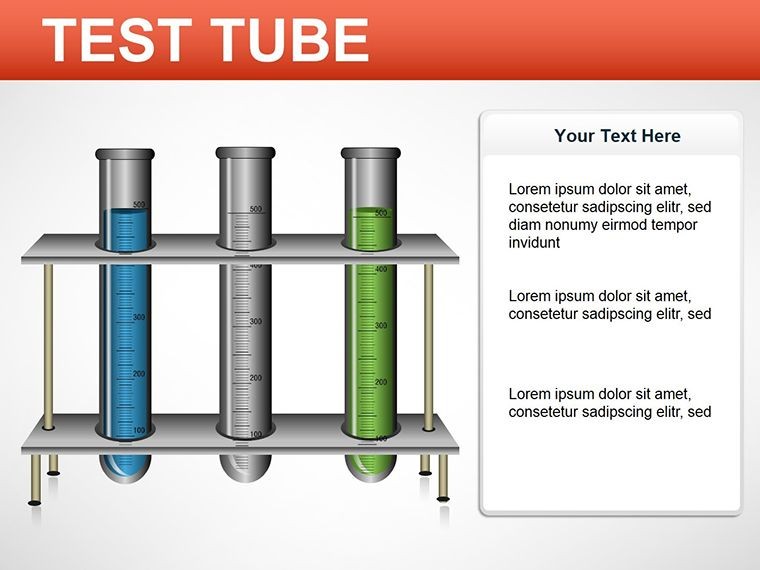
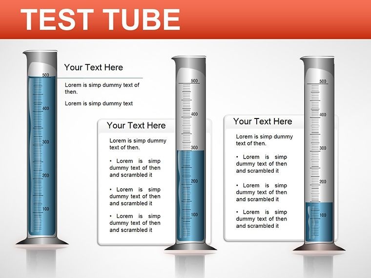
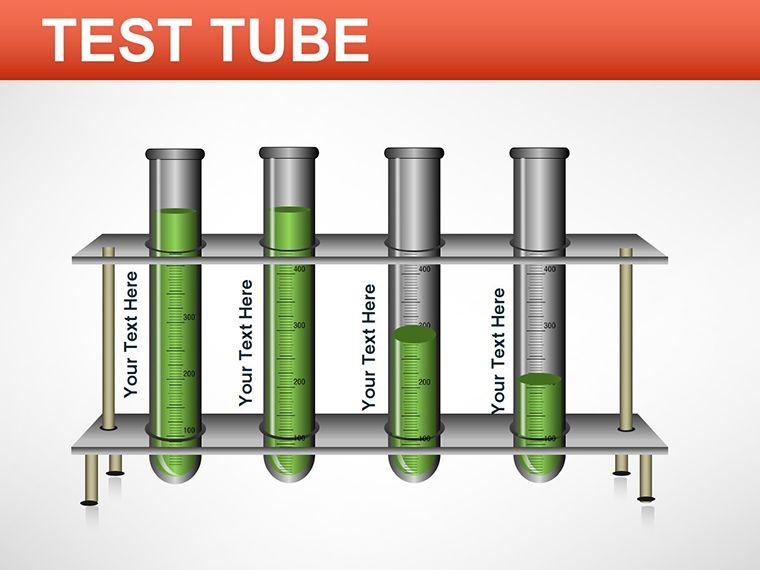
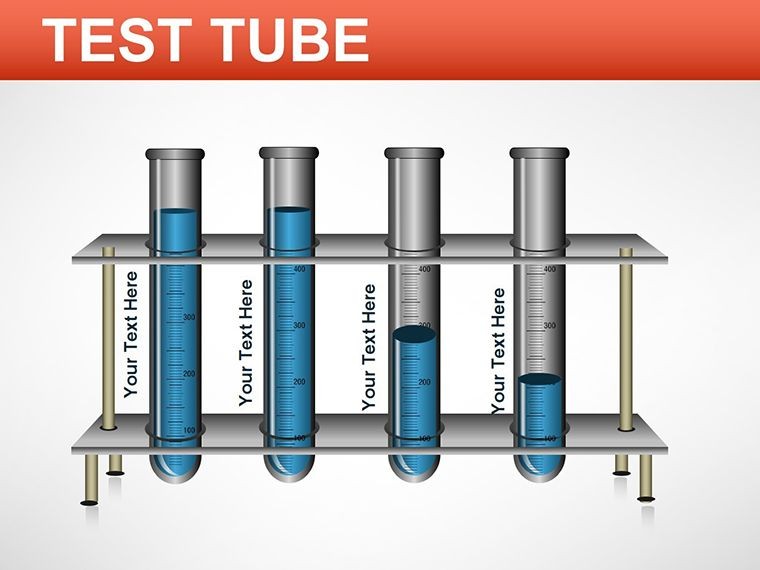
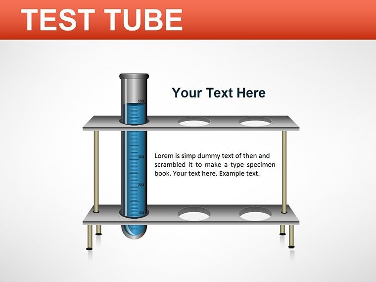
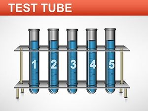
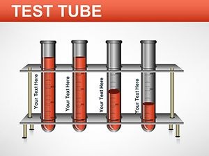
What sets this apart? It's the thoughtful progression of slides that mirrors real-world workflows. Slide 1 kicks off with a blank canvas for your title or overview, letting you set the stage with a single test tube icon that hints at the experimentation ahead. By Slide 5, you're into multi-tube arrays, perfect for comparing concentrations side-by-side - think swapping in your own hex codes for substances like acids or bases to match your palette. And don't overlook the animation-ready transitions; a subtle fill effect can simulate bubbling reactions, drawing eyes exactly where you want them during your talk.
Core Features That Fuel Your Lab Narratives
Dive deeper into what makes these diagrams tick. At its heart, the template offers fully layered compositions where each test tube is an independent object. Resize one without distorting the row, or recolor individually to denote variables like temperature gradients - hot pink for high heat, cool blue for chilled samples. Infused with over 50 customizable icons (from pipettes to safety goggles), it's geared for quick swaps, saving you the hassle of hunting through Keynote's library.
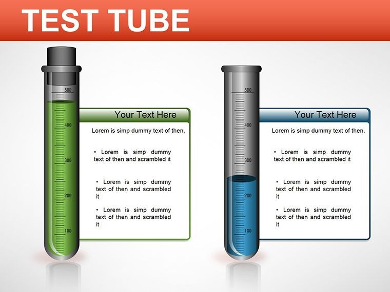
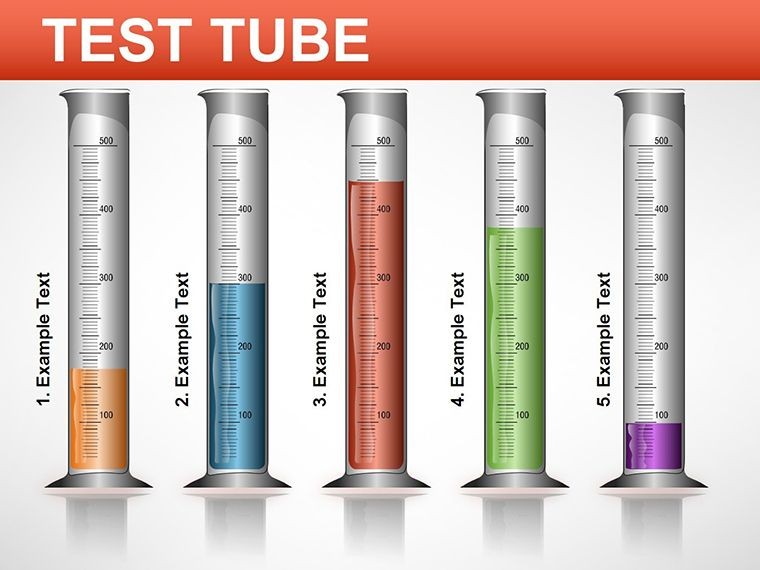
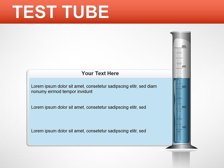
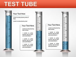
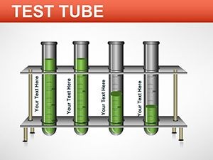
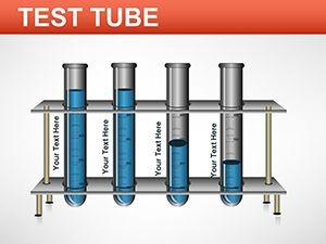
- Modular Tube Designs: Straightforward cylinders for basic setups or Erlenmeyer flasks for advanced mixes, all pre-aligned for symmetry.
- Labeling Precision: Smart text boxes that snap to tube necks, with font scaling that keeps readability intact even in dense clusters.
- Integration with Charts: Embed bar graphs or pie slices inside tubes to quantify results, like yield percentages from a synthesis run.
- Export Flexibility: Seamless output to PDF or video for sharing beyond Keynote, ideal for journal submissions or online webinars.
These aren't afterthoughts; they're crafted from feedback loops with working scientists, ensuring they handle the nuances of real protocols without the design overhead.
Real-World Applications: From Classroom to Conference
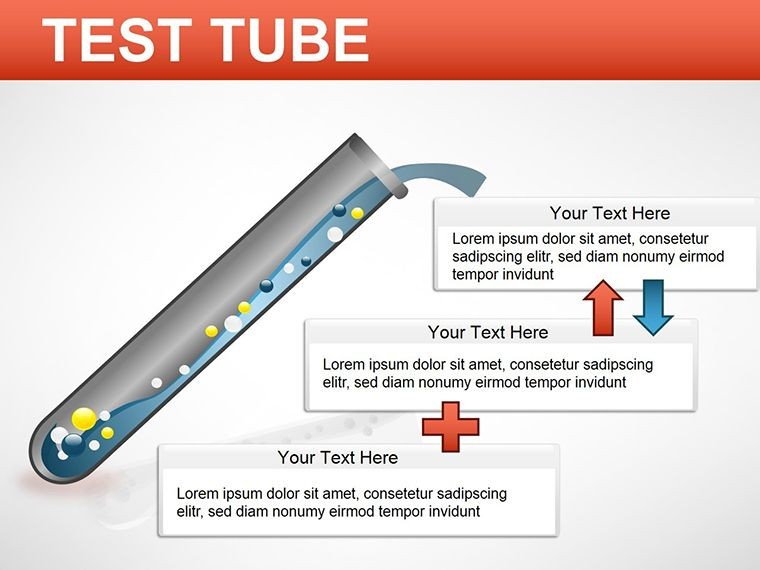
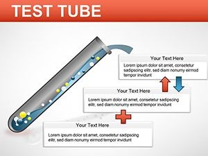
Picture a biology instructor at a university seminar, using Slide 8's sequential tube layout to walk through osmosis stages - each vessel filling progressively to show water movement across membranes. The audience leans in, not lost in jargon but following the visual cue of rising levels. Or consider a pharma researcher pitching a new compound: Slide 12's reaction pathway diagram, with arrows linking tubes, spotlights stability tests, making the case for funding as compelling as the science itself.
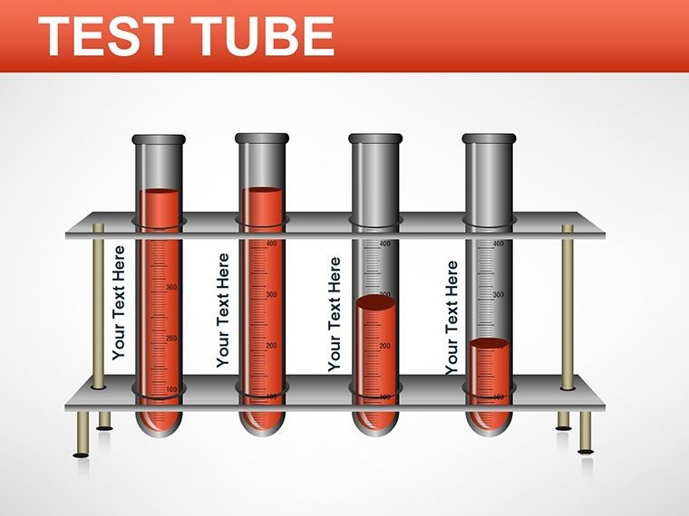
In educational settings, this template shines for breaking down abstract ideas. Assign students to recreate a titration curve on Slide 10, fostering hands-on learning without starting from scratch. For corporate R&D teams, it's a staple in quarterly reviews - map out assay results across tubes to highlight bottlenecks, turning data dumps into strategic insights. Even in environmental science pitches, adapt the cluster view on Slide 14 to depict pollutant dispersion, with color-coded tubes representing contamination levels over time.
The beauty lies in its adaptability: no rigid formats mean you can pivot from organic chemistry flows to biotech pipelines mid-presentation. And for those hybrid events? The responsive elements ensure clarity on screens big and small, keeping remote viewers engaged just like in-person ones.
Step-by-Step: Building Your First Diagram
Getting started is as straightforward as pipetting a sample. Open the template in Keynote, and head to Slide 3 for a starter single-tube setup. Select the tube shape, then use the format panel to tweak its fill - perhaps a semi-transparent overlay for solution visibility. Next, duplicate for multiples via Command+D, aligning with the guide rails for perfect spacing. Input your data labels via the text tool, and apply a build-in animation to reveal contents sequentially. Test on projector mode to confirm legibility, then export a draft for peer review. In under 20 minutes, you've got a pro-level slide that rivals custom agency work.
Pro Tips to Maximize Impact
To elevate from good to unforgettable, layer in context. Pair tube visuals with minimal text - aim for one key takeaway per slide, like "Reactant A yields 85% conversion." Use Keynote's magic move for smooth handoffs between slides, simulating a real lab pour. For accessibility, add alt text to images via the inspector, describing "Array of five test tubes showing pH progression from acidic to neutral."
Avoid clutter by limiting to 4-6 tubes per view; if your dataset sprawls, split across slides with consistent numbering. And for that extra polish? Incorporate subtle shadows under bases to ground the design, mimicking lab realism without overcomplicating edits.
Users often share how this shifts their prep dynamic - from hours tweaking alignments to minutes refining messages. One lab coordinator noted it streamlined grant proposals, letting visuals do the heavy lifting for methodology sections.
Why This Template Outshines Basics
Compared to Keynote's stock shapes, this template skips the guesswork. No more wrestling with connectors that snap off-kilter or colors that clash with your theme - everything's pre-vetted for harmony. It's lighter on resources too, loading faster than bloated alternatives, crucial for live tweaks during Q&A.
Plus, the thematic icons extend beyond tubes: integrate balance scales for equilibrium demos or thermometers for thermal shifts, creating a cohesive lab aesthetic across your deck.
Ready to infuse your next presentation with lab-grade clarity? Download the Test Tube Keynote Diagrams template for $22 and watch your scientific stories resonate.
Frequently Asked Questions
What versions of Keynote does this template support?
It's fully compatible with Keynote 2016 and newer versions, including the latest macOS updates for seamless performance on Mac or iPad.
Can I use these diagrams for non-scientific presentations?
Absolutely - adapt the tube layouts for process flows in any field, like marketing funnels or project phases, by swapping labels and colors.
Are the elements truly editable, or are there locked parts?
Every component is unlocked and grouped logically, allowing full customization from shapes to animations without restrictions.
How do I add my own data visualizations inside the tubes?
Simply drag in Keynote charts or images, resizing to fit the tube contours for integrated, professional hybrids.
Is there support for animations in the diagrams?
Yes, all slides include build options; apply fades or wipes to reveal tube contents step-by-step for dynamic reveals.