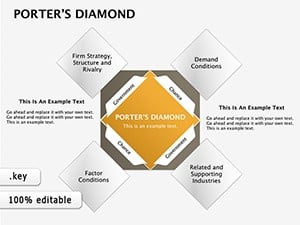
Porter's Diamond Keynote Diagrams: Forging Competitive Insights
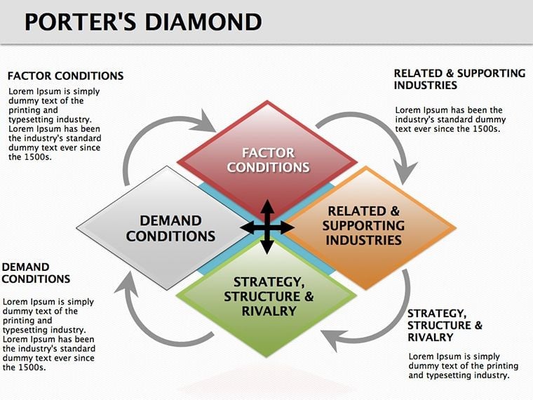

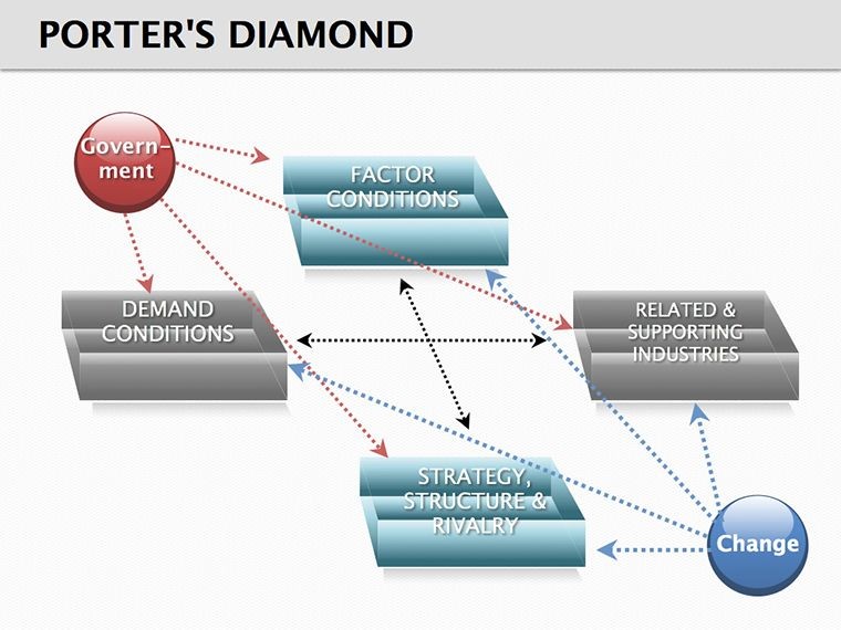
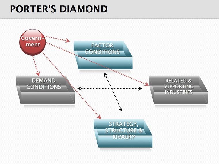

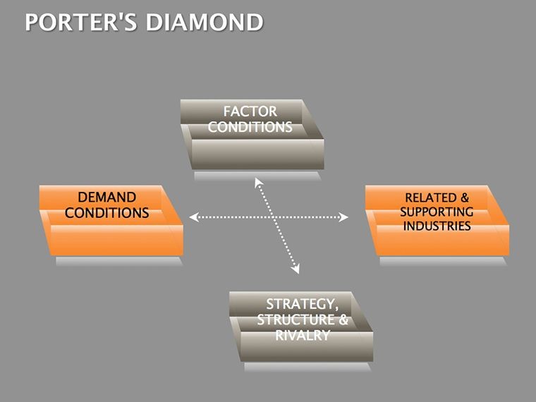


Understanding what makes industries tick requires more than spreadsheets - it demands a framework that reveals hidden dynamics. The Porter's Diamond Keynote diagrams template, inspired by Michael Porter's model, offers 13 editable slides to dissect factor conditions, demand, related sectors, and rivalry, plus the wildcard of government and chance.
Aimed at strategists, MBAs, and consultants, this tool helps unpack why some firms thrive while others falter. Map a tech hub's talent pools or a manufacturing sector's supplier webs, turning theoretical models into tactical maps. Your analyses gain depth, your pitches gain persuasion.
Tailored for Keynote, with cube and cycle elements for multidimensional views, it's built for iterative refinement - update as markets shift, collaborate without compromise.
Diamond Facets: Essential Features
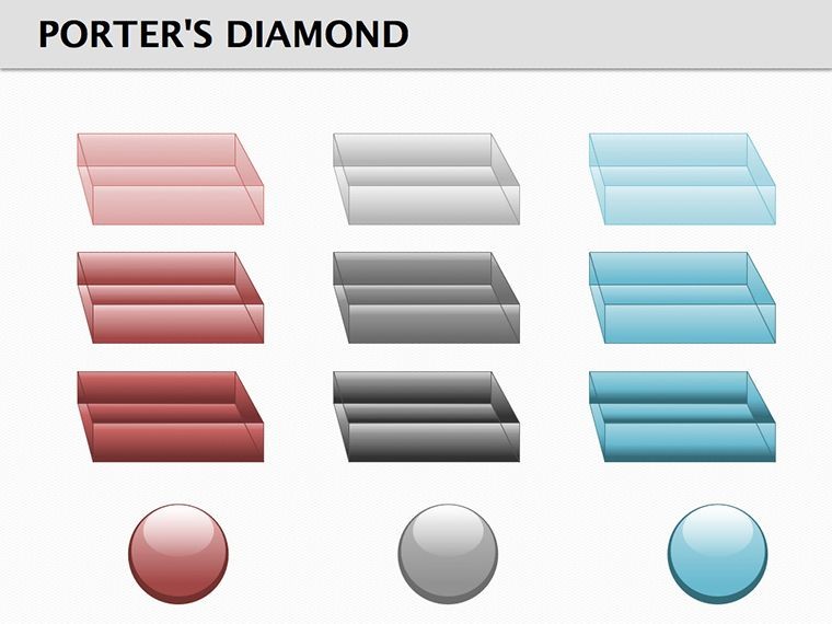
This 13-slide collection emphasizes interconnectedness, using geometric precision for clarity.
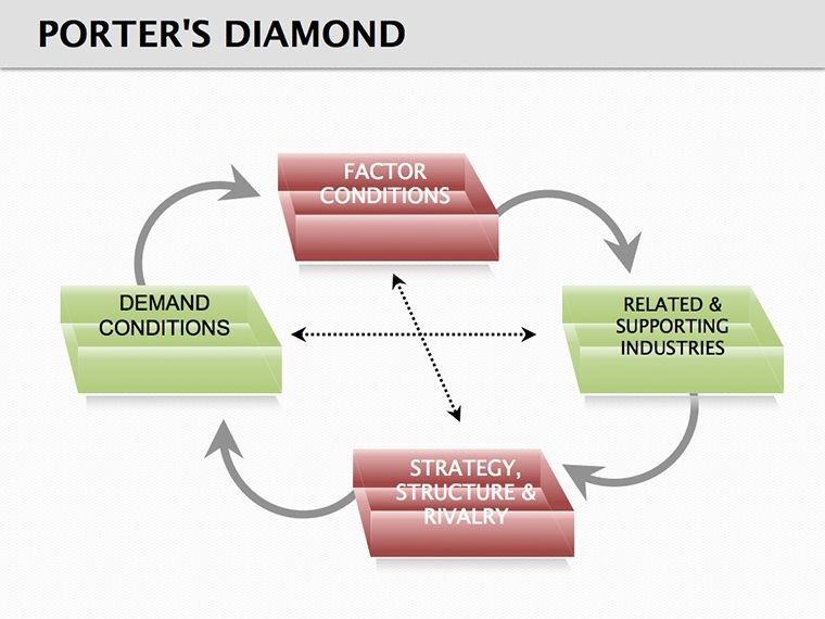
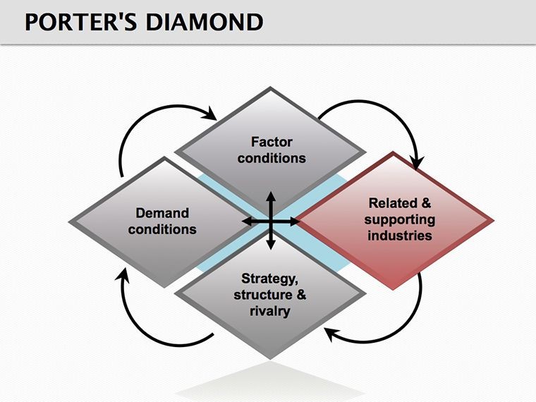
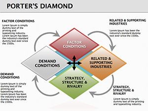
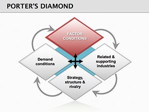
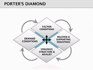
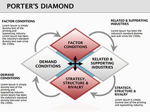
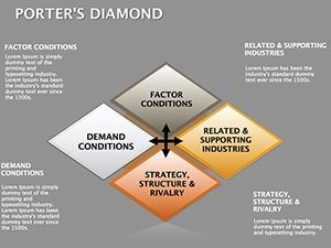
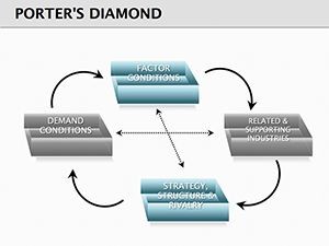
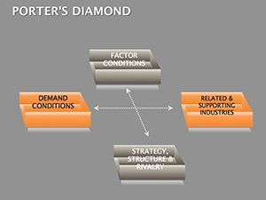
- Diamond Core Structures: Hexagonal frameworks with labeled vertices, expandable for sub-factors.
- Cycle Integrations: Looping arrows for feedback loops, like innovation cycles.
- Cube Expansions: 3D blocks for layered data, rotating to expose angles.
- Adaptive Links: Connector lines that snap to elements, color-coded by influence strength.
Adapt in Keynote: Rotate diamonds for emphasis, fill cubes with gradients for intensity, or hyperlink vertices to detail slides - making complex webs navigable.
Facet by Facet: Slide Exploration
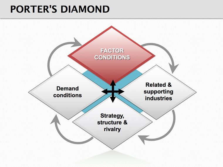
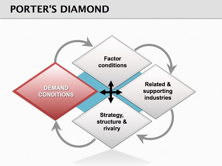
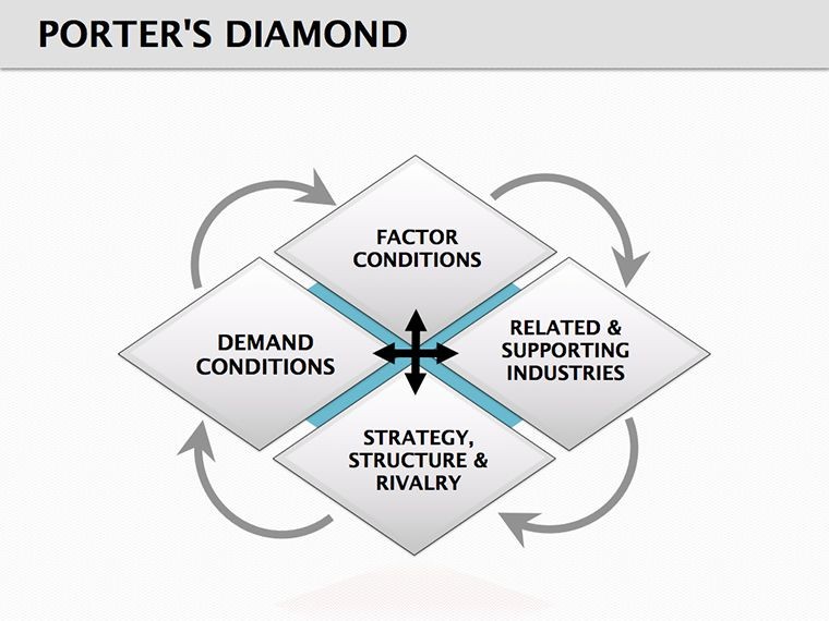
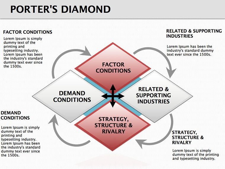
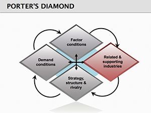
Slide 1 centers the diamond: Place industries at the core, radiate factors outward. Slides 2-4 zoom on inputs: Factor condition cubes stacked by resource types - talent, infra, raw materials.
Demand slices in Slides 5-7: Cycle rings encircling buyer personas, arrows showing sophistication levels. Related industries get Slides 8-10: Interlocking diamonds for supplier ecosystems.
Rivalry heats up in Slides 11-12: Opposing vertices with bar tensions, simulating competitive pressures. Slide 13 synthesizes: A master diamond overlaying all, for holistic overviews.
Strategic Spotlights: In-Practice Power
An analyst probes automotive trends: Diamonds facet out supply chains, cycles loop R&D feedbacks, revealing why EVs accelerate in certain regions. For academics, a professor diagrams wine industries - factors like soil cubes, demand cycles from global tastes - engaging students in real rivalries.
Such applications transform models from textbooks to toolkits, sparking strategies that endure.
Blueprint to Brilliance: Step-by-Step
- Frame the Foundation: Select Slide 1, label the diamond's points with your sector.
- Build the Blocks: Add cubes to factors, input qualitative notes or quant scores.
- Connect the Cycles: Draw loops for interactions, thickening lines for strong ties.
- Illuminate Rivalries: Animate oppositions, fading weaker edges to foreground threats.
- Holistic Harmonize: Duplicate to master, tweak for scenarios like post-merger views.
This sequence ensures your diamond polishes insights without overwhelming.
Refinement Rituals: Pro Pointers
Use Keynote's shadows for 3D pop on cubes, or blend modes for overlapping transparencies in cycles. Limit facets to five per slide for focus - drill down via builds. For group sessions, enable co-editing to crowdsource factor weights.
Pair with external data viz tools, embedding charts into vertices for hybrid depth. Validate with peer reviews, adjusting arrows based on fresh intel.
Polish your competitive lens - claim this template now and diamond-cut your strategies.
Frequently Asked Questions
What does Porter's Diamond analyze?
It examines national advantages through four main factors plus two influencers, explaining industry competitiveness.
Are the 3D elements rotatable?
Yes, Keynote's 3D controls let you spin cubes and diamonds for multi-angle reveals.
Can I customize the connections?
Fully - adjust line styles, colors, and curvatures to reflect relationship nuances.
Does it support data import?
Yes, paste from spreadsheets into text boxes or link tables for updates.
How flexible for different industries?
Highly - swap icons and labels to fit tech, manufacturing, or service sectors seamlessly.
Are animations included?
Pre-set for sequential builds, like expanding factors one by one for paced reveals.